It's no secret that I'm not a huge fan of Instagram, filters, and so on. But it's not the overall effect, on the page, that I take issue with. It's the way that the low resolution web version, usually with effects applied, is the 'master' image. Now, I'm sure that some Instagram users do take high quality master JPGs and only upload and add filters in the final stages - and this is fine.
You see, there should always be some way of getting back to a high quality, high resolution master image, either to share in that form, to archive, to crop from, or - simply - to have another go at effects and processing. If all you have is a low resolution, low grade image on a web page then you haven't really got much at all.
Which is all a little preamble to explaining how to do a little image processing on your Windows Phone to show your photos off to better effect. Without losing the originals and without sacrificing resolution or quality. Or taste.
Sometimes the sun's out, lighting is perfect and your photos 'pop'. Perfect. No need for any extra work.
However, often the weather's so-so, overcast, colours are all muted, everything seems drab. Without going to crazy lengths like painting in colour(!), there are still subtle things you can do to help your photos look err.... more impressive.
Here are a few examples, taken from the last few days in the rather patchy UK May of 2015. Down by the lake, usually spectacular, the photo (all of these taken on the 1020, so you can't blame the optics, sensor etc.) was very 'meh':
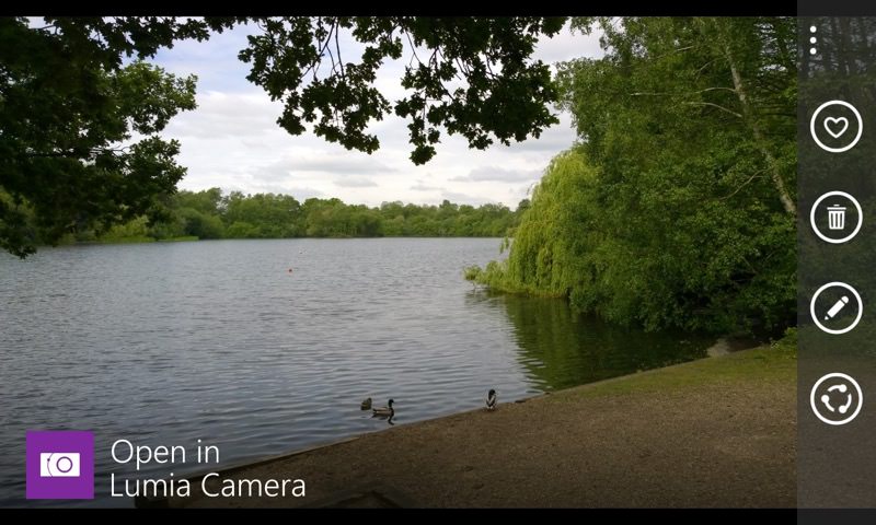
Now, you can't paint in blue skies, but you can tweak the photo using the Lumia's built-in tools.
Yes, there are lots of 'photo editors' listed in the Windows Phone Store, but none are as well integrated and few as good as the free Microsoft tool that's either built-into your Windows Phone or one tap away - Lumia Creative Studio. It should pop up as an option when you hit the 'Edit' control in Lumia Camera - if not, use my link etc.
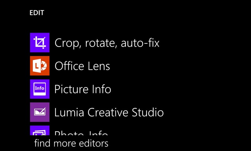
Now, the core of Lumia Creative Studio is the set of five image parameters that can be played with:
- Temperature (how 'warm' the image is, usually with red and orange tints, versus how 'cold', with blue and green tints')
- Clarity (related to sharpness and contrast)
- Brightness (as it sounds!)
- Shadows (adjusting the range of brightness levels across the image, i.e. deepening or levelling out stuff that's in 'shadow')
- Vibrance (how saturated the colours are, from monochrome to blazingly garish tints)
In fact, before you go adjusting these to any degree, try tapping on the 'magic wand' auto-enhance tool first.
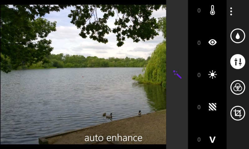
This, as it sounds, is a quick fix that will improve most photos, but it doesn't usually go far enough. Which is why I'm going to encourage you to go 'manual'. Tap on each of the five image processing controls in turn and have a play with the vertical sliders (each running from -100 to +100):
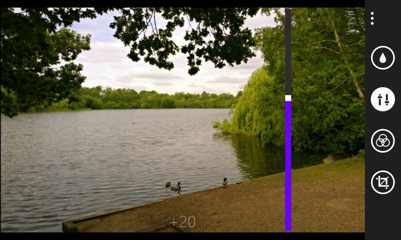
The value for each is shown in pale text on-screen as you fiddle. As a guide, the photo above ended up looking 'best' to my eyes (and without looking artificial) with settings of:
- Temperature- +10 (i.e. add a little warmth, as if the sun were out!)
- Clarity - 0 (best leave as-is, you can always sharpen the image later of you really, really want to)
- Brightness - +10 (i.e. add extra virtual brightness)
- Shadows - -10 (i.e. increase the dynamic range of the photo a little - if the sun were out then shadows would be more extreme)
- Vibrance - +15 (i.e. increase the saturation and bring out the natural colours a bit more)
Remember that, even though you're in a 'fiddling' mode, you can still do the usual multi-touch pan and zoom, in order to perhaps see the effects of your chosen parameters on a small section of the photo.
Once you've got an image that you like the look of, use 'Save as copy' on the '...' menu (because you just know that you'll want to have another go at processing the image from scratch in the future. Or at least to have this option.)
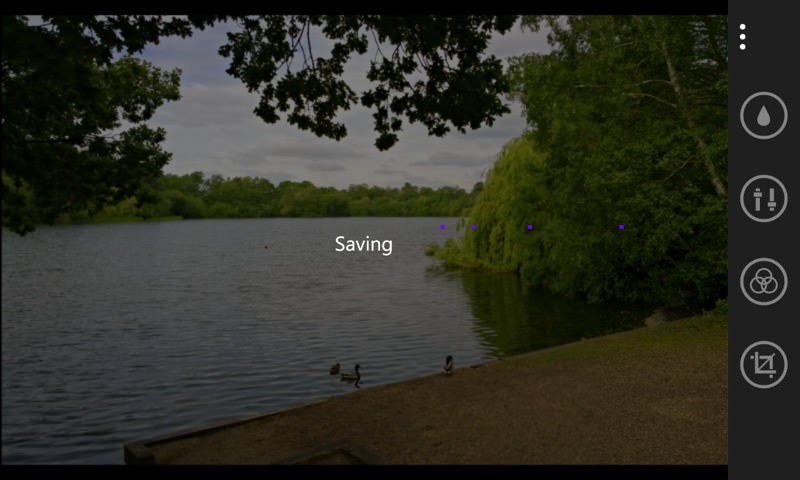
Finally, back out of Lumia Creative Studio, back to your Camera/Storyteller/Photos gallery (as appropriate). You may need to swipe to the side to see your new, processing image, rather than the one you started with.
There's one extra next stage which will depend hugely on your subject, of course, but I'd like to suggest that you use the 'Crop, rotate, auto-fix' option built into every Windows Phone as well. Because this includes a free (as in unconstrained) cropping tool, and by chopping off the very top and bottom of your image you may be able to achieve a more 'cinematic' photo.
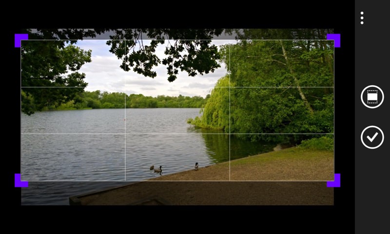
For landscapes, this works particularly well, of course, so take this with a pinch of salt, but the human eye perceives square (or 4:3) images as a little boring, because they can be taken in at a glance, and 20:9 (or wider) aspect ratio photos as more interesting, because they usually do involve more hunting around with the eyes, sweeping across to take in detail.
The end result here, then, after my manual tweaking and selective cropping of top and bottom, is:

Which looks more arty and more interesting than the original. Heck, the weather even looks warmer!
Let's use the same technique on a couple more snaps from the same week in the UK. A field of buttercups caught my eye:
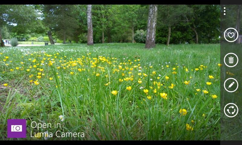
All very pretty, but the yellows and greens were a bit muted under the overcast sky.
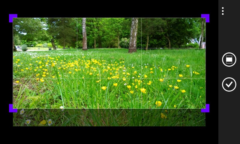
So, applying the same Creative Studio tweaks as above, and about to approve the manual crop in the built-in Windows Phone tool, we have this cinematic image shaping up:
It should be noted that Lumia Creative Studio does have more tools and functions, from a 'blur' hub (not really needed on most Lumias, since the cameras already have limited depth of field by design, so macro subjects will naturally have some 'bokeh') to predefined filters. I still don't think many people will actually use these for anything serious, but they're worth a mention.
Here's another example photo from the same time period. Again very overcast and boring lighting.
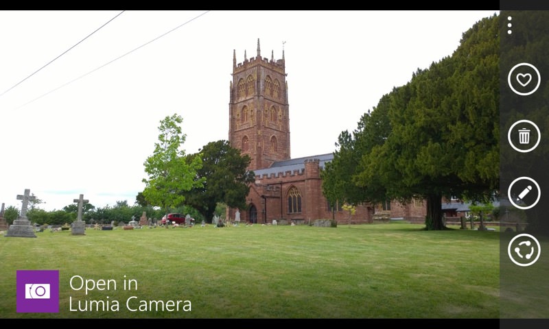
This time I headed into Lumia Creative Studio's filters section. They're all pretty drastic and 'obvious', but if you're after something striking as a piece of 'pop' art then perhaps one of these will fit the bill?
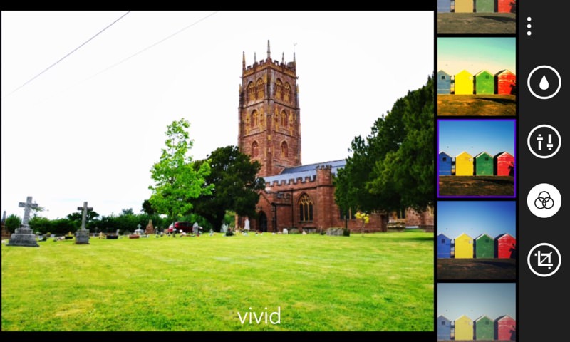
_____
The willingness to applied a preferred profile of manual settings, plus the free crop, give the best results for most subjects though. At least if you're snapping the natural world and want things to still look natural!
Comments welcome - what are your favoured (subtle) image processing techniques on Windows Phone and how 'destructive' are they, if at all?
PS. By the way, why can't you use the 'crop' in Lumia Creative Studio itself? Because this constrains you to the current aspect ratio and/or flits between various predefined aspect ratios, reframing all the time if appropriate (e.g. on the 1020, 930 etc.) All well and good, but when you want to drastically change the shape of the frame, the built-in Windows Phone cropping tool is more flexible!
