There’s a ton of good things to be said about Microsoft’s mainstream budget device of last year, the Lumia 640. Following up on the unfortunately-compromised 630/635 devices of the previous year with a much more comfortable set of hardware specifications, the Lumia 640 has found relative success in the Windows Phone world, not least because it can be had for just around $30 in many places in the United States, albeit locked to AT&T. Thirty dollars!

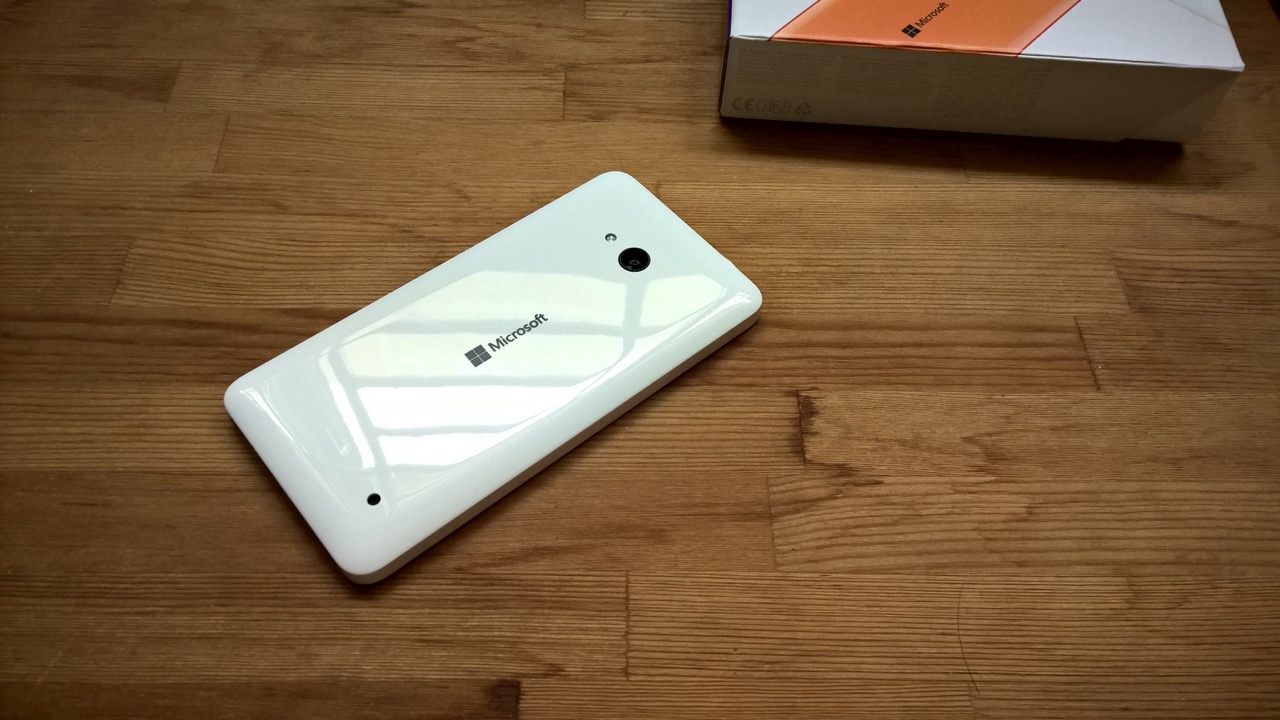
This past week, I swapped my Lumia 930 (coming on a year old since I got it) for a brand-new, fresh-out-of-the-box Lumia 640 that had two back shells included - a fluorescent glossy orange one and a much more palatable matte black. Of course, I also got a healthy payout from the transaction, as one would expect. All told, I got my Lumia 640 for around the equivalent of £70.
This might sound like sacrilege to readers of AAWP, but I never really fell in love with the Lumia 930. Sure, it was (is) a very powerful device with top specifications all around (at least until the Lumia 950 series came along) but it had a very clunky and heavy form factor, a frustratingly sealed design, it ran pretty hot even in day-to-day use and it burned (literally! - Ed) through its smallish 2420mAh battery in just about half a day. Besides, it doesn’t have Glance Screen nor does it have microSD expansion - two features which I consider essential to a smartphone experience, particularly on Windows Phone. Anyone who disagrees may refer to the Samsung Galaxy S7, whose two biggest additions over the S6 are an always-on time and date readout and a microSD card slot.

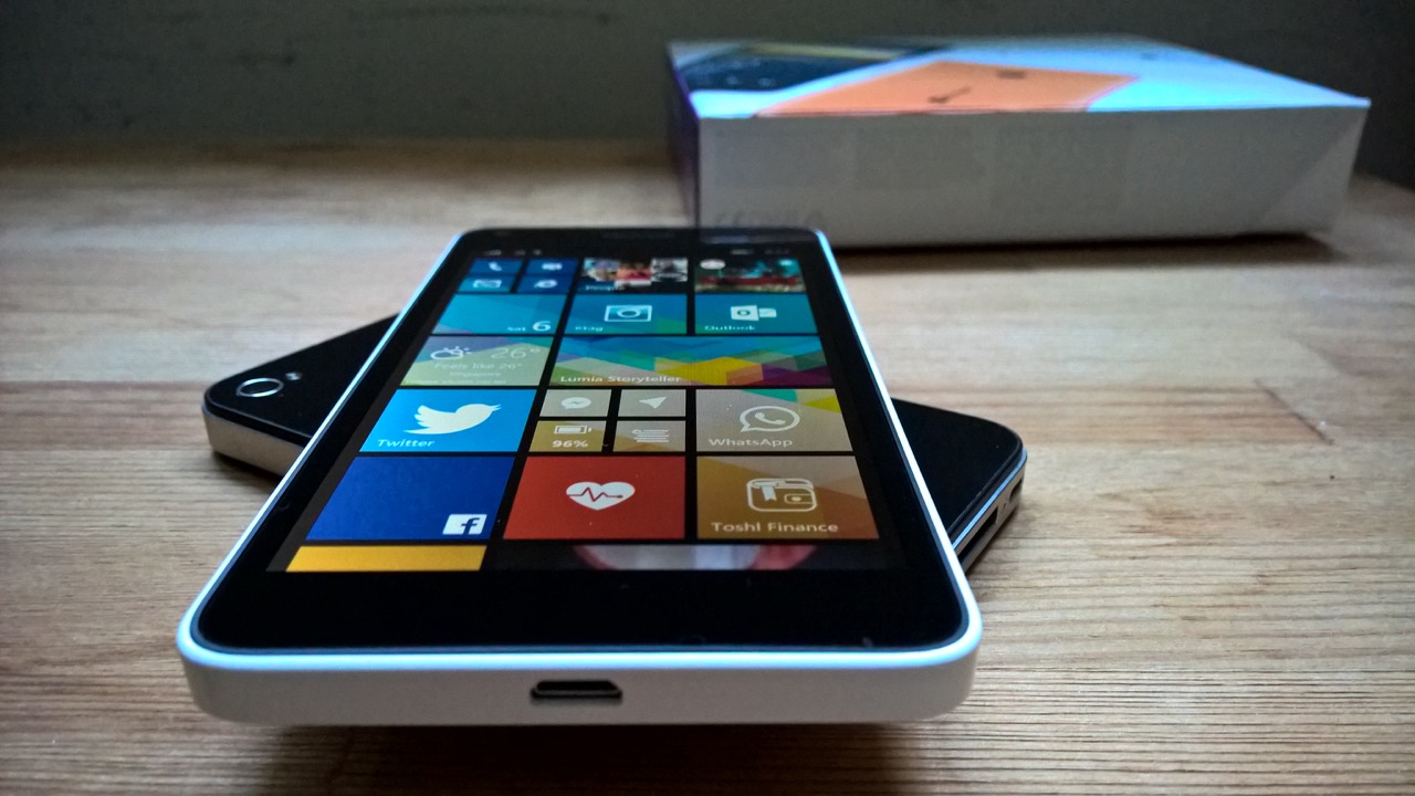
The Lumia 640 may not ignite passion and excitement the same way a flagship might, but it sure does tick a whole bunch of boxes even for a veteran smartphone user like myself and I contend that this device comes closest to being a Lumia 950 “lite” - perhaps even closer than the newer Lumia 650. There is very little about this device that comes across as being inadequate - everything that you’d expect to have in 2016 is built into this polycarbonate-and-glass wonder. The screen measures up well against the competition with a spacious yet compact 5-inch diagonal and a pixel density that’s within shouting range of the 'Retina' Display on an iPhone 6s. There’s 8GB of internal storage - just enough to give you about 4GB out of the box which would be an issue on iOS and pre-Marshmallow Android devices, but selecting your microSD card as default storage for apps, games, media, maps and downloaded files is an integral feature of a Windows Phone. There’s a capacious 2500mAh removable battery - some 25% larger than that on the Lumia 650 and just 500mAh smaller than what you get on a Lumia 950.

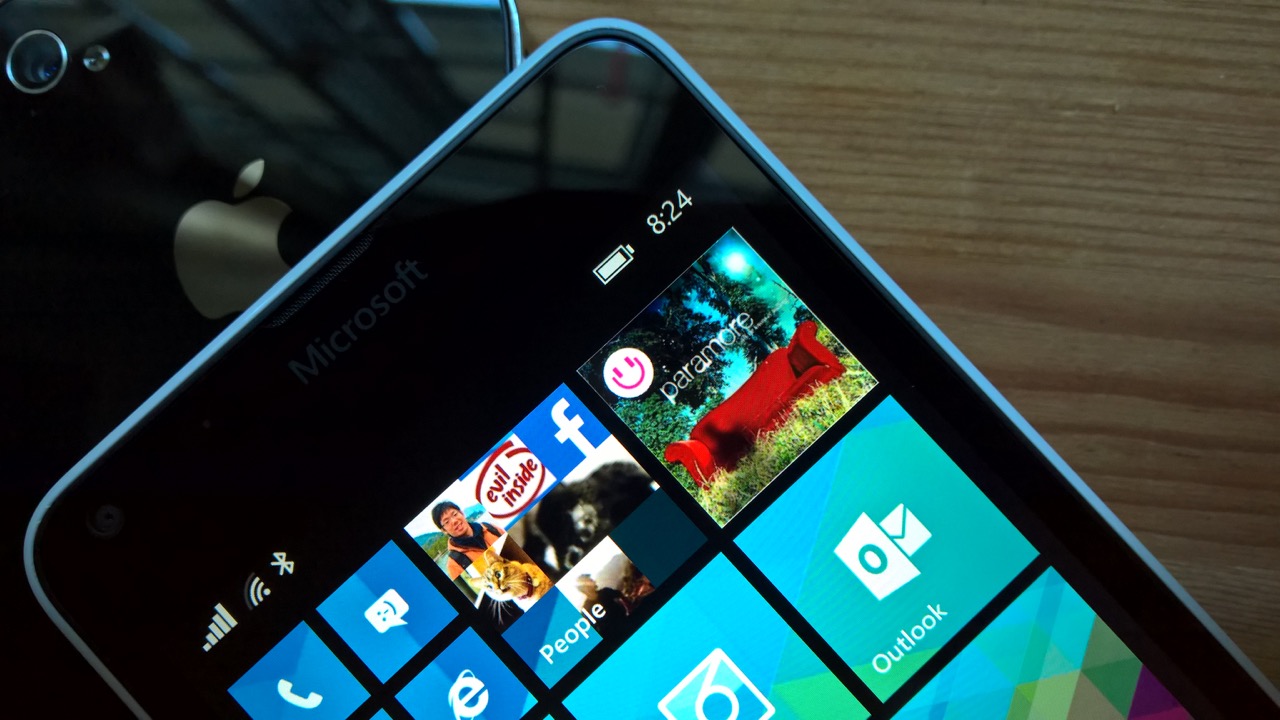
A quad-core Snapdragon 400 and a single gigabyte of RAM ensures that the 640 just about meets the mark for Windows 10 Mobile while having far lower power consumption than the likes of the 950. There’s no fancy liquid-cooling pipes needed here either - the 640 stays cool to the touch no matter what you’re doing with it. The LCD screen with ClearBlack Display polarizers may be considered by some to be inferior to AMOLED - but what you lose in sheer contrast and saturation is more than gained back by the fact that you can use all the light/white themed apps and browse as many web pages as you like without significantly decreasing your battery runtime. The 640 scores higher in the durability stakes, more so than the 650 with its aluminium band and polished chamfered edges that, while beautiful when new, is just going to be dinged up the moment you drop it. The 640, like the 950, boasts good old polycarbonate in a range of colours in matte and glossy finishes, so you can dress up your Lumia like a traffic cone if you so choose.
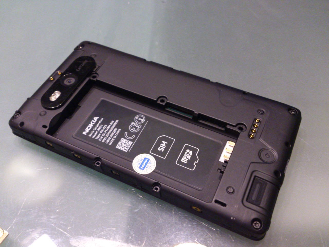
In many ways, the Lumia 640 mirrors the design ethos of the Lumia 950 so well that you’d imagine that the same team of designers were behind both phones (they were! - Ed). Perhaps neither device is as flashy and eye-catching as a glass-backed Samsung Galaxy S7 or the HTC One series with polished metal gleaming in the light, but it’s in day-to-day use that you truly come to appreciate the minimalist, down-to-earth form factor, the durable, grippy, hard-wearing surfaces and the fact that you can use your phone without ever worrying about it or having to put it in a case just so you can preserve its pristine look. It’s design that’s meant to be used, and even if a corner gets a little messed up after a trip to the concrete, a new back shell for utterly nominal cost will likely take care of it. Battery gets 'tired' a year down the line? Just swap it out. Running out of storage? Slot more in. And what’s old is new again.

Where it all started!
In truth, I haven’t been happier with a Lumia than I have with the Lumia 640. It’s no 950 in terms of raw power and it certainly doesn’t support Windows Hello nor Continuum, but it ranks just about decent to outstanding in all the ways that matter - from the cameras to the screen, performance, battery life, repairability and build quality. Everything that’s great about the 950 is in effect distilled to a lower price-point and I’d say the relationship between the 640 and Microsoft’s flagship isn’t that dissimilar from that of the Moto X and the Moto G. It’s speedy, responsive, more than okay to look at, has great connectivity, can be used one-handed, slips into any pocket and I don’t ever have to worry about dropping it or running out of charge before the day is done. Honestly, I’ve left my array of portable batteries at home since I got the 640.
I haven’t put my Lumia 640 on Windows 10 Mobile for personal reasons (my transition to the new platform will likely come around the release of Redstone), but you could if you wanted to. All in all, It’s a reasonably-priced device that’s ideal for both new users as well as old hands like us. Go get your hands on one (or its upsized sibling that also comes with upgraded cameras and an even bigger battery) if you haven’t already, and I bet you won’t disagree.
PS. See also Steve's original review from a year ago. He loved it and gave it a whopping 80%.
