In a blog post titled "Modern Email for the Next Billion Mailboxes", Microsoft's Chris Jones explains the thinking behind the new look web mail sevice.
"We think the time is right to reimagine email. So today, we're introducing a preview of Outlook.com. We realized that we needed to take a bold step, break from the past and build you a brand new service from the ground up. You already know Outlook via the Outlook desktop application-for PCs and Macs-as the world's most popular application for reading email, managing a calendar, and connecting to people. And you may have used the Outlook Web App connected to Exchange Server in your organization. Now, in addition to a desktop application and a service for businesses, we're offering Outlook as a personal email service - Outlook.com.
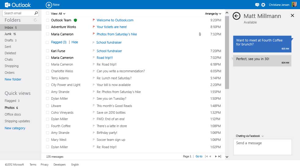
Essentially Outlook.com is a new look for Microsoft's popular webmail service Hotmail. Much of the same functionality is present, although there are some extra features, and the new Metro UI is of course a very significant change. However, more importantly, it is clear that the company intends to promote greater integration between Outlook.com and its various platforms. For example, if you are signed up for Outlook.com and then sign into Windows 8 using the same Microsoft account, the Mail, Calendar, and People apps will automatically be configured with email, calendar and address book information from Outlook.com. We would expect to see a similar set up process apply to Windows Phone 8 too.
Microsoft is keen to emphasise that Outlook.com is about more than just traditional webmail. First is the new look, which, together with being ad free, means there are 60% fewer pixels in the header and 40% more messages visible in the inbox, compared to the webmail most people are used to. Outlook.com uses Exchange ActiveSync, which makes it easy to take it out of the browser and into your mobile device. Every major mobile platform support Exchange for mail, calendar and contacts.
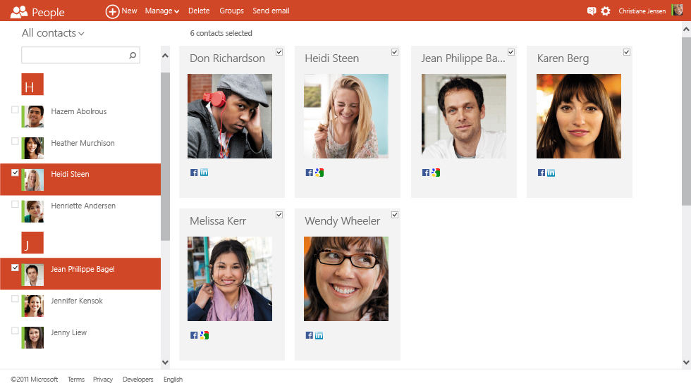
There's also an emphasis on social networking integration (Facebook, Twitter, LinkedIn, Google, Skype). This is used in, as with Hotmail.com, to consolidate contact information and ensure that contact information is always up to date, but will also be used to provide context to emails. Information from social networks, such as photos and status updates, are shown in the side bar, when viewing email.

Outlook.com retains all of Hotmail.com's key mail handling features, with the ability to easily set up rules to keep your inbox organised, and import email from other accounts. There's also full integration with the Office Web Apps and SkyDrive to deal with attachments, the latter of which means "you can stop worrying about attachment limits", according to Microsoft.
One piece of integration that's not available in the current preview release, but will be in due course, is Skype. This will allow you to call contacts from Skype, from within the browser. It will be added as a service to the existing messaging component of Outlook.com (currently giving access to Facebook chat and Windows Live Messenger).

Here's Microsoft launch video for Outlook.com:
