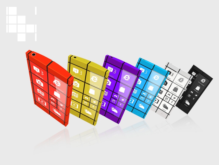
Kanavos suggests a bold industrial design through a number of vertical and horizontal contrast colour stripes, that is visually completed through the recent minimal but strong windows mobile user interface design. What is shown on the main menu screen, does not disrupt any more the design of the device but, instead, the black stripes of the Windows [Phone] OS meet the ones of the hardware and thus the OS becomes, in a sense, a bridge between the two sides of the device. everything blends and complete each other.
At the same time and beyond the looks, the hardware’s "windows-(tiles)-design" serve a branding/strategic role as through it directly communicates the operating system this phone carries in contrast to the generic designs the vast majority of the current phone manufacturers offer.
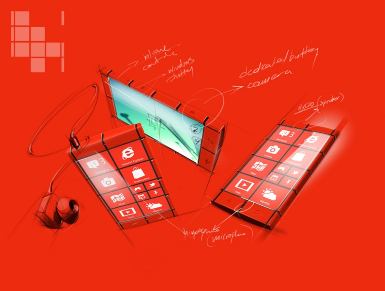
Finally, Kanavos is proposing a new function by removing the “Windows” button from the front-lower-center part of the device to its left and right sides in order to facilitate the easier access to this function while holding the device.
For some reason I think the biggest argument Stasinopoulos and any partner would have in bringing this to market is the moving of the Windows button! If they did manage it, put me down for the white version!
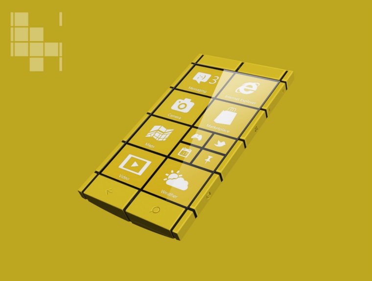
Just for good measure, here's a close up of the Kanavos model in yellow, which seems to be the colour of choice to demo Windows Phone 8 with.
You can read Stasinopoulos' thoughts on the design at his website, and the portfolio of Kanavos images can be found on his Flickr account.
Can someone get this man a ticket to Redmond to build a prototype?
at the same time and beyond the looks, the hardware’s windows-(tiles)-design, serve a branding/strategic role as through it directly communicates the operating system this phone carries in contrast to the generic designs the vast majority of the current phone manufacturers offer.
finally, kanavos is proposing a new function by removing the “windows” button from the front-lower-center part of the device to its left and right sides in order to facilitate the easier access to this function while holding the device.