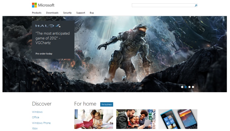
This is more the story of the design and the process inside Microsoft that led to the 'Windows 8 UI style' coming to the front page of arguably one of the top websites in the world:
"There was this moment when Trent was standing up at the front of the room showing us an early concept, and someone asked if we could allow the menu to support four levels of hierarchy. Without pause, we heard Trent yell, 'No! Just… NO!' He had a grin on his face. It was one of those 'No, but I still like you' no's'. I knew in that moment that this was going to go well," said Michael Ruggiero, the development manager for the home page, to me over pizza a couple of weeks ago. Michael entrusted much of the integration and optimization work to a very talented developer on his team, Tyson Matanich, who worked closely with the crew from Paravel to build the site you see today.
One of the interesting points on the front page is that it is a responsive design. Change the size of the browser window and the page will rework the elements on the fly (much as the All About Windows Phone site does). As we all know, change is coming to Microsoft at every level with the next version of Windows on the desktop, the smartphone, and beyond. The home page story is part of that change, and this is a fascinating look at the process.
