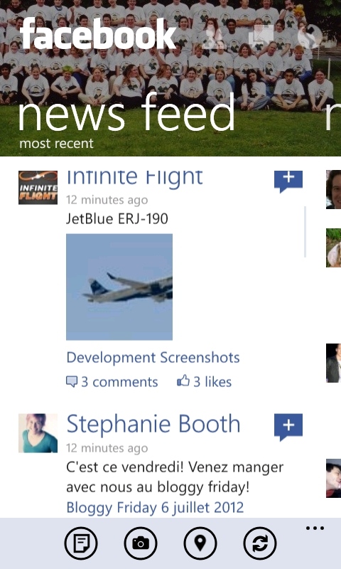
Toledo's post was, in part, prompted by the recent release on the Facebook Beta app for Windows Phone, the design of which, as we noted, has moved away from the panorama design pattern used in many Windows Phone apps:
The new design is more closely aligned with the look of the Facebook app on other platforms (iOS and Android). For example, the large header text is replaced with the standard Facebook shortcuts (Menu, Friends, Messaging, Notifications Chat). Swiping to the right exposes a navigation list giving quick access to various sections and functionality, whilst swiping to the left shows a list of chat contacts. In general the new design feels cleaners and has less clutter, though some may mourn the loss of the direct "Metro" style.
Toledo argues that the new Facebook app, while moving away from what has traditionally been seen as Metro is actually pushing the next generation of the design principles espoused by Metro:
The app does not use the typical out-of-the-box controls i.e. Panorama, Pivot or Page that have “traditionally” given Windows Phone it’s particular flavor and perhaps even differentiation from iOS and Android design languages. The release of the Beta sparked a range of comments, some in support, some against the design aspects of this app. To be clear, the ones that support the app (me included) are not saying that this is the best ever possible app of all times… We are simply celebrating the fact that a major industry player like Facebook is pushing what I’ll call Metro, to the next generation.

![]()
Old Facebook and new Facebook apps: both follow the Modern design language
Toledo goes on to note that the perception of the pivot and panorama design patterns as being synonymous with Metro is incorrect and is partly the result of a big push to get as many apps onto Windows Phone as possible:
For 3 years now we have seen 100K plus Windows Phone apps hit the market. Many of them are games and the rest rely on mainly two design patterns: Panoramas and Pivots. I’m sick and tired of this. It’s not that Panorama and Pivot are wrong, no, they are reliable, flexible, powerful controls that give you a lot of options to create great apps. My problem (one that is shared by many in the community and inside of Microsoft) is that we have made these two patterns dictate our 100K Windows Phone experiences. This is wrong. Design patterns like Pivots or Panoramas are just that, patterns. A mature, design savvy, sophisticated designer knows that that story and experience comes first, much before “design patterns”, those are just tools.
The Metro (now Modern) design principles of Windows Phone (and Microsoft more generally), Toledo says, should be seen as part of a wider movement in design circles to apply the principles of Modernism. It is difficult to summarise the idea of Modernism simply, but in essence it is more a way of thinking than a specific style, with an underlying principle that the design of an object should be based purely on its purpose and that "form follows function".
The thing Microsoft and now Apple (thank you Ive), and a huge number of UX and UI design agencies are trying to do is to apply the design principles of Modernism. Modernism, you know? The philosophical, fine arts, architecture, cinematographic movement that started in the early 20th century.
Toledo finishes with an interesting quote...
I’ll close with something that my two good friends August de los Reyes, Sr. Director for XBOX design studios and Sean Wolcott, also a Sr. Designer with XBOX said to me a few weeks ago: “… don’t call it flat, don’t call it Metro, don’t call it modern, just call it Good Design.”
...which highlights an important truth... a good app experience is the outcome of good design, not the application of a set of rules or design patterns. It also gives Toledo's blog post its title: "Don't call it Metro, call it Good Design".
