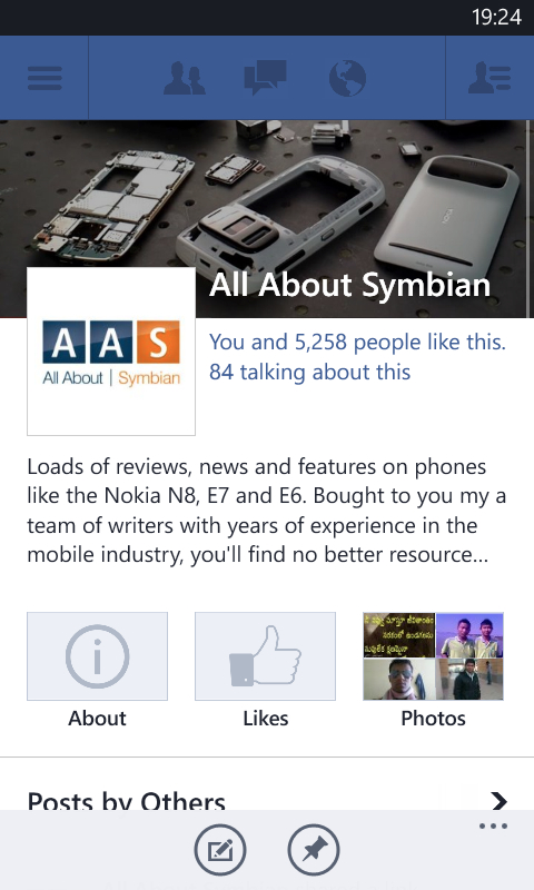
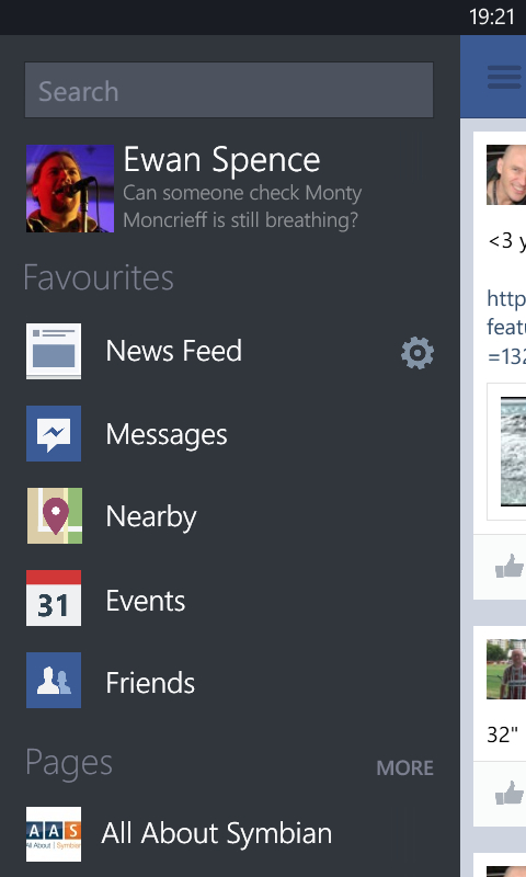
Originally the Facebook app for Windows Phone followed the then Metro design style (now of course it's the legally safer 'Windows Phone Design Language'). That's been thrown away, and the Facebook app now feels much like every other mobile version of Facebook, be it iOS, Android, BlackBerry 10, or any other flavour. In a way I'm disappointed in that - just as I was when Twitter switched to the unified UI approach across their mobile offerings - but I can understand why this is an approach that is favoured.
There's a lot added to this version of the client, as the official Microsoft Windows Phone blog notes:
This major update brings a ton of new features and improvements that many of you have been asking for, including a complete overhaul of the user interface, improved navigation, support for high-res pictures, post sharing, Facebook Timeline view, and more.


What do you think of the changes? Should the client have kept its unique UI, or do you agree with the switch to a UI that matches other platforms? Let us know in the comments. Meanwhile, you can download the latest version of the app via the AAWP App Directory.
