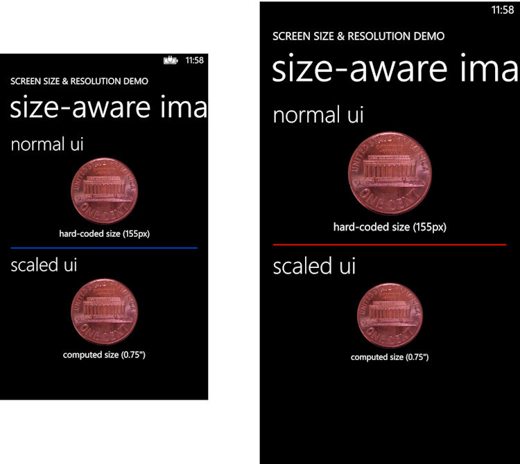
The default behaviour for apps running on a large screen device is to behave as if they were running on a standard screen device, thus ensuring backwards compatibility for all existing apps. This is done by having apps running on a 1080p run as if they were on a 720p screen and using the same 1.5 scale factor (but do note text and graphics are still rendered at the full 1080p resolution).
Windows Phone 8 GDR3 includes a couple of new properties (PhyscialScreenResolution and RawDpiX) that can be accessed by developers to detect larger-screen devices and/or devices with a 1080p resolution screen. Specifically developers can now retrieve information about true screen resolution (useful for scaling graphics and video), raw scale, and physical screen size (useful for displaying content at a specific physical size). This means it is possible for new apps to be optimised for large screen / high resolution devices.
The Windows Phone Developer Blog post references a newly available MSDN example project that demonstrates one way in which this can be achieved. A ZoomBox control, similar to the existing ViewBox control, allows for the rendering of UI elements at the appropriate size regardless of the screen's physical size.

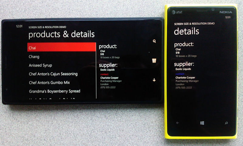
A more complex example is also showcased, with an example of how a larger screen device might have an app display information that would usually be displayed across two separate views. It's worth emphasising that such views are not a standard part of the Windows Phone UI, so app developers might want to think carefully before implementing them, but it is a good demonstration of what is practical on a larger screen device.

A more in-depth technical discussion is available on the Windows Phone Developer Blog.
How many developers choose to implement apps with views specific to large screen Windows Phone devices remains to be seen, but the capability is certainly there, and has the advantage of being applicable across a full range of device sizes, including potential future 7-inch screen devices.
