Thanks to WPCentral, there's a brief textual changelog:
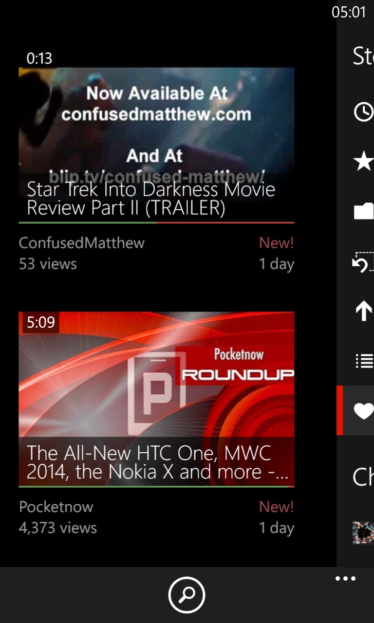
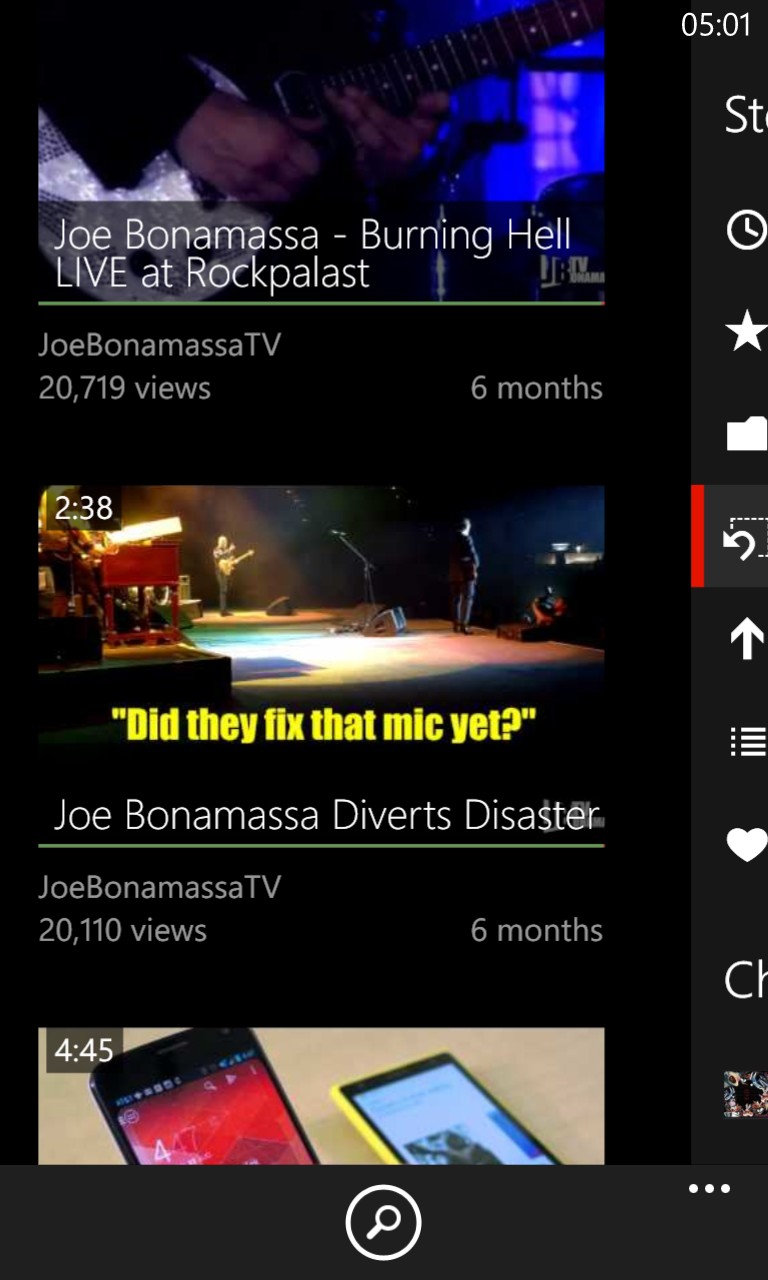
- Main panorama facelift
- Sub navigation UI overhaul
- Long titles can now be viewed when clicked
- Full screen button (for phones with rotation lock on)
- Playback bug fixes
- Various bug fixes and improvements
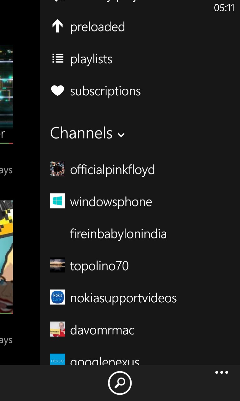
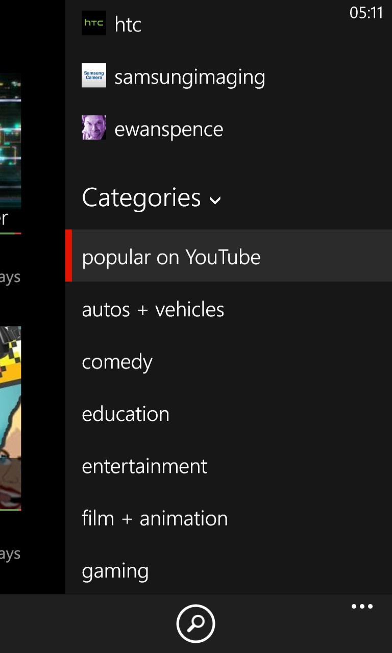
The new 'river' secondary UI (handling all channels and category browsing) is quick and convenient:


It's also very Android-like, in the way the controls slide in from the side - the concept of the icons and thumbnails showing the first graphical element (or first few characters) of a channel or category, and then you swipe across to reveal the full name, works very well:


Slightly confusingly, there's no obvious way to tap on something to get back to the main 'home' UI, but it seems that the humble 'back' key works well here, so all's well.
You can buy or update MetroTube here in the Windows Phone Store. The best $1 or 79p you'll ever spend!
