I wouldn't normally news post an app update in which the main change were different fonts, but Skype's a core part of the platform in my estimation and this update also brings along under the hood bug fixes, so all updates are very welcome.
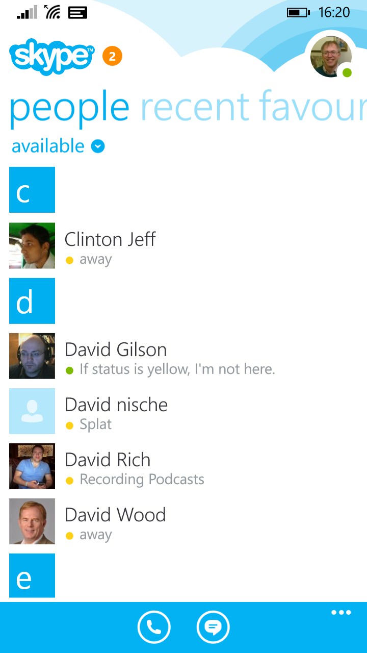
Here's the new version in action:


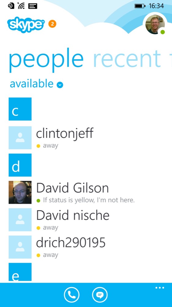
Before and after - smaller fonts, a more professional and productive layout - eyesight permitting - though with today's 4" and 5" screens it's not going to be an issue...

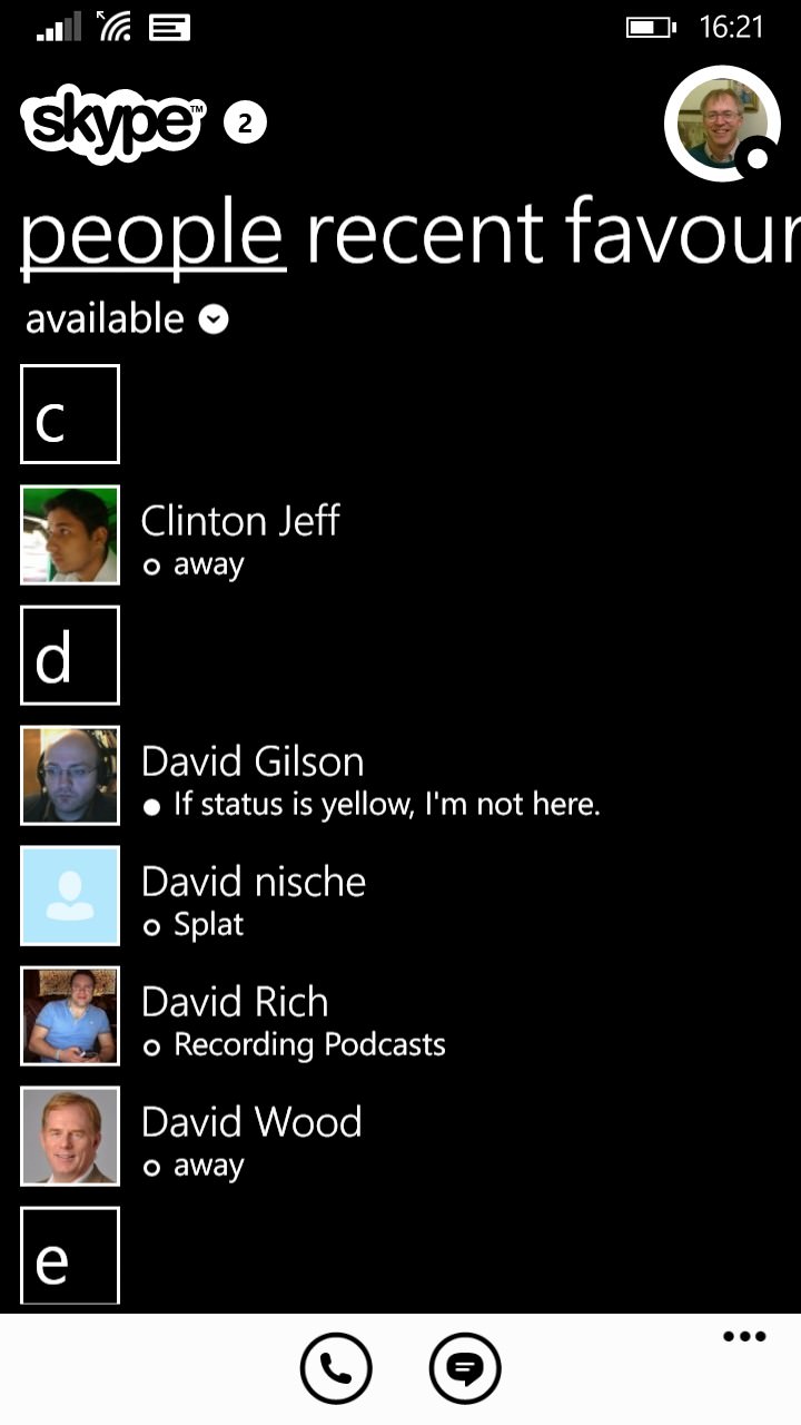
Just for a change, I switched on the 'High contrast' mode in Skype's settings - I didn't actually know this was there, but it should save a lot of power on AMOLED screened phones....(!)
Always good to see Skype being maintained and updated and, especially on the newer x00 series processors, the user experience is now pretty good overall. Anecdotally, I've started to use Skype on Windows Phone more and more for intra-office communications, plus many guests have now used it as their main audio source when guesting on my PSC podcast.
The Windows Phone Skype app can be downloaded or updated here.
