From the Store description:
The Expedia Hotels & Flights app is an easy and convenient way to book your hotel or flight when you’re on the go. You can also save up to 40% with amazing Expedia Mobile Exclusive hotel deals and with Best Price Guarantee rest assured that you're always getting the best deal. Save on hotel rooms:
- Save up to 40% with Expedia Mobile Exclusive hotel deals
- Default to your current location for fast, on-the-go booking
- See reviews from actual hotel customers
- Sort by price, deals, or reviews — instantly
- Get cheap hotel rooms or 5-star luxury suites
Find the perfect flight:
- Book a flight to anywhere in the world
- Sort by price, duration, or time instantly
- Search by airport name, city, or code
- Book in a flash
Other features:
- Already signed in? Book in under 30 seconds
- View your itinerary
- View upcoming trips that you book in the app and on the web
- Open the app when you're about to travel and immediately see your trip
In use, the application largely succeeds, though it's clearly a work in progress:
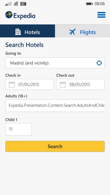
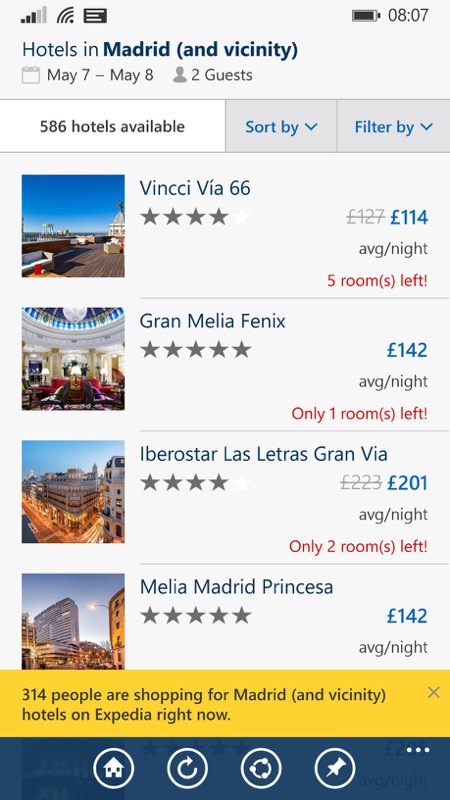
It's straight into hotel and flight searches, but that's fine. Note some glitches, as in the 'Adults' field above, left. But it mostly works, producing decent matches. Note the pop-up at the bottom - why is this here? How on earth cares how many other people are shopping for similar things? For travel, surely you'd usually want to go where other people aren't booking??
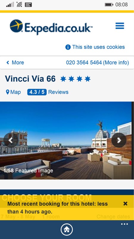
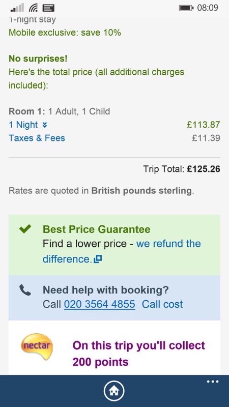
Aha - found a hotel that looks promising. Darn it, another pop-up - why the flippin' heck should I care that someone else made a booking here four hours ago? This sort of thing is surely just Expedia saying "Look, we're really popular and active!" Hmm..... (right) On the plus side, the layout of the fees/details/booking pages is top notch, all beautifully clear and even a 'phone this number if you're not sure' panel. Plus Nectar points (though they're worth less and less these days....)
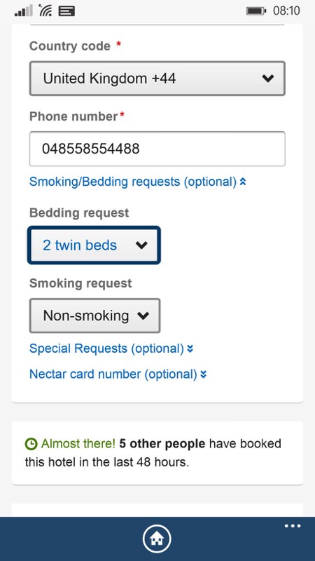
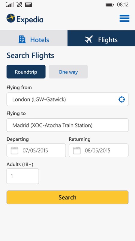
Again what is it with the reports of what other people are doing?? The form is again very clear, though (as I've found from personal experience) the 'bedding request' here is just that, a request, and there's no guarantee that you'll get what you asked for when you arrive!! Still, the Expedia form is clear again; (right) The Expedia Flights module is also represented, with the same clear layout.
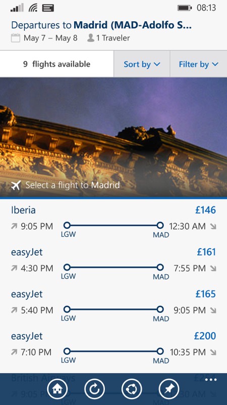
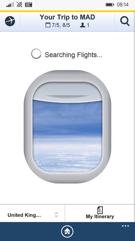
Plenty of flight options too, beautifully presented, complete with a mocked-up airliner window to stare through while exact availability is checked!
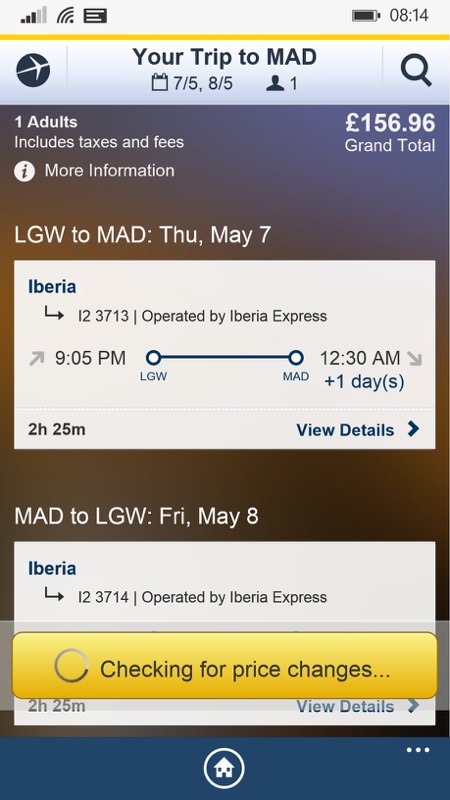
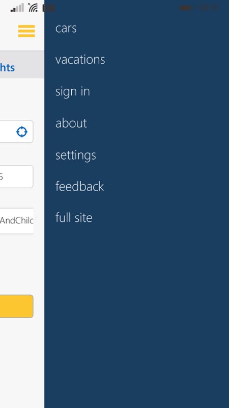
In fact, it's all so easy that it's tempting to just book and.... travel. Which is Expedia's aim, of course, so well played; (right) Top right on the Expedia home screen is this 'hamburger' menu, with the usual macro navigation options, including 'car' and 'vacations', both linking through to the Expedia mobile web site.
A very nice v2.0 on the whole, but we need some things tightened up and I see no reason why the extra two sections shouldn't also be included. So roll on v2.1 or 3.0, etc.
You can grab Expedia for Windows Phone here in the Store. It's free, after all.
