The changelog for the two apps is:
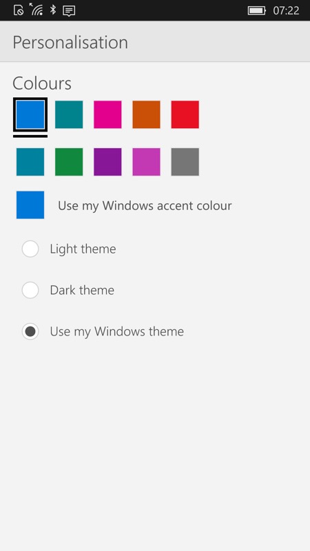
- Choice of light theme, dark theme and following the accent colour chosen by the user in .
- Removed the option to toggle over to Outlook Calendar (the corresponding button had already gone from Calendar in a previous version, I'm guessing no one actually used these - it's much more intuitive to access the applications from the Start screen, etc.)
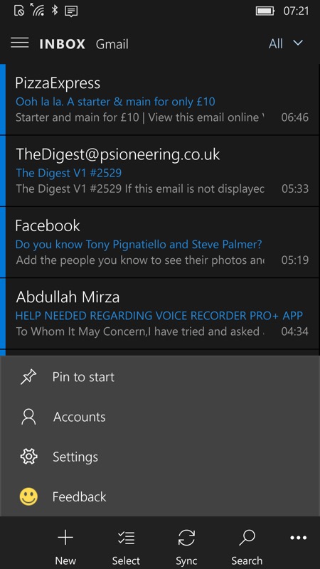
- Access to Settings button is now from the bottom '...' bar.menu.
Here are the two applications in action:


Plenty of customisation then, in Outlook Mail, though once you actually READ an email, you're back to eye-glaring white, thanks to the HTML/web nature. Maybe an extra option to try rendering these darkly too, Microsoft? Otherwise half the benefit of going dark in the first place is kinda lost....??!


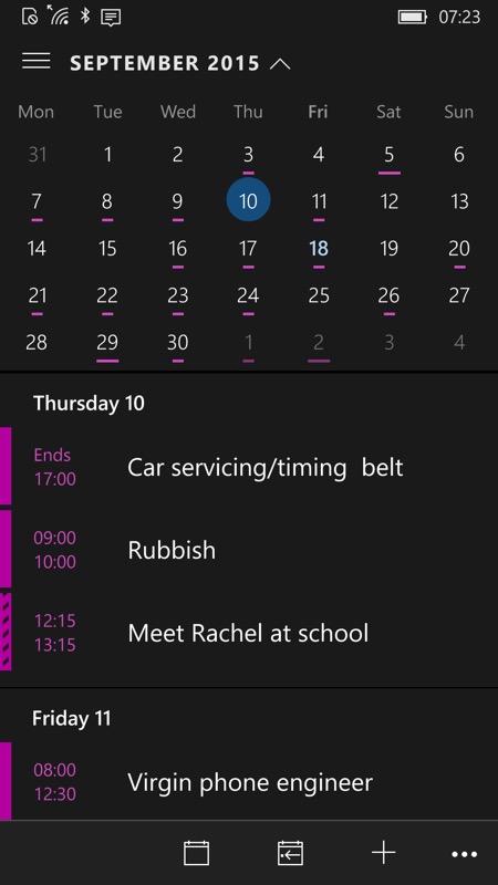
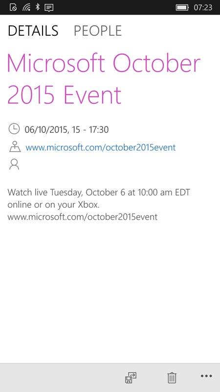
Ditto for Calendar - and unforgiveably so - there's no reason at all why Calendar appointments have to be 'rendered' in white still!
So, Microsoft, a step in the right direction, but please go the extra mile and finish the job!
