Here's the official changelog - ignore the one that pops up in the app itself. This - and that in the Store - always seem to be behind reality. Why can't Microsoft get itself synced properly in this regard?
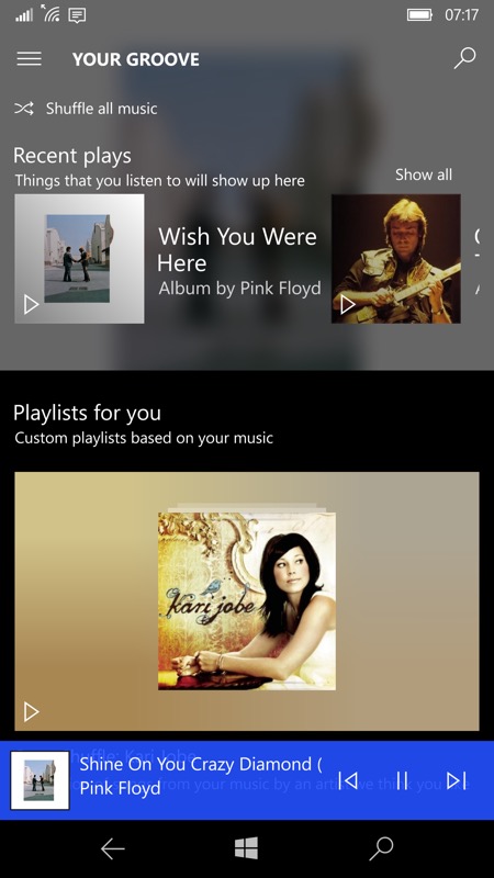
- Design improvements to make Your Groove and Explore more colorful and vibrant.
- Unplayable tracks won’t be added to Now Playing to give you a better playback experience.
- The app retries loading streaming songs a few times when it used to try only once.
- 23 UX tweaks including messaging improvements, updates for Narrator, and updates to the accuracy of playlists lengths.
- Fixes for crashes when using scroll wheel while viewing an artist detail page and when clicking on “more” in artist details.
Big blocks of background blurred colour are the most obvious improvement, especially in the Your Groove (home) panes:
You can update Groove in the Store in the usual way as long as you're a Fast ring Insider. If you're not then just wait a few weeks and you'll get this anyway.
Comments? It's pretty on the phone, apparently it's even prettier on the larger PC screen?