Interestingly, the new Skype UWP client also doesn't show up for Fast ring Insiders (on the Redstone 2 'feature2' branch), at least not yet.
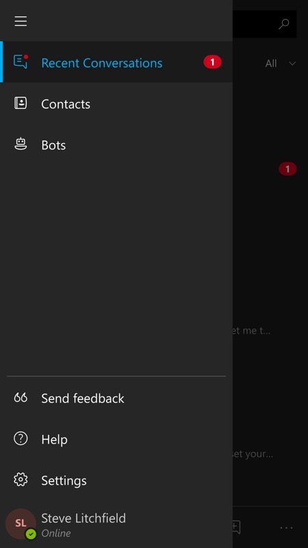
Here's Skype UWP's UI as it was before today (here on a Lumia 930):
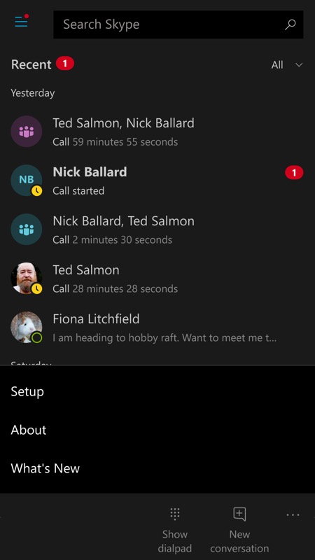
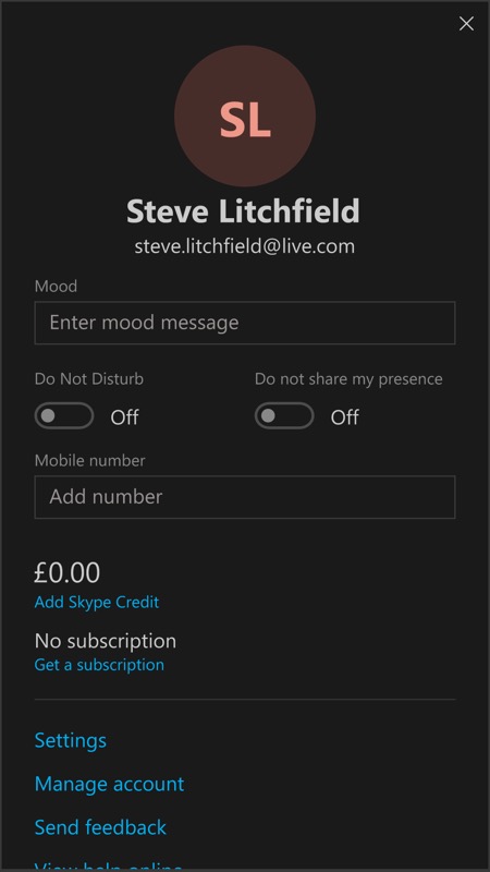
And here's the UI now, with hamburger menu and '...' menu both banished in favour of a single menu available after tapping your own profile image, top centre:
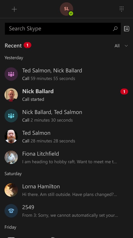
You may (or may not!) be wondering where the 'bots' have gone? They're now under the '+' control, i.e. start a new conversation and you get to choose with a bot, etc.
It all works well enough, though I always get a bit worried about the sheer number of UI conventions within a single ecosystem - and Windows Phone users have been through enough changes for a lifetime already!
Comments on the new UI? Better? Worse?