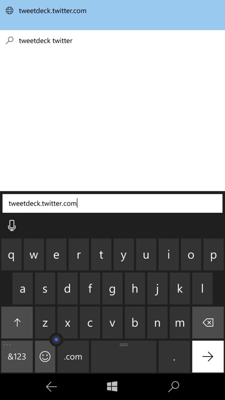
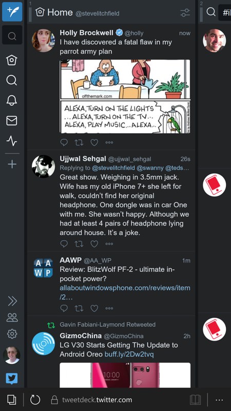
Tweetdeck is now totally rewritten to work on the web, i.e. as a HTML5 application. Just go to this URL (save it as a favourite, etc.) and then you're into the full Tweetdeck experience. 'Application' shortcuts down the left, multiple vertically scrolling panes and side-swiping between Twitter areas. You'll get the hang of it.
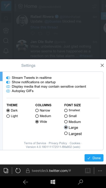
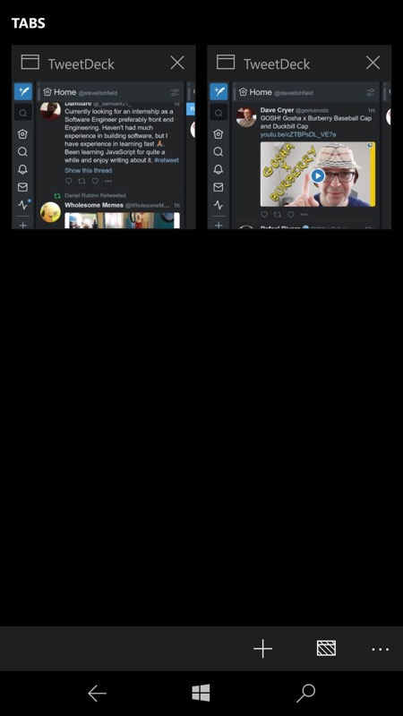
The main challenges here are that Tweetdeck (for the web) is optimised for larger displays than a smartphone, so for example when you bring up its settings (in my case to switch to 'dark' and to increase the font size), you can't really see the dialog and you have to swipe the greyed out page upwards to see what I'm showing in the screenshot here. Still, I got there in the end; (right) note that Edge, as usual, is great at remembering 'tabs' and keeping them open, even one with so much loaded as Tweetdeck. So be careful when opening up your favourite again or using a live tile shortcut - it's very easy to end up with multiple Tweetdeck tabs! Oops....
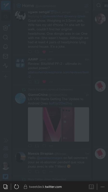

A typical example of the non-optimised nature of Tweetdeck on Windows 10 Mobile and Edge - more specifically that assumptions are made about screen real estate. Here I've tapped on a retweet control and the whole screen greys out. What's happening is that the retweet dialog is just off the bottom of the screen. Swiping up (right) reveals it, and even then you have to swipe right a bit to get to the actual Retweet control!

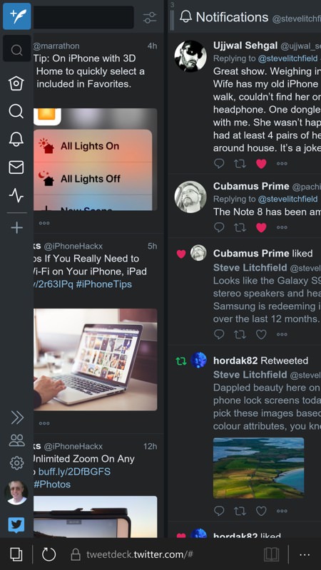
On the plus side, because this is official Twitter code, you get native 280 character support for tweets, with the usual 'filling circle' indicator; (right) swiping sideways between Twitter panes is easy and smooth - Tweetdeck is generally a pleasure to browse.
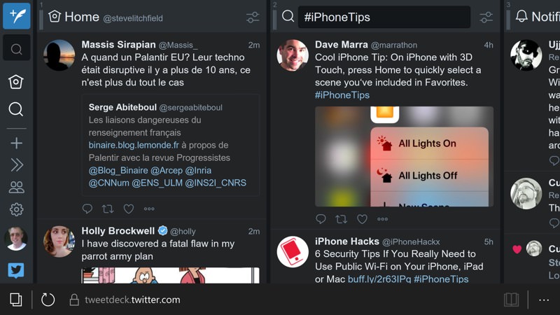
It works even better in landscape mode, in terms of keeping an eye on things at least. I preferred portrait mode for interacting with Twitter and entering tweets and replies though.
Comments welcome if you've tried living with this solution! Is it workable for you?
