Translations
- We added the German translation
- We added the Brazilian / Portuguese translation
- We added the Spanish translation
Airplane / offline mode
- This airplane mode allows you to synchronize your categories in order to view them offline
Menu
- We improved the menu for better performances
- We implemented a new scroll bar and a blur effect to adopt the Microsoft Fluent Design when the menu appears over the content
- We implemented an automatic saving of opened and closed categories for the next launching
- We added the favicons
- We added the Settings button in the compact menu
- On mobile, we added the possibility to open the menu via the back key when you are on the homepage
Settings
- Menu - We redesigned the settings, with a blur effect to adopt the Microsoft Fluent Design, and with the total removal of green color
- Homepage - We simplified the customization of your homepage
- Homepage - It's now possible to select 0 article per category, in order to have just the list of categories on your homepage
- Homepage - New option on your settings, to display all last articles or only the unread articles
- Sharing - Your accounts are now synchronized between your Windows 10 devices
- Sharing - Now, there is an option to disable the advanced sharing of FeedLab, to use only the Windows 10 sharing
- Categories - We fixed the issue to edit the categories
List of articles
- We simplified the action to mark all articles as read
- We added the action "Mark as read older than one day"
- We added the action "Mark as read older than one week"
- You can personalize the sorting and the display mode of your articles list for each category and website
- We improved the separation tooltip for resizing the articles list (desktop / tablet)
- We improved the list of articles in narrow mode
- We fixed the issue to refresh the list of articles "Saved for later"
Article
- We improved the article's header to bring more fluidity
- On mobile, when you scroll the header and the command bar are automatically hidden
- We added lateral margins on the articles to facilitate the reading (configurable in the settings)
- We implemented an automatic saving of the view (mobilizer) to use for displaying a full article, according to the website
- We displayed dates according to the user's culture
- We improved the actions to swipe to the next / previous article
- We clarified the error messages
- We removed Instapaper mobilizer due to the unavailability of the service
- We improved the HTML encoding of some websites
- We improved the diaporama
Sharing
- We fixed the issue to share an article via Facebook
- We fixed the sharing of article to avoid the encoding errors of Windows 10
Global
- We improved the in-app purchases
- We fixed the issue to synchronize your settings across your Windows 10 devices
- We added the possibility to pin the number of unread articles on your lock screen
- We improved the live tiles
- We improved the badge logo for the notifications
There are also new keyboard shortcuts for FeedLab UWP when used on the desktop.
A few screens to illustrate FeedLab v3.0:
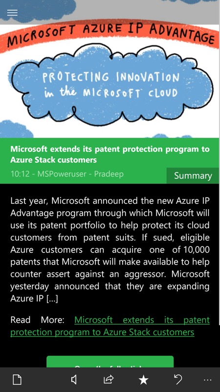
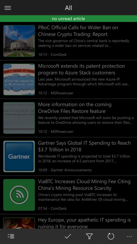
A polished Windows 10 UI - here reading a story's summary (from RSS) and (right) browsing through the headlines (here I've now read them all)....
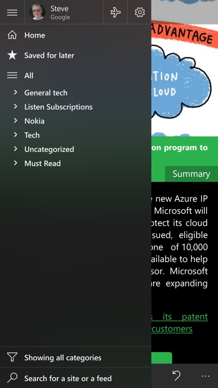
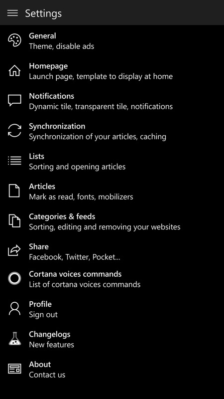
The new Fluent Design translucency on the hamburger menu and (right) a new look and organisation for Settings.
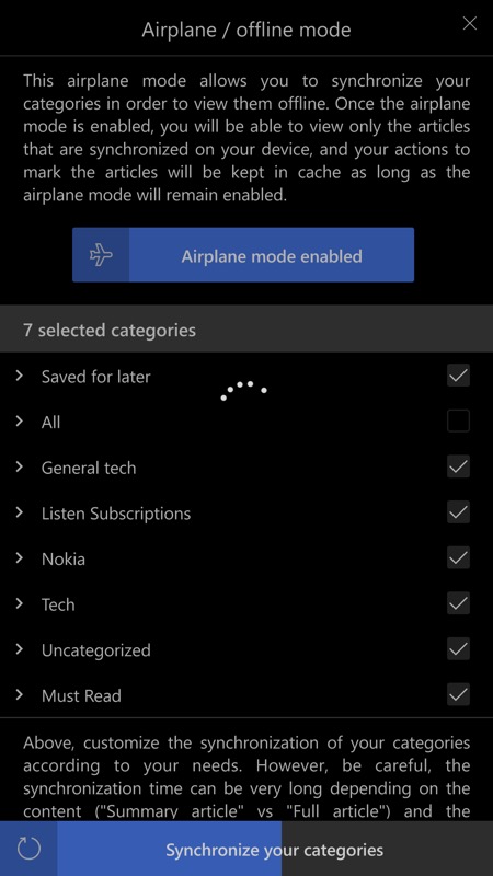
The Airplane mode is handy if your mobile data is limited. Just load up on stories before leaving the house or office!
There's too much here to screenshot everything, but you can grab FeedLab UWP here in the Store - it's a free download, so why not just try it for yourself? It's - obviously - for Feedly users on the whole, but if the concept of news feed reading/raiding appeals to you then you'll already have a Feedly account, I'm guessing!
