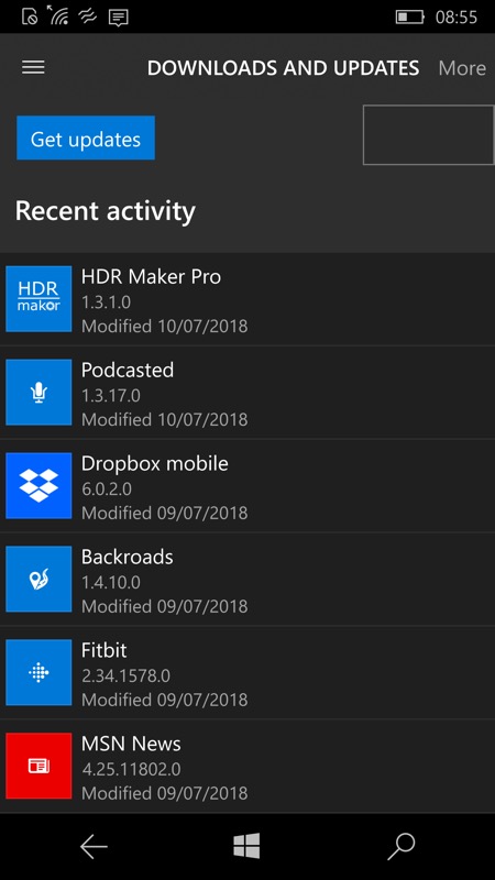
The title 'oops' on devices like this Lumia 950 can only have been through lack of testing - there's a 'More' link, which popped up a blank box that did nothing! Specifically, you couldn't search (at least, on this, and a few other pages); (right) the UI has been simplified now to a shorter title, making room for a search control on smaller devices. The 'Downloads' link, by the way, is for the desktop, it seems, letting you see which updates are queued for installation, etc. Don't worry about it.
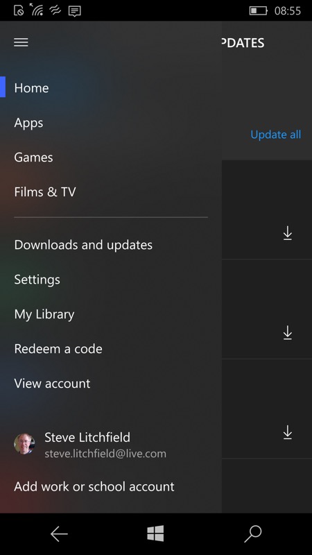
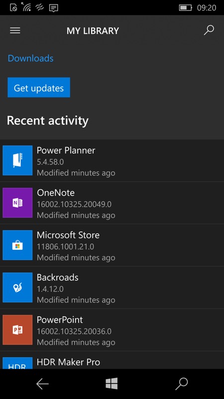
Secondly, after choosing 'Downlads and updates' previously, the hamburger menu would stick around, on top of the view selected; (right) hard to show in a screenshot, but the UI is now fixed. Here I'm at the Store home and about to tap 'Downloads and updates'. When I do, the menu disappears (correctly) and I'm at the right 'My library' page.
Yes, it's confusing having various terms for essentially the same page, but there we go, Microsoft never really makes things simple.
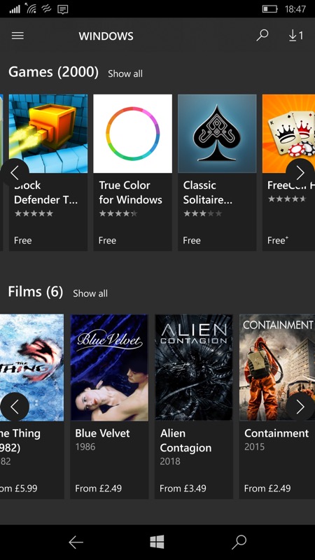
And, as ever with Microsoft, it's two steps forward and one step back, with the icon carousels now no longer touch-friendly in terms of swiping - instead, you have to tap arrows at either side of each block. Urgh! Let's hope this change is temporary!
You can update the Store app in the errr..... Store, on the phone, of course!