Here's a visual overview of the (old and) new Store client in action:
Before: part of the vertical page panorama for an application - as you'll know, it's slow to load, section by section, and the swiping goes on forever; (Right) After: there are implied tabs that load the various sections needed, just as on the web and also on the Desktop now too.
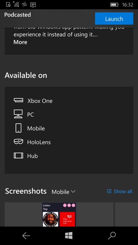
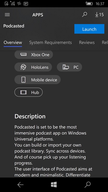
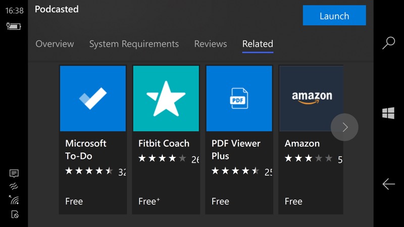
Application entries look different in other ways, here's one of the composite graphics above Podcasted UWP, more things are centred and there's a fresh look; (right) it's not all a huge success on the small-screened phones, mind you. On this test Lumia 950, the 'Related' tab isn't shown fully.
Of course, this is Windows 10 and very adaptable - rotating the phone to landscape and it's then a much wider screen canvas and you can see all the tabs.
As you might expect, you update the Store client in the Store itself. Just follow your nose, it'll restart itself when it needs to!
Overall, this is a positive change - I'd trade some small layout issues for far faster page loading any day.
Comments?