Here's the official changelog:
- Schedule Sorting - If your Smart Scheduled List seemed a little messy, we apologize for the confusion. With this update we have improved the sorting methods.
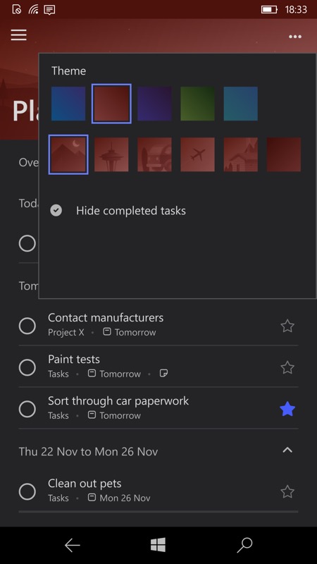
- Themes in the Scheduled list - If you use the different themes and colors to keep your lists organized, you'll be happy to know that you can now also use them in the Scheduled list.
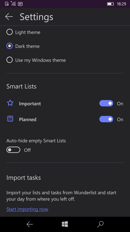
- Hide empty smart lists - Now you can hide your empty smart lists automatically, so you will not see the Planned and Important lists in the sidebar if they are empty.
- Likewise, smart lists can be hidden from the shortcut menu.
Here's the new version in action:


Note how you can toggle on the two 'smart lists', depending on what you need to see, or prefer. And now you can auto-hide either of these if they're currently empty, cleaning up the home view; (right) theming is now available for the Planned (Scheduled) smart list.
You can grab Microsoft To-Do here in the Store, if you haven't already. As mentioned before, this is shaping up to be an attractive and pretty powerful tool/service, syncing on multiple devices and platforms, and I'll be diving into more depth with it at some point.
