Let's start from the beginning. Most modern operating systems (Windows/OS X/Android/Symbian/Linux/you-name-it) have had multitasking for years. In other words, multiple applications can be running at the same time. Why would you want this? Some examples:
- So that your email collection and music don't stop just because you wanted to play a game.
- So that you can start a biggish web page loading and switch away to check a text message, then switch back to see that the page is now fully loaded.
- So that you can take a phone call in the middle of a big game session and then hang up to find the game paused and exactly where you left it.
Etc. You get the idea. Multitasking is good.
Multitasking is also evil. In that if the applications (and processes) in question aren't immaculately behaved, it's easy for the sheer weight of things going on to overwhelm the limited processor, memory and battery resources of a phone. Which is why Apple has long held that full multitasking is a very bad thing and has never allowed it on the iPhone and iPad. Instead, Apple ended up (after user pressure) implementing a compromise whereby apps get their state saved exactly, for quick resumption when the user next asks for them, in addition to a set of special dispensations for certain background functions (e.g. playing background audio) to be carried on. (I know, I'm simplifying horribly, but you get the idea.) On iOS, the compromise seems to be working and even power users rarely find the lack of true multitasking getting in the way.
Microsoft, when designing the all-new Windows Phone, had a decision to make: go down the Symbian/Android route of full multitasking ('anything's possible, but phones can bog down if the users don't take care or aren't that tech literate') or go the iPhone way, where only core system apps are allowed to multitask (because only the OS maker knows what it's doing) and everything else has to get closed down when not actually on-screen.
For reasons of responsiveness (and partly observing that it was working out quite well in the iOS world), Microsoft opted for the latter approach, with the first version of Windows Phone 7 effectively closing down third party applications the moment they got shunted from the phone's screen. Yes, the core UI of each phone was nice and fast, but everyone complained that every third party app or game had to start from scratch every single time, even after something as simple as the screen timing out. The user experience, once you got beyond the trivial, turned out to be quite frustrating, which is why 'Fast Application Switching' was implemented for Windows Phone Mango. The idea, as on iOS, was that applications save enough of their state that they can come back from 'dormant' state (in RAM) or from 'tombstoned' state (on flash memory) to present the same screen and context as when you last left it.
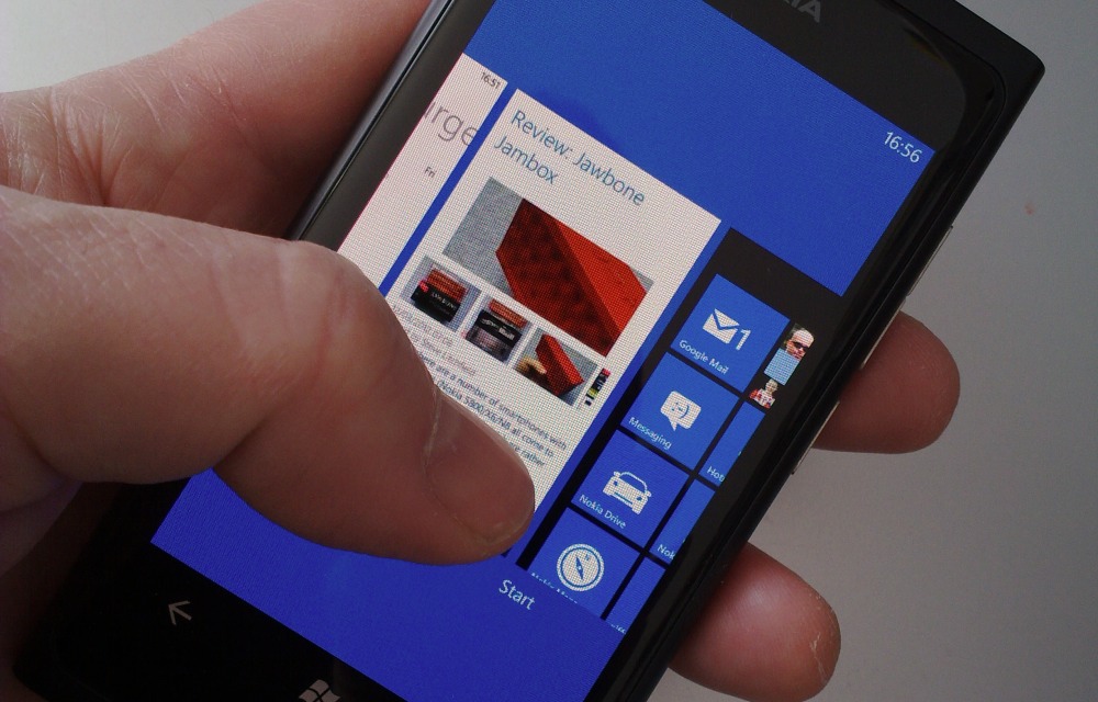
A few months on and many applications have now been tweaked to support Fast Application Switching. You can try it for yourself by pressing and holding the 'Back' control icon down - scroll through your 'running' (active or dormant or tombstoned) applications and tap on one - the chances are that it'll pop up quickly and right where you left it.


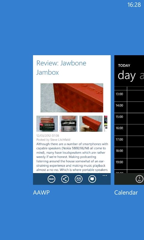
From left to right: At the home page of an application (in this case our very own AAWP app!); deep inside the app, reading a review; switching away to another application and then using the long-press on 'Back' mechanism to use Fast App Switching - the original app is shown preserved in its in-use state, one tap and you're right back in the thick of it.
So. Everyone's happy, right?
Wrong.
Fast Application Switching is indeed a step forwards and generally works pretty well, but you may have noticed that it's not used most of the time. By design (apparently), applications are STILL restarted when you tap on their icon in the applications menu or on their live tile. You'll see this happening because:
- you'll see the application splash screen again (if it has one)
- you'll be back at the opening screen, not in your account/details/sub-page view (or wherever you were a few moments ago)
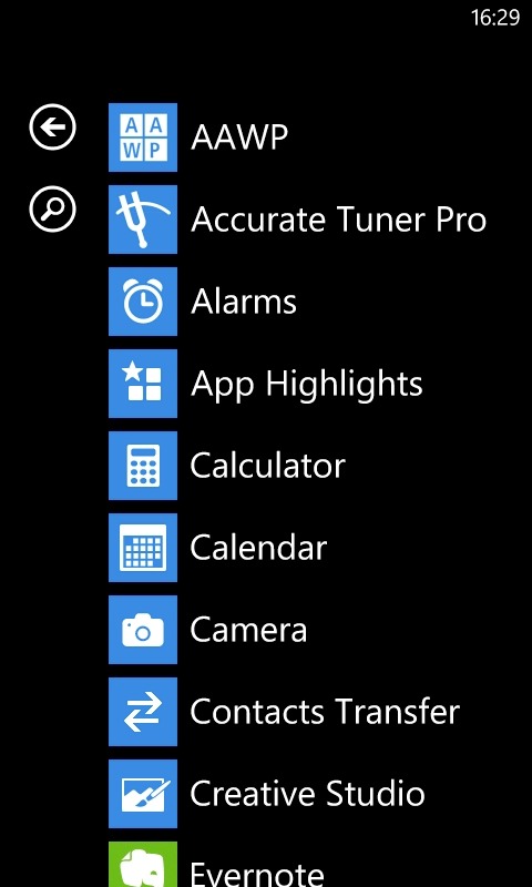


From left to right: instead of using the 'Back' mechanism, why not simply tap again on the app's icon/name in the main start menu?; the splash screen is shown again (uh-oh); and we're back at the starting view and have to navigate all over again... (In case you're wondering, this is nothing to do with the AAWP app, this happens with every single Windows Phone application, even the core OS/built-in ones!)
All of which puzzles me greatly. Microsoft's own documentation, in this case Multitasking for Windows Phone, says of the dormant/tombstoned state: "the application is preserved in memory so that if the user returns to the application, it can resume almost instantly".
'Returns to the application'. Surely, if I've just been using the Twitter or IMDB or AAWP (or whatever) applications, then tapping on their live tiles or on their icon in the application menu should 'Fast App Switch' back to where I've got to? The last thing I want is to restart the app and have to pick my way through the UI all over again. And again. And again.
Is the non-use of Fast App Switching in Windows Phone's UI a gigantic bug, an 'Emperor's New Clothes' issue that noone else (until now) has been confident enough to speak up about? Is it a design decision that's obvious to you but that utterly escapes me? Is it a(nother) big technical limitation in the OS as it stands?
Either way, we should be told. Over to you Microsoft - what the heck is going on?
Steve, AAWP, 2 April 2012
PS. This (obvious) behaviour is mentioned in passing in one of the Windows Phone UI polls, why not go vote for it to be implemented? I did!
