When you look over the sea of Android devices, it does feel that the manufacturers have all decided that what people really want in their smartphones is a grid of application icons, and to be notified from a drop down box the instant something has happened in any of these applications or online services. The 'connected app experience' is the driving force from analysts and industry watchers. This is the template that every new phone is measured against:
Not got a big enough app store at launch? Not able to scroll back through alerts? Not able to interact with your notifications immediately? Then you're not following the standard way of doing things and you must be marked down.
If every OS, if every UI, all morph into a similar style; if all our UI methods become consistent; then where will progress come from? Where will designers innovate and take risks if all that will happen is that they are hammered back by brand managers and PR teams who don't want a new system to be labelled as lacking?
This is why I think Windows Phone should play an important role in the smartphone space... if it can regain the confidence it once had to stick to the vision of the system, and stop trying to be more like Android.
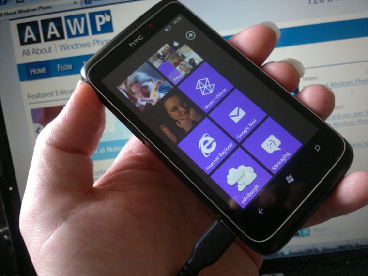
Windows Phone is a system where things are done differently. Going back to the initial handsets running Windows Phone 7, you had the (then) Metro UI evolving out of the Zune media players into a system where the focus was placed on the live tiles that were regularly updated with information from online services. You had applications, but the user path into them was fluid. You could easily move between screens in part of the email app, to contacts, to social networks, to the web, to your photo gallery, and more.
Windows Phone 7 was never a notification and app grid-based OS. It sought to do things differently, to look at the issues that were important to users with a different answer. For many (including myself) it worked, and worked well. I still find it overpowering when I switch to another Android handset to review or try out, just how demanding and pervasive the notifications system can be. Answer everything immediately, do it now, keep yourself at notification zero, always be checking status, etc. The apps can be rationalised as the conduits for the notifications, and driving more interactions by the user to the online world.
Being fully connected, always working, always interacting, is not something that suits everybody. Yes, you can turn all these off on your other smartphones, but for me Windows Phone has offered an alternative to the tyranny of notifications.

The idea of fluid apps was also heavily pushed in the initial versions of Windows Phone. Windows Phone was not 'go into app, go to home screen, go into another app, and go back to the top-level of the first app', your information would flow, clicks on text would take you to the correct place in another application. It was most noticeable in the built-in apps, but a number of third-party apps did follow the paradigm.
Of course, with the increased viability of iOS and Android to make money for developers, Windows Phone apps had fewer resources and budgets allocated to them, and became converted applications from the other platforms, in many cases taking the UI from the other platforms and dropping them into Windows Phone. That makes for more applications, but it weakens the unique nature of Windows Phone.

To be fair, Microsoft is at much at fault here as the third-party developers. The initial vision of Windows Phone, as seen in Windows Phone 7, has continued to be diluted with each subsequent iteration. We are at the point now where the idea of live tiles holding your information with the occasional toast alert has been supplanted by a notification centre. To the majority of people familiar with Android and iOS, this is "a good thing", and they are not wrong in this regard. But neither are they right.
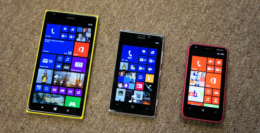
Windows Phone started from a place where disruption could be cultivated. It helped the platform stand out, and it created a different product. Compare those early versiosn to the latest update on Windows Phone 8.1 and you can see the change. Windows Phone is slowly turning to the same paradigms as the other platforms. Your live tiles are getting closer and closer to a home screen grid of applications, notification and alerts are handled in the same pull-down style as every other handset, third-party services are being actioned by third-party apps as opposed to being integrated into the Windows Phone hubs (and of course the hubs are being minimised as well).
Windows Phone, in its age, has decided to follow the herd. It still has many different ideas on user interface and interaction, and it still retains the hooks that made it special in late 2010 when it first arrived on the scene. But the drive to be more acceptable to the mainstream has led Microsoft to first question that original voice of distinction, and then put it aside to be more like the popular girl at school.
As Windows Phone reaches more users, it has become more acceptable to the masses. The practical side of me accepts that this is one of those things that needs to be done, but the romantic side of me worries that if you dilute Windows Phone too much to appeal to the masses, you simply become an Android clone with all the UI issues, and none of the benefits.
