Let's start with what should happen on a smartphone when playing back video (either streamed or local, it doesn't matter). You're reclining in a dimmed room, about to enjoy some phone-hosted entertainment. The interface, including controls, lights up for a few seconds, to give you a chance to tap something or make a difference, and then the interface, again including controls, then gets out of the way, leaving you with just the video content itself and no distractions.
This is exactly what happens on Android, for example, where physical controls stop being backlit after a few seconds, leaving you with just the video and, depending on the application, perhaps a slight hint at where the controls are with small and dim dots.
Unhappily - and you can see where this is going, ever since the dawn of Windows Phone it seems to have been a decree from on high that if the screen is powered up and doing something then so must the controls be. It really doesn't have to be this way, since when looking at static content on most Windows Phones (e.g. a web page), the backlit controls auto-dim after a few seconds, to save power, sensibly.

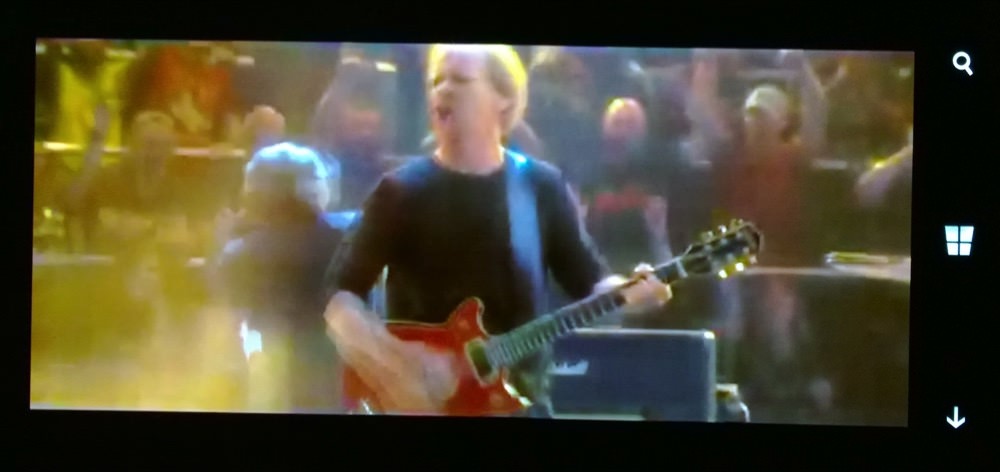
Watching a music video on the Lumia 930 - two minutes into the video and those blasted controls are still lit up!
So why does this behaviour change when you view video content? How is this any more interactive than looking at a photo or text on a web page por whatever? Start a video playing (again, it doesn't matter whether it's in an application, on YouTube or local MP4 files) and then sit back and watch - and get annoyed that for the whole time you're watching (potentially hours) the Windows Phone controls stay backlit. It's distracting and annoying and unnecessary. And there's no reason for it. We know that the OS controls the backlights here.

On the Lumia 830, the controls are somewhat dimmer, but they still ruin the mood...
Ah, you say, this will have been fixed for the newer phones with 'virtual' Windows Phone controls. Nope. In fact, it's worse, since these are implemented using the current screen brightness, usually much higher than that of physical button backlights. Come ON, Microsoft, we're watching a video of some kind, just minimise those glaring control icons - and hey, at the same time, give us the ohysical space back on devices like this.

On the Lumia 630, the virtual controls remain on the screen all the time too - and even brighter!
No doubt there's an argument that "if people can't see the controls then they won't be able to exit the video", but this is hogwash. 80% of the smartphone market, with Android phones, somehow manage to find their way out of videos. After all, the user knows roughly where to tap and it's not rocket science to detect a tap in the rightmost (with the phone in landscape mode) part of the display and pop up the interface again briefly.
Is it just me that's getting hot under the collar about all this? Do folks at Microsoft not take their phones home at night and watch streaming video content in bed, like the rest of us? How can this UI oddity have been unnoticed and unfixed for version after version of the OS?
_________
PS. I'm sure some will be able to think of the exceptions to the above, for example with the Lumia 735, on which you can manually dismiss the controls now, or very low end phones (e.g. Lumia 520) which don't have backlights behind their physical controls. But the editorial holds true across the vast majority of the Lumia and Windows Phone range.
PPS. Somewhat ironically, when looking at still photos, the controls do get extinguished after a suitable timeout! Go figure!
