The story so far, of course - Weather, nominally under MSN branding, has been a staple of Windows Phone and works very well, as shown below:
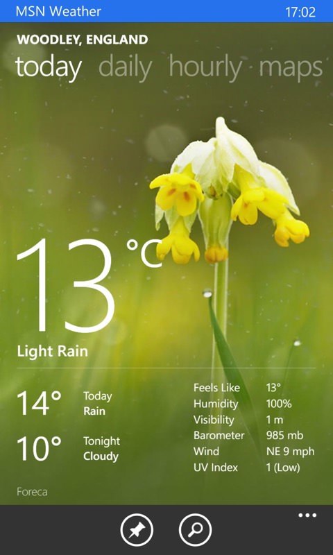
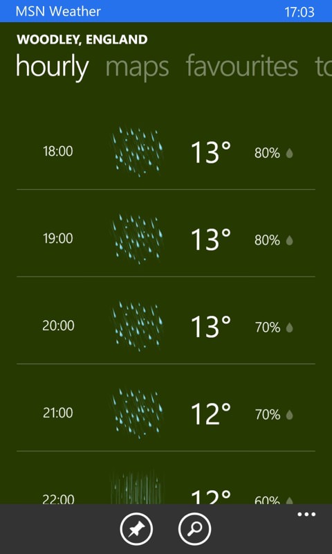
Weather the old-style 'Metro' fashion - still pretty and useable though, albeit perhaps needing one too many swipes here and there... This is the 'Today' summary and one of my favourite views, 'hourly'...
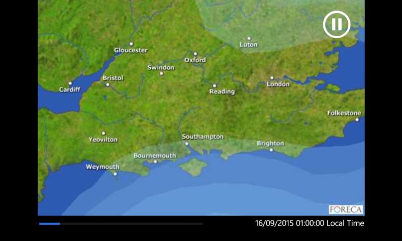
Mini-movies showing weather patterns were also a feature, forced in landscape mode but useful if you knew how to interpret them!
However, this was coded for mobile only and wasn't suitable for 'universal' implementation, to essentially run the same code on tablets and laptops. Moreover, the latter already had a sophisticated weather application, which is what has been tweaked and now appears for Windows 10 Mobile handsets in firmwares and in the Store:
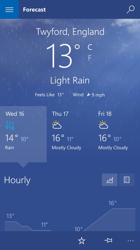
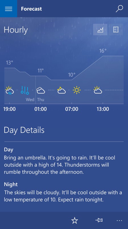
The interface has been converted to use the hamburger menu (see below, left, too). The main forecast pane now has everything in the one view, just swipe up to look up and down. The days form virtual tabs in the middle of the pane, and I really liked the diagrammatic way hourly weather is shown, you can take it in with one glance. Or just read the plain English versions beneath!
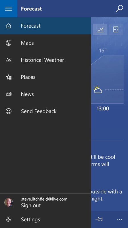
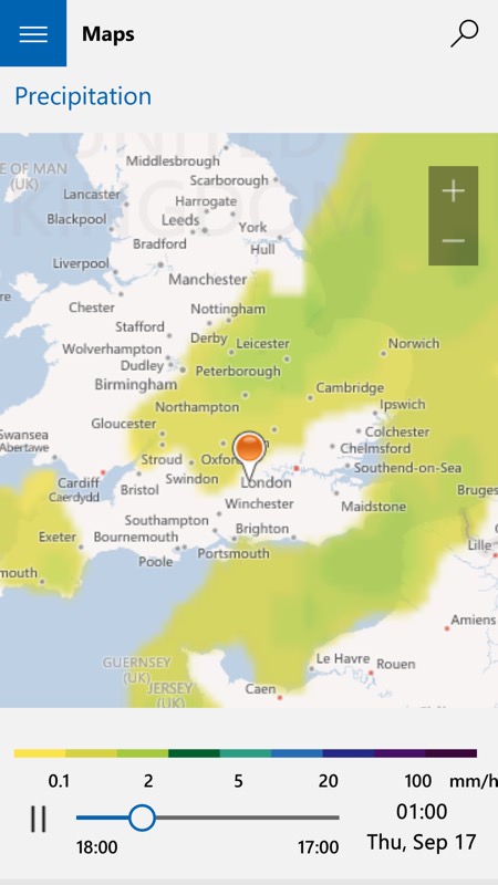
Most people will spend 99% of time in the 'Forecast' view, of course, which is why it's the first thing that anyone sees... Other views and functions are tacked on to the hamburger menu, top left. Maps, shown right, provide a selection of animated weather pattern diagrams, and all portrait on the phone, thankfully. Though if you start Windows 10 Weather in landscape mode then it also works fine, in fact adding hamburger-esque shortcuts to the main functions down the left hand side. All part of the tablet/laptop-friendly code underneath!
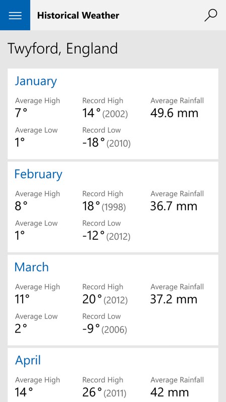
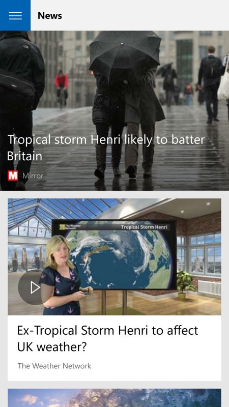
'Historical weather' sounds odd but in fact is a quick way of comparing the current stats with what happened in a different month. While News, right, provides graphical shortcuts to weather-related new stories from a variety of feeds.
The old Windows Phone 8.1 weather application was quite handy, but it was also optimised for small, low resolution screens and the new application, being Windows 10-wide, makes better use of higher resolution screens and the Windows 10 UI in general. More data, better presented in higher density, etc.
Another tick in the 'Why Windows Mobile 10?' chart then. What's next in my look at grown-up apps on the new platform? Maps, perhaps - am I ready to dive into a city in rush hour with it? Watch this space!
PS. In fairness, I have to add that the live tile under Windows 10 Mobile only shows three days ahead, whereas the live tile under Windows Phone 8.1 showed a full five. It's possible that the former's style was decided on based on the possibility of 'triple-wide' tiles, something which hasn't yet been enabled in the OS.
PPS. Also, in fairness(!), Glance functionality (for supported devices) has also not yet been finished by Microsoft, so I can't comment on Weather's integration, etc.
