And so, with apologies for the length and number of screens (I've downsampled them from the original 1080p for obvious web and bandwidth reasons!), here's the walkthrough of the new user experience, as of Windows 10 Mobile Build 10581:
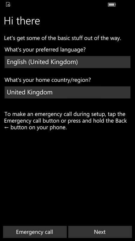
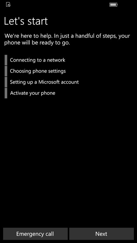
It's a standard and clean startup, with the user stepping through as usual...
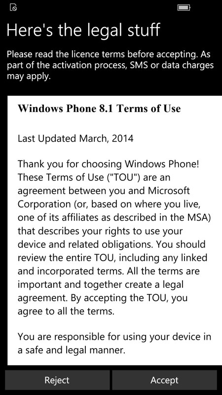
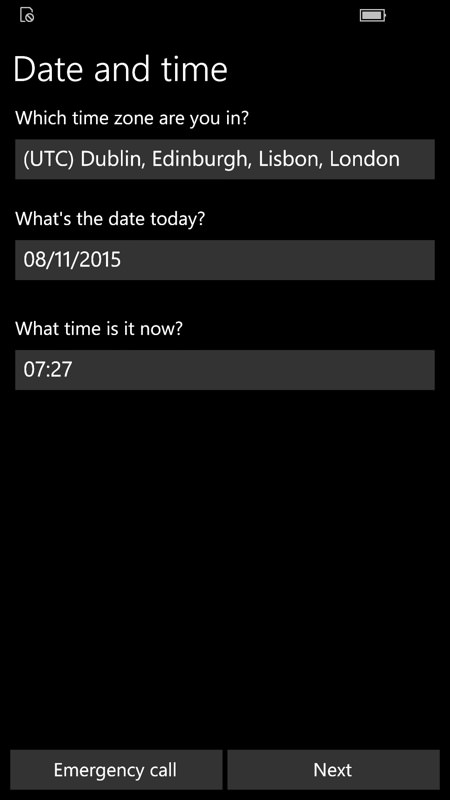
Oops. The old Windows Phone 8.1 'Terms of Use' is still being brought up. This is a local HTML file in the firmware and trivial to change, but please, Microsoft, someone tie a knot in their handkerchief to remember to swap this over before sticking it in any Lumia 950s....!
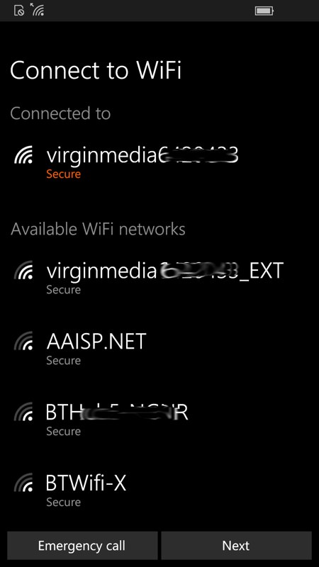
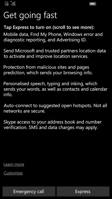
Then it's on to picking a Wi-fi access point and (right) the controversial Windows 10 'Express' permissions. In theory, you can tap the tiny 'Customise' link, but I don't know of anyone who bothers - for most people the defaults make the most sense in terms of the smartphone and its services (e.g. Cortana, Maps) helping them. And anything that particularly rankles can be sorted out later in Settings - 99.9% users will want to get going quickly, and so I don't have a problem with a nice big 'Express' button.
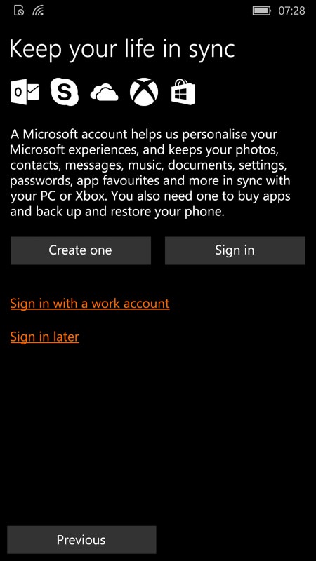
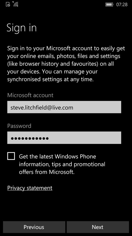
This section hasn't changed much over the years, signing in to your Microsoft account, though do note that browser history and favourites are now explicitly given a shout out.
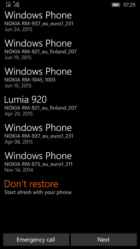
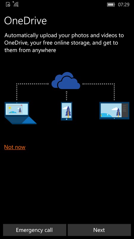
New users of (e.g.) a Lumia 950 may well have a backup of a previous Windows Phone that can be used as a starting point, but given that most data will get synced back via People/Calendar/Outlook/Photos/OneDrive, i.e. from the Cloud, I'm tempted to recommend that everyone follow my lead here and simply opt not to restore from the old backup under the old OS. A new wine skin for new wine, etc.; (right) Ho yes, automatically upload your photos and videos to 'your free online' storage. I guess no one's told the Windows 10 team about the savage cutbacks to OneDrive last week?
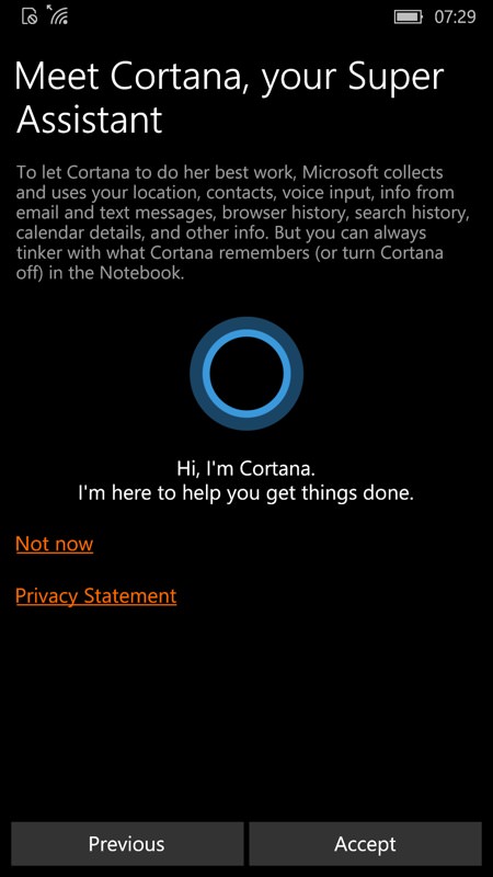
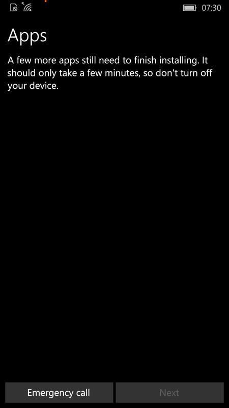
A nice simple screen to accept Cortana on board, who wouldn't accept such a cute err... circle?! (right) This is where the app provisioning for this particular device gets configured (from Microsoft's servers), setting up the application set that will get installed in the background below. The screen above is only up for a minute at most though.
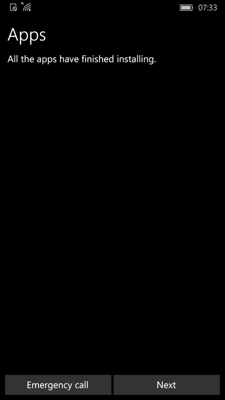
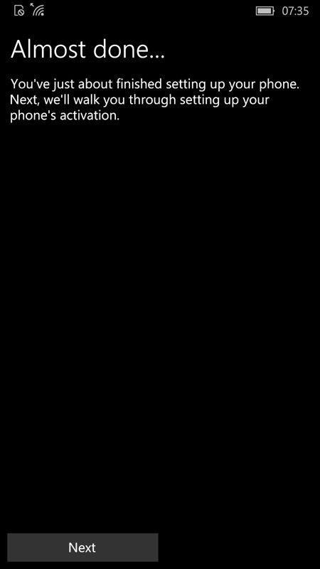
Are these two screens really necessary? The first just acknowledges that the previous step has finishes and the second says that the next one is about to start. Can't we just omit these two panes and keypresses and move on more quickly??
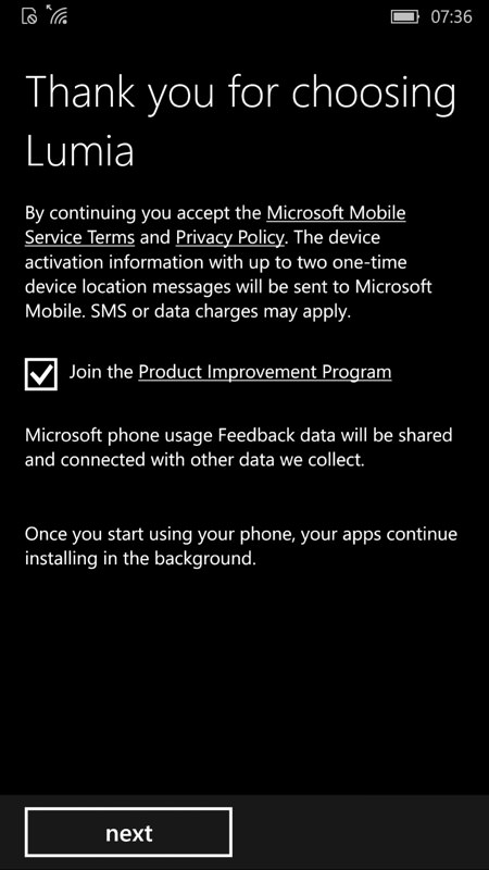
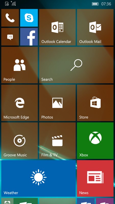
So Microsoft is continuing with Nokia's old Product Improvement Program - though again, this would make sense rolled into the 'Express' settings above (and turned off the user explicitly if they really didn't want to take part). So the last three keypresses have all been a bit pointless; (right) At last we see the Windows 10 Mobile default live tile layout - at least for this particular device, the Lumia 930, as determined by Microsoft's provisioning servers. No doubt there will be subtle variations for other devices and in other regions. A nice mix of tile sizes to give the user a sense of what can be done though, plus even a folder just off the screen bottom here. And, of course, none of the tiles have data yet since the phone hasn't got going with pulling down data from the Cloud.
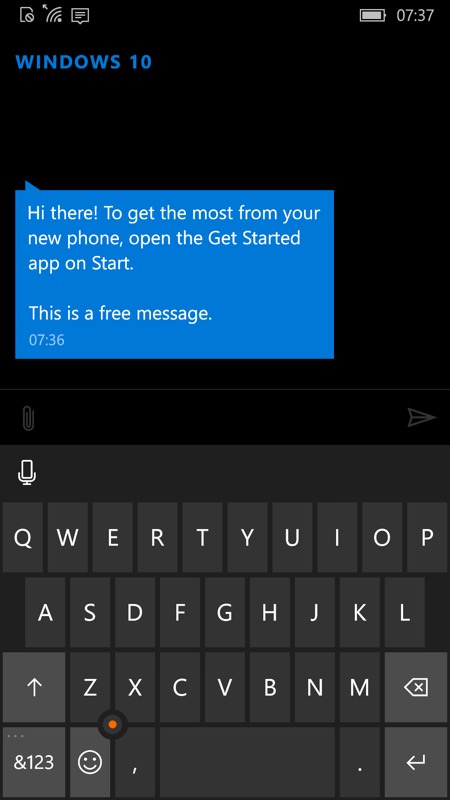
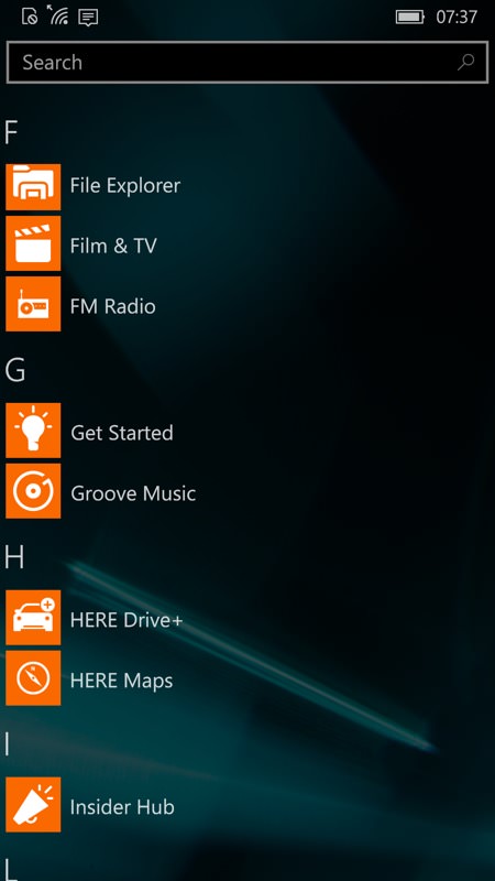
A new text 'arrives' (not actually via SMS, but don't tell the user!) prompting them to seek out the 'Get Started' application - it's not in the live tiles here, so it's off to the application list...
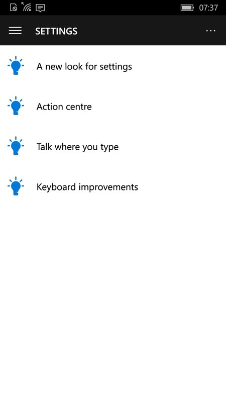
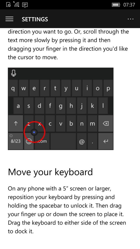
Get Started is effectively a quick start manual for the OS, and very well done, with one glaring UI issue. Here we're in the default Settings section. But how is a new user going to know that there's far more content 'hiding' on the hamburger menu, top left? An initial pane or pop-up introducing this menu concept would have helped here.
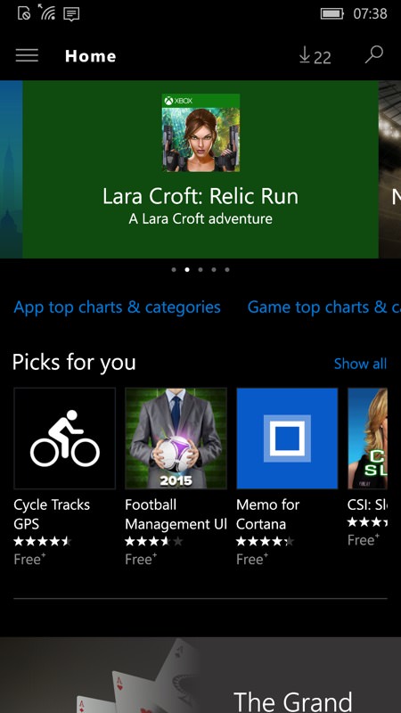
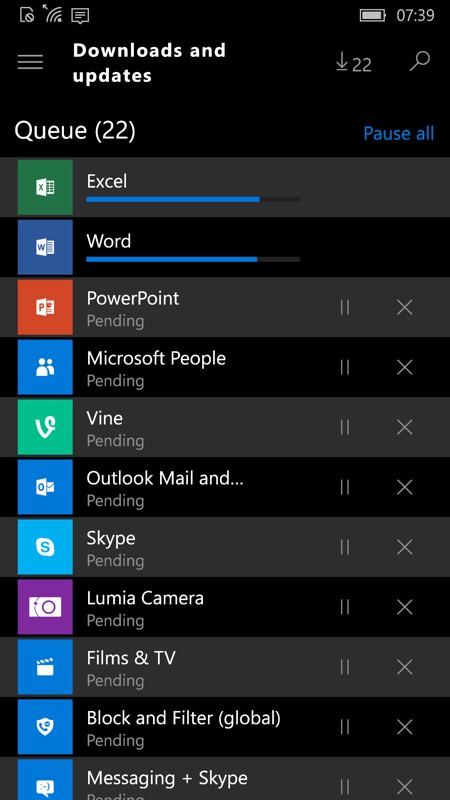
But most people will find their way through to the Store quickly enough, at which point the familiar download count is seen top right and anyone in the know will tap through to see the mass of core applications which are queued for downloading and updating. I guess all this is unavoidable and, to be fair, the phone's main functions are all useable while these download and install. But a pop-up telling the user that this is essentially a one-time batch and will take an hour or more and that they should essentially get on with their lives and look back later, might be helpful.
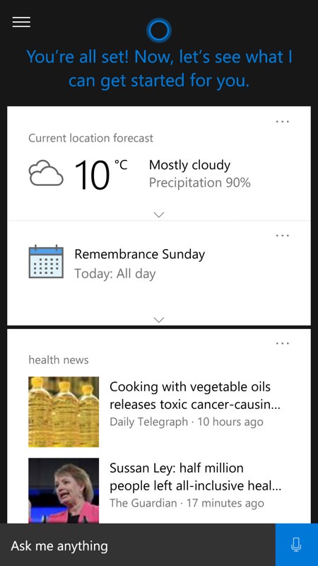
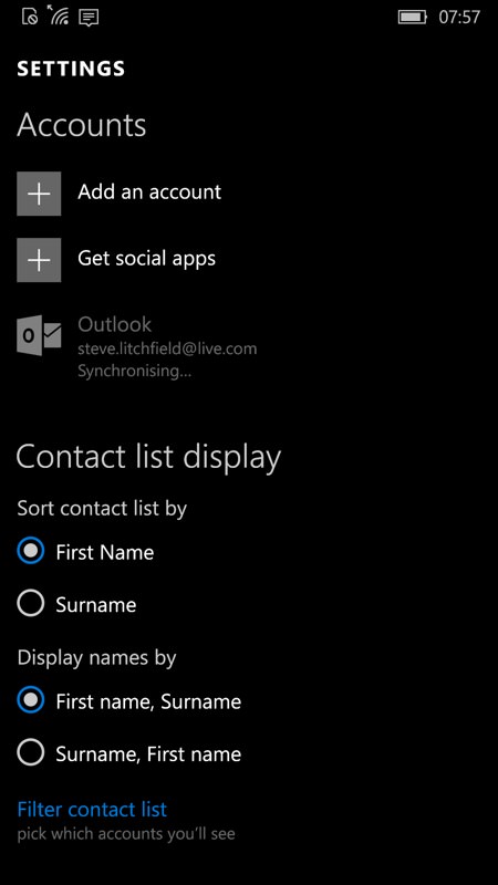
Tapping through to Cortana brings up the familiar interface and helpful summary of 'What's up?'; (right) heading into People and its Settings shows that the user's Microsoft account contacts are also well under way synchronising down from the Microsoft servers - contacts are possibly the number one thing new users will look for.
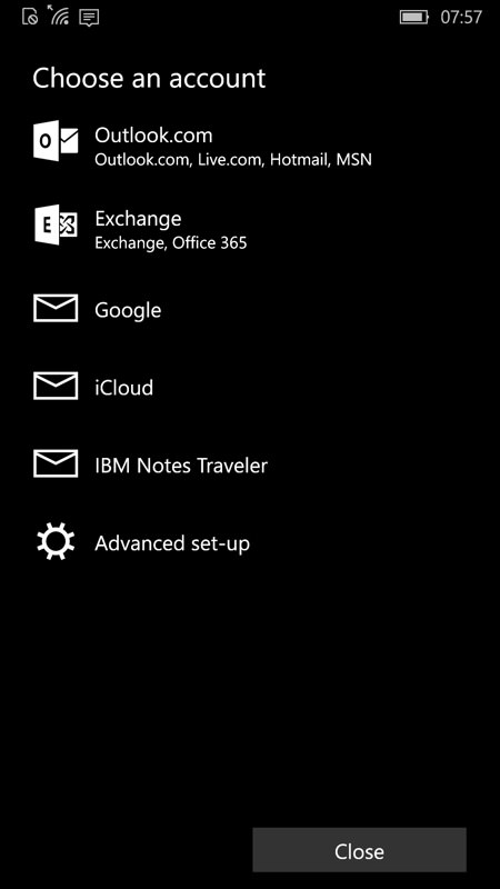
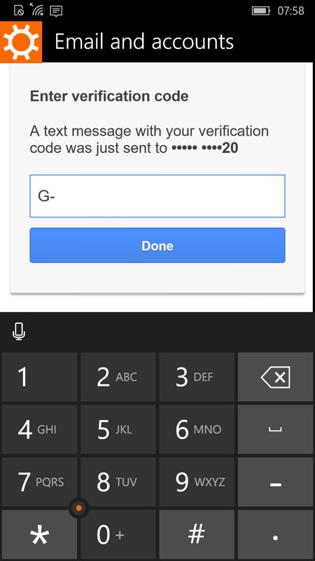
People includes a quick way to add another account to the phone and this is where most people will add in their Google/Apple etc details if they have a second major email address and set of contacts - it all ties through to Calendar and Outlook for email, don't worry; (right) two factor authentication is handled slightly messily by spotting a 'toast' code arriving at the top of the screen and then having to quickly memorise it and retype it below. Isn't it time a phone application was clever enough to spot a SMS authentication arriving and pluck the details out automatically?
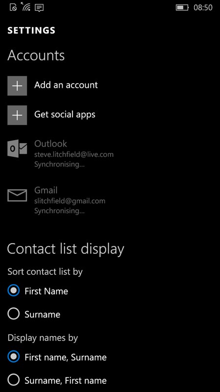
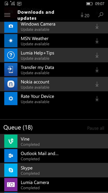
So we've now got the user hanging around a little - two Cloud accounts are syncing down, plus there's still more applications queuing up to install in the Store. I estimate a good hour before all of this is 'done' - so why not tell the user? "We're restoring and updating everything you need. Don't worry if your phone is a little unresponsive for the next hour. All will be well!" - or similar?
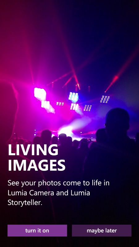
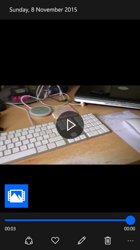
There are still things to tie up on the imaging side - I keep nagging Juha and his team about this. On the Lumia 930 here, for example, Lumia Camera still appears as the default camera app, despite the setting being there to use 'Windows 10 Camera' instead. And, even when using the latter, the extra functions like Rich Capture and Best Moment just show an icon/blob, with no explanation.
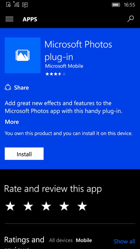
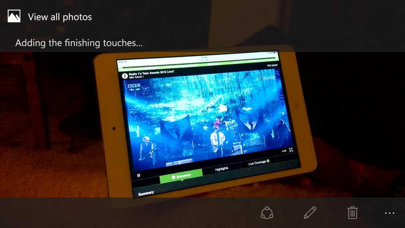
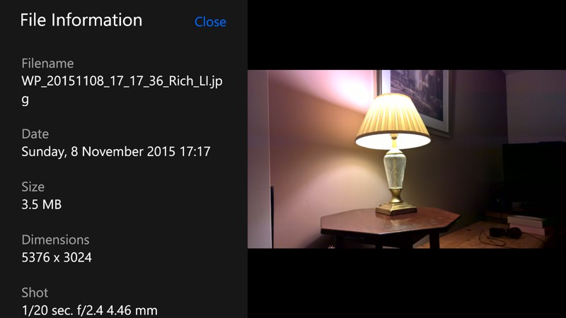
If you know what you're doing, tapping the icon brings up a prompt to head off into the Store, where you can grab the Photos plug-in - though even then Rich Capture is broken, with photos showing 'Adding finishing touches' forever and never letting you edit the images, even though all the raw data is there under the hood. I'm expecting a big Photos update this week to fix all this.
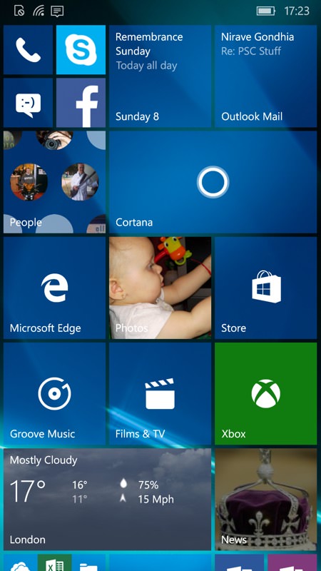
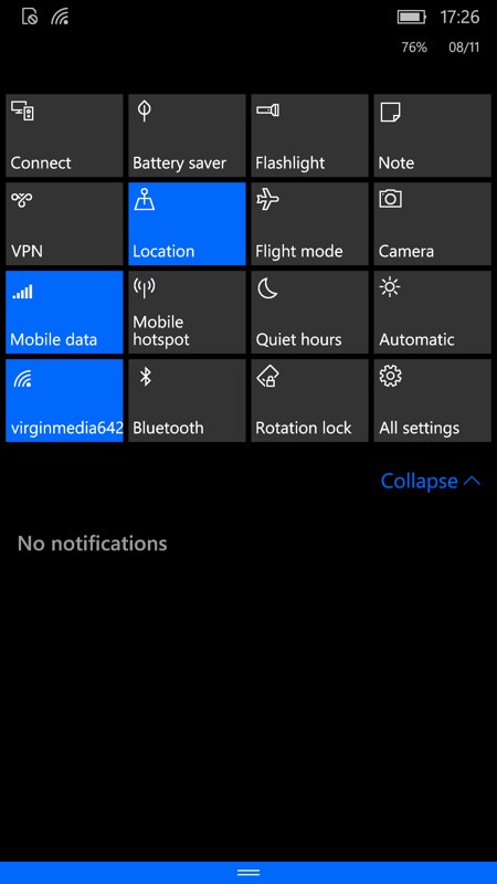
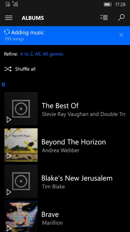
An hour later and everything has synced, with the live tiles now mainly populated - much better; (middle) the Action Center tiles all now work too, some very useful toggles and functions on the expanded view here; (right) most things now work as expected too - even Groove Music is pikcing up my music from the (shrinking!) OneDrive cloud.
Overall, the start-up sequence is close to release quality though - I'm being picky above. The biggest issue is the slow speed at which all the built-in applications update themselves from the Store - yet this turns out to be the biggest strength of the platform going forwards. Having almost every application and function fixable by Microsoft directly through the Store without needing approval from any third party does make for an efficient way of moving Windows 10 Mobile on as a 'service', just like its desktop counterpart, even if fixes to the kernel and other Windows 10 workings might still require periodic firmware updates through the usual 'phone update' channel.
So, come December, new Lumia 550, 950 and 950 XL owners will be well served with the state of the current code - it remains to be seen just how well it all copes should the user choose to restore a backup from a device under 8.1. I'm guessing that most people here (like me) will have been on the Insiders Programme so long that they'll not have tried this either. Hopefully Microsoft has though!
Comments welcome.
