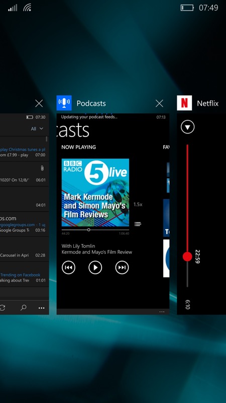
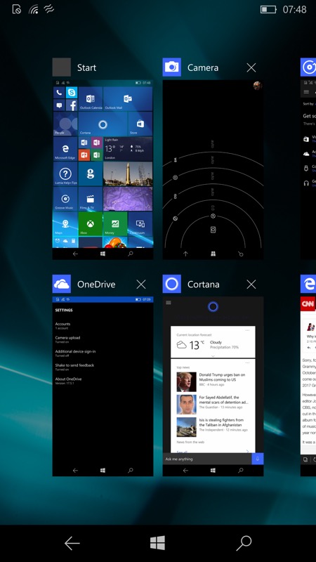
It's very evident that from Build 10586 onwards there was an improvement in speed and responsiveness of Windows 10 Mobile in general. Now, there were obviously a myriad tweaks and improvements under the hood, but one very interesting change (that I don't think anyone else has spotted yet) is that part of the improvement came from streamlining the way 'multitasking' is handled - and then presented to the user.
Now, obviously, this is Windows Phone/Windows 10 Mobile, and the applications and games shown in the carousel aren't really 'multitasking', i.e. running flat out in the background - they're suspended and have strictly limited operations until next called to the foreground (with huge stability benefits for the average user as a result), but it was still usually faster to use the carousel and tap on them here than to use the Start menu again, whereupon some applications insist on starting from scratch and ignoring their 'running' instance (e.g. Store).


Examples of the single height and double height carousel layouts (depending on screen resolution). Both are now limited to seven recently used application thumbnails (plus Start)....
But the size of the carousel has now changed, thanks to:
- more applications are being rewritten to resume running instances automatically (this has been happening for several years now)
- Microsoft has noticed that, when the carousel is at the '14' entries tier (for 2GB devices like the Lumia 930/1520/Icon, and now the 950 range with 3GB RAM), the time taken to bring up the UI and swipe right to the furthermost entries is usually longer than if the application HAD been accessed by other means, or even restarted from scratch.
- the need to get Windows 10 Mobile smoother and faster on devices with 1GB and even 512MB of RAM has been increasing in urgency as the time of the OTA update rollouts nears.
With this reduction in the maximum size of the multitasking carousel on the more capable devices presumably come under-the-hood efficiencies in terms of how RAM is used on all phones, contributing to the speed up that Insiders have noticed across the board for the 'RTM' build 10586.
I have to say that I used to hate using the carousel on the more capable phones for the very reason mentioned above - especially on the Lumia 930/Icon, with just a single 'screen'/app shown at a time, it took quite a while to flick across 14 applications just to find the one I wanted to go back to. Limiting the UI here to 7 applications (plus, usually, the Start screen thumbnail) makes a lot of sense. And on the larger screened devices, with the 'two high' carousel, '7' plus the Start screen image takes the layout to a tidy two screens of four thumbnails each. Very neat.
Comments? Will this affect you? Had you noticed? Will you mourn the longer multitasking carousel?
