It truly is a lofty goal that dispenses with the prevailing notion that desktop platforms and mobile platforms ought to be separate from one another even if they may be built on the same underpinnings. Perhaps more cynically, it also allows Microsoft to claim a huge installed base of Windows 10 clients in yet another attempt to attract developers to consider building Windows apps alongside iOS and Android offerings.
There’s no question that I had become immensely bored with Windows Phone 8.1. It’s mature, it works well, and rarely anything goes wrong with WP8.1 on my Lumia 930. But hardly anything new and exciting has come out on that platform in the past year and - never mind about the app gap - even many of the apps that are present in the Store in Windows Phone 8.1 have long been abandoned by their respective app developers. I was really looking to Windows 10 Mobile to usher in a sort of renaissance for Windows Phone; after all, what I had seen of Windows 10 on the desktop was promising. Make no mistake about it - Windows 10 on the desktop has given my old PC a new lease of life, fixing pretty much everything that was wrong with Windows 8 and eliminating a lot of the frustrations I used to have with Windows.
I never put any of the Insider builds on my Lumia 930. Why go out of my way to make my Windows Phone worse, I thought? I’m fine with waiting for Microsoft to iron out all the kinks. I’m fine with not seeing how the sausage is made, for I know that seeing how it’s made will only taint my perspectives when the final meal is served. So on Windows Phone 8.1 my Lumia 930 stayed, until Microsoft finally released Windows 10 Mobile for the Lumia 930 and a host of other relatively modern Lumia and third-party Windows Phone devices last week.
.jpg)
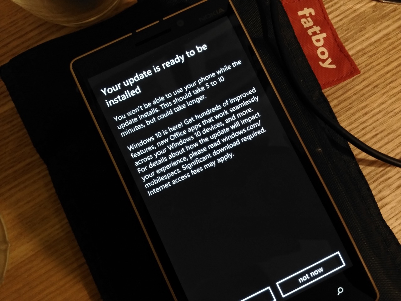
I’m sad to say that Microsoft’s release of Windows 10 Mobile for existing devices as an opt-in upgrade that can only be accessed if you read AAWP and realise that you need to go to the Store and grab an “Upgrade Advisor” app that then enables your phone to download the packages (phew!), does indeed say a lot about the current state of Windows 10 Mobile. [I'm sure official emails - with link - will go out to users in the near future, from Microsoft, as part of the roll-out - Ed]
It’s just not there yet. And if you’re used to your Snapdragon 800-powered Windows Phone working pretty much perfectly with fluidity, stability and speed being hallmarks of the user experience, you are absolutely going to be disappointed with Windows 10 Mobile.
The first two days are wonderful. Barring any upgrade maladies (the first time I ran through the upgrade process, my Lumia 930’s front microphone wouldn’t work in voice calls. Rolling back and going through with the upgrade once again with hard resets at every stage got rid of that problem), there is a lot to like about Windows 10 Mobile.
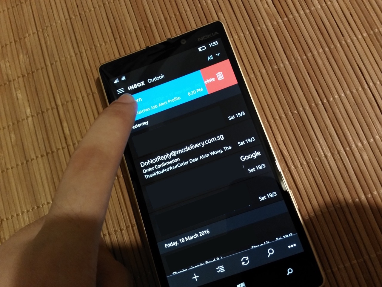
As far as I’m concerned, Microsoft’s Edge browser, while not my first choice on the desktop, is absolutely fabulous on a smartphone. It’s fast - much faster than the creaky old Internet Explorer of old. It preserves the usability-focused control layout that Microsoft got right the first time with Windows Phone 7. It renders pages accurately without having to spoof an Android browser with a user-agent hack. The new Groove Music and Outlook apps are also fantastic. Groove displays glorious and beautiful album art that spans across the width of the screen, and finally dispenses with the ugly grey background that characterised the Xbox Music app. Email handling is so much more efficient with swipe actions on individual items. Rotate to landscape, and the Calendar view expands intelligently. These apps are the same in terms of design and functionality on Windows 10 Mobile as they are on the desktop, and that really demonstrates the promise of the Windows 10 platform. Notification handling has also caught up once again to Android and iOS with the ability to dismiss individual notifications, expand them to see more information and respond to messages without leaving the current app.
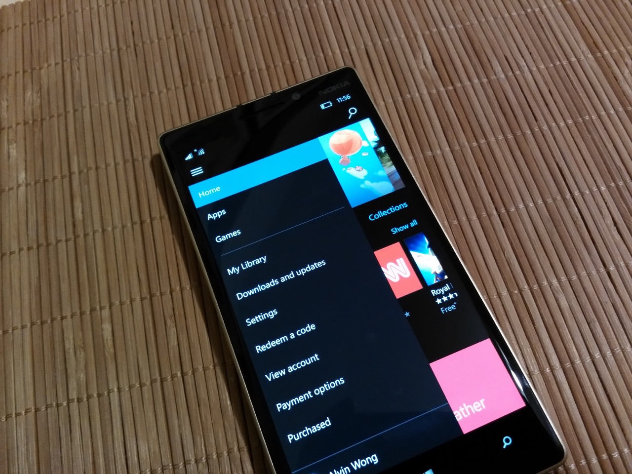
There are also the other visual elements. Comically-oversized headers and lists that never really made the best of the available screen real estate have given way to more standard and far more usable, efficient and reasonable app layouts. Hamburger menus hide account switchers, buttons for different sections within an app and the like; common functions are rendered in beautiful line art on the bottom with an overflow menu if needed. The old pivot views still exist, but in a form that resembles traditional tabs at the top of the screen that you can swipe between. Lists are noticeably more dense, fonts are generally heavier to compensate for their smaller size, and overall the new user interface conventions help increase efficiency and ease-of-use.
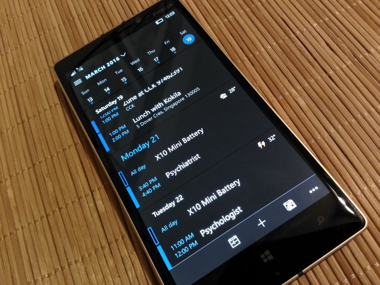
Some will bemoan the continued deconstructing of everything that made Windows Phone unique when it came out, but in my opinion following mechanisms and designs that are the most functional and make the most sense across years of UI evolution on iOS and Android is for the betterment of the platform, and makes it less daunting for developers looking to port their apps across. And right now, what Microsoft really needs isn’t a user interface like no other. They recognise that they have to make it as simple as humanely possible for developers to get their offerings to Windows, and abandoning panoramas and hubs and the old pivots should really help.
There’s no question that there is a ton of potential and promise in Windows 10 Mobile. If things work out the way Microsoft wants it to with developers, we could see Windows Phone becoming relevant to consumers again in 2017. However, what we have in the present release does not live up to this platform’s potential at all, and that is why I am actually relieved that Microsoft has opted not to upgrade devices like my mother’s Lumia 520. It’s just not going to work for her. This upgrade process isn’t going to work for most people even though Windows 10 Mobile’s release to existing devices has been delayed repeatedly. Never mind the fact that it’s opt-in - let’s consider the fact that a hard reset (or multiple hard resets, in my case) is pretty much mandatory if you don’t want to deal with a litany of things that do not work. I was having installed apps show up with weird “C:\Program Files\….” text strings on the first boot into Windows 10 Mobile coming from Windows Phone 8.1.
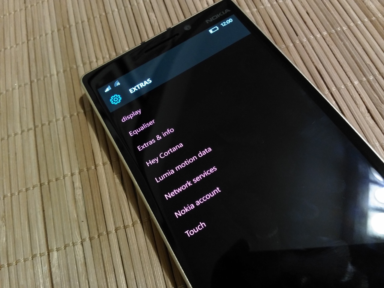
Yet, if you do a hard reset, you would have to know that you should grab all the Lumia-specific settings plugins with an app like SysApp Pusher or by going through your Store history, because a hard reset wipes them out. Imagine your average user going ahead with a Windows 10 Mobile upgrade and then hard resetting after it’s done 'like Steve said to do' [hey, don't blame me! - Ed] and then realising that double-tap to wake doesn’t work anymore because the “Touch” plugin isn’t installed. Said plugins are dumped unceremoniously into an “Extras” page in the Settings app that looks downright unfinished and inconsistent with the rest of the options as if Microsoft would ideally like to forget that Nokia had to patch otherwise unavailable functionality into Windows Phone in order to enable basic features like Super Sensitive Touch and colour temperature adjustment.
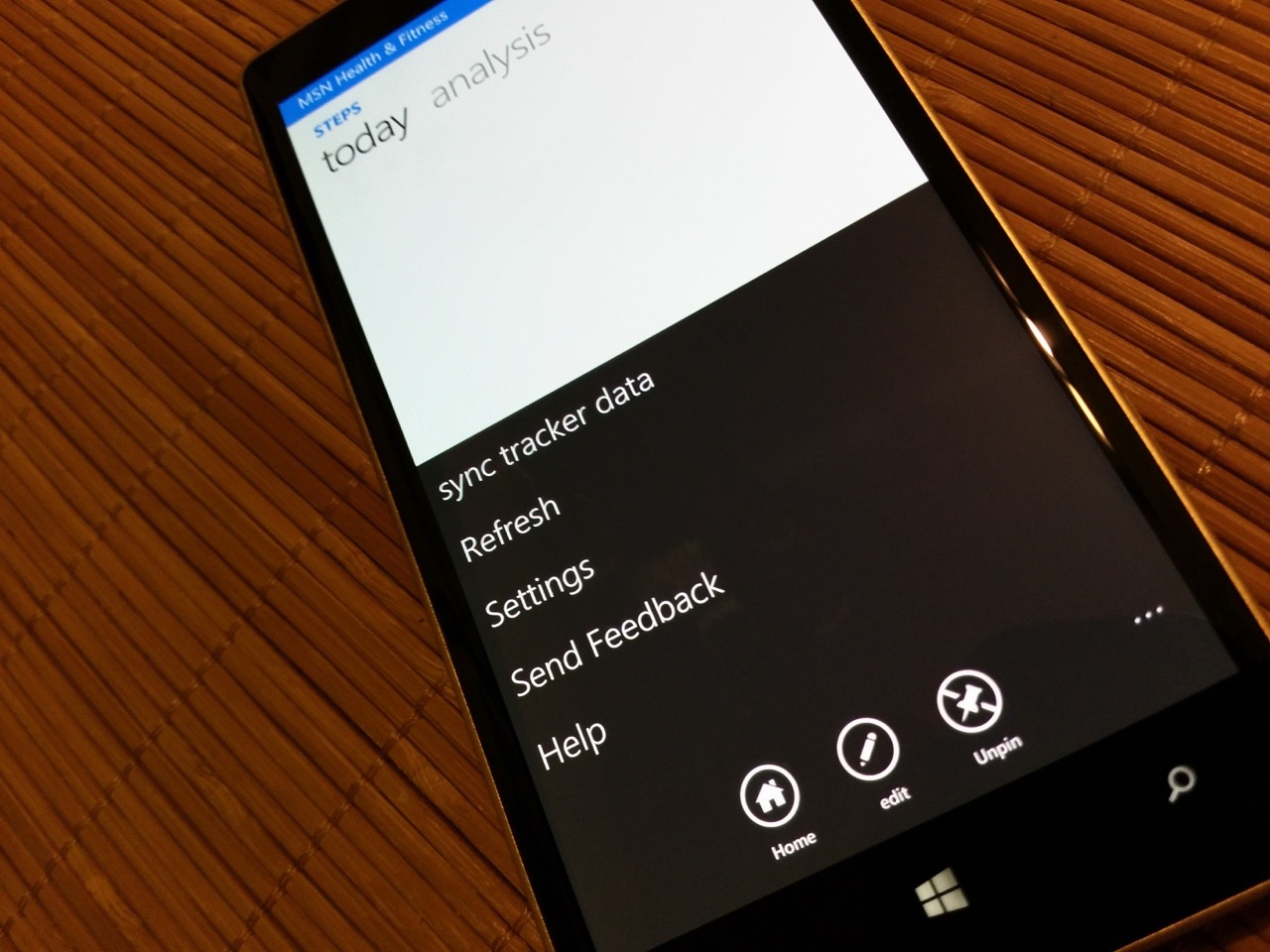
Speaking of user interface inconsistency, there is tons of it in Windows 10 Mobile. Honestly, it’s jarring coming from Windows Phone 8.1. Never mind the fact that apps released for Windows Phone 8.1 look very different from apps designed for Windows 10 Mobile because the legacy apps retain their icon and button styles (think fat buttons with white outlines and round icons centre-aligned in the toolbar versus slim buttons with no outlines and line-art icons right-aligned in the toolbar); inconsistency exists even within Windows 10 Mobile’s core apps, with some screens in the Settings app being grey and others being black, some pivot views having icons with text labels beneath them (Phone) and others having bold text labels (People), some dialog boxes appearing at the top of the screen while others appear at the centre and a sense that things aren’t quite gelling together just yet.
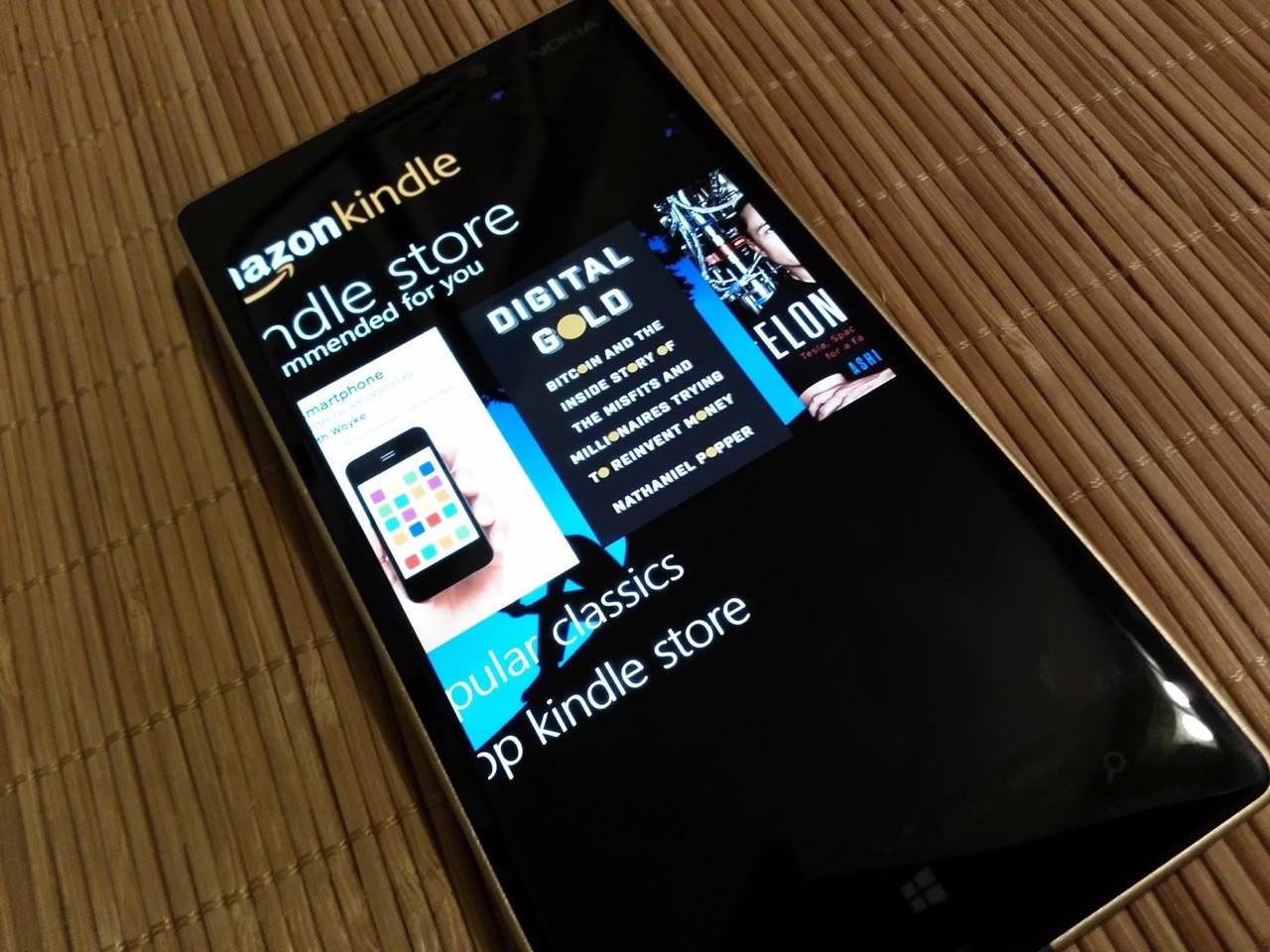
Inconsistencies can be ironed out rather easily, but feature regressions are a more of a problem for Windows 10 Mobile. For example, if you’re like me and you live in one of the hundreds of countries in the world where Cortana doesn’t work just yet, you will find that the Search app that used to be really beautiful in Windows Phone 8 and 8.1 is now a broken mess. Pinned websites on the Start screen no longer show a thumbnail of the respective page for easy identification. There’s no longer a way to pin the Data Sense and Battery Save functions to the Start Screen in order to see your battery percentage and data usage at a glance.
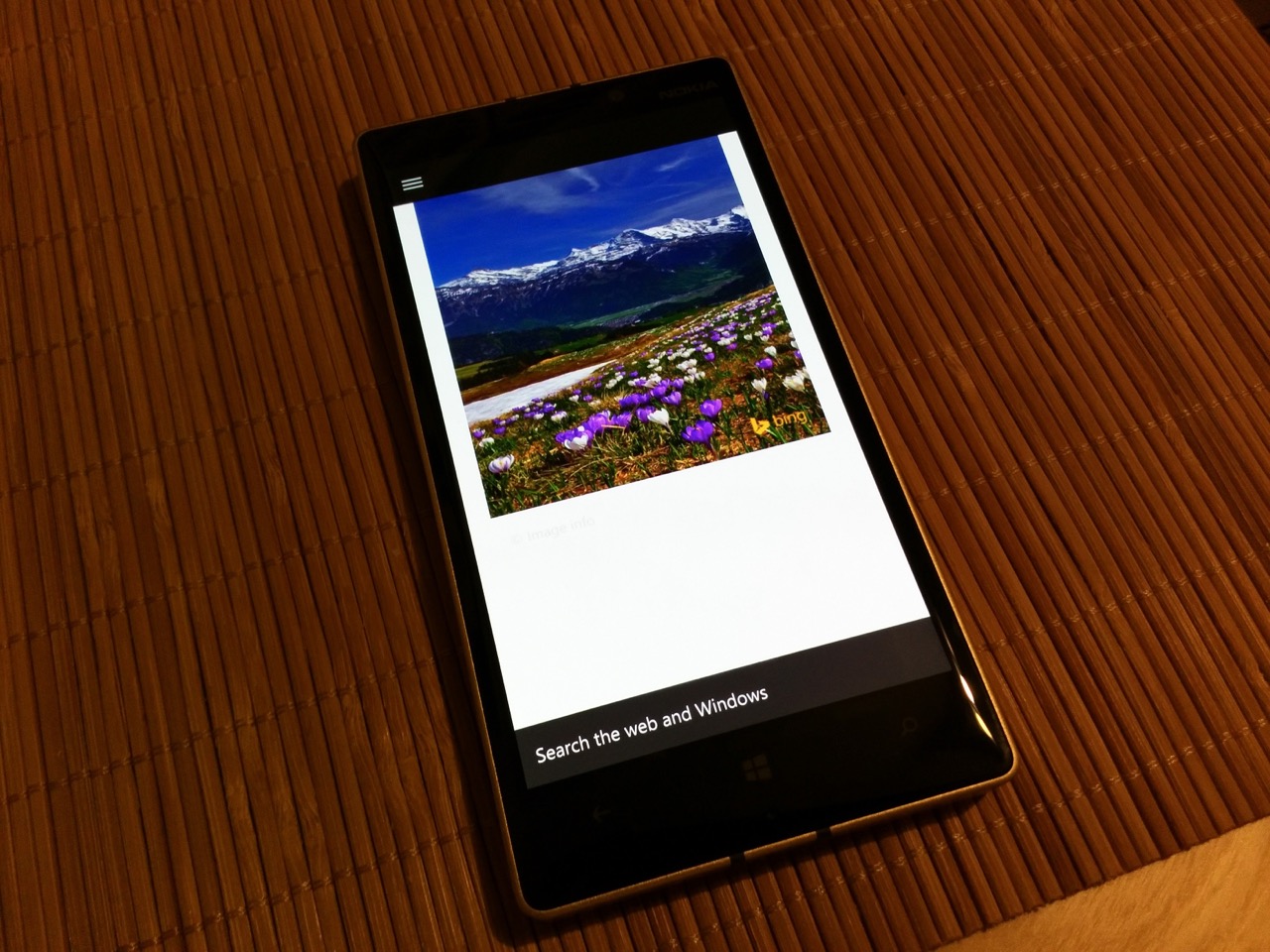
Windows Camera is your only choice of camera app in Windows 10 Mobile; upgrading makes Lumia Camera 5 stop working and out goes background noise reduction and surround sound in video recording, forced-on Rich Capture and the ability to shoot 5-megapixel and 16-megapixel shots at the same time so as to be able to reframe later. Imaging used to be a complete package on Lumia smartphones and honestly one of the highlights, and it feels like Microsoft has managed to turn it into a mere after-thought. I would have at least liked the option to stay with Lumia Camera 5 - instead, that app is “artificially” disabled after your freshly-upgraded Windows Phone connects to the Internet in order to update all its 50+ apps in the Store.
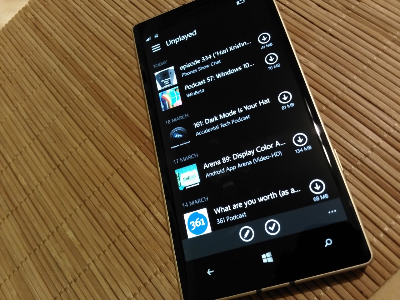
I could put up with all these inconsistencies and regressions if Windows 10 Mobile actually worked properly all the time, but I can’t even really say that about this release. For instance, Windows 10 Mobile is noticeably slower on the same hardware than Windows Phone 8.1 was, and even though the user interface transitions have been sped up and made to be far less sweeping and dramatic, there is noticeable jerkiness even with basic manoeuvres like swiping to the app list from the Start Screen when there is a background image applied. Half the time, doing that also makes the search box at the top activate automatically and bring up the keyboard with it which is hellishly annoying. Pressing the Back button to exit an app and get back to the app list causes the dark tint on top of the background image to disappear.
Outlook insistently tells me I have 69 unread emails in my secondary Google account that I only use for directing receipts and spam to as well as syncing contacts and calendar events, even though I have already disabled email syncing and the account no longer appears in Outlook itself. And there’s that horrible excuse for a Search app that just comes across like whoever coded it really hated their job and couldn’t be bothered. Copying text is also buggy - at times the Paste button just refuses to show up on the keyboard even though I have just pressed “copy” multiple times. Changing tracks using the volume dialog is laggy and the sweeping transition between song titles repeats itself for no good reason. Changing the colour scheme induces lag. Adjusting the transparency of Start Screen tiles induces lag. I could go on, but I won’t.
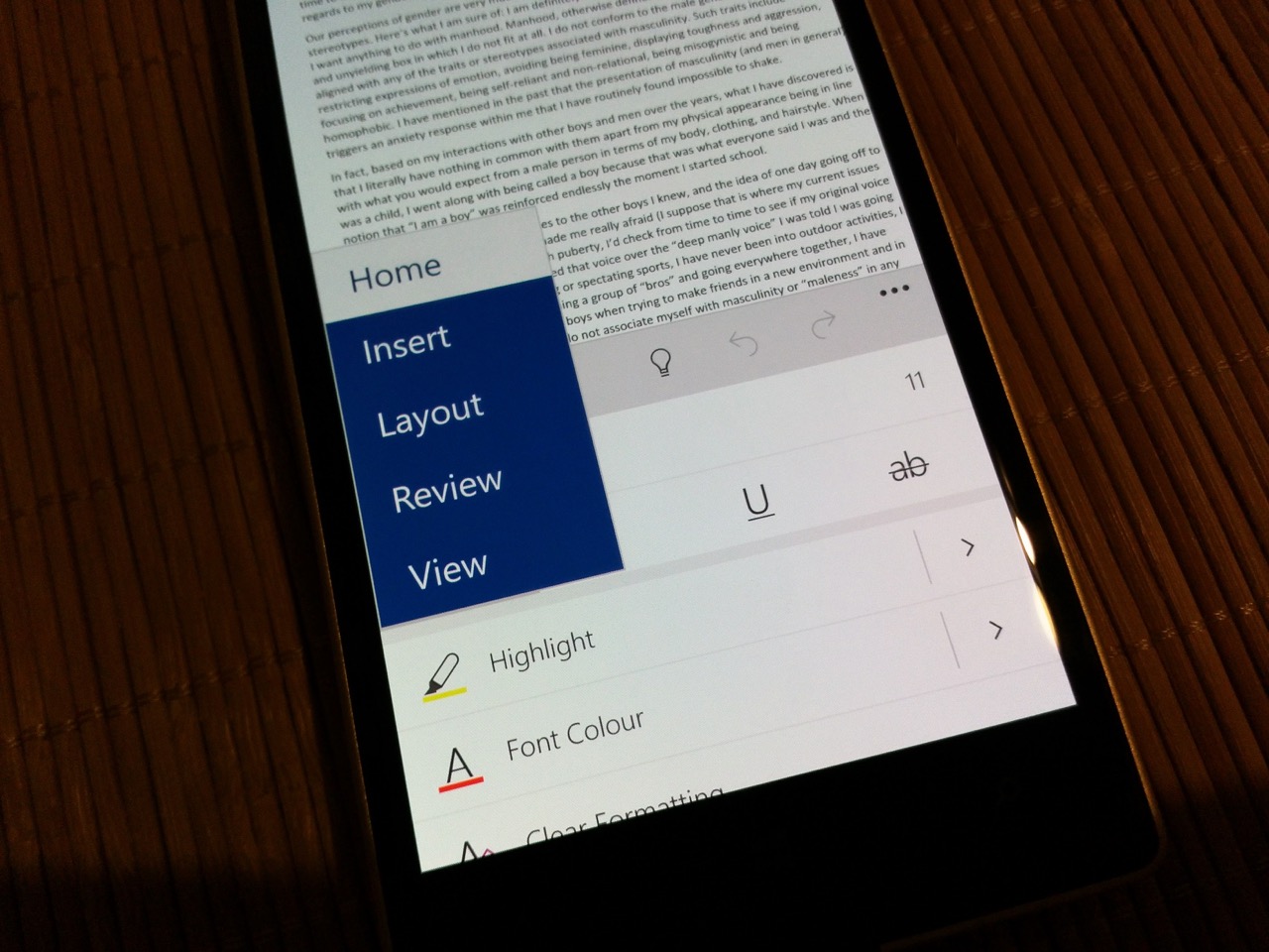
I am really torn. The new apps designed for Windows 10 Mobile are actually really nice - I mentioned some of the first-party apps above, but third parties are also doing some really nice work. Instagram is a direct port of the iOS version with full functionality, Twitter is massively improved and actually looks downright beautiful, the Facebook app is so much more responsive than it is in Windows Phone 8, Readit for Reddit has been a particular favourite, as are Unstream, Dropbox, The Guardian - all of them look unique and differentiated without compromising on Windows 10 Mobile’s user interface conventions. But there’s no getting away from the fact that, right now, Windows Phone 8.1 presents a far more stable, polished and quality day-to-day experience, whereas Windows 10 Mobile misses the mark on all the metrics that matter most to (for example) my mother who just wants her phone to work as it should, all day and every day, and does not have time to mess around with flashing and hard resets and figuring out why her phone has taken such a hit in performance.
Here's the latest (slightly shopped) Windows phone devices share from AdDuplex, red pies won't get W10M pic.twitter.com/Fe5Onqcjcz
— Tero Alhonen (@teroalhonen) March 17, 2016
In the end, I do take my hat off to Microsoft for withholding the Windows 10 Mobile upgrade from the majority of the existing Windows Phone installed base [by shipment numbers, if not available models - Ed]. It might have been 'released', but Windows 10 Mobile still isn’t really ready - not in its current guise (build 10586.164), and certainly does not represent a clear progression from Windows Phone 8.1 particularly in areas where Windows Phone has historically succeeded. Will I put Windows Phone 8.1 and Lumia Denim back on my Lumia 930? At this point, I probably will. We shall see what happens with Redstone, but right now Windows 10 Mobile does make using my Lumia 930 less enjoyable than it used to be, and I just am not ready to accept that.
[Ed: PS. I've found Redstone to be faster and smoother than the current Threshold branch and would encourage Alvin to try that on his 930 as soon as Microsoft open up the new branch to older hardware]
