My Note 7 duly arrived from my operator on 19th August. Besides the usual retail package, it also came with the lens kit. The lens kit consists of a lens cover, telephoto lens and wide-angle lens. So it’s pretty good value. Gavin’s Gadgets has done an in-depth review of the kit, so I will not be doing a review of the Note 7 as such here. You could do well to begin with MrMobile’s video review. Instead, I will take a look at how Nokia’s one and only phablet compares with the current Android flagship, and in some way also Windows 10 Mobile (W10M) vs Android.
Size and handling
The 1520 is really a monster of a phone. I have pretty large hands but even I failed the Steve Litchfield test for one-hand operation. I just couldn't get my middle finger to touch my thumb, no matter how hard I try. But I have no such issues with the Note 7, with room to spare.
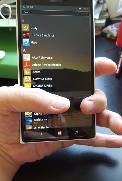
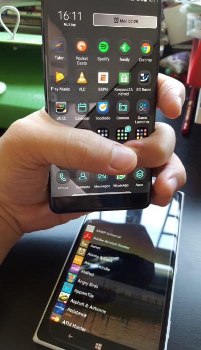
Some more photos to illustrate the size comparison (by the way, all photos courtesy of my son’s Galaxy S6):
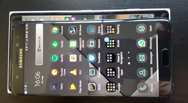
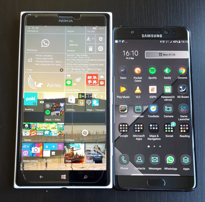
The Note 7 is a head shorter than the Lumia 1520
While the Note 7 screen is 0.3" smaller than the Lumia 1520's, it demonstrates the amount of engineering that Samsung has done to squeeze the 5.7" inch display into such a small (sic) body. Obviously, the Note 7 wins hands-down in terms of one-hand operation. But the Lumia has a trick up its sleeve with the keyboard size – a long press on the space bar will enable the user to shrink the keyboard and even move it round the screen. While the Note 7 can shrink the keyboard too, it has to be done in the settings.
Button placement is something which I have to get used to. For one, there is no longer the camera shutter button to wake and unlock the phone to take a snap. However the double-click on the home button works well too. Another are the volume buttons. I am very used to having them on the right of the various Nokias. So many times in the past 2 weeks, I have accidentally locked the phone instead of adjusting the volume.
Notifications galore
After I started to install apps, my notification centre was flooded with alerts left, right and centre and the phone was buzzing and beeping away like crazy. Both Android and W10M allow me to turn-off notifications by app. But W10M has finer tuning available – banner, sound and vibration. Hence I have it all turned on for messages but banner only for new tweets arriving.
But I do agree that the Android’s notification centre is more feature-rich now – e.g. I can control podcast playing – but it means a very busy centre/pane. Android relies on the pane to keep the user informed. This why I prefer the way that W10M has taken…
Live Tiles
The implementation of Live Tiles means that, comparatively, my notification centre in the Lumia 1520 is comparatively sparse. I can pin Live Tiles for Twitter, calendar, to-dos etc. to the start screen, and I access the apps fewer times to get information that I need. This does mean that the Lumia’s start screen may have live tiles flipping and turning away but then again I can customise it to have just shortcuts. But I like the Live Tiles as information is always a glance away…
Glance screen
This has always been a Nokia trademark – despite other claims to have invented it! Samsung’s version has more interactivity as I can double-tap on the icon to go straight into the app. But Nokia’s implementation has the upper hand in terms of being able to present more information.
Camera
I thought I would just do a simple comparison of the Note 7 and Lumia 1520’s cameras. First the interface. Nokia’s implementation of the concentric circles for control is legendary and is a real gem. But what is less talked about is the one-finger gesture for zooming in and out, which means my hands are always holding the camera steady. This is another hard-to-kick habit but in the Note 7, this gesture will switch to the selfie mode.
Samsung has implemented the camera UI really well, especially for the normal users. Swipe down for selfies, swipe left for modes, swipe right for effects and swiping in the opposite direction to return. Simple and straightforward.
How about quality? I think Steve has done a series of camera head-to-head comparisons (the Note 7 camera is the same as the S7's), so I’ll leave it to the experts. But take a look at these photos and see if you can identify the phone that took the photo. Pretty easy, I would say, scroll to the end of the article for the answer.


(The shot was taken with HDR off and with little interval between shots.)
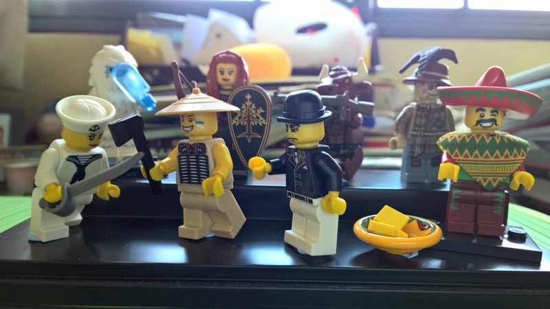
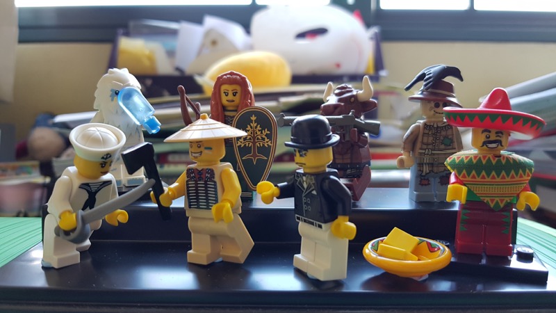
(My daughter’s toy collection, HDR off with little interval)
Symbian??
Why is Symbian even mentioned here in 2016? Until now, 2 weeks into using the Note 7, I still have not kicked the habit of double-tapping to unlock the phone. The "wrong" arrangement of the back and menu keys are not much of an issue now. But the double-tapping is such a reflex action for me, especially when I’m working on something and want to unlock the phone to check something.
Among the first apps that I installed was Situations, which I really missed. While not as extensive as some other similar Android apps, it does what it is supposed to in an elegant manner. But to my dismay, it doesn’t open and close apps as well as the Symbian version. The next app to find a place is another Symbian stalwart – X-plore – which is a sterling file management app from S60 and Windows Mobile days. Check out their website! I have even bought Mau Mau just to relive those days…..
Conclusion
The Lumia 1520 was a statement from Nokia that it can make a big phone. In that, it succeeded. The hardware quality is top-notch and the screen is a joy for media consumption, beating even the Note 7. However, other than that it really has not exploited the big screen.
The Note series is a different kettle of fish and the Note 7 is a very mature phone. And it shows. It hides its 5.7" very well and is in fact slightly narrower than the earlier Notes. There is multi-window support and is really well implemented and useful. Even the user experience feels well thought-out, with little touches that show its maturity. For example, when I plug in the cable to charge the phone there is a small animation to tell me that charging has begun. Killer feature? No, but it’s useful.
Is there no way back for Windows phones and W10M? There are glimpses which I alluded to earlier to suggest otherwise. But Microsoft and its phone partners seem to bring out phones that feel unfinished – cue the stories of the 950/950XL and now the Elite X3. Steve always argues that you need to give it 6-9 months and the hardware and software will stabilise and work coherently. This argument seems reasonable.
But the problem is that time waits for no one and by then the competition has moved on, and once again Microsoft will find itself behind the curve and having to give chase. How many times can it do that?
PS, I have also shared my thoughts on the Lumia 1520 previously in another article "Goodbye, beloved Symbian... Hello, Windows Phone!".
PPS. The second photo of each set is taken with the Note 7. Not a lot of difference for me but results from Lumias tend to be a little warmer.
