Jason writes:
Okay, so this is going to be controversial... But I think one of the biggest impediments to people adopting Windows Phone or Mobile (WP/M) is the Start screen. What's more, I think there's a simple fix. The issue is that Android and iOS home screens scroll left/right, whereas WP/M scrolls up/down.
Don't get me wrong, I am very happy with WP/M as it is. I'm just thinking back to what caused my initial confusion and unfamiliarity with the interface when I first moved to it in 2010. While I don't think this is necessarily the solution to making WP/M a huge success, I do think this is a key difference that puts people off.
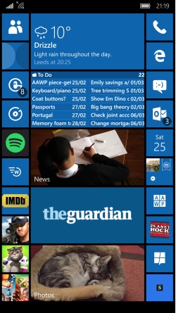
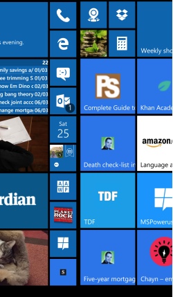
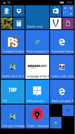
So how could Microsoft do it? While it may be technically difficult – or not, I don’t know – UI-wise, it could simply mean changing the app list access to a swipe up and having the Start screen run over multiple left/right screens rather than a continuous up/down scroll. See some example mock ups below, shown as I swipe my finger left, half a screen at a time - you'll get the idea:


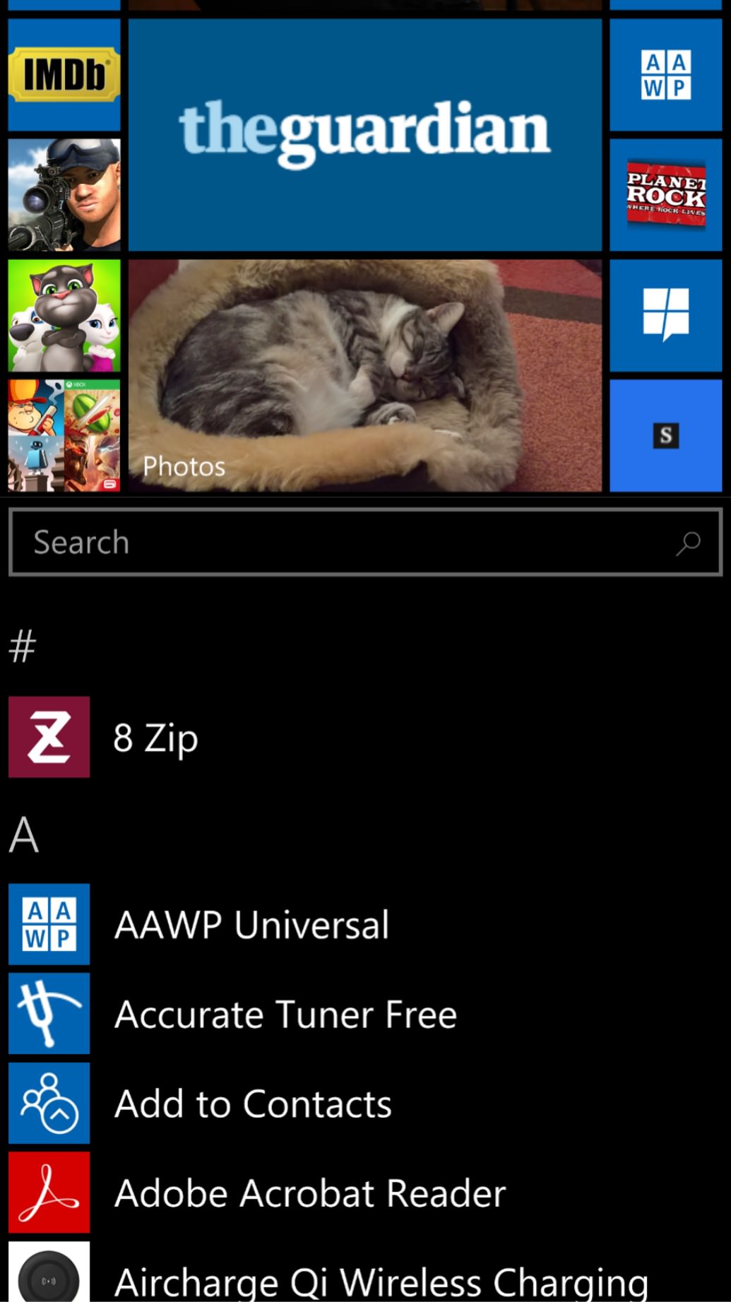
The app list would then become accessible by swiping your finger up - again, here's my mock-up:

What's more, I think Microsoft could change this without changing the Desktop version too. This can already pan out left/right as well as up/down (as tile content is added).
What do you think? I think Microsoft should seriously consider this change*. Sound off in the comments. Like me, you probably like the Start screen as it is and would rail against any changes* especially if it is to make Windows 10 Mobile more like Android and iOS, but there's no point being different if it's not helping the user base grow...
* or should that be further changes..? After all, the notification pane addition in Windows Phone 8 1 was to mirror the user experience on Android and iOS...
__________
Steve replies(!): You're a brave man, Jason. This is certainly an interesting idea - but there's no way this could ever happen within 'Windows 10 Mobile' - the step change for people upgrading would cause too much confusion.
Now, with 'Windows 10 on ARM' on the horizon, i.e. with a more desktop-like shell (and Win32 emulation) and on slightly larger form factors, we'd be in different territory and a side-scrolling menu/tile-set/desktop would make more sense than the current portrait-optimised 'Windows Phone' Start UI.
We'll have Jason on the podcast shortly to talk about all this some more!
