For completeness, Microsoft now has a 'home' page for its 'Fluent Design System', introducing the ideas. It's all a bit frothy and the page doesn't go anywhere, mind you.
The ideas behind User Interface (UI) design under 'Fluent Design System' are divided into:
- Light - think glowing UI elements as a mouse is moved over things that can be clicked.
- Depth - think windows that recede into the distance as something else takes over in the foreground, think parallax effects as foreground content is scrolled over the top of other content that's effectively now part of the 'background'.
- Motion - think animation of progress bars and icons where appropriate, think sliding panes.
- Material - think transparency, with translucent panes showing part of what's underneath them.
- Scale - think taking UI concepts into working with 3D.
I should say right up front that some of these make an awful lot less sense on the (relatively) small, (mainly) portrait phone touchscreen than on a large, landscape desktop monitor, driven by a mouse and keyboard.
For example, on a phone screen there's no 'hover over' concept (as with a mouse cursor), so things can't 'light' up as your finger gets near! Ditto, in a single-screened environment (i.e. apps run full-screen on the phone by necessity), there's no need for fancy 'depth' effects (though transitions have been part of Windows Phone for ages and will continue to be used). 'Motion' is again something not really needed on the phone, since there are already sliding panes where needed (think hamburger menus sliding over and back again) and everything else is full-screen. 'Scale' is a somewhat tenuous name in the first place, but 3D ideas will gradually creep into UWP applications, as we've seen already (e.g. here and here).
Which leaves 'Material' as the only one of the Fluent Design concepts that's really applicable to any degree. When there are lists and panes of content, it's a nice touch to be able to get a sense of these even when the application's UI elements are covering them. Now, a lot of the time, content will be text-based and showing this through a translucent menu will just be visually confusing, but if the application is right then the results can be very attractive. So we get the example applications below, based around graphical content (e.g cover art or thumbnails or satellite maps), which adds colour and texture to translucent UI panes on top.
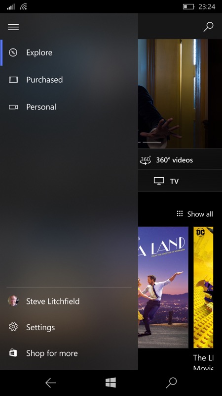
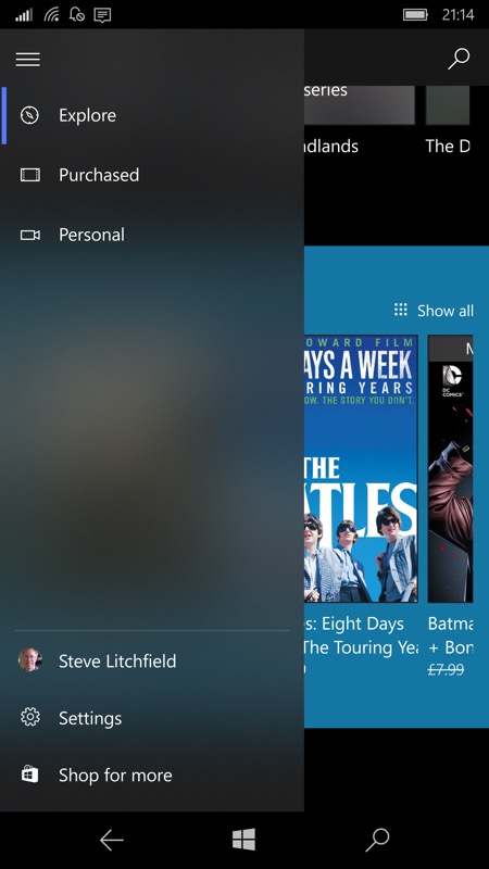
Here's a quick gallery of most of the built-in Windows 10 Mobile applications which support these 'Material' translucent effects, with comments:
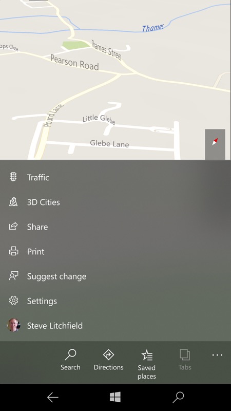
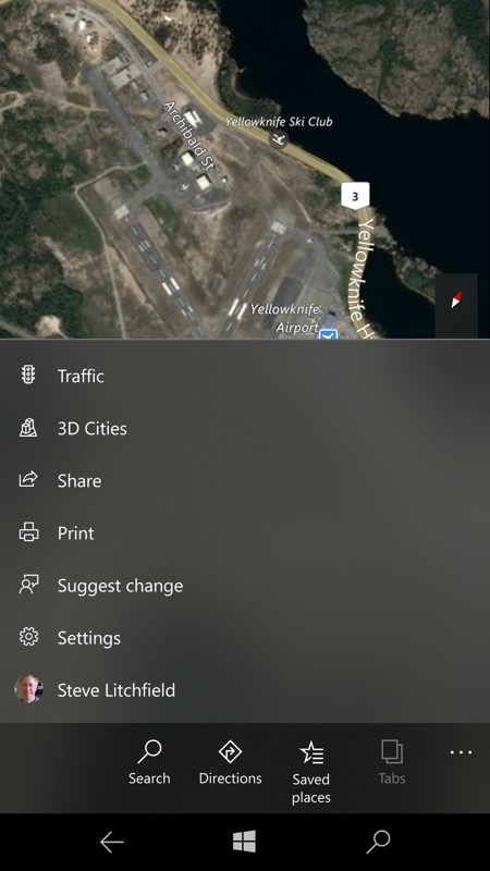
Windows 10 Maps doesn't appear to offer translucency at first, but that's because there's no point on the main map views, as the colours won't vary enough to make an interesting difference. (right) On the other hand, turn on the 'Aerial' view (from the right hand 'Layers' tool pod) and now there's some interesting and varied imagery to 'show through', as shown here.
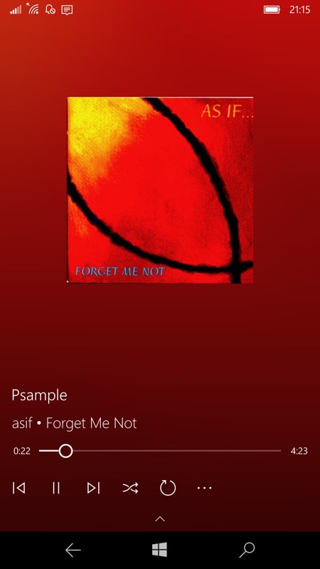
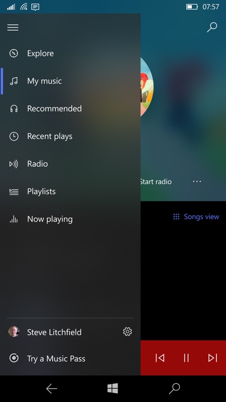
Groove Music was one of the first Windows 10 applications to get translucent effects and they're everywhere, as you'd hope with gorgeous album and artist art in abundance, from background colour bleed (left) to translucent navigation menus.
Films & TV is another application that's a natural fit, with block movie art and thumbnails to add patches of translucent colour behind menus...
Grover Pro (podcatcher) was close behind its inspiration, Groove Music, in adopting backgrounds derived from artwork and there's translucency in many places, though not - curiously - on the navigation menu yet, which is why I haven't shown that here. Instead, look under the 'now playing' bar at the bottom, podcast information scrolls under and shows through this, another neat translucency effect.
The minimum OS version needed to see the menu translucency is the Creators Update (Redstone 2, though of course any application can push out any pixels it wants if it tries hard enough, on any OS version, so translucency isn't 100% limited to RS2 and beyond - as evidenced by Groove Music and Grover Pro above, which did/do cool stuff even under Anniversary Update). And as work goes on with Redstone 3 (Fall Creators Update) we might see more UWP applications acquiring extra visual clues.
So - which other Windows 10 applications (if any), first or third party, do you think would benefit from 'Material'/translucent effects? Or indeed, any of the other 'Fluent Design' concepts? Any room for animation or 3D or depth?
It's true that the number of examples so far is small under Windows 10 Mobile, but there aren't many cases on a 5.n" touchscreen running full-screen applications where graphical effects of this kind add much. Given that you'll be using your phone under a variety of lighting conditions, you're usually after maximum contrast - I usually run all my phones with plain black wallpaper (or similar), as what looks funky and cool for the first 30 seconds often gets in the way of actually seeing detail on the screen thereafter. That the screens above even look interesting (rather than confusing) in real life is down to the large AMOLED screen of my 950 XL - the effect would need disabling on smaller (and LCD) screens, generally, I suspect.
It's also worth noting that handling the translucency uses some processor power and that turning 'Battery Saver' on currently disables any hamburger menu 'Material' effects, though I'm guessing the saving is slight and other effects, such as background colour derivations, carry on regardless. Still, it's interesting that these factors are related and, if much more of the UI is affected by 'Fluent Design' concepts, then the power savings from turning it all off might well add up.
Comments and suggestions welcome, then!