In order to investigate, I set a Lumia 950 XL up at the recommended 8MP resolution and snapped a scene across the garden, at around 3 metres. My subject was, deliberately, a magazine with some large headline text. As humans, we're very sensitive to text, especially when things go wrong. It's easier to see this happening with a text headline than with, for example, a flower or the tower in the magazine cover.
Here's the full (simple) scene I was snapping for this test. It's a kind of imaging 'benchmark' (get it?!):
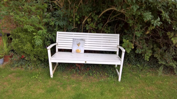
Now, simple maths tells us that a PureView zoom of 1.37x is the 'lossless' limit for the 950 XL. At that exact zoom factor, the 8MP output is effectively 1:1 from the underlying 20MP sensor. Sadly, Nokia and then Microsoft (I'm sharing the blame here) refused to give us an indent or any clue in the UI as to when this limit is reached. Instead, there's a zoom control that appears in the UI when you start to zoom in (usually by swiping upwards) and you just get + and - controls, along with a sliding indicator at the bottom of the viewfinder:
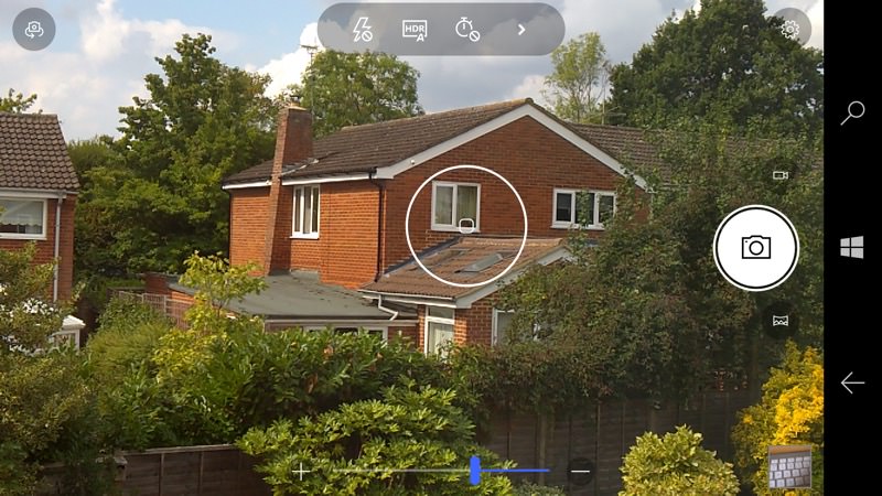
Assuming the zoom indicator is marked invisibly at 10% intervals, I've tried to get close with a series of zooms of the test (bench) scene:


The visuals bear out my maths - though the 'break even' point is rather scary in terms of the UI. You can see optimum zoom perhaps in the very first zoomed crop, i.e. just 10% along the zoom bar, and everything following that is 'made up' detail and increasingly fuzzy.
This is something I've never covered before on AAWP, but my guesstimate 10% intervals along the zoom 'line' correspond to zoom factors of:
| Zoom step along in the Lumia 950 Camera UI (approx) |
Actual zoom factor (approx) |
| 0% | 1x |
| 10% | 1.3x |
| 20% | 1.5x |
| 30% | 1.7x |
| 40% | 1.9x |
| 50% | 2.2x |
| 60% | 2.5x |
| 70% | 2.8x |
| 80% | 3.2x |
| 90% | 3.6x |
| 100% | 4x |
Now, refer back to my earlier maths and you can see that by the time the zoom slider has even got to 20% we've gone way beyond the PureView limit for this device. (As a reference, the original Lumia 1020 went up to 2.5x for lossless zoom.) In fact, we veer into lossy territory when we get much past 10% on the UI slider, which surprised me - I'd always gone for about 30%, to 'play safe', when in fact this was already seriously lossy. And my camera comparisons which involved the Lumia 950 XL and zooming usually went for 2x zoom, matching the hardware telephoto of competing devices. The table shows just how far this goes beyond what is really 'safe' on the Lumia 950 range.
It's hard to see pixel level details even with crops above, so I've gone the extra mile in zooming into the crops above too, reproducing the same detail (the letters 'ver' in the title) at each zoom factor:
 (1x)
(1x) (10%)
(10%) (20%)
(20%) (30%)
(30%) (40%)
(40%) (50%)
(50%) (60%)
(60%)  (70%)
(70%) (80%)
(80%) (90%)
(90%) (100%)
I realise that your eyes are probably completely squiffy staring at pixels by now, but I take two conclusions from all the crops above:
- There's some extra detail at 20%, but not a significant amount. In practice you gain nothing by going much beyond 10% along the provided zoom indicator. But if your fingers should slip and end up at around the 20% mark then it's not the end of the world.
- The much criticised Nokia/Microsoft digital zoom algorithm isn't as terrible as I previously thought, i.e. the text isn't really ugly as you zoom in further. From 20% onwards you do start to get a white halo around letters, but the pixellated title remains pretty smooth as you zoom 'in'.
Comments welcome if you've followed along with this super-geeky feature so far! Maybe you like shooting everything at full (16MP/20MP) resolution and just never zooming at capture time? For the 950 range (unlike on the 1020 before it) perhaps the idea of capturing everything and then cropping later is just simpler and less prone to artefacts?
