My wife, my daughter, my mum (when she was alive), half a dozen friends, all Windows 10 users now (some upgraded from Windows 7 or 8), and not one of them has the slightest idea about what to do with the Start menu's live tiles. If they need an application and it doesn't scream at them with a familiar icon from a tile then they type in its name or, often pick it from the most recently used applications in the apps list.
When I have attempted to customise theit live tiles for them (e.g. removing games and bloat, making Photos larger, that sort of thing) they've gone 'Oh thanks!', but then carried on accessing applications the way they always did. The mass of coloured tiles on their screen might as well have been pretty wallpaper.
And, if I'm honest, even on my Surface Pro I often use traditional desktop shortcuts and system tray icons rather than live tiles. In part this is because the very nature of live tiles causes their appearance to keep changing. Looking for the News or Store? Depending on the story or app highlighted, I might not even recognise the relevant tile for a good second or two!
All of which means that I wasn't at all surprised to see this, on Twitter:
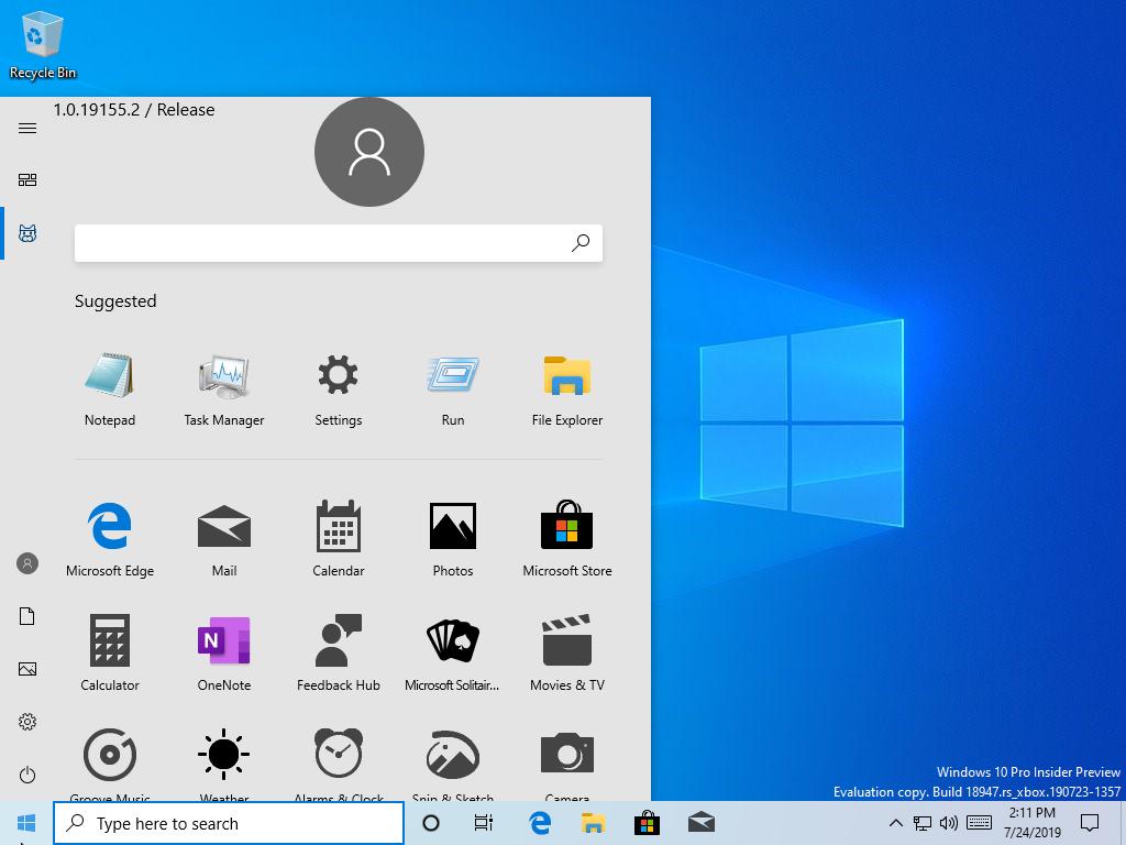
Shown here then are 'suggested' applications, i.e. the ones used most, followed by your own choice of favourite apps, all in a mainly static grid. And I agree with Zac over at WC, that this change is inevitable and probably all for the best:
Every app, whether it's a Progressive Web App (PWA), Universal app (UWP), or Win32 program, has an icon. Only a small percentage of those also have a live tile. So why build an entire user experience around something that a minority of apps support? It makes more sense to develop your user experience around the thing everyone has and make that experience the best it can be. It's also simpler, cleaner, and more straightforward for users to deal with icons instead of live tiles.
...I don't believe this pivot away from live tiles is a bad thing, either. Sure, it's sad, but once Windows 10 Mobile went away, the live tile interface really didn't make much sense anymore. I'd rather Microsoft focus on a clean, easy to use and easy to understand Start menu experience for Windows going forward.
Which hits the nail on the head really. Live tiles make far more sense in a full consumer touch ('fondle slab') interface, where your fingers are roaming a Start screen (on tablet or phone), delighting in the content displayed and treating yourself to tapping on whatever takes your fancy. On the phone in particular, customising the Start screen and making it your own tightly curated experience (here's a good example of mine) is part of the fun of owning a Windows phone in the first place. And so most owners at least have a stab at doing so. And, for most (though not all) applications, live tiles offer some extra information beyond the app's icon, usually cycling through new content to draw you in.
But on a (probably) work/productivity-centric desktop or laptop experience, most people just want to do whatever they want to do, as quickly and efficiently as possible. And for that mindset, live tiles are just... wasted.
Comments welcome, you all love live tiles on the phone, but would you miss them on the Windows 10 Desktop?