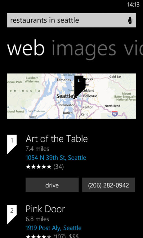
Prior to the change the web pivot already offered blended results (e.g. for news), but this is now taken much further. The most obvious example of this is when performing what Bing thinks is a local search (e.g. looking for the name of a business). With local mode triggered the top most result will be a nearby place (e.g. search for "starbucks" and a result for the nearest Starbucks is shown), with a mini map view, calling button, and drive (navigation button).
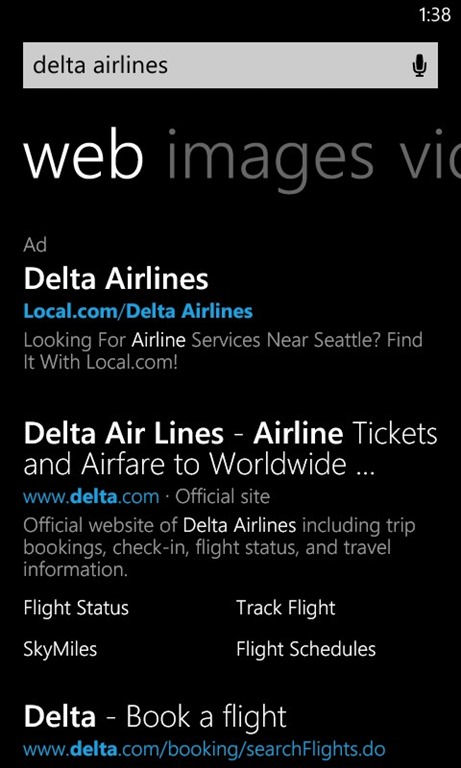
Some websites now also get rich results, providing sub links to web site sections, enabling you to get to key information faster (e.g. searching for delta airlines shows a result with rich results for flight status, flight tracking, sky miles and flight schedules).
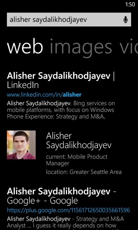
A futher example is the integration of at-a-glance snapshots for products, people and other search objects, which show key information (e.g. birth date, location, and net worth for people) and link to aggregated information pages. The aim of these results is to provide at a glance information and predictable high quality results (note this is currently available in the US only).
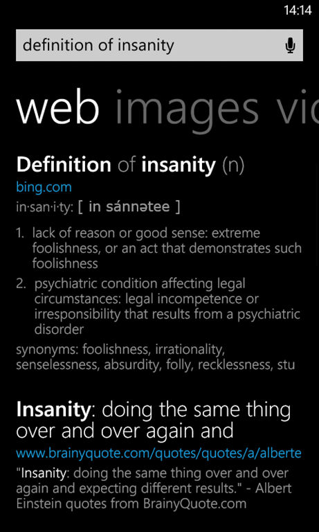
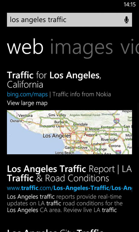
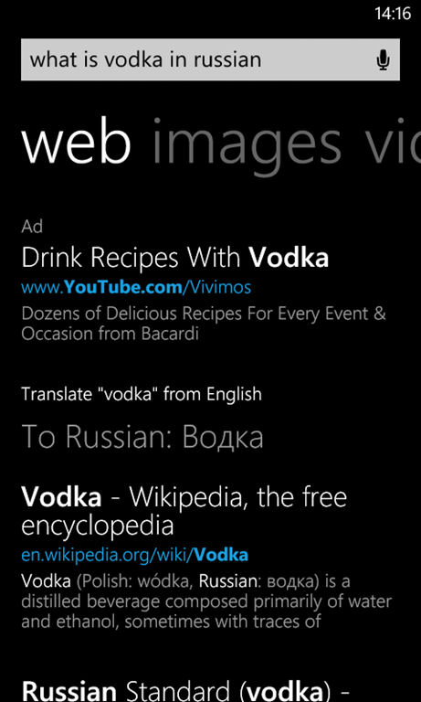
Also expanded are the Instant Answer style results that provide semantically rich result for certain queries (e.g. definitions, currency conversion, airline flight numbers, time, traffic and translation). Once the Bing update is complete Windows Phone will support 30 of these Instant Answer style queries.
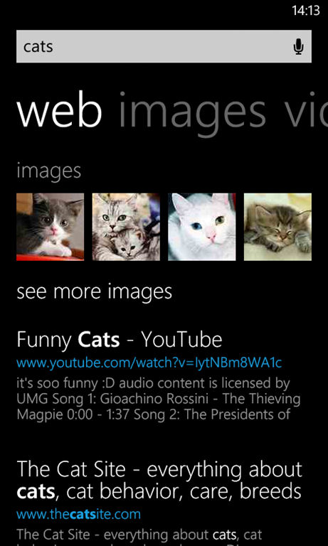
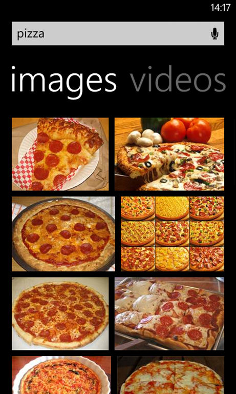
For some search terms images are blended in the web pivot, but a richer set of results is never more than a single swipe away. By separating the old media pivot into images and videos pivots media search results are effectively given greater prominence in the new layout. The image search results have also changed from a square grid layout to a cascading grid (masonry) layout, which is better suited to the different aspect ratios typically returned by search results (i.e. fewer images are "cut off" to accommodate the layout).
Microsoft release the following statement about the new layout:
“We can confirm that people will now see a refreshed experience when they use Bing on Windows Phone 8. The updated experience is rolling out gradually and will be available globally on all Windows Phone 8 devices in the coming weeks.”
What do you think of the new layout? Would you have preferred a choice of the old or new? Do you use Bing on your Windows Phone? Let us know in the comments.
Update
The official Windows Phone blog now has a post on the changes.
