Late last year, Google introduced a new version of its Google+ mobile web site - the idea was to keep it consistent across all phone platforms. This almost worked, but for some strange reason (or not, depending on if you listen to conspiracy theories) Windows Phone got missed in the testing and the Google+ site had been unusable for the millions of Windows Phone 7 and 8 users.
First of all, the display width got auto-sensed wrongly, with words being cropped off the screen. Then a revamp of the code sorted this out but broke the commenting system - you'd tap on a post to bring up the comment stream and absolutely nothing would happen. A few (in one case profiteering) third party kludges appeared in the Windows Phone Store, each fooling Google into serving up slightly different code, but none of these addressed the fundamental problem that Google's code simply didn't work in (or hadn't been tested in) Internet Explorer.
Happily, Google's code change in the last week seems to have sorted this out and Google+ is now a pleasure on Windows Phone 7 and 8. Here's the proof:
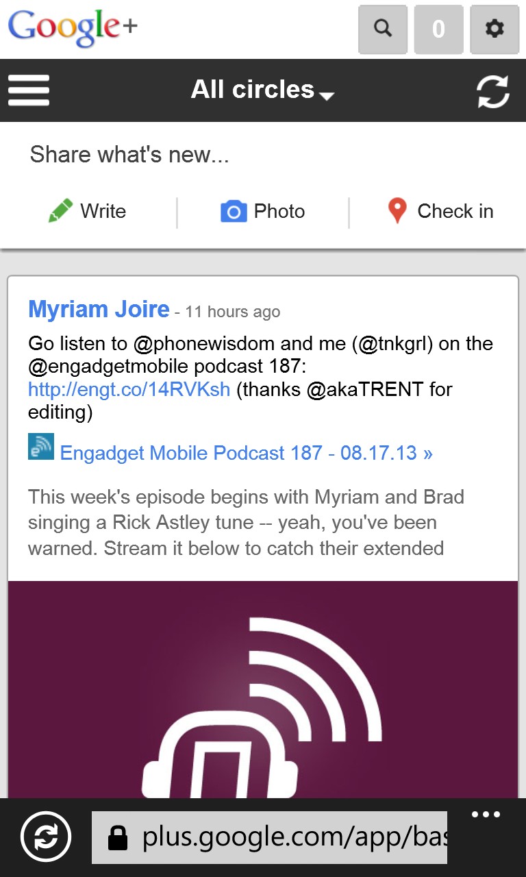
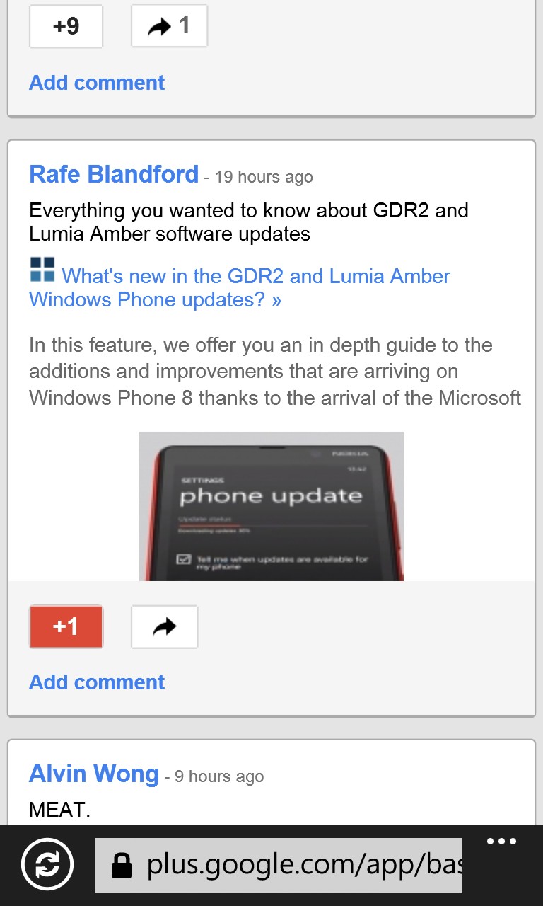
Bringing up Google+ for the first time, you see your 'All circles' timeline; (right) an individual post, ripe for tapping on, to comment.
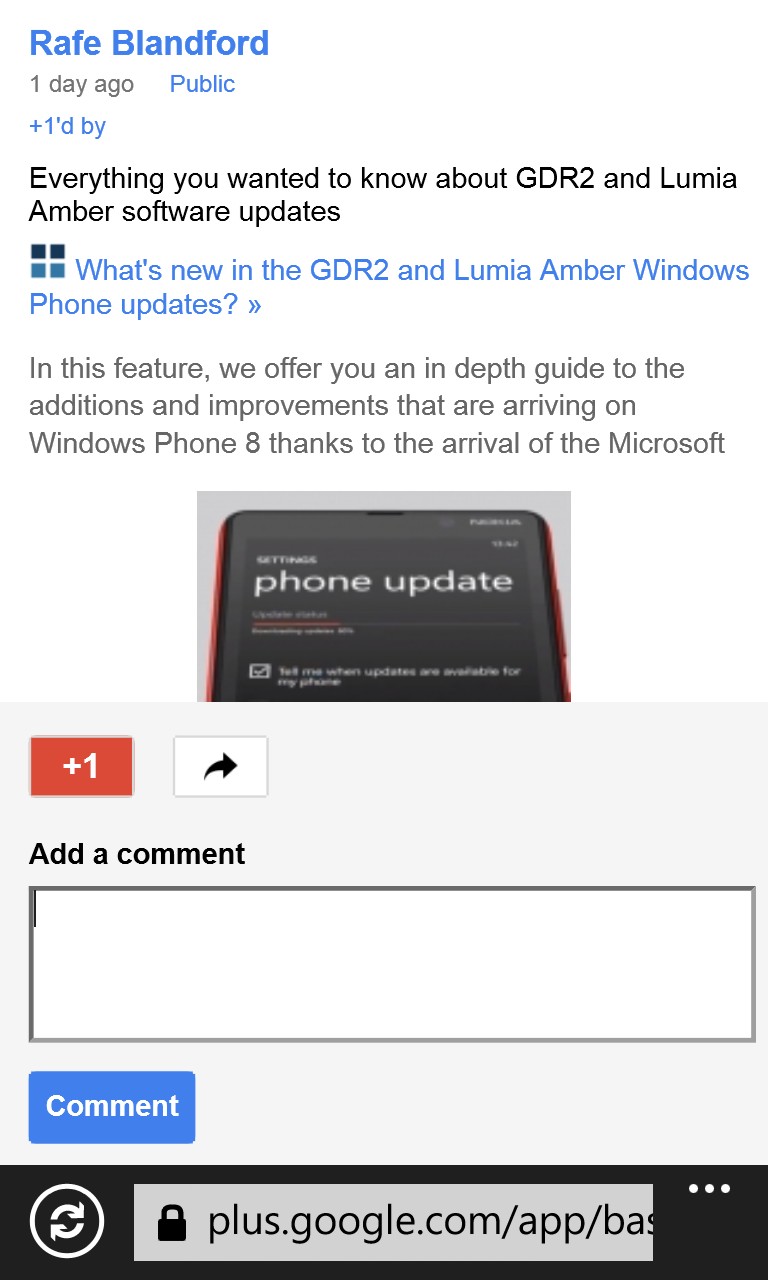
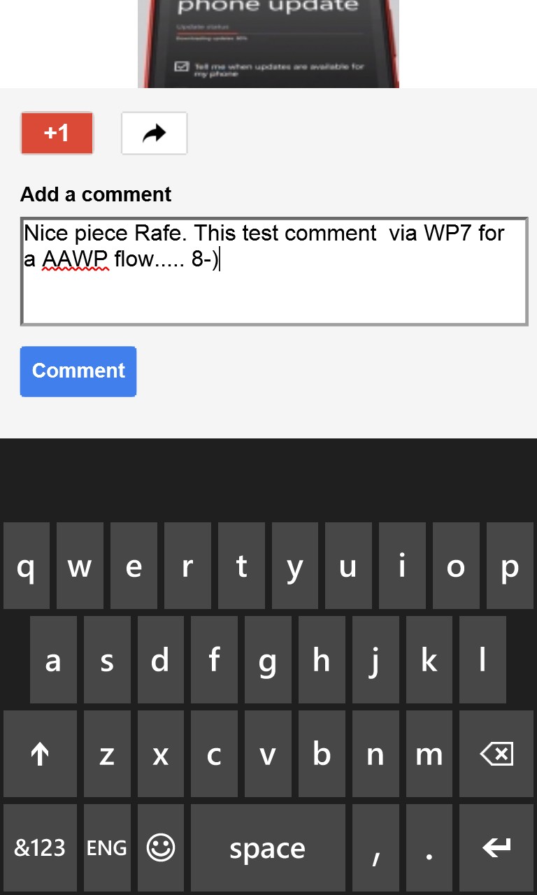
Happily, tapping on the post now does bring it up in its own page, with display of existing comments and a field to add a new one...

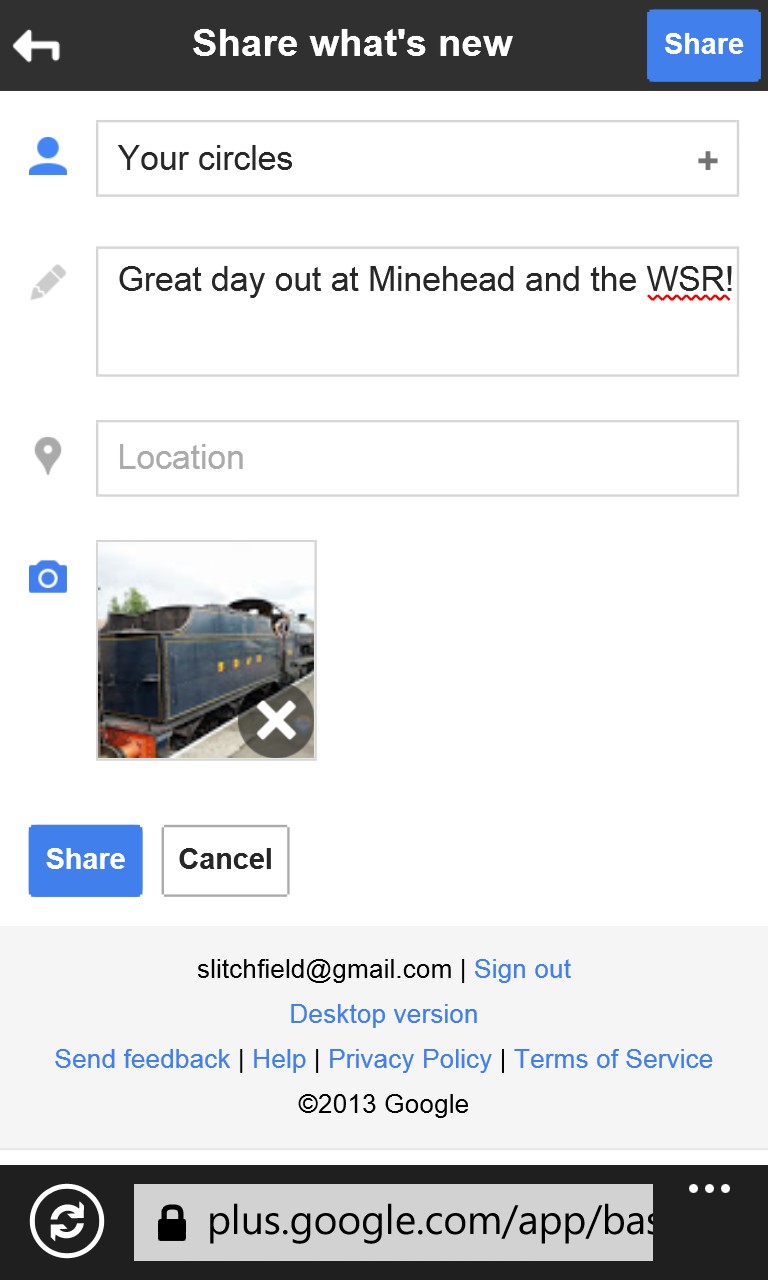
You can compose new Google+ posts by starting from a blank form, your uploaded photo gallery, or your location...
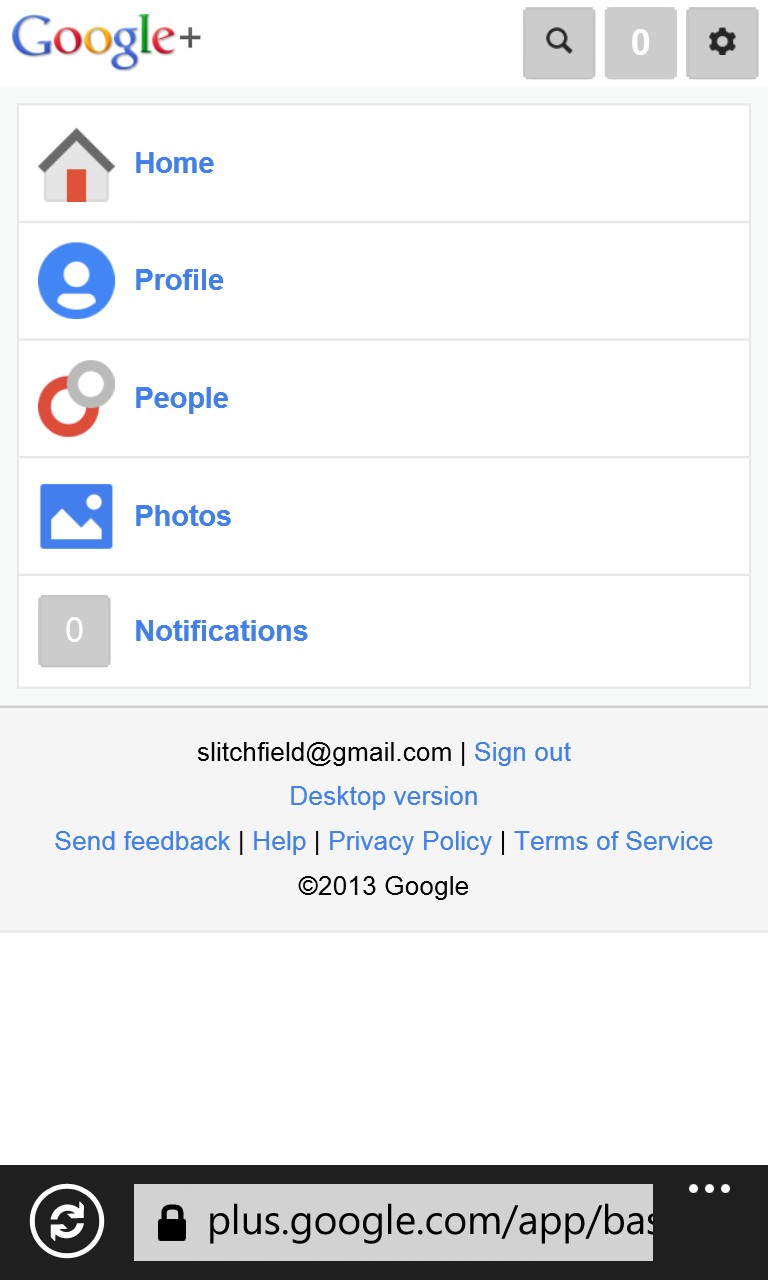
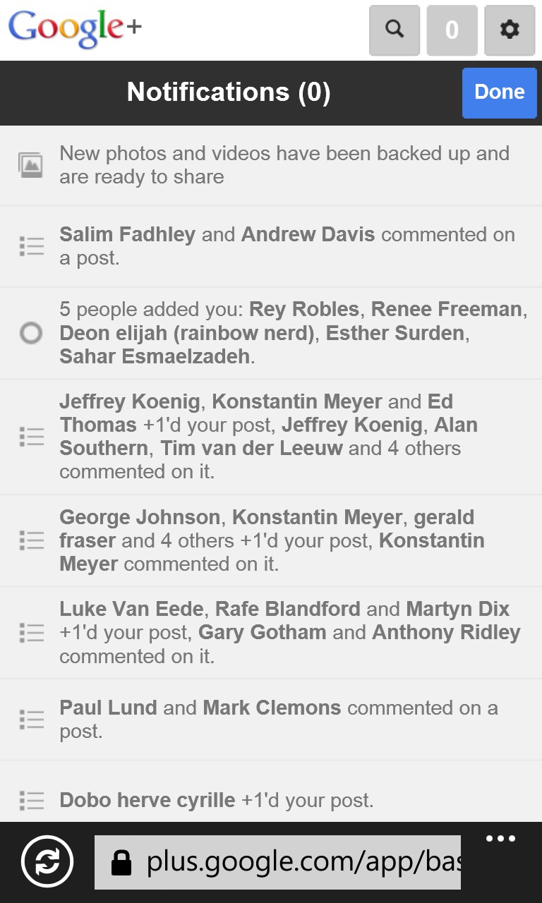
Tapping the /// menu, top left of the main Google+ home page, gives you this simple five way menu - on the right is an example of how notifications looks and, yes, tapping on any notification takes you straight to the relevant post or page.

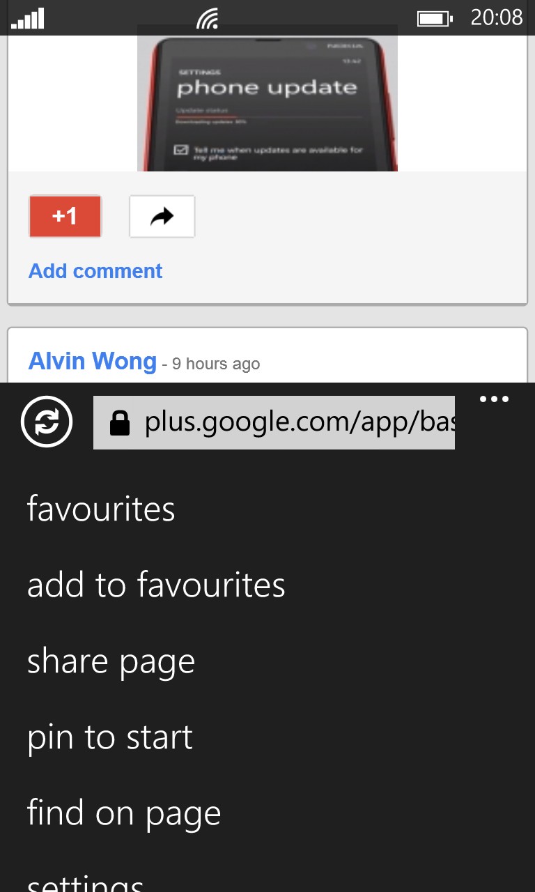
The Profile section, as you might expect, gives access to your bio, post list and uploaded/shared photos; (right) the '...' menu shows two easy ways of making Google+ easier to get to in future.
It's a shame, throughout, that there's no full-screen mode (or auto-hide system) in Internet Explorer, since it looks a little messy always having the web address bar shown. Maybe Microsoft can do something about this in a future platform update?
The address to type into Internet Explorer to get to all this is 'plus.google.com', but it's a doddle to also:
- 'add to favourites' (on the Internet Explorer '...' menu)
- 'pin to start' (also on the menu) - a thumbnail gets created, which is of slightly random nature. Anyone know how to replace this with a proper logo?
For someone who loves Windows Phone and its hardware but also wants to keep a toe in the world of Google and Google+, the world just got simpler.
