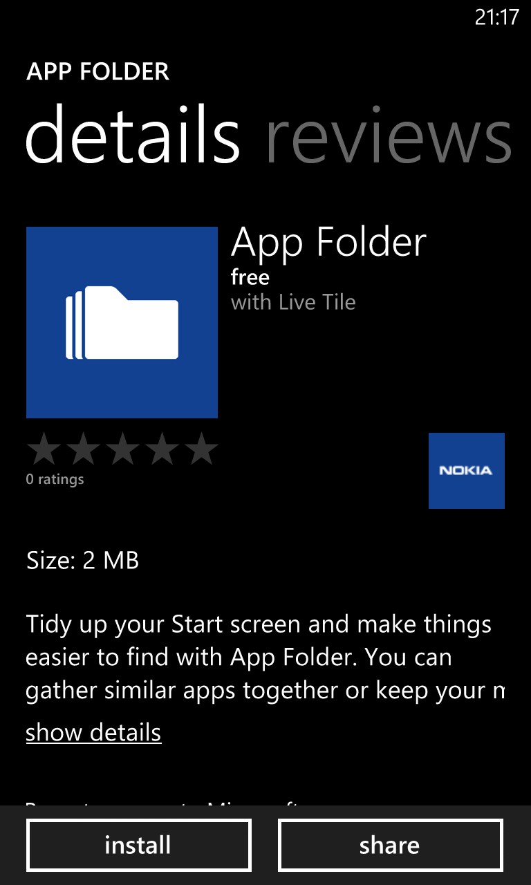
As we say yesterday, the user interface for App Folder isn't physically part of the Black update, it's a separate app in the Nokia Collection. This can be searched for and installed on any Lumia, I put it on my Lumia 920.
Here's App Folder in action:
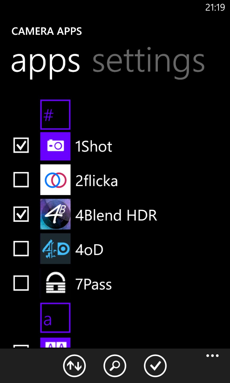
Once started, you opt to make (and name) a folder, then pick the apps you want included.
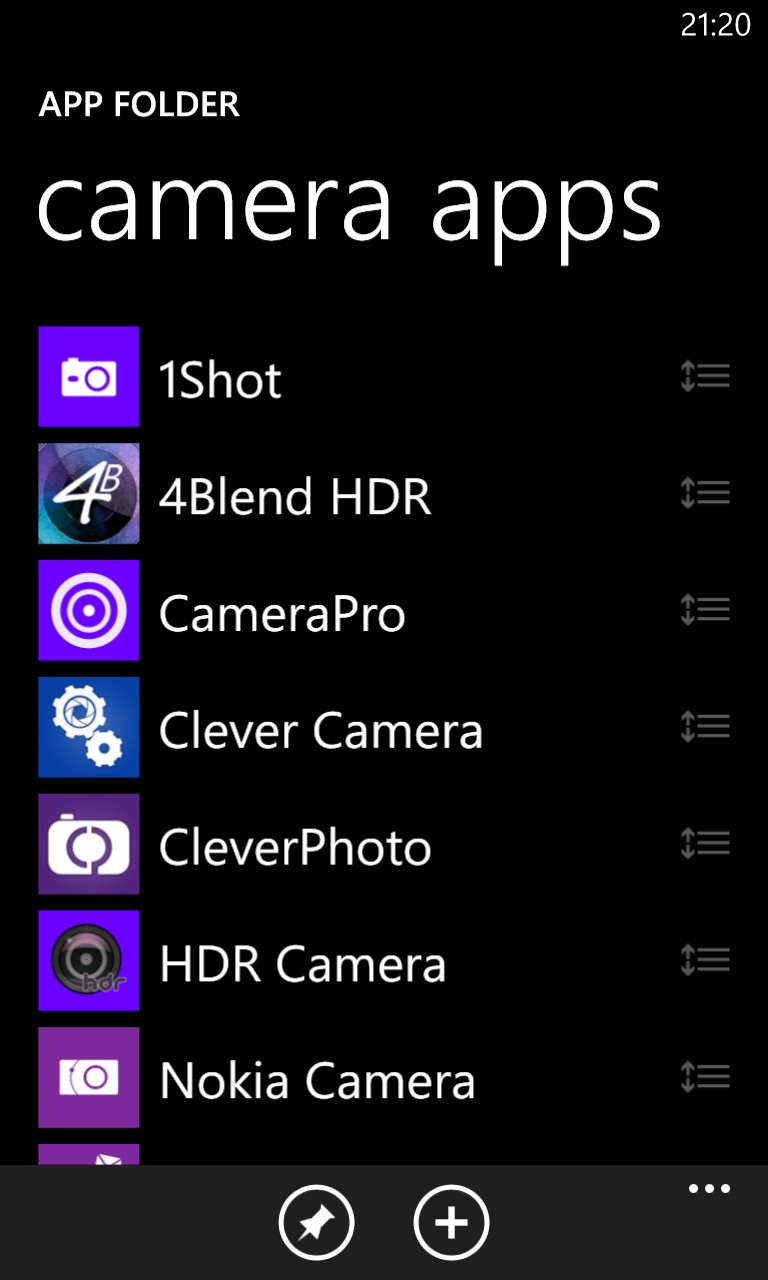
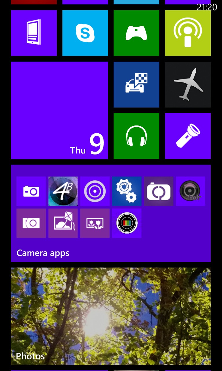
The end result, as you can see above, is a neat group of up to 12 application icons - if you specify more than 12 in a group then the extra ones don't get shown in the double wide tile shown here*.
* if the tile is reduced to 'single wide' then you see the first six icons only; if reduced to single width (i.e. the smallest size) then you just see four icons.
However, tapping on any icon in the tile just results in App Folder itself being launched, showing the list of applications listed in the folder, you then have to swipe to, and tap on, the app you need.
How is this an improvement on simply putting (say) up to eight application shortcuts in a double wide space on a Start screen? In this latter case, each application is available with a single tap, as opposed to a tap, then a wait and then a swipe and then a final tap:
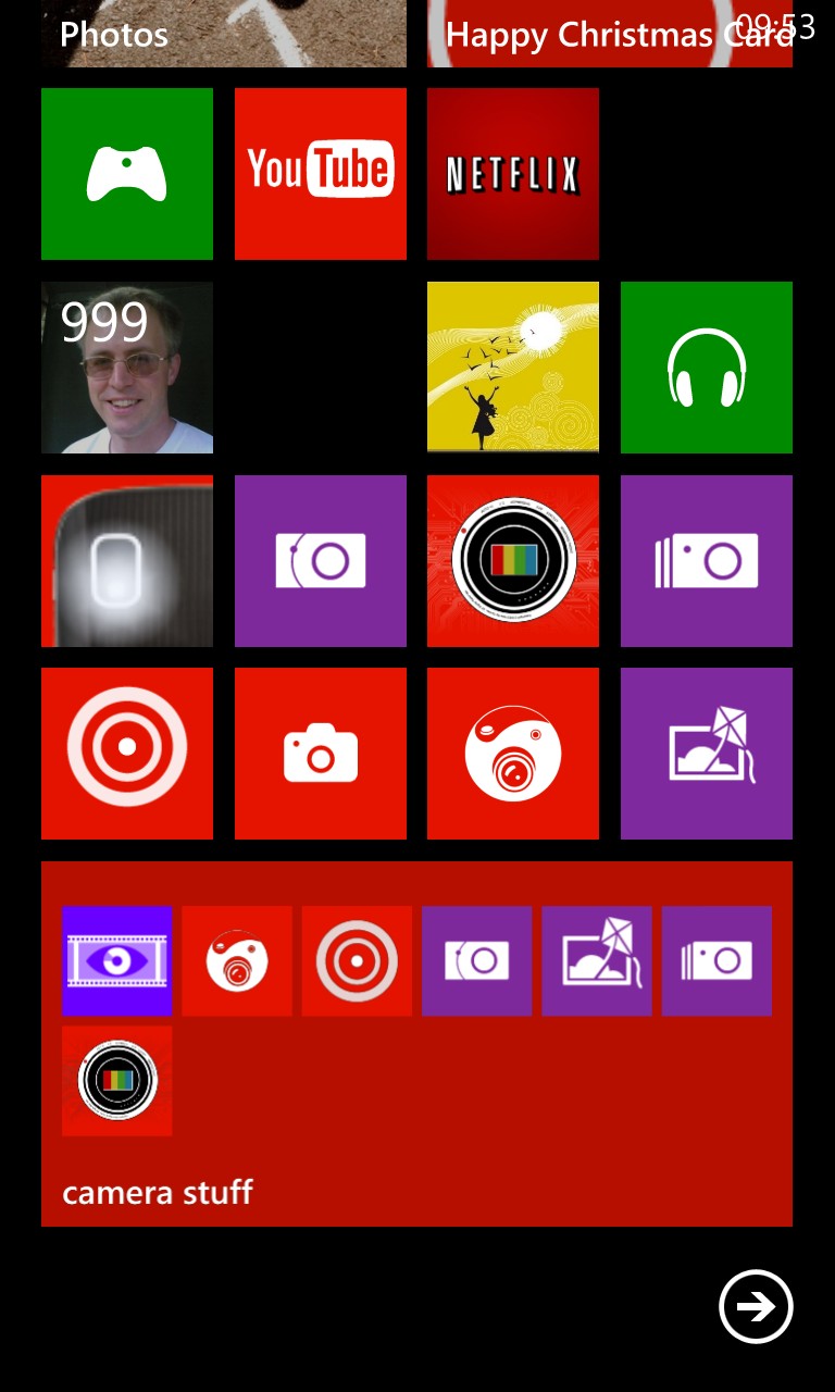
In short, yes, it's great that App Folder exists and that it's available for all Lumias. It may even help some people with thinking about which applications they use, but in an ideal world surely the individual icons in the App Folder tile should be directly selectable? The current system is significantly slower than having direct application shortcuts and with only a minimal space saving on the Start screen.
Of course, the answer is probably that the Start screen architecture doesn't allow for selecting individual tap points within a live tile. In which case we may have to wait for the next version of Windows Phone (i.e. beyond Black) in order to genuinely get this sort of Start screen innovation.
