From the myTube description in the Windows Phone Store:
New in latest updates:
- New app design and logo
- Ability to choose the color scheme in the settings
- Fixed Google+ comment loading issues
- Issues with offline playlists fixed
- "Very high" thumbnail quality option on high memory devices
- Background audio now uses an audio-only stream, instead just playing audio from the video stream, for reduced data usage
- Big fixes
You've got to chuckle at the last line of that changelog - maybe there really were 'big' fixes, in which case phew? Or maybe it was simply 'bug fixes'...(!)
myTube works very well in terms of bombarding the user with information, options and suggestions - it's impossible to be bored once you start browsing - though it's also a little confusing sometimes and more than once I had to back out of the application in order to get my head around where I was in the UI:
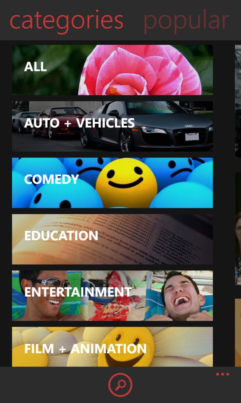
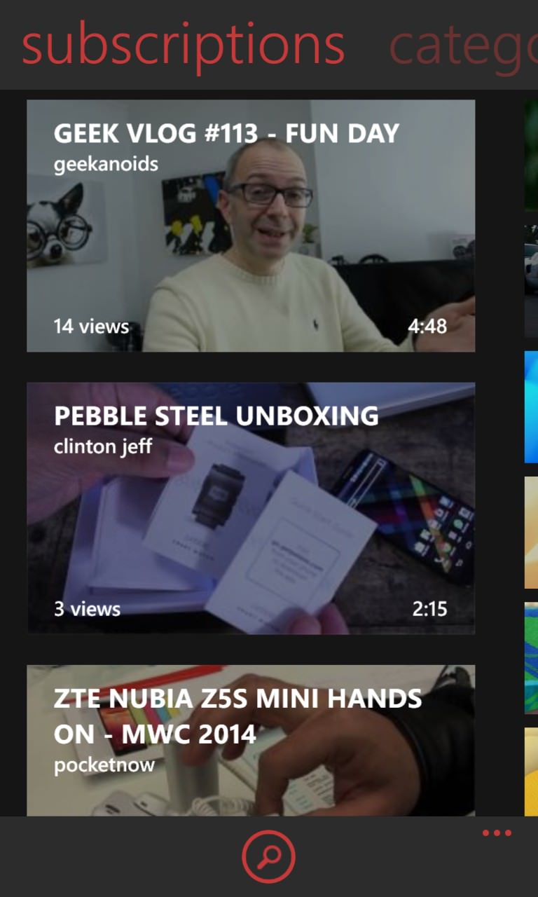
There's terrific use of high quality video thumbnails to illustrate the UI and content - gone are the old small graphics from the old days of YouTube...
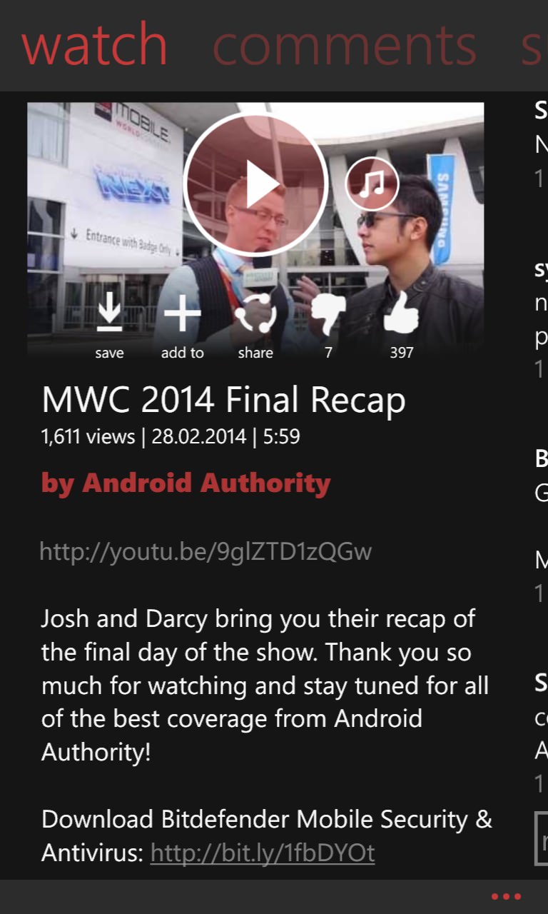
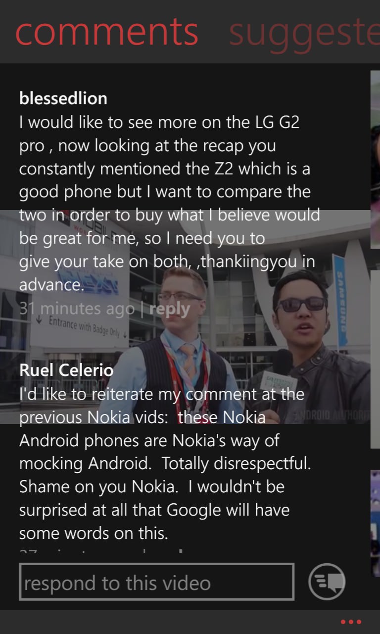
myTube's USP is the way it allows videos to keep playing even while you're exploring their metadata and reading comments (shown above) and suggestions. Yes, it's a little unnerving reading text over video playback, but you get used to it and, for talking heads style videos, you're not missing much anyway!

Rotating the phone during playback brings up the full-screen player and with side swipes cleverly operating cue/review within a video...
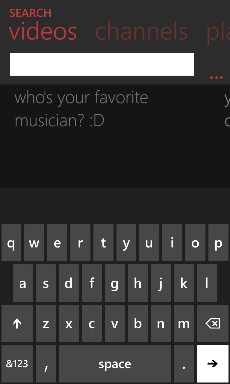
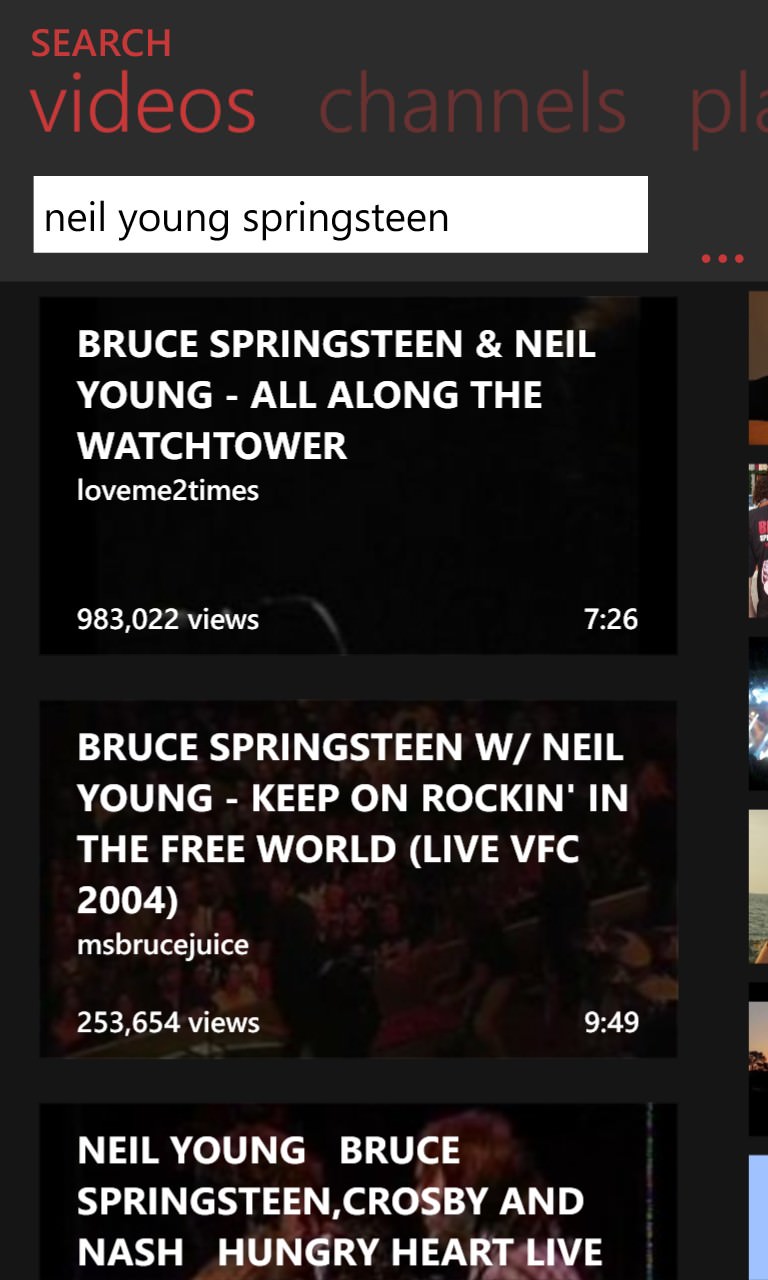
myTube is quite delightfully persistent at every stage in suggesting things you might like - even the search box above pops up a question to give you an idea of what to type!
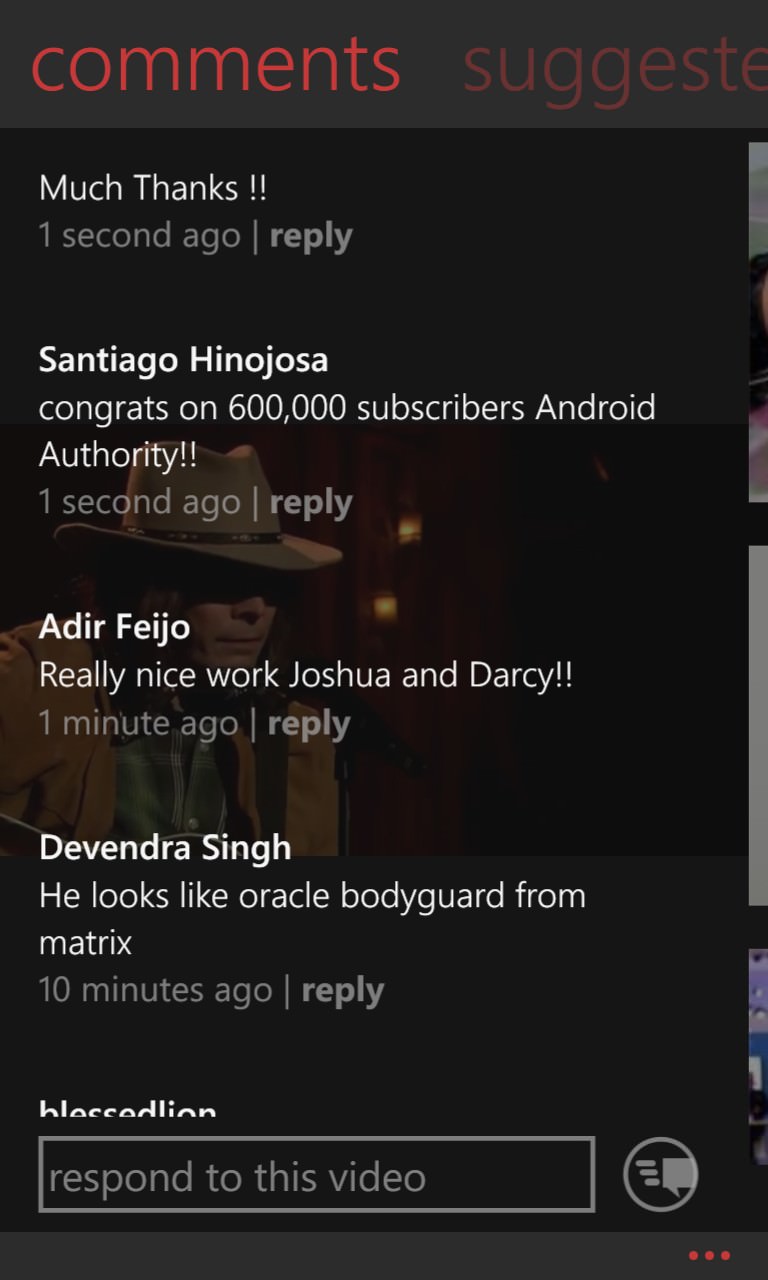
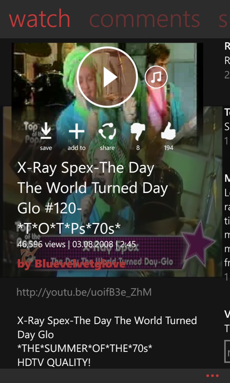
Everything's not all rosy though - here the wrong comment stream is superimposed on another video (left), while (right) the superimposition of thumbnail/info on a video stream can result in some very ugly effects. Admittedly not helped by my choice of video here(!)
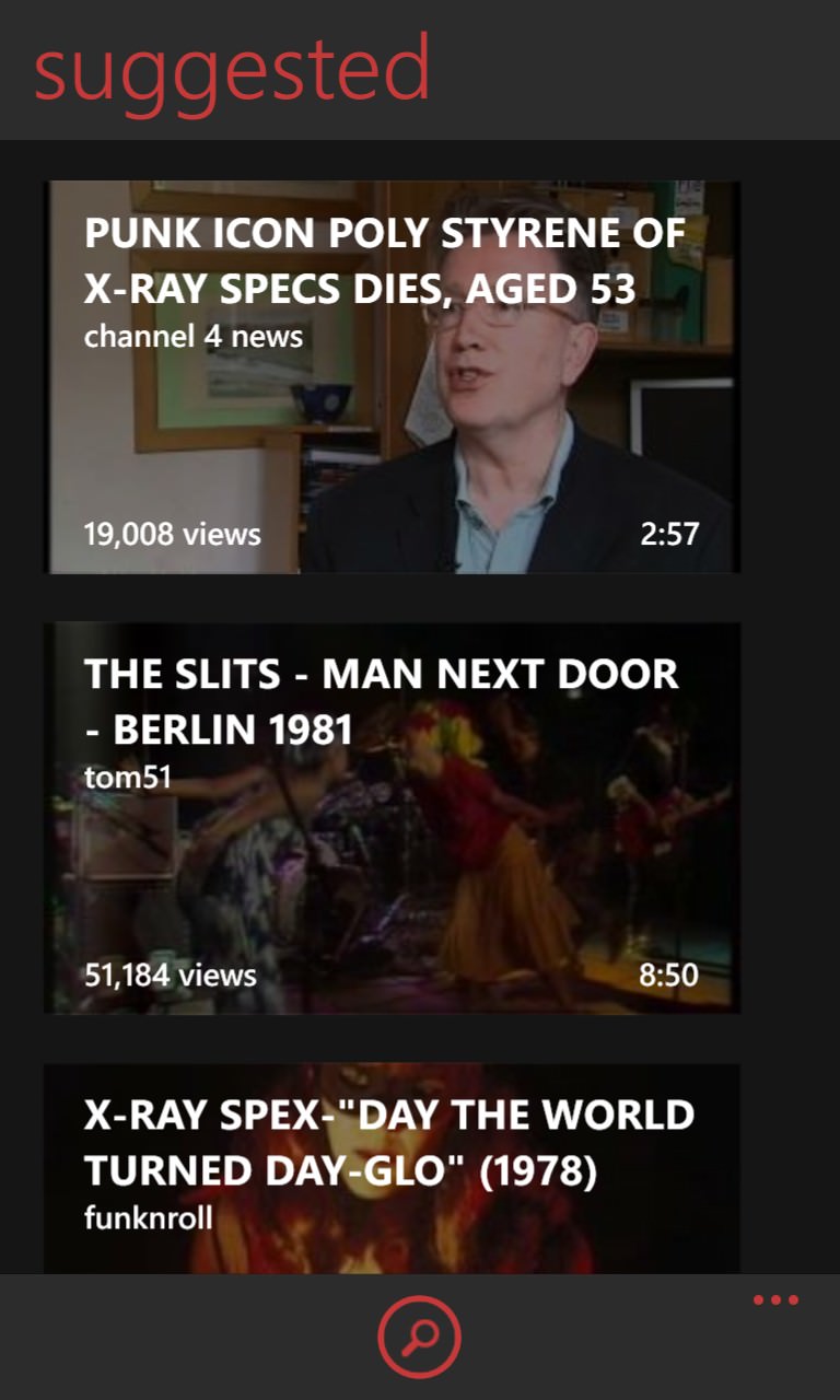

The accuracy of the suggestions comes from YouTube itself, of course, but myTube does an excellent job of presenting it all, and with the new high-res video thumbnails; (right) even when you start off, rather than a blank playback screen, you get a cheerful comment and a smiley(!)
Great to see the evolution of this tool, overall, though. Comments welcome if you've tried it too?
You can try or buy myTube here in the Store.
