From the developer, Rudy Huyn, comes the changelog since the last time we featured Dropbox, back in the summer:
Dropbox 4.5 for Windows 10:
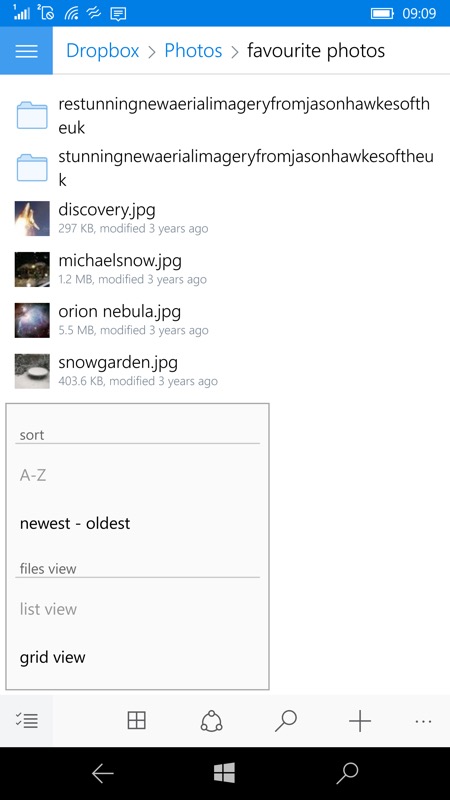
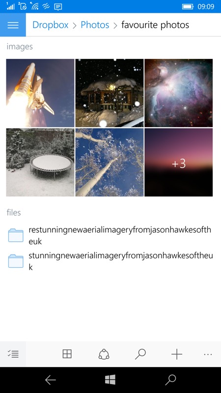
- introducing a new view style ‘grid view’ that provides a segmented folder view grouping photos and videos into a grid view, and files, folders and upload in progress into list view.
- links becomes clickable in comments
- UI improved: better adaptive design, animations, blur effect, etc...
- better support of Xbox controllers
- optimization and bug fixes
Here's the new version in action:


Debuting the split grid view, with dual grids (images/videos) and listing of relevant folders...

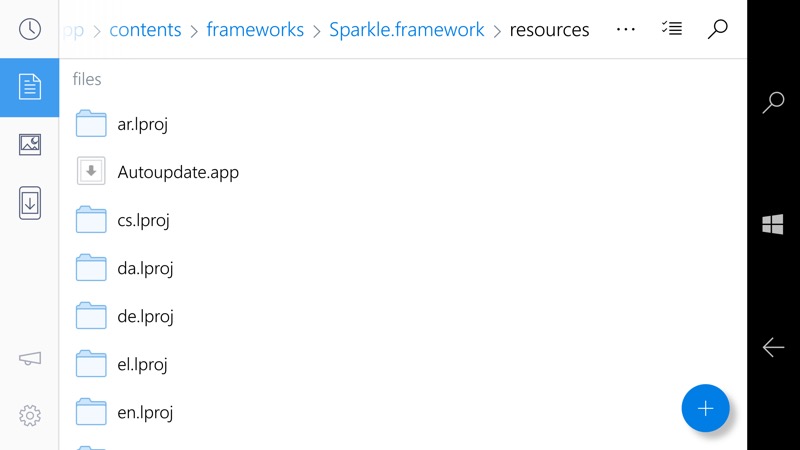
Dropbox's UWP app is extraordinarily 'Windows 10'-compliant in terms of style, here in landscape mode (which will also work well for Continuum)...

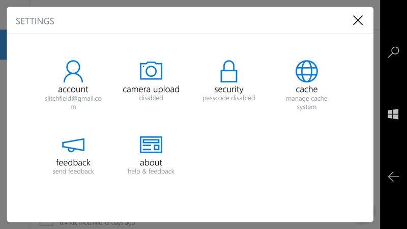
...and the Settings pane is virtually identical to Windows 10's own Settings....
Dropbox UWP app for Windows 10 is something of a star in the ecosystem. Perhaps even the best Dropbox implementation in the mobile world? It's free anyway, as is a Dropbox account. You can grab or update the Dropbox UWP here in the Store.
