Podcast Lounge was deemed just about the 'Rolls Royce' of podcatching applications for Windows Phone 8.1, but in this brave new world of Windows 10 and podcatching UWPs we've yet to see the application reimagined. The wait is almost over though, as these screenshots should show:
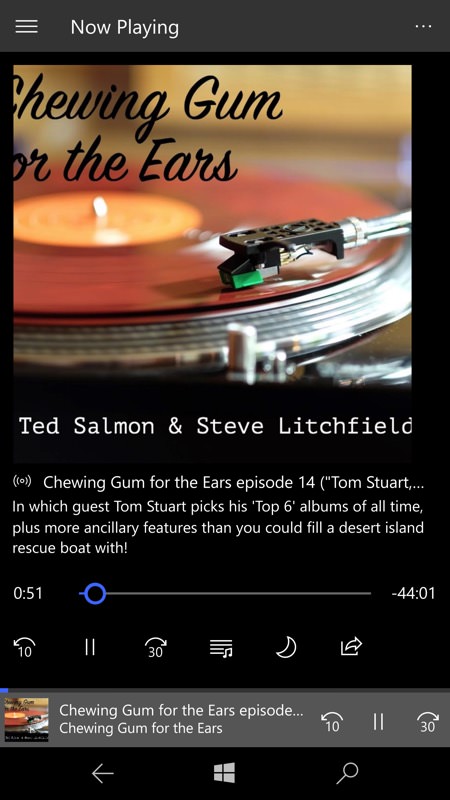
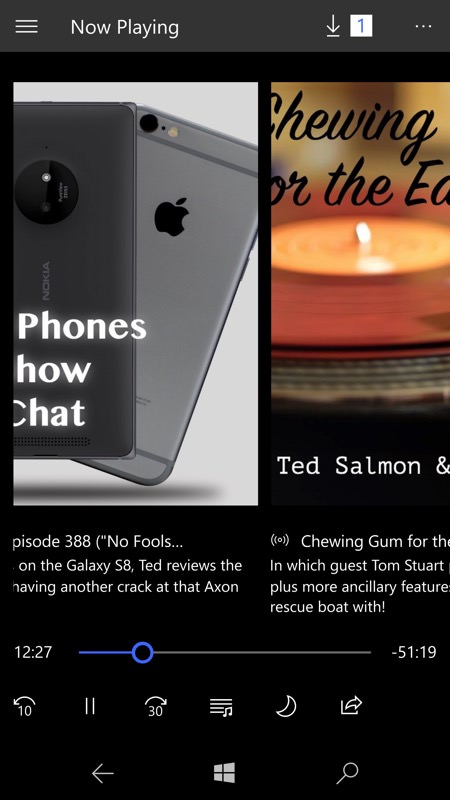
Playing one of my favourite podcasts (ahem), it's a clean and very Windows 10-styled UI, with the twist here that you can swipe between podcasts in your current playlist, with each picking up their last playback point perfectly as you do so. Really neat.
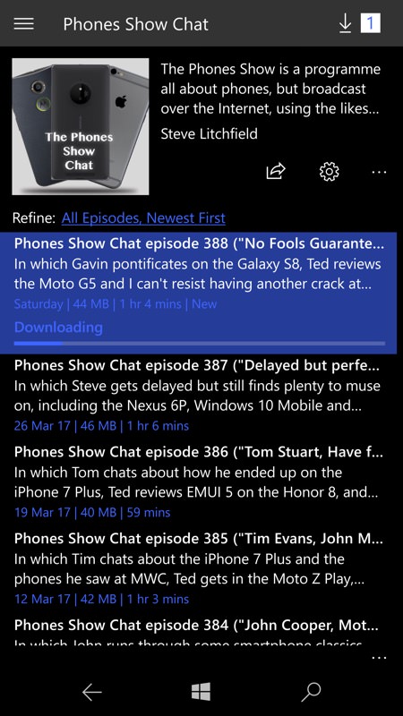
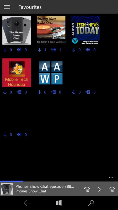
Browsing through shows in a podcast feed - there are long press options too, though not shown as they look a bit unfinished at the moment; (right) the main 'Favourites' grid also looks unfinished, with some podcast artwork not current displayed. All very clear though, with the currently playing show only a tap away at the bottom of the UI.
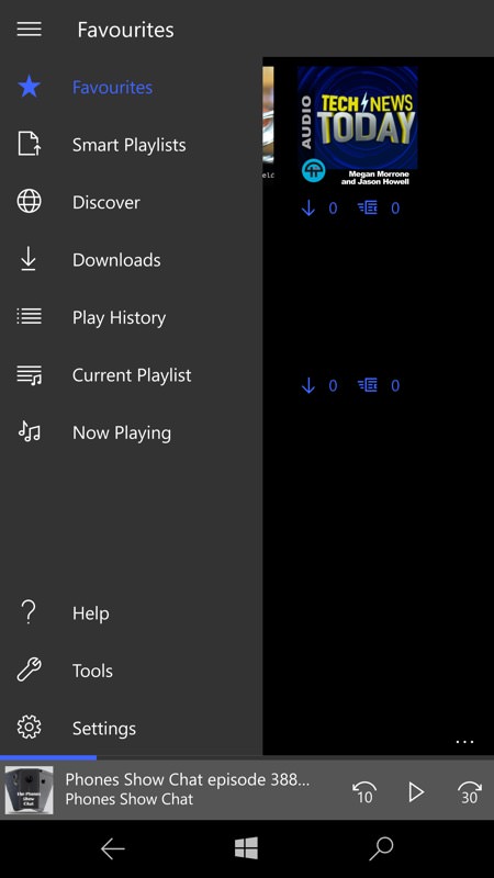
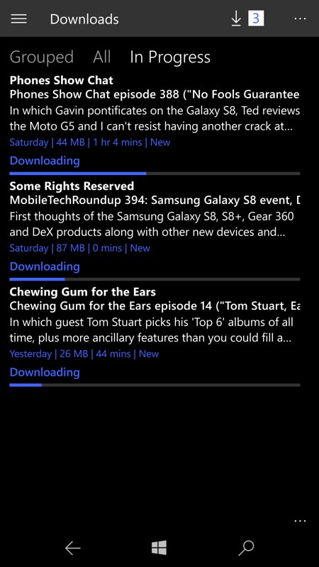
The main hamburger navigation menu; (right) the Downloads pane shows current downloading progress.
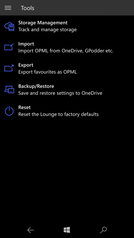
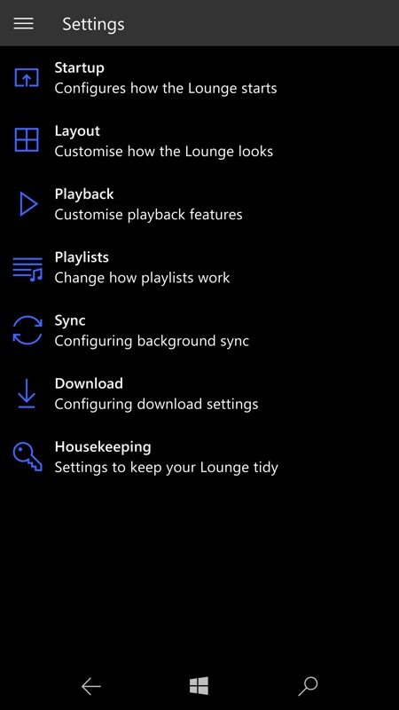
And so to some of Podcast Lounge's traditional strengths - all the tools and settings and configurability...
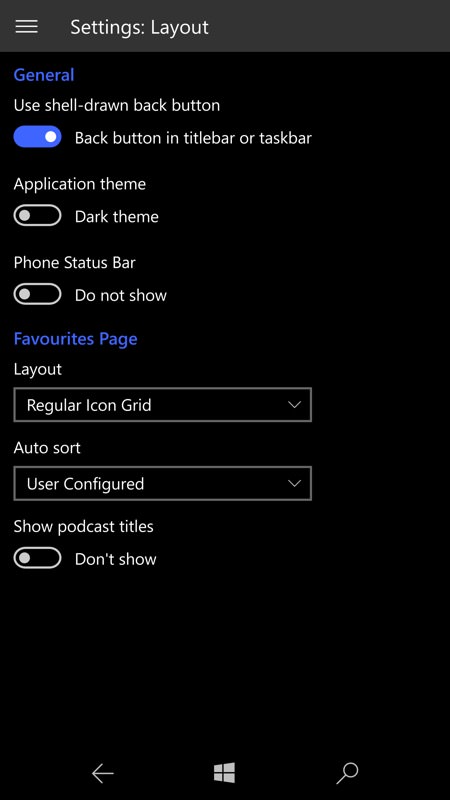
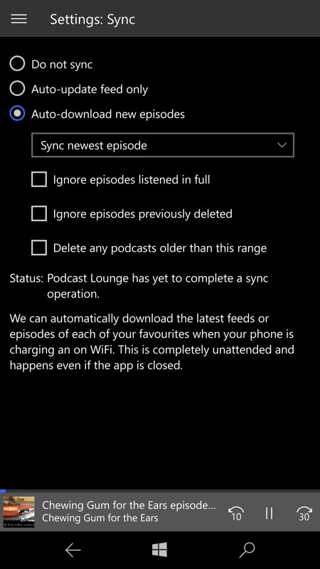
There's the choice of light or dark themes and various layout options, so suit all tastes; (right) syncing podcasts auto-downloads anything new, as you'd expect.
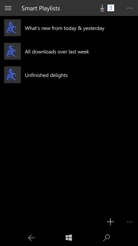
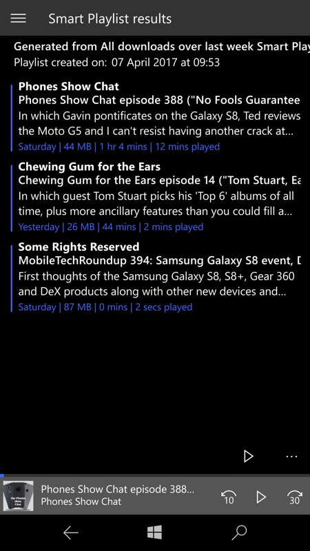
The 'Smart Playlists' are Podcast Lounge's way of presenting 'What's new?' - here are three shows it's identified from the last week, for example.
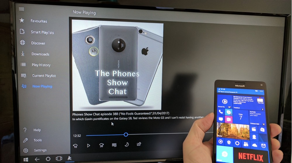
And, just to prove that this is a full UWP app for all Windows 10, here's a shot of the interface on a Continuum display:
I'll keep you posted as and when the beta goes public or it gets a formal release in the Store.
