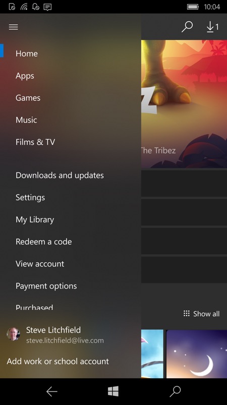
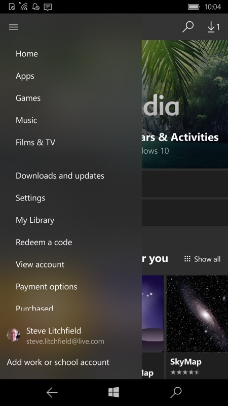
Here's the new Store in action on my Lumia 950 devices:


Windows 10 Mobile continues to get better and better looking - such a shame that all of this is coming in a climate of mobile hardware apathy from Microsoft. Every time I pick up one of my W10M phones I'm overwhelmed by how grown up and professional the interface is. Well, usually, there are still exceptions, plus some miscreants which are still slow and clunky.
Still, anyone with a modern Lumia or Elite x3 or IDOL 4 Pro (or similar) should see this update now. From my tests, it seems to require the Fall Creators Update (branch 1709) etc. (roll-out, Insiders). Update: this is now rolling out to those on the Creators Update (branch 1703) too.
Comments? What do you think of the new Store look? Performance seems to be an issue sometimes, though slowdowns are somewhat erratic, I suspect there are bandwidth concerns here and that cleverer caching is needed, Microsoft.
