From an MSPU article:
The update brings along a very attractive dark theme, giving the options of the default, light and dark appearance of the app.
More importantly, the app will now sync passwords with the desktop version of the app, just like the iOS version, after you log in and verify the device using some form of 2-factor authentication.
The browser uses a WebKit rendering engine and is smooth and fast on most Android devices. It offers such features as synced favourites, a synced reading list, continue on PC support, a feed adjusted to your interests, the choice of multiple search engines, auto-fill forms and passwords and can be set as your default browser.
It seems if Edge is your default browser on the desktop currently there is very little reason it could also not be your default browser on your android phone.
Microsoft Edge for Android isn’t available to all users at the moment, and you will have to join the preview program to be able to get your hands on it. The preview program is open to everyone though, so you can sign-up for it here. Once you are part of the preview program, you will be able to get the browser on your Android phone here.
What with Rafe and I chatting about Microsoft apps and services on Android in the podcast, it seemed appropriate to at least try this new beta of Edge on Android - is it a dramatic breakthrough in the browser experience? Not really, but it was interesting:
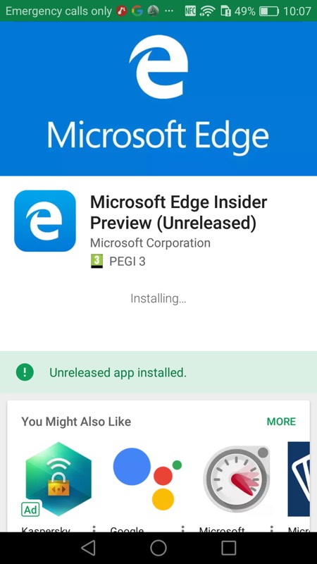
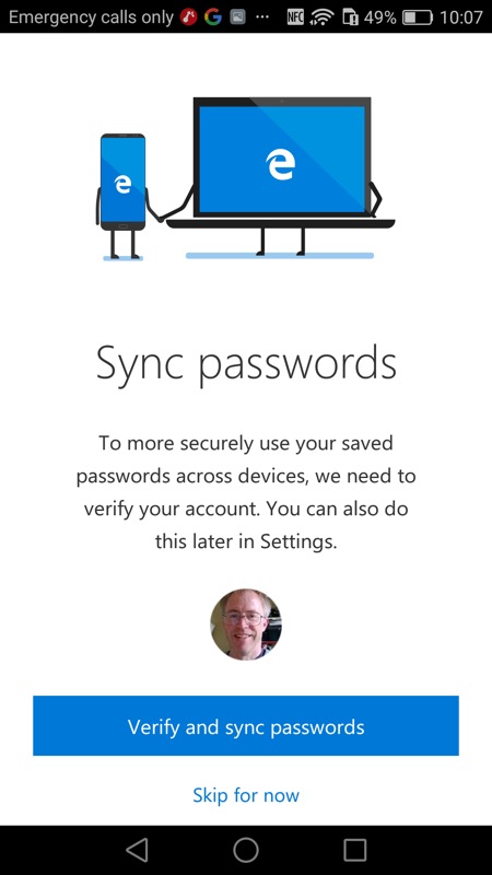
You have to follow the specific links (above) to get to the Preview, but it does all join up; (right) once installed, you're offered the chance to sync your passwords through your Microsoft account from other devices (e.g. Windows-running phones)
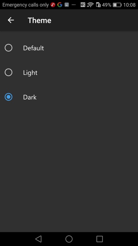
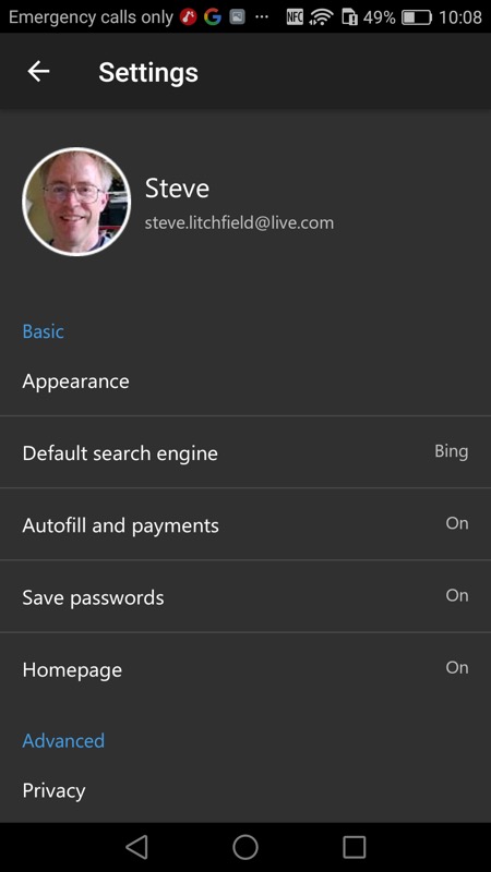
'Appearance' is front and centre and it's a no-brainer on an AMOLED-screened phone to keep it 'dark' as much as possible.
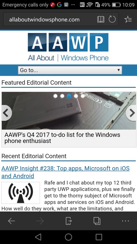
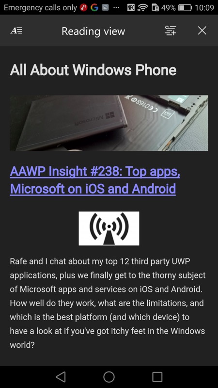
Unfortunately, the theming only applies to all screen furniture and menus, not to the web pages themselves. Yes, I know that changing the styling conflicts with what a web designer might have specified back in his cosy office, but why shouldn't the user have a choice? (right) there's a workaround of sorts, with the built-in Reading mode, which strips out anything unnecessary and - yes - can be part of the 'dark' theme. So we (kind of) got there in the end!
Comments welcome from web authors - is there a major reason why web browsers don't offer dark backgrounds with light text? What am I missing? The power savings for AMOLED screens would be enormous. Surely it's just a case of switching out white or light backgrounds for all-black (or dark grey) and then making all HTML text white?
