The app layout optimisations apply only to the built-in apps. While it is possible for third party developer to optimise the layout of their own apps for display on large screen devices, but, at the time of writing, there were no known examples of this.
These changes to the ways apps are displayed are aimed at optimising the display of app on bigger screens (five inches and above). As we noted in ourLumia 1520 review:
A bigger viewing area has two theoretical uses. Firstly, it can be used to display more content at the same size as a smaller screen (e.g. additional lines of text on a web-page). Secondly, it can be used to display the same content as a smaller screen, but at a bigger size, making things easier on the eyes.
The changes in Windows Phone 8 Update 3 fall into the first of these scenarios, but it's only rarely just a simple question of scaling in line with the increased physical screen size. When combined with the fact that some apps are not changed at all this means the software experience of Windows Phone 8 Update 3 on large screen devices mixes both the scenarios outlined above.
Beginning with the Start screen this video walks through some examples of the way apps are displayed differently on the Lumia 1520 (large screen) compared to the Lumia 925 (standard screen). In the video we note there are some small differences that can be explained by the differing aspect ratio of the two devices (16:9 for the Lumia 1520 and 15:9 for the Lumia 925), but these are very slight set against the differences introduced by app layout optimisations.
The screenshots below are taken from those shown in the video above and illustrate a number of the different techniques (and their implications) that Microsoft has used in optimising Windows Phone 8 for display on larger screen devices. Each pair of screenshots has been adjusted to offer an approximation of the size comparison between the screen's of the Lumia 1520 (right) and Lumia 925 (left).
The extent to which it is possible to zoom out from an Excel sheet has been adjusted upwards for the large screen devices, which means it is possible to view more content of the screen at one time (e.g. see how extra columns and rows are visible). This is an example of a scaling change, but, because there's no change in the default zoom level (i.e. when you open a spreadsheet), it is not immediately obvious when you use the app.
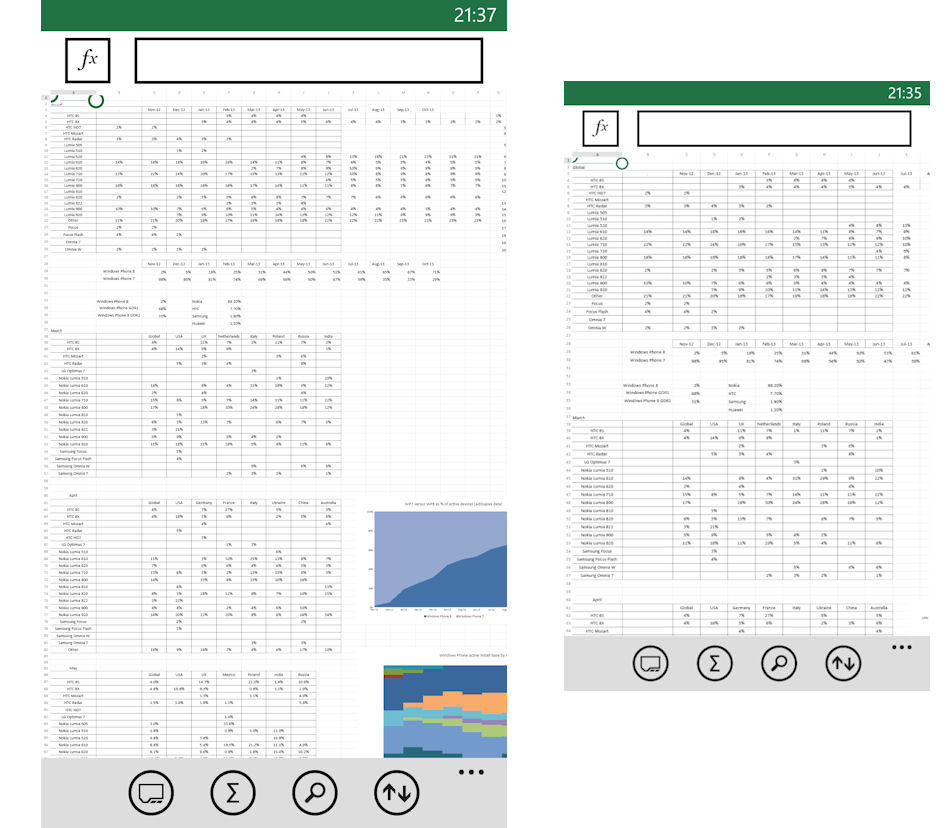
When an Excel sheet is viewed at the same zoom level (default) the scenario is of showing the same information, but at a bigger size, as illustrated in the screenshot below (i.e. scaling). The result is that on screen information is easier to read. It's worth noting that, in the case of Excel, the bigger screen also means the usable zoom level (i.e. when you can still select individual cells for editing easily) is different between the two devices, with the advantage obviously going to the bigger screen.
The same "usable zoom level" benefit can be found in Internet Explorer, especially when viewing websites designed for viewing on laptops or desktops. For mobile web sites this does not usually apply as there's often no pinch-to-zoom (depends on how web site is written). This zoomed out use case is, along with the viewing of photos and videos, where the additional pixels (1080p versus 768p) and higher pixel density (334 versus 368) have their greatest benefit (for Lumia 1520 versus 925), something that is not really possible to demonstrate via a screenshot.
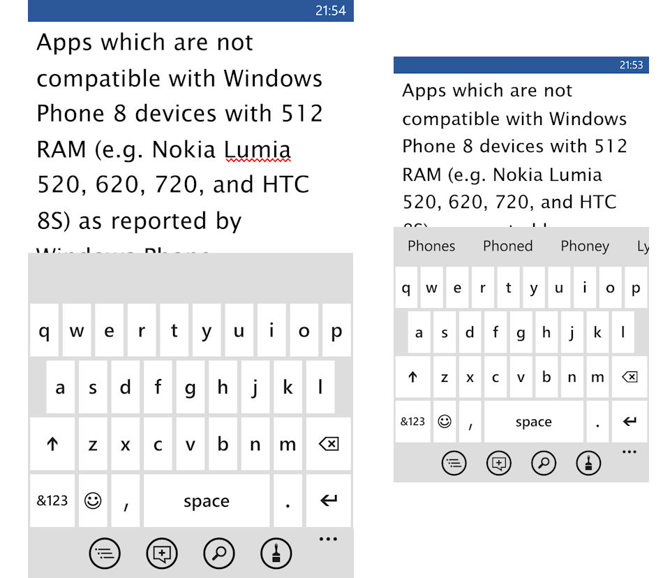
The on screen keyboard is an example of straight forward scaling. The benefit here is that the keyboard, and the individual keys that make it up, are larger. This makes it more comfortable to use and reduces the number of miskeys (i.e. faster text input). The large size does mean that, for most people, the only practical way to enter text is with two hands.
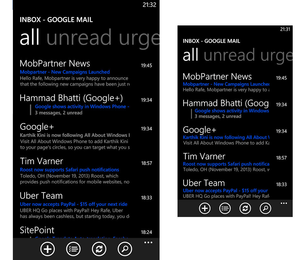
The Email app is a less straight forward example. Scaling is employed, as can be seen in the "larger" text size of the headings, but there's also user interface customisation. Specifically, there's an additional line of body preview text shown in the inbox (and folder) listings. The consequence of this is that you see roughly the same number of emails on screen at one time, but you also see a bigger preview (possibly making in easier to triage the email in question).
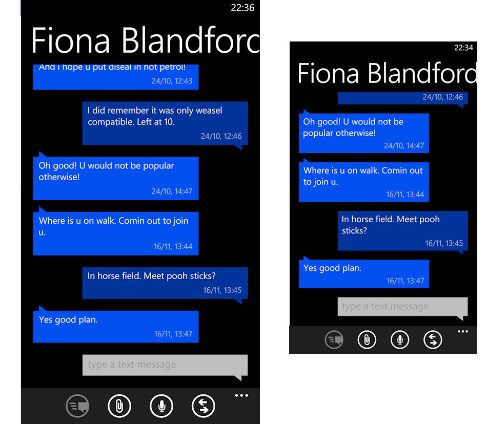
In the Messaging app the bigger screen is used to display additional incoming and outgoing messages. While the header text (name) is scaled upwards, the text for incoming and outgoing messages is not (as can be seen in the screenshot they are roughly the same physical size). Consequently a greater part of the conversation can be seen on the larger screen device. This type of app display optimisation is used in a number of the other built-in apps, including the Windows Phone Store app (lists of apps and games) and in the Music+Videos hub (list of music).
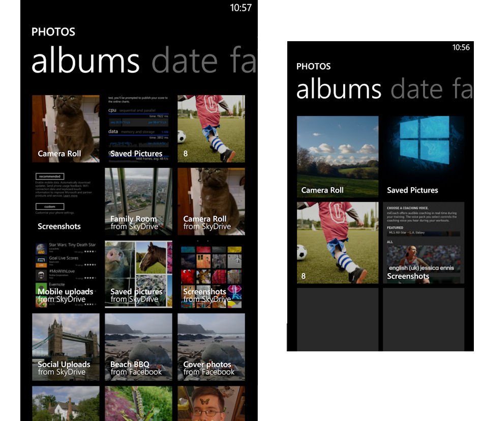
Another example of the screen being used to display more information can be seen on the albums index page in the Photos hub, where three album tiles are shown across the page instead of two. In this instance the album tiles are physically smaller in size on the large screen device than they are on the smaller screen device.
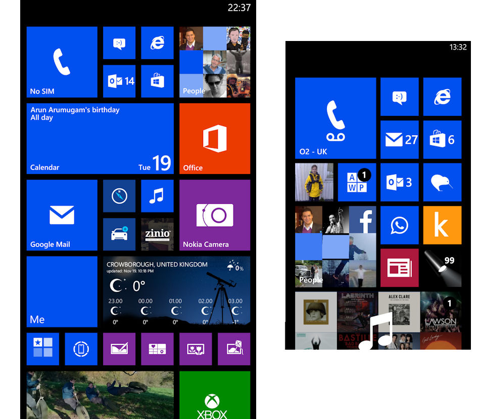
The same is true of the Start screen where each size of Live Tile is physically smaller on the Lumia 1520 than they are on the Lumia 925. This works well, especially for the double wide size, which feels like less of a screen hog on the larger screen device (equally, some may find the small tile size too small). It's the ability to see more of what you pinned to the Start screen that really make the difference when using the device. It's worth noting that it's not just the extra column of Live Tiles, you also effectively get an extra row and half visible at bottom of the screen.
What can be seen from the video and screenshots above is that the way Microsoft has optimised Windows Phone 8 for display on large screen devices is relatively subtle. Unlike the Samsung Galaxy Note series of devices there's really no additional software features of functionality; there's no specific support for stylus input, nor any multi-windows screen layout options.
Some of this is no doubt down to necessity. There is a limit to the amount of changes that can be made in a relatively minor software release. However, the variations in the way the bigger screen has been used (scaling, zooming, UI adjustments) does show Microsoft has put significant thought into the optimisations. It's not just a simple matter of making everything bigger, or displaying more information, rather it is a marriage of the two.
The end result is a software experience that is optimised around emphasising a large screen smartphone experience. This can be contrasted with large screen smartphones, where an out sized screen feels like a means to an end.