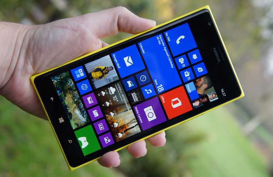
Review: Nokia Lumia 1520
Score:
85%
In this review we take an in depth, hands-on look at the Lumia 1520, Nokia’s entry into the large screen smartphone space, covering all aspects of its hardware. The Lumia 1520 is due to appear in the USA and a few other select markets first, but then will roll out across the world in the coming months. Future review parts will look at the software changes to Windows Phone for the big screen, plus imaging and multimedia performance in more detail.
Introduction and unboxing
The Lumia 1520 can, on the face of it, be explained very simply. It’s filling a gap in the Lumia portfolio. Nokia might refer to the device as a “large screen smartphone”, but for everyone else this is Nokia’s “phablet”. That means it is immediately going to attract attention from the increasing number of consumers who consider a large-as-possible screen as the critical factor when deciding what smartphone to buy. This large screen allure makes up a key part of our assessment of the Lumia 1520, but there’s also more to consider.
That’s because the Lumia 1520, running on the Snapdragon 800 SoC, it is the first of Nokia’s third generation of Windows Phone hardware. Moreover, it offers a further refinement of Nokia’s Windows Phone vision. The combination of the latest incarnation of the 'fabula' hardware design language, together with cutting edge component and hardware innovation, plus further software customisations from the Lumia Black software, result in a device that, as we shall explore below, deserves to be seen as much more than Nokia’s entry into the phablet space.
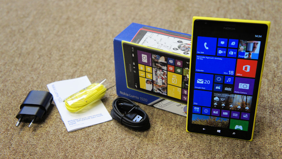
The latest addition to the Lumia portfolio arrives in the familiar Nokia’s drawer-style cardboard box, albeit one that is a little larger than usual, the first hint of the leviathan that lies within. Three stacked layers hold the phone, paperwork (quick start guide and warranty information), and accessories (CA-190CD USB cable, AC-60 charger, WH-208 headset, and SIM door opening tool).
The quick start guide has been slimmed down to just a handful of pages, with an explanation of the components of the phone, and an illustrated guide to inserting the SIM card and microSD memory card. For everything else you are pointed to the on board Nokia Care app, the online support guide on the Nokia website, and a series of support videos hosted on YouTube.
Design and materials
When talking about the design of the Lumia 1520, the first word is, inevitably, large. We’ll look at this, in terms of the physical and practical considerations, in more detail in the size and weight section below, but in terms of the general design, the presence of a six inch screen means that the dominance of a large glass panel is more pronounced than for most slab form factor smartphones, which means there’s arguably less room for distinctive design.
Even so, the Lumia 1520 is unmistakably a Nokia device, maintaining a consistency of design styling that stretches back to the Lumia 800. The same “pure” design approach, with its roots in minimalism and modernism, is applied right across Nokia’s range of devices, but it is in high-end devices, like the Lumia 1520, that it is at its most beautiful.
The Lumia 1520 design is based around the same polycarbonate unibody that was first used in the Nokia N9 and Lumia 800. Over the last two years, Nokia has gained considerable expertise with polycarbonate, something that is apparent from the improved finish, fit and shaping found in the Lumia 1520. Nokia’s materials team also says that the material should wear better over time, though there’s no real way to test this quickly.
In contrast to the Lumia 920 and 1020, but like the Lumia 925, the Lumia 1520 has tapered edges all around the device, making for a comfortable fit in the hand, in whichever orientation the device is held. It also goes some way to helping minimise what would otherwise feel like a very blocky device, which, along with some design refinement discussed below, is one of the reasons this is our favourite implementation of Nokia’s polycarbonate unibody design.
As we’ve mentioned previously, the commonality of design across the Lumia range can also be seen in the way Nokia’s smartphones can be described in relation to each other. For example, the rounded edges and ends of Lumia’s 1520’s unibody polycarbonate shell are similar to those of the Lumia 720. While, the camera hump, a raised area that circles the protective camera glass, has the same styling, albeit slightly wider in circumference, to that of the Lumia 925. Examples of cross portfolio design consistency can be seen in the way the buttons on the side of the device have the same spacing, the way the microUSB port is always positioned upwards, and the way the 3.5mm audio jack is always on the top edge of the device.
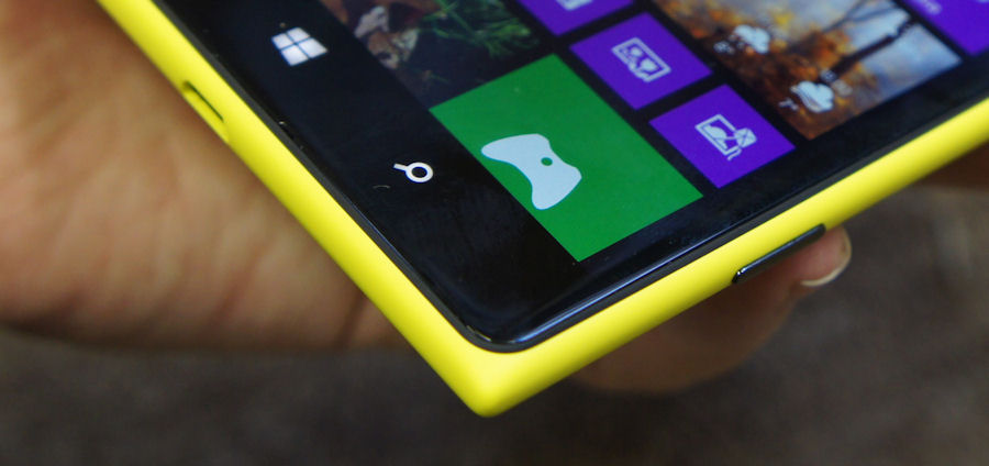
Part of the consistency also comes from the Lumia devices' signature colour range, something that is now being copied by other manufacturers. The Lumia 1520 is available in yellow, red, white, and black. Colour aside, there are two design differences to note. Firstly, there are the differences in the polycarbonate coating/finish: the yellow, white, and black version are matte, while the red is gloss. Secondly, the white variant has colour matched side buttons (i.e. white), while the other variants have black ceramic buttons, the latter would be our personal preference, but it’s a rather subjective opinion.
The protective Gorilla Glass 2 on the front of Lumia 1520 is gently curved (2.5D glass) and flows into a thin bumper section, which ensures a tight finish between the glass and the inside edge of the polycarbonate shell. This tighter finish should be less susceptible to trapping dust and dirt, when compared to the edges of earlier Lumia devices. It also serves as something of protective, shock absorbing element, if the device is dropped.
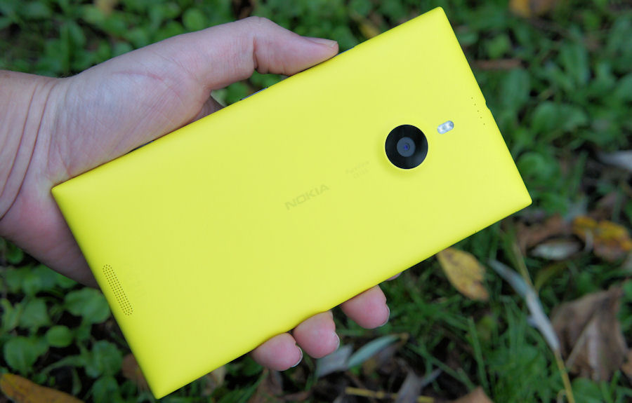
The back of the device houses the aforementioned camera hump, accompanied by a dual LED flash and subtle PureView camera and Nokia branding. At the top are five holes, outlets for one of the device's four directional microphones. The other microphones are located next to the front ear piece, on the bottom edge of the glass screen, and on the bottom back side of the device. Also at the bottom back edge is a speaker grille, positioned on the first part of the tapered edge, ensuring that, even with the device laid flat on a surface, audio output is not muffled.
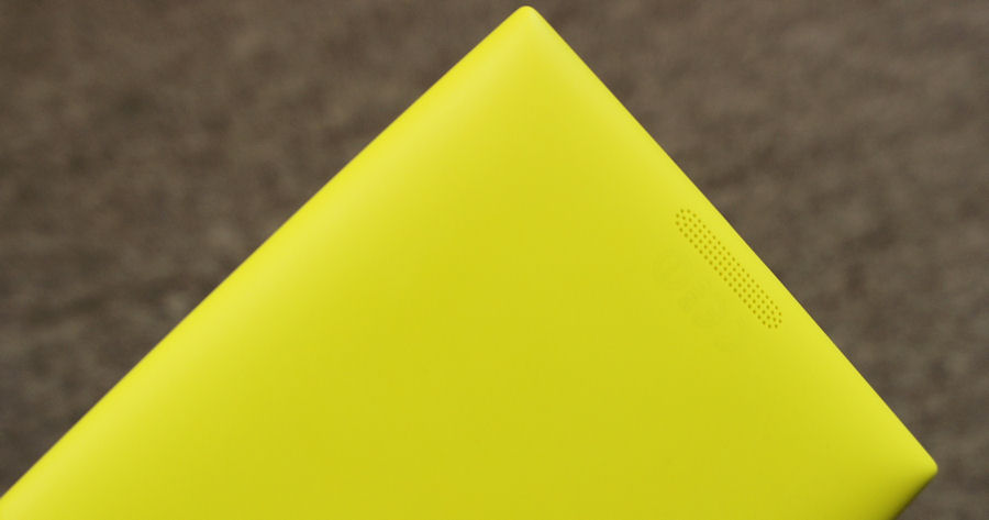
At the centre of the top and bottom edges of the device you’ll find the 3.5mm audio and microUSB ports respectively. It’s not only a pleasing piece of symmetry, it also the most sensible position for both ports from a practical point of view.
On the left hand side of the device you’ll find the SIM card slot and a microSD card slot, a first for a high-end Lumia device. Both are accessed using the included SIM door key accessory, with a slide out caddy holding the respective cards in place. The inclusion of a microSD card should please power users and make it very easy to supplement the 32GB of onboard storage.
The Lumia 1520 uses the nano-SIM card format, the first Nokia product to do so. The nano-SIM card format, measuring 12.3 x 8.8 x 0.67 mm, is a little smaller than the micro-SIM format used in previous Lumia products. In terms of smartphone engineering, every bit of space saved is important, even in a device the size of the Lumia 1520. Nokia hasn’t said so specifically, but we expect most future Lumia devices to use the nano-SIM format.
Switching to a nano-SIM format is inconvenient for those upgrading from another device, especially when buying a device SIM-free, but in most cases your operator will provide a new format SIM at no extra charge. It’s worth noting that there are adaptors that let you use a nano-SIM in a micro-SIM slot/caddy or mini-SIM device, something you’ll need if you wish to switch back to using an older device for some reason.
Specific criticisms of the design of the Lumia 1520 are relatively hard to come by. Those that do exist are more about personal preferences (e.g. use of certain materials), or the inevitable trade-offs between different design, cost, and component elements (e.g. camera hump versus camera quality). If pressed, we might identify the use of Gorilla Glass 2 rather than 3 and tricky on-the-go access to the microSD card slot as issues, but both of these are relatively minor concerns.
Looking at the design as a whole, it is, perhaps, fair to criticise Nokia for not trying something different. After all, the Lumia 1520 is essentially a refinement of a design that dates back more than two years. However, that argument feels fashion led, and, in our view, that should take second place to the merits of attention to detail and the beauty of simplicity.
Size and weight
The first thing everyone notices about the Lumia 1520 is its size. Physical dimensions of 162.8 x 85.4 x 8.7mm make it comfortably the biggest Nokia device of recent years. There are bigger smartphones on the market, such as Sony’s Xperia Z ultra, but there’s no doubt the Lumia 1520 is undoubtedly a (literal) giant amongst smartphones.
A few years ago, a smartphone the size of the Lumia 1520 would have been dismissed as a curious monstrosity, not fit for human hands. Back in 2011, the big phone of the Windows Phone world was the HTC TITAN, with its 4.7 inch screen. Even the Samsung Galaxy Note, generally regarded as one of the devices that heralded the start of the large screen smartphone trend, only had a 5.3 inch screen.
Now in the second half of 2013, the launch of a six inch screen phone seems not only perfectly reasonable, but can justifiably be described as Nokia catching up with its competitors. It’s a great example of just how quickly things can change in the smartphone world, something that becomes even more apparent when you consider most smartphones have a two year development cycle.
It’s obvious that a six inch screen results in a very big device, but it’s worth emphasising how much of an outlier this is from the rest of the Lumia range. There’s a 1.3 inch gap between the Lumia 625, previously the biggest screen Lumia device, and the Lumia 1520. By contrast, the rest of the Lumia portfolio varies in screen size by only a single inch (3.7 - 4.7 inches), and most of the devices are within half an inch of each other (4 - 4.5 inches). What this means is that the Lumia 1520 is close to twice the size of the Lumia 620 and almost a third bigger than the Lumia 925.
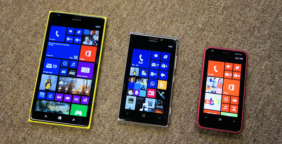
Lumia 1520 alongside the Lumia 925 and Lumia 620
As a result, the Lumia 1520 is closer in size to a small tablet than it is to its Lumia sisters. That should not be regarded as a bad thing, but, for potential purchasers, it is important to realise that the Lumia 1520 really is in a different device category to the traditional smartphone.
| Device | Size (mm) | Volume (cc) | Weight (g) | Screen size (in) |
| Nokia Lumia 1520 | 162.8 x 85.4 x 8.7 | 120.3 | 209 | 6.0 |
| Nokia Lumia 625 | 133.2 x 72.25 x 9.15 | 87.6 | 159 | 4.7 |
| Nokia Lumia 925 | 129 x 70.6 x 8.5 | 78 | 139 | 4.5 |
| Nokia Lumia 620 | 115.4 x 61.1 x 11 | 76 | 127 | 3.7 |
| Nokia Lumia 720 | 127.9 x 67.5 x 9 | 78 | 128 | 4.3 |
| HTC One Max | 164.5 x 82.5 x 10.3 | - | 217 | 5.9 |
| Sony Xperia Z Ultra | 179.0 x 92.0 x 6.5 | - | 212 | 6.4 |
| Samsung Galaxy Note 3 | 151.2 x 79.2 x 8.3 | - | 168 | 5.7 |
As with Nokia’s other recent high-end smartphones, the thickness of the Lumia 1520 is largely dictated by the camera module. The presence of a camera hump gets the device’s primary thickness down to a respectable 8.7mm, comparable with similar devices, and notably thinner than Nokia’s first generation of Windows Phone devices.
The Lumia 1520 is a relatively heavy smartphone, weighing in at 209g. Nokia’s Lumia smartphones have had a bit of reputation for being on the heavy side, when compared to devices from other manufacturers, something best exemplified by the Lumia 920. That’s not the really case with the Lumia 1520, which is comparable to other six inch phablets (e.g. HTC One Max at 217g), though it doesn’t quite match up to some of Samsung’s efforts (e.g. Galaxy Mega 6.3 at 199g).
In practical terms, the size and weight of the Lumia 1520 has two important factors. The first, fairly obviously, is that it’s almost always a two handed device. It should be possible for most people to hold the device with a single hand, but unless you have very big hands, you’ll need your second hand for any screen interactions. Even something as simple as tapping the call answer button will generally require two hands, less you risk dropping the device.
Secondly, and critical for a mobile device, is the way you carry it round with you. It’s not so much about whether it will fit in your pocket, although that will be an issue in some cases, it’s more about whether it comfortably fits in your pocket. If it doesn’t, something that really depends on the individual, you’ll need to find some other way to keep the device with you. Putting it in a bag works fine, but that can limit ease-of-retrieval.
Neither of these factors should result in an instant dismissal of the Lumia 1520. It is, absolutely, still a mobile device, it’s just a lot closer to the mobility boundary than most smartphones. Ultimately, the size of device that you want to carry is a personal preference, framed in the context of what you use your device for.
Screen
The size of the Lumia 1520 is largely dictated by the size of the screen. So the obvious question is why a six inch screen? What’s the benefit to going large?
More than anything else, it really is as simple as a case of bigger is better. Yes, there are other screen properties that come into play, but when you get down to it, it’s all about having a bigger viewing area.
To support the bigger viewing area, the Lumia 1520 is the first Windows Phone device to have a 1080p resolution screen (1920 x 1080 pixel). The additional pixels mean the screen’s pixel density (367ppi) remains well above the “retina” level, and on-screen content remains sharp, despite the increase in the physical size of the viewing area.
A bigger viewing area has two theoretical uses. Firstly, it can be used to display more content at the same size as a smaller screen (e.g. additional lines of text on a webpage). Secondly, it can be used to display the same content as a smaller screen, but at a bigger size, making things easier on the eyes.
Previous Windows Phone devices have always been about the second of these options as they’ve maintained a similar scaling factor regardless of the physical size of the screen. The Lumia 1520 is a little different in that its bigger display is used to do a bit of both. While the emphasis remains on scaling content to a bigger relative size, there are a number of areas where the bigger screen is used to display more content.
The most obvious example of this is the Start screen, which on the Lumia 1520 has three columns of standard size Live Tiles across the screen, rather than the two found on other Windows Phone devices. Another obvious example is found in the email app, where an additional preview line of body content is shown in the inbox and folder listing screens. Other built-in apps taking advantage of the extra display space include Store (additional app icons in lists), Messaging (scaled text size), and the People Hub (scaled text size). Currently, we’re not aware of any third party apps that are optimised for the Lumia 1520’s display size, but it’s certainly theoretically possible to do so (by default, third party apps use the same scaling as on devices with a 720p resolution screen).

Start screen on the Lumia 1520 versus Start screen on the Lumia 925
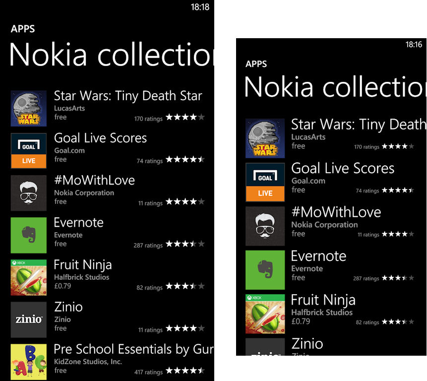
Store app on the Lumia 1520 versus Store app on the Lumia 925
Screen size and screen resolution seem to be the primary characteristics by which smartphones displays are judged. The Nokia Lumia 1520 scores well in both these categories, but we’ve always felt that the quality of the screen, and implementation of related companion technologies, often have a greater impact on screen usability, and therefore result in more meaningful differentiation between competing devices.
The Lumia 1520 display is built around a high quality LCD IPS panel, which gives a good base to build on, but it’s really the way Nokia implements the screen stack that makes the Lumia 1520 stand out from the crowd. Nokia describes various aspects of its screen technology using generic descriptive names: ClearBlack Display, high brightness mode, sunlight readability enhancements, and super sensitive touch.
ClearBlack Display is really an amalgam of several different technologies related to the way different layers of the screen are combined together, but the most important element is the inclusion of circular polariser and retardation layers between the surface of your phone and the LCD display, cutting down on screen reflections.
High brightness mode, which increases screen luminance by 20% in sunny conditions, and sunlight readability enhancements, which tune screen content in response to input from the ambient light sensor, are both also critical in improving screen visibility outdoors.
Super sensitive touch, first introduced with the Lumia 920, increases the signal to noise ratio in the touch sensing layer, making it possible to detect weaker touch signals. The most obvious use case for this is to use the touchscreen whilst wearing gloves, but it also works for the back of a fingernail.
Nokia is continually improving all of these screen technologies, with new innovations and refinements delivered as they become available. With the Lumia 1520, Nokia is introducing the next generation of its sunlight readability enhancement technology, which as explained in a recent feature is enabled by Apical’s Assertive Display technology. Rather than tuning the screen as a whole, as in the previous implementation, the display is tuned on a pixel by pixel basis. This makes a big difference, especially when viewing content with contrasting areas of dark and light colours, because the tuning is no longer based on an average for the screen as a whole, but for each individual pixel.
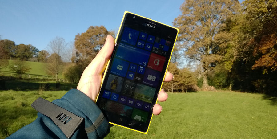
Lumia 1520 in bright sunlight
The Lumia 1520 has one of the best screens you'll find on any current smartphone. When you hand over the device to someone for the first time, the reaction is almost always, "wow, look at that screen". It's not about any one specification, or a particular technology, but rather a complete package that should ensure maximum screen visibility and usability in all the many environments in which smartphones are used around the world.
Camera
The Lumia 1520 has a 20 megapixel camera, with an accompanying dual LED flash, but the critical numbers are f/2.4 aperture and a 1/2.5" sensor size (compared to 1/3" on most generic flagships). Also included in the PureView branded camera is Nokia’s implementation of optical image stabilisation (OIS) and 6-element Carl Zeiss optics. These characteristics put the Lumia 1520 into the very top tier of cameraphones. Indeed, of the smartphones currently on the market, it’s really only Nokia’s own Lumia 1020 that has a better baseline specification.
The baseline specifications are noteworthy, but what really stands out about the Lumia 1520’s camera is that it implements the same oversampling and lossless zoom technologies found in the Lumia 1020. The ratio of oversampling – 16MP to 5MP (16:9 aspect ratio) or 19MP to 5MP (4:3 aspect ratio) – isn’t as high as on the Lumia 1020, but it’s more than enough to give the Lumia 1520 an edge over other high end cameraphones. For the same reason the lossless zoom of the Lumia 1520 is less than on the 1020 (2x for photos, 3x for 1080p video, and 4x for 720p videos), but as with oversampling it’s impressive that the technology can be applied to a standard sized camera module.
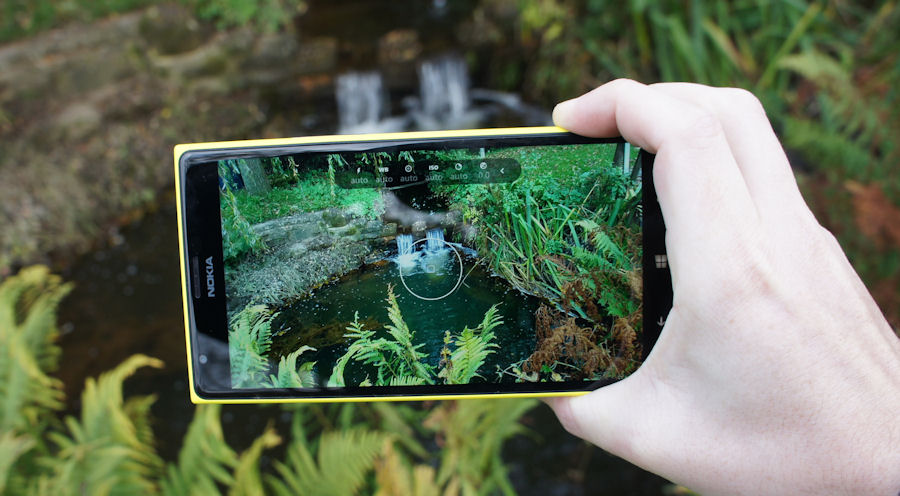
The Lumia 1520 has the same dual capture mode as the Lumia 1020. This means that a high resolution image (16/19 MP) is captured and stored in addition to the standard resolution image (5MP). Annoyingly, as with the Lumia 1020, these high resolution images can only be accessed when the phone is plugged into a PC or Mac, something that really needs to be fixed in a future software update.
While dual capture mode is the default for the Nokia Camera app, it is also possible to use single capture mode, capturing just a single 5 megapixel image. This offers a very slight improvement in shot-to-shot time, but the difference is small enough that, storage space aside, it’s not really worth using the single capture mode, unless you never intend to access the high resolution images.
More interesting is the alternative dual capture mode that makes it possible to capture in RAW format (5MP JPEG image and 16/19MP DNG image). The addition of RAW capture will delight imaging aficionados, but it’s hard to gauge how widely it will be used, especially on a device like the Lumia 1520. Make no mistake, RAW capture is an important milestone in Nokia’s imaging journey, and an impressive piece of innovation, but it’s hard to escape the conclusion that the real round of applause will arrive when a software update adds the same capability to the Lumia 1020 early next year.
It’s worth noting that, as with other Lumia devices, the full range of imaging features is only available through the Nokia Camera app. This, with its intuitive and well thought out user interface, is the default camera app out of the box, but the standard Windows Phone Camera app is also present in the app list, which could potentially confuse some users.
We’ll be looking at the Lumia 1520’s camera performance, including video capture, in more detail in a later review, but the initial results,as you can see from the limited range of sample below, are encouraging. Performance superior to that of the Nokia Lumia 925, which is exactly what you would expect from what is effectively the next generation of the Nokia's standard high-end camera module. The Lumia 1520 is also significantly better here than the phablet devices it will be directly competing against, which means, if you’re looking for both a big screen and a great camera performance, the Lumia 1520 is going to be your first choice.
5MP resolution (JPEG) files: 1, 2, 3, 4, 5, 6 | RAW (DNG) files: 1, 2, 3, 4, 5, 6 (~20MB in size each)
Internals and performance
Inside the Lumia 1520, there's a Qualcomm Snapdragon 800 based SoC (MSM8974). It has a quad-core processor, clocked at 2.2GHz, accompanied by an Adreno 330 graphics co-processor, and 2GB of RAM. This is a very significant hardware upgrade compared to earlier Lumia devices and marks the Lumia 1520 out as the first of Nokia’s third generation of Windows Phone hardware.
It’s the first Windows Phone device with a quad-core processor. It’s also the first Windows Phone device to have a core specification that is equivalent to the leading smartphones on other platforms. Windows Phone devices have rarely had any performance issues, but there’s no denying that, up to this point, the core hardware, even on the high-end devices, has always been a generation or two behind the cutting edge. It’s hard to gauge whether this has had any real impact on sales, but it certainly hasn’t made the promotion of Windows Phone devices any easier.
| SoC | Devices | Specification |
| MSM8227 | Lumia 520, 521, 620, 720 | Dual-core 1GHz Krait, Adreno 305, |
| MSM8930 | Lumia 625 | Dual-core 1.2GHz Krait 200, Adreno 305, LTE |
| MSM8960 | Lumia 820, 920, 925, 928, 1020 | Dual-core 1.5GHz Krait, Adreno 225, LTE |
| MSM8930AB | Lumia 1320 | Dual-core 1.7GHz Krait 300, Adreno 305, LTE |
| MSM8974 | Lumia 1520 | Quad-core 2.2GHz Krait 400, Adreno 330, LTE |
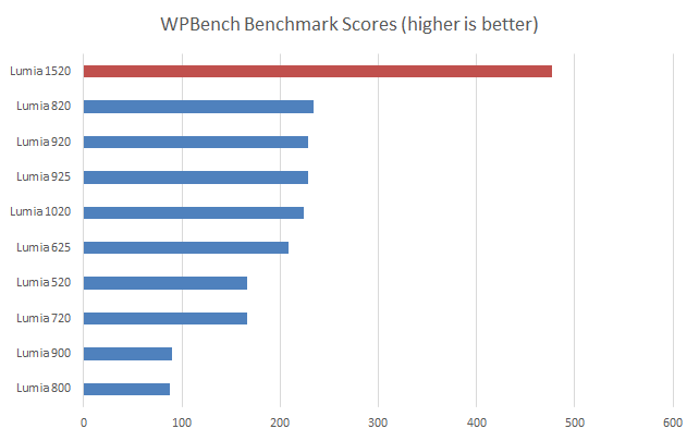
The extent of the hardware upgrade can be seen in the benchmark results below, with the Lumia 1520 more than doubling the previous highest WPBench score.
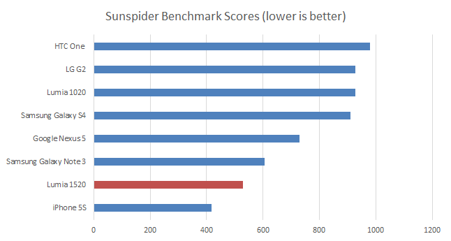
The SunSpider benchmark, which measures the performance of a browser’s JavaScript engine and the underlying hardware, can be used to provide some basis for cross platform hardware comparison, but it’s important to note that any benchmark should be treated with caution as they do not always reflect real world usage.
The Lumia 1520’s result in the SunSpider benchmark gets close to matching the Apple iPhone 5S and beats all the currently available Android devices. It’s notable that a Snapdragon 800 running Windows Phone appears to offer superior performance to a Snapdragon 800 running on Android (e.g. Samsung Galaxy Note 3 and LG G2).
In terms of real world usage, the new hardware doesn’t have a big as immediate impact on Windows Phone as you might think. There’s no discernible difference in opening or resuming the built in apps (e.g. Messaging) and general UI interactions don’t feel any faster. On the other hand, the Lumia 1520 does boot up from a cold start about 5 seconds faster the Lumia 925. Similarly, third party apps do open a little quicker, when compared to the Lumia 925, but the difference is usually less than half a second. You will notice this difference in a side by side comparison, but for most apps it’s going to be hard to real feel a difference day to day.
To be fair, the performance differences are sometimes more apparent for resource intensive apps, such as PhotoSynth, but it says something that we had to go to some effort to find examples of this. The results really are a testament to the efficiency of the Windows Phone platform and it is quite telling the performance difference between a Lumia 520 and a Lumia 1520 is relatively small. That doesn’t mean the Snapdragon 800 is an unnecessary upgrade. Some of the extra power is no doubt being used to push the extra pixels around the 1080p resolution screen, but more importantly the added performance future proofs the Lumia 1520. Not only will it ensure that the device can happily run future version of Windows Phone, it also opens up additional resources for future games and apps.
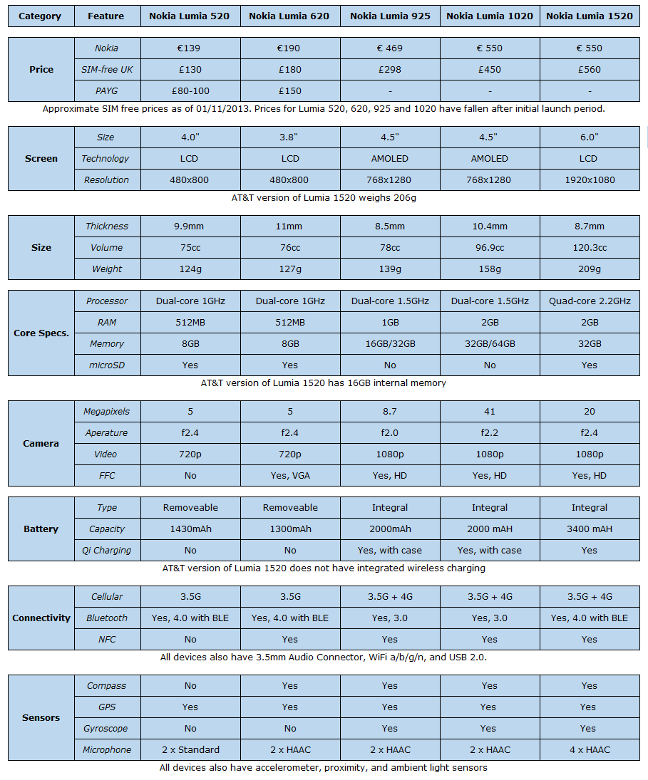
The Nokia Lumia 1520 has an integrated battery with a capacity of 3400mAh, the biggest ever in a Nokia smartphone. While we’ve yet to do an extensive battery test, the initial signs are promising, with the Lumia 1520 getting through several days of testing with charge to spare at the end of each day. Built-in support for Qi compatible wireless charging is a very welcome addition, but more convenient that having to purchase a separate clip on case.
The Lumia 1520 ships with 32GB of on board memory, but that can be augmented by a microSD card (sizes up to 64GB supported), which should be more than sufficient for most users.
As you would expect for a high-end smartphone, there's a full range of sensors: accelerometer, proximity, ambient light, magnetometer (compass), gyroscope, and GPS. Local connectivity is similarly well served with WiFi (2.4/5GHz a/b/g/n/ac), Bluetooth 4 (including LE support), and NFC.
The Lumia 1520 supports GSM (2G), WCDMA (3G) and LTE (4G) for cellular connectivity. There are three variants of the Nokia Lumia 1520, each with a slightly different cellular radio configuration:
- RM-937: Global variant: EGSM 850/900/1800/1900, WCDMA 850/900/1900/2100, LTE band 1 (2100), 3 (1800), 7 (2600), 8 (900) & 20 (800), LTE Cat 4/3 (150 Mbps Downlink, 50 Mbps Uplink), HSDPA+ Cat 24 (42.1 Mbps), HSUPA Cat 7 (11.5 Mbps)
- RM-938: US variant: EGSM 850/900/1800/1900, WCDMA 850/900/1900/2100, LTE band 2 (1900), 4 (1700/2100), 5 (850) & 17 (700), LTE Cat 4/3 (150 Mbps Downlink, 50 Mbps Uplink), HSDPA+ Cat 24 (42.1 Mbps), HSUPA Cat 7 (11.5 Mbps)
- RM-939: China variant: WCDMA HSPA+ variant: EGSM 850/900/1800/1900, WCDMA 850/900/1900/2100, HSDPA+ Cat 24 (42.1 Mbps), HSUPA Cat 6 (5.76 Mbps)
LTE connectivity is upgraded from the Lumia 925 from Cat 3 to Cat 4 for downloads (theoretical maximum increase from 100 to 150 Mbps), while WCDMA connectivity is upgraded for uploads (HSUPA) from Cat 6 to 7 (theoretical maximum increase from 5.76 to 11.5 Mbps). The bottom line is that the broad cellular technology and band support means the Lumia 1520 should support your operator's maximum data speed for at least the next couple of years.
Software
The Lumia 1520 runs on Windows Phone 8 Update 3 with Nokia Lumia Black software. We're going to be taking a more in depth look at what's new in the next part of this review. Watch this space.
Conclusion
With the Lumia 1520, Nokia has once again delivered a superb piece of hardware, further burnishing the company’s reputation for design excellence and innovation. The Lumia 1520’s camera is something quite special, getting close to the experience and quality of the Lumia 1020, without any form factor compromises. The overall feel and design impresses too, with an attention to detail that offers moments of delight. But the biggest stand out – exactly as it should be on a device in this category – is the screen, which is, quite simply, the best we’ve seen on any smartphone.
What’s interesting about the Lumia 1520’s hardware is that it offers a glimpse of the next iteration of devices like the Lumia 925 and 1020. The Lumia 1520 may be the first of Nokia’s third generation of Windows Phone hardware, but it certainly will not be the last. You can expect to see a Snapdragon 800 powered Lumia 930, or equivalent, in the first half of next year. It will have a core specification and performance characteristics similar to that of the Lumia 1520. That’s something worth keeping in mind if your primary attraction of the Lumia 1520 is that it represents the cutting edge of Windows Phone hardware, rather than the fact it has a six inch screen.
Any final conclusion about the Lumia 1520’s hardware is going to depend to some extent on your personal perspective. If you’re looking for a large screen (5+ inches) Windows Phone device then the choice is simple. The Lumia 1520 is your only option. The lower cost Lumia 1320 will be available soon, but that’s all about delivering a similar large screen smartphone experience at a lower price point.
If you’re looking for a new Windows Phone device and wondering whether you should pick the Lumia 1520, then the question you need to answer is whether you want a large screen smartphone. The benefits of a larger screen are largely self-evident, so it’s really about considering whether you can live with the downsides that come with a bigger device. The ability to carry it with you conveniently and comfortably is chief amongst these because the biggest merit of any smartphone is the way it can always be with you, never more than a second or two away. Any device the size of the Lumia 1520 starts calling that attribute into question.
If you’ve already decided you want a large screen smartphone, but haven’t settled on a particular platform, then the great design, excellent build quality, outstanding screen, and industry leading camera make the Lumia 1520 one of the most compelling choices in terms of hardware. Pick out almost any element of the hardware and you’ll find the Lumia 1520 at, or near, the top of any ranking. However, as has become a familiar refrain for the Lumia range, it’s likely that any purchase decision will almost certainly be driven by the software. The decision isn’t about whether you want the Lumia 1520’s hardware - you do - it’s about whether you want Windows Phone.
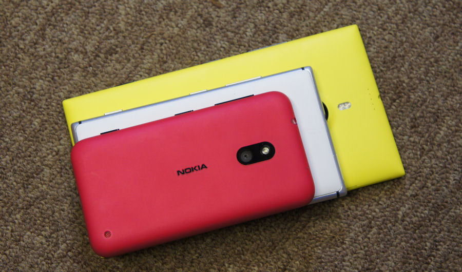
Nokia Lumia 620 (top), Lumia 925 (middle), and Lumia 1520 (bottom)
Video review
Taken from our video review of the Nokia Lumia 1520:
Reviewed by Rafe Blandford at

