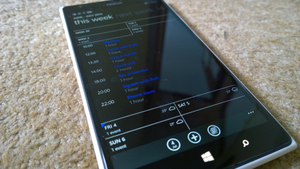
Of course, Windows Phone 8.1, in the shape of the Lumia Cyan update, hasn't rolled out officially yet, but with the latest Developer Preview we've got a pretty good idea of how 8.1 will look on the Lumia 1520. And with that in mind, let's see a few examples of where optimisations have been made. (And with a nod to AllAboutPhones.nl, from which we've used a few old screenshots!)
Shrunk headers, reduction of white/black space
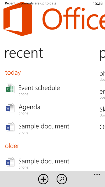
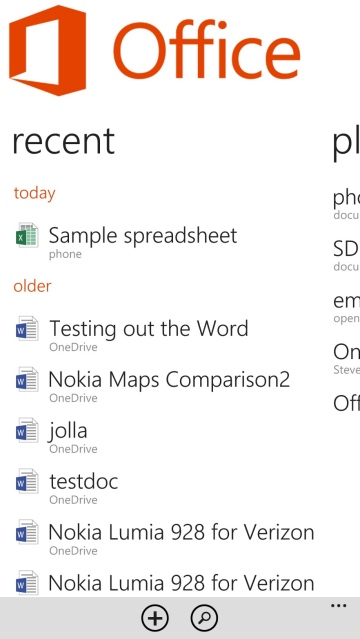
As an example, one of the most obvious wasters of space under Windows Phone 8.0, the Office hub has had its UI tightened up considerably. See the before/after screens below. With smaller logos and headline fonts, plus less white space between list entries, almost twice as many documents can be listed on the front screen:
The same idea has been implemented in most other places, for example here in the Store - despite the addition of a handy search control, there are still more items on show under Windows Phone 8.1. In general, across all apps and dialogs on the 1520 there are now several more list elements shown compared to the same screens under Windows Phone 8.0.
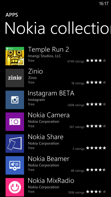
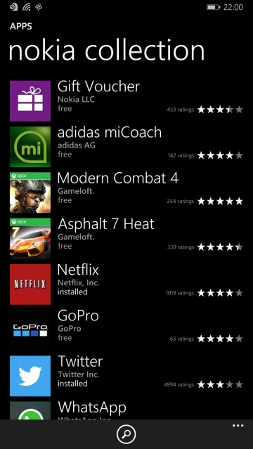
In part the improvements have been down to changes in the applications themselves, in part due to system wide font and layout improvements, but the cumulative effect is quite dramatic on the larger screen.
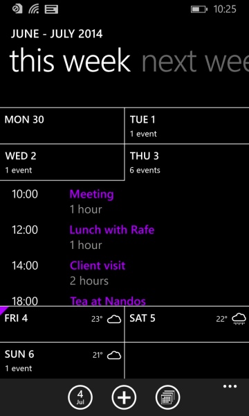
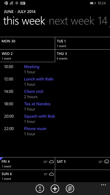
With applications that were rewritten from the ground up for the new Windows Phone 8.1, the effects are even more dramatic, with an awareness of the existence of the Lumia 1520 and its 6" 1080p screen from the start. For example, here's the same day in the Windows Phone 8.1 Calendar, effectively a totally new application, seen here on the Lumia 1020 (left) with 4.5" 768p screen and on the 1520 (right) - quite a dramatic difference in content possibilities:
Toolbars
Looking again at the above Office and Calendar screenshot comparisons, you can also see that the main toolbar has been shrunk down in size, leaving more space for content. This applies across most applications, in fact, so is a system wide improvement. For example, here are before/after screenshots from HERE Transit:
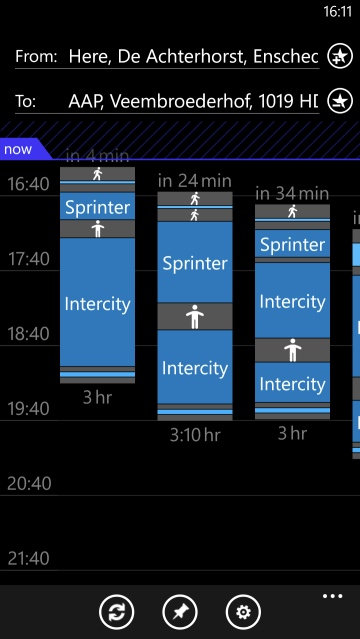
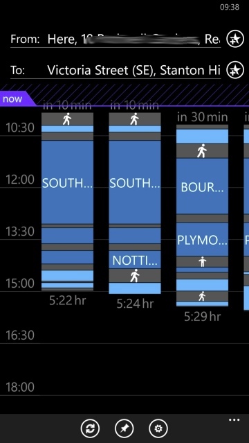
So although the main content hasn't changed, in this case, the narrower toolbar gives more space for that content (should it need it).
Overall
Add up the tweaks across all applications on the Lumia 1520 and the feel of the entire device is changed, I contend. The aim for the 1520 was to be a 'phablet' and compete with devices like Samsung's Galaxy Note 3, but under Windows Phone 8.0 the lapses into over-sized phone UI let the device down badly.
With Windows Phone 8.1, its new controls, tweaks and new apps onboard, the Lumia 1520 is a far more pleasant device to use. Cyan may not be here quite yet, but the Developer Preview gives us all that we need to know. And, with this in mind, we're going to re-evaluate the 1520 as a mid-2014 phablet - watch this space.
