Unsurprisingly, with at least two months (if not three) to go before Windows 10 Mobile is 'baked', it's hard to write a cohesive 'review'. Instead, my notes should give you a flavour of where Windows 10 Mobile stands mid-June 2015. In a sense, I've taken the time and effort hit so you don't have to(!)
Battery life is the one showstopper, to be honest - everything else in Microsoft's own 'known issues' or the points raised below can be worked around. Now, we've seen terrible battery life on previous builds of Windows Phone in 'Preview' mode and this Insiders Preview is, if anything, even earlier in development, so I'm not at all surprised. There's a great deal of polishing and optimisation yet to happen. I do expect the final Windows 10 Mobile to be more battery intensive than Windows Phone 8.1, but only marginally so.
But I have to emphasise the obvious up front: if you have a Windows Phone that's NOT your main device then go ahead and try all this, it's a blast seeing how it's all coming together and it will make you appreciate the finished article (in September, allegedly) all the more. If you only have ONE Windows Phone then stay away - build 10136 is far better than previous builds but still nowhere near ready to get you through a smartphone-filled day. You have been warned.
With all that said, here are the things you need to know. Most of what follows was tested on the Lumia 930, i.e. the Snapdragon 800-powered top of the range, I wanted to give Windows 10 Mobile the best chance possible.
Initial operations
Firstly, note that different results are obtained by upgrading to Windows 10 Mobile Insiders Preview after having factory reset your device than by doing it the other way around. Not vastly different, but the exact Start screen set-up, application load out and, ultimately, stability, are noticeable. After a few iterations, I settled on both! I.e. wiping, then upgrading, then factory resetting again. This provided me with the most 'vanilla' experience possible and, hopefully, the closest to what the programmers at Microsoft are seeing in their development environments.
Secondly and most importantly - and this may well be true for the final version as well, so it's worth underlining - in addition to the new operating system, there are also updates to just about every application that will need to be installed via the new Store after the main upgrade, plus applications deemed to be appropriate for specific devices, to be added after a factory reset. In the case of my test devices, the average was 40, repeat 40 application updates waiting. Meaning that, with these set to auto-install by default, the experience on the phone is going to be distinctly sub-optimal for the first hour or so with Windows 10 Mobile.
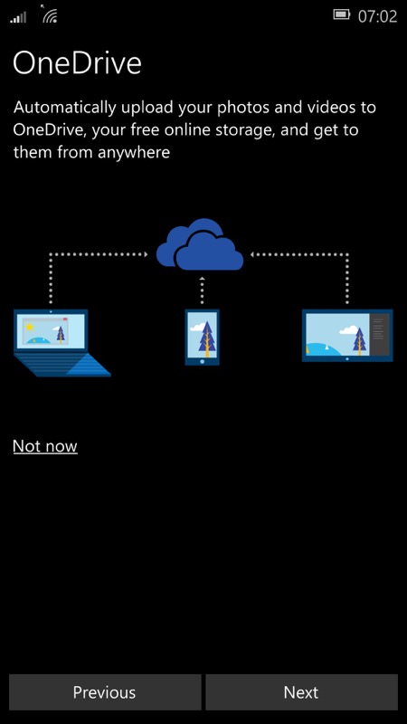
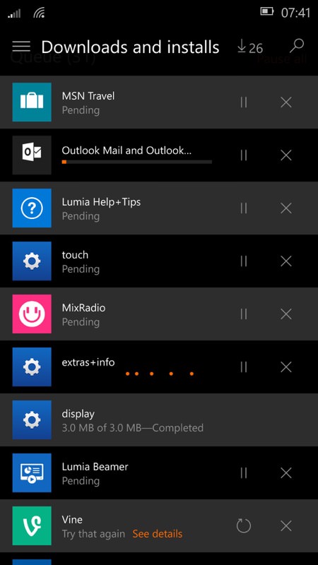
Getting going.... one of the initial set-up screens, the obligatory ecosystem auto-upload (always useful, I'm not knocking it), plus the appallingly long-winded background installation of a great many apps (depending on device, by the way, the model and variant determine which ones get retro-loaded)....
All the user knows is that their phone's getting very hot, slow and applications and tiles keeping changing on their own (as things install in the background). Quite why Microsoft can't pop up a one-time 'Welcome to Windows 10 Mobile, please go off and have a beer while lots of applications install!' message is beyond me. As an old-hand at this, I went looking for what was slowing the phone and its connection down, but a normal user won't be as charitable.
Complicating the above process even more is that the new Store gets 'behind', showing, for example, 26 applications and updates left to install when in fact it finished most of them already and the UI just hasn't caught up. Patience, a charger, and - at some point - a device restart or two are needed, before everything settles down.
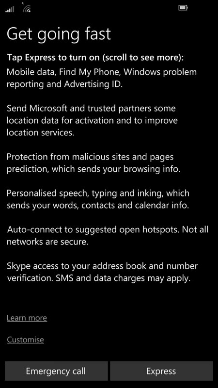
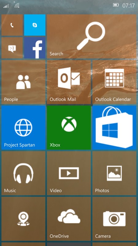
Several of the initial Windows Phone 8.1 set-up screens are now combined into this 'Yes, set everything default and move on' dialog, which is a good idea; (right) the default Start screen after a factory reset under Windows 10 Mobile. As at June 2015 anyway!
Email, PIM
Outlook Mail is now very good, with the small caveat that it's 100% white-themed. Given the replication of Outlook on the web and on the PC, it's unlikely that we'll see a dark theme option, but I live in hope. Outlook Calendar is deeply tied to Outlook Mail and in fact you can toggle between the two 'views' from the UI of each. When both apps are fully rounded, you'll be able to create meetings and have the mail section manage the responses in the usual Outlook way.
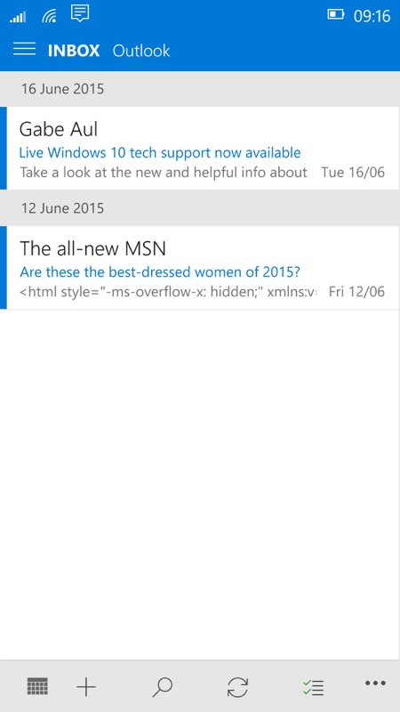
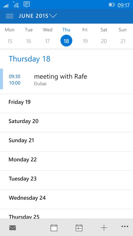
Toggling between Mail and calendar is quick and trivial, and with a consistent UI. You know, if I was the sort of person who actually scheduled and attended meetings, this would be really rather useful....
Oddly, there's no 'Outlook Contacts', relying on a re-written People application that brings in contacts from multiple account and the biggest nuisance is that the detail view for a person is highlighted in your phone theme's chosen 'accent' colour. Which produces a shockingly vivid display!
Of particular note to me, Outlook Mail now emails full resolution photos (at long last, after years of Windows Phone downsampling anything I sent out!) - this will be seriously useful to a family shutterbug like me.
Cortana and search
With a mix of dark and light content, Cortana works very well on Windows 10 Mobile (as it should, being central to Microsoft's ambitions here), though it's worth noting that the live tile is broken in build 10136, remaining essentially blank most of the time. The 'long press of the search control' on the lockscreen also worked as it used to, kicking off voice recognition, which is great to see.
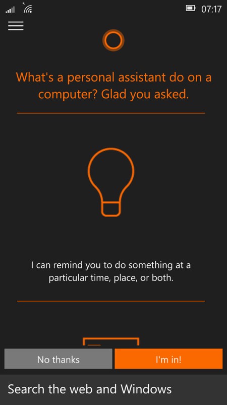
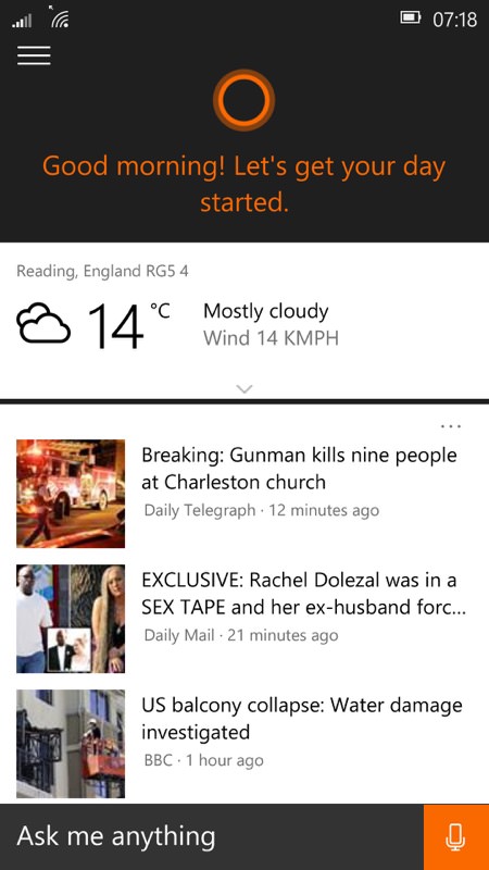
Cortana is central to Microsoft's AI approach to Windows 10 in general, so it's not surprising to see it almost completely implemented already. Just get that live tile working, guys...!
Store(s)
Yes, I wrote the sub-heading as plural, since at build 10136, not all Windows Phone applications are compatible with the new Store (labelled 'beta' in the main listing here), so the old Store app is included as well. The new version is somewhat slow and clunky, but again there's debug code under the hood that will be gone for the final releases. Plus there are nice features like picking up the system's light/dark theme setting, something which I wasn't expecting for Windows 10....
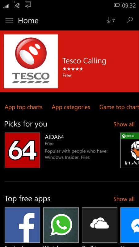
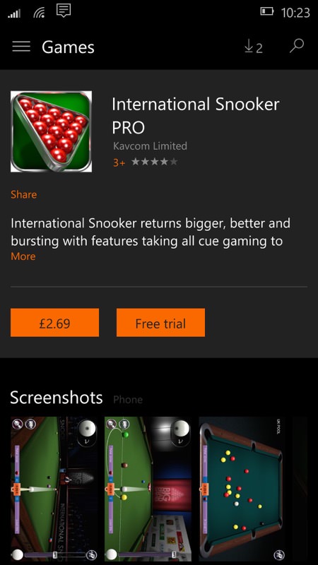
Near the top right is the current 'downloads' count, showing what's trying to install in the background - with the Store in the currently beta state, there were always several items 'stuck' in the queue!
Maps - and HERE Maps
Loaded manually from a shortcut tile, the Microsoft Maps client is now very good, using mainly licensed HERE data, but also pulling from other sources where needed. In fact, it all works well enough that the official HERE Maps and Drive+ clients really aren't needed at all, yet they're here presumably because of a few extra functions not implemented in the Microsoft client yet. I suspect these will disappear in the next build.
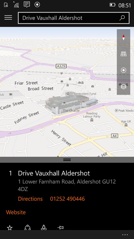
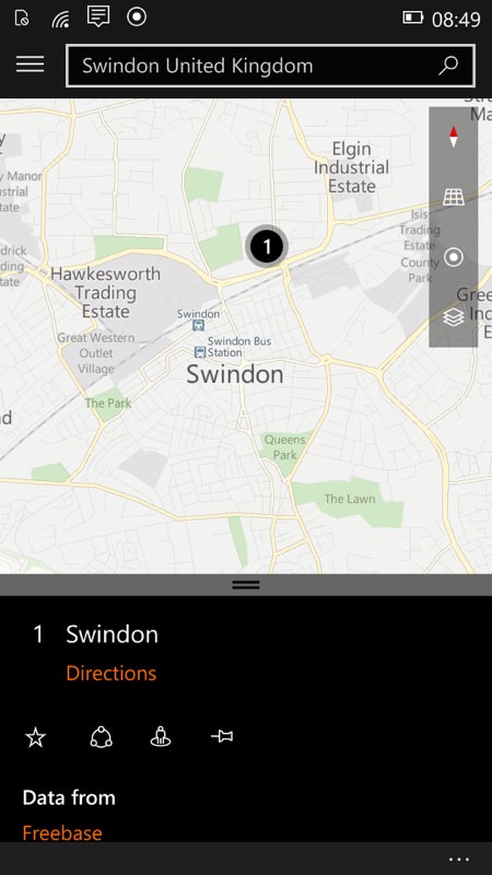
Mapping works well in 2D and '3D', with voice guided navigation too, most (but not all) of which comes from HERE Maps sources...
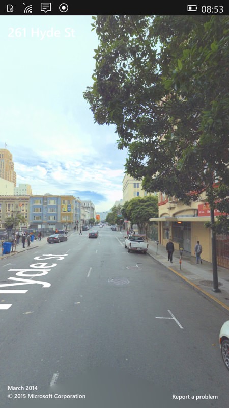
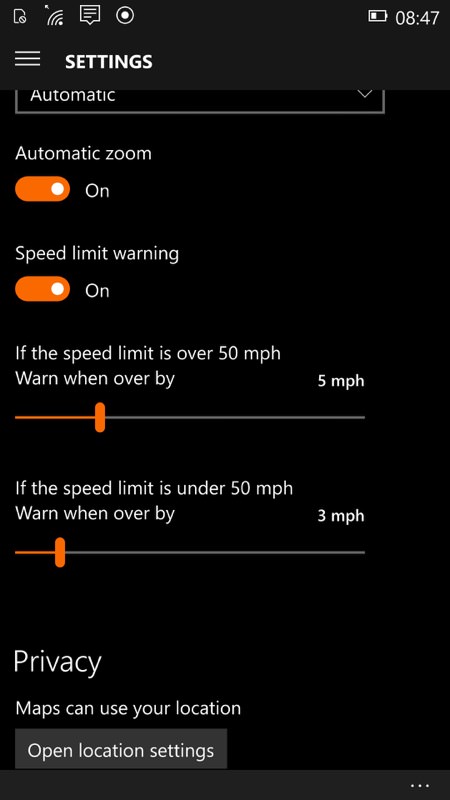
With the move to Microsoft branding come other niceties, like the street views and 3D maps (below); Above, right, some rather helpful settings too, freed from HERE Maps/Drive own settings hierarchy....
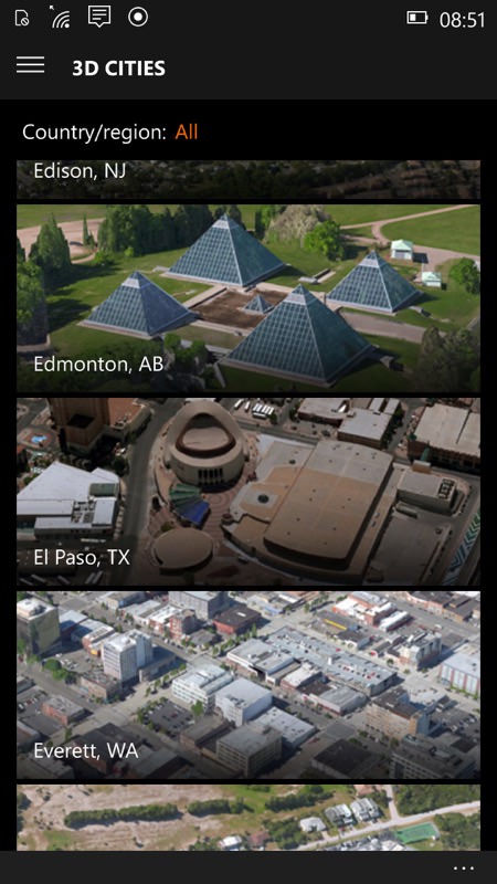
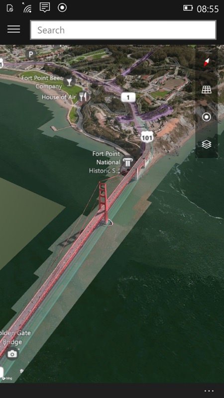
The 3D maps are a little bit of a gimmick and very USA-centric at present, but good to see all the possible added value here...
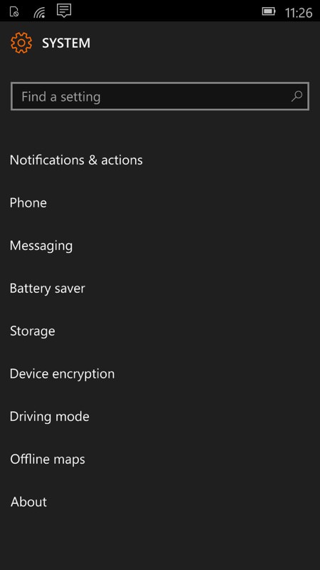
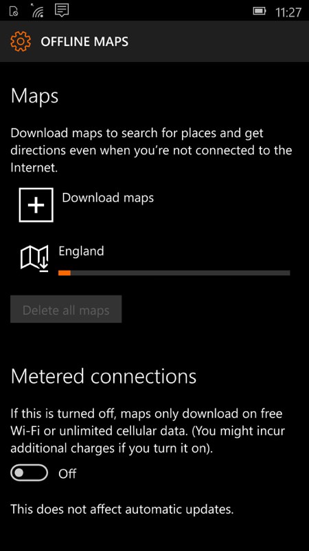
Offline maps are still supported, with the main way into these via the main Windows 10 Mobile system settings - and yes, these will download in the background, so you can set a bunch downloading and then get on with your life!
Maps is pretty well rounded, as you'd expect from an application that's forming a core part of Windows 10 on the desktop too.
Web browsing
Still labelled as 'Project Spartan' in the application list, Microsoft's new Edge browser picks up several enhancements for this build 10136, including better full-screen video support and an 'InPrivate' browsing mode. Importantly, Microsoft already has such confidence in the new browser that Internet Explorer isn't included at all. This time round, at least - it's possible that it might make a comeback, perhaps via the Store, for enterprise use later this year.
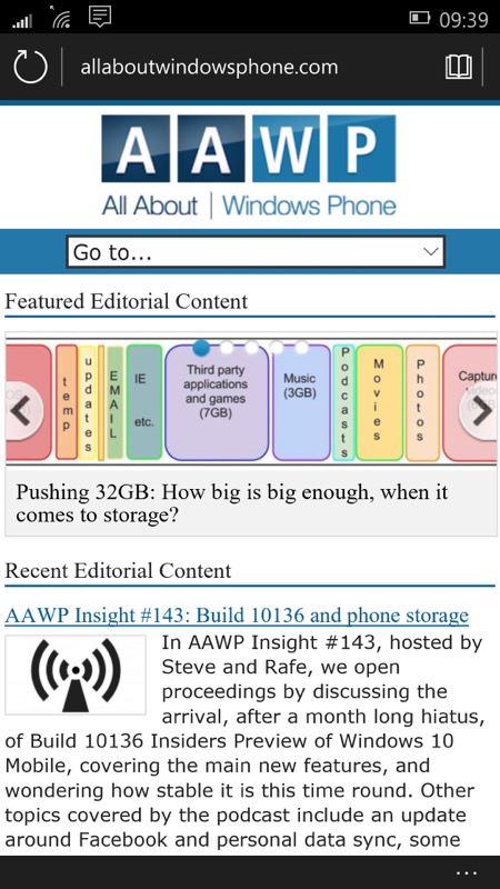
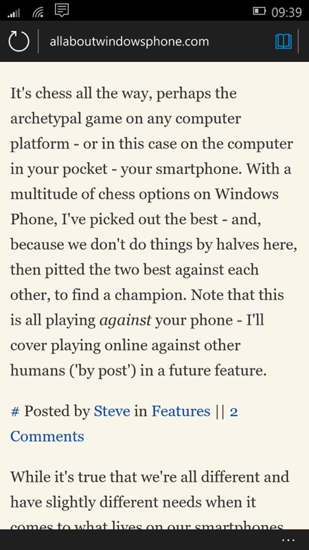
Viewing a web site in traditional and reading modes... Project Spartan, err... I mean Edge (when the rename hits) is an impressive modern browser, and apparently extremely HTML5 compliant.


Secure sites were no problem.... not indeed anything else I tried. Streets ahead of Internet Explorer and you can see why Microsoft dropped the latter and all its old code...
Camera (etc.)
Microsoft's intentions here are becoming clear, with a Camera application that's derived from the latest Lumia Camera, complete with 'Rich Capture' (though this seems to have stopped working in this build), working at the full resolution of whichever phone it's installed on (i.e. 5MP, 8MP, 13MP or 16MP - I'll address the 1020 in a later feature). Hence my piece yesterday on the rise of resolutions and the sidelining of oversampling.
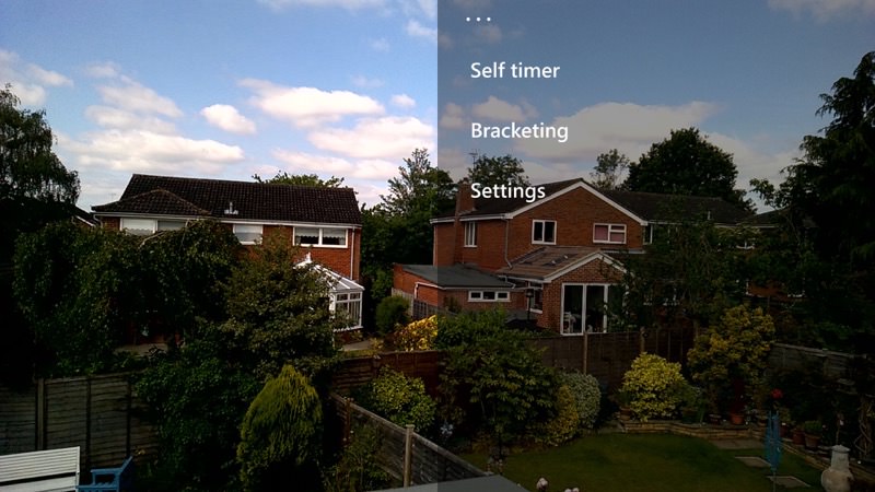
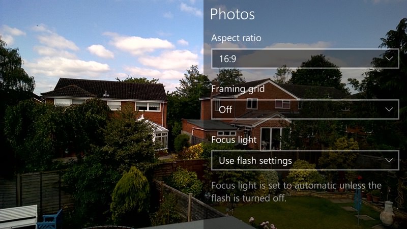
Of course, users can install whatever camera applications they like - and older versions of Lumia Camera do work, as do 1Shot, ProShot, and more, so there's plenty of choice for anyone wanting something specific from their phone's imaging under Windows 10 Mobile. But new users will only see the one app, 'Camera', and they'll, on the whole, be happy.
Photos
The new universal Photos application acts much like Google Photos, in that it integrates your store of images in your Microsoft account's OneDrive, all in theory synced (at least at the thumbnail level) with every device you own. All very clever, though it's noticeable that on this early build, Photos can take a few seconds to 'notice' new images that you've captured - making it slightly frustrating when you're trying to do something with them, e.g. share them. In fact, sharing from Photos is currently buggy and doesn't always work, so the point is moot, but there's clearly work still to be done here.

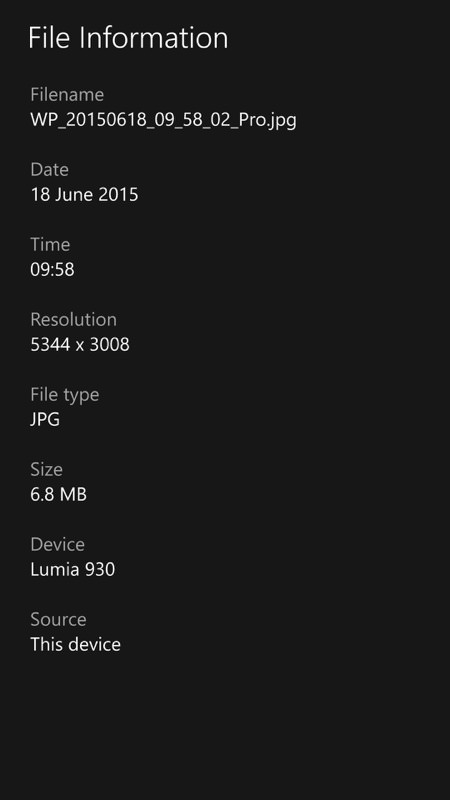
Photos is now getting pretty foolproof (albeit at the cost of a little more bandwidth!) across the Microsoft ecosystem; (right) great to see proper image information built into Photos at last, even if it stops short of providing full EXIF data...
Happily, Photos recognises 'Rich Capture' shots from Lumia Camera (and presumably will from Camera, once all the dots have been joined), in addition to linking through to Lumia Creative Studio on Microsoft-branded devices. The concept of 'albums' is still in place, if needed, and accessed via the 'hamburger' menu, top left.
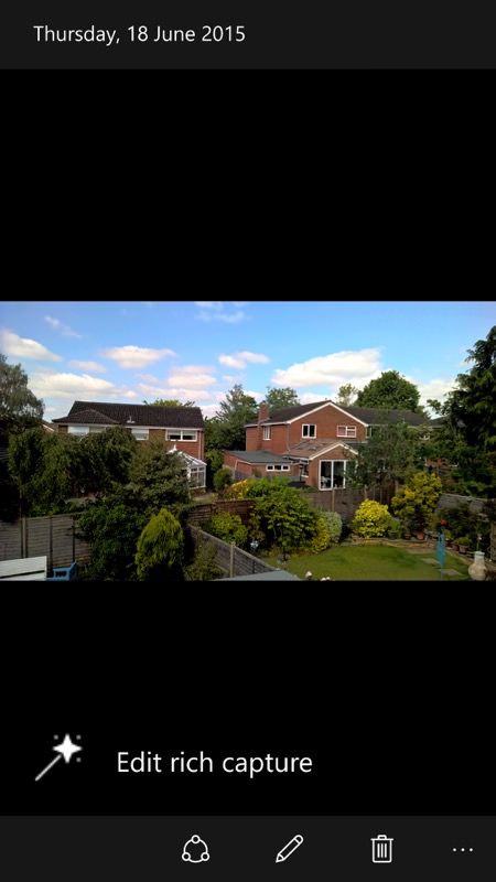
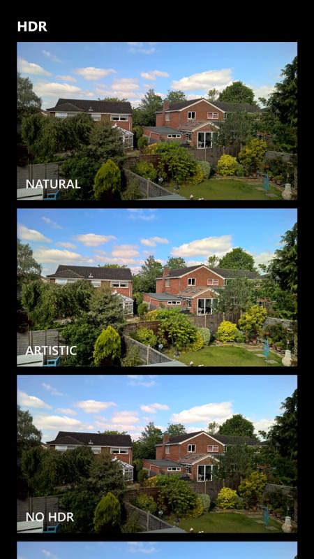
Rich Capture recognised within Windows 10 Mobile Photos (unlike the equivalent in Windows Phone 8.1)...
Music and other media
Loading on Music from my PC was quick and easy and all tracks were automatically scanned and added. When played, artist artwork was shown in some cases but not others, presumably grabbed from Xbox Music - no doubt this will be shored up before Windows 10 Mobile hits for real.
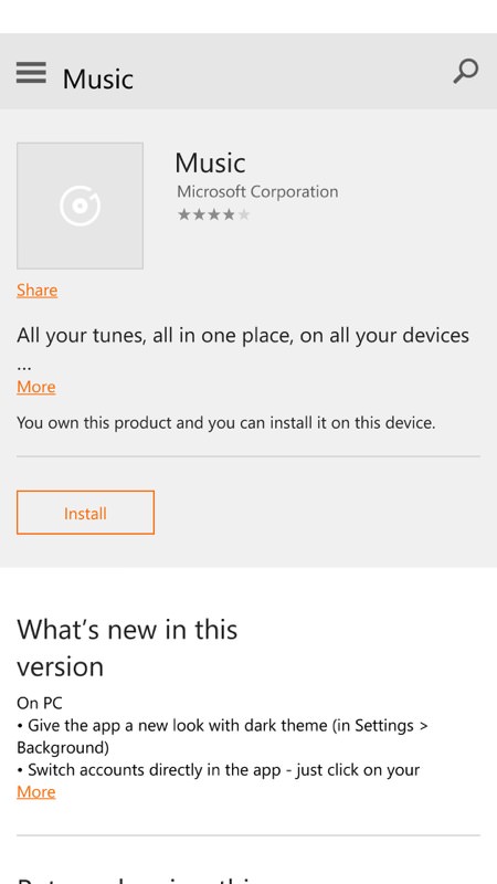
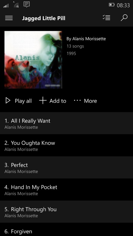
Music is also installed via a stub tile on the Start screen, grabbing the latest version from the Store....
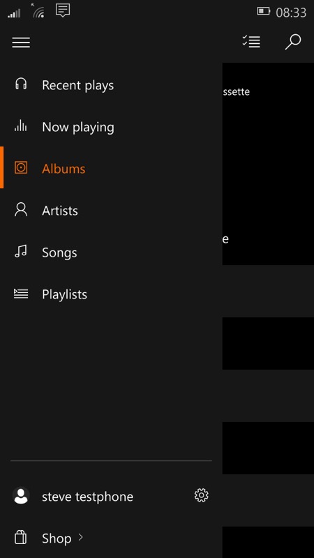
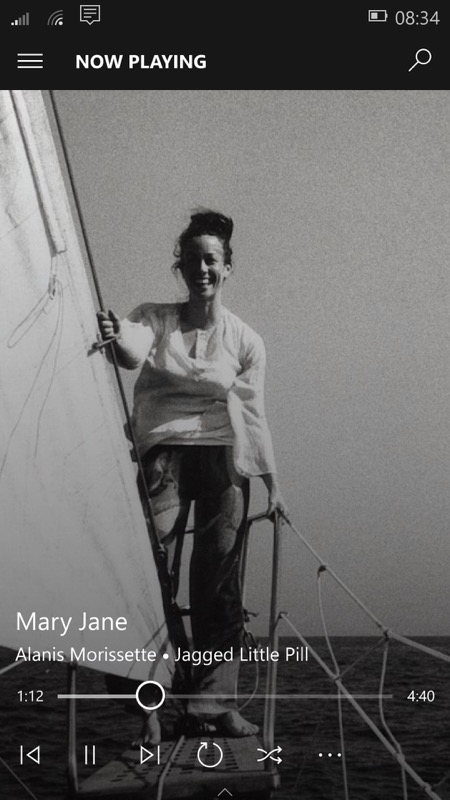
The hamburger menu provides major navigation, while bottom of screen controls provide playback options...
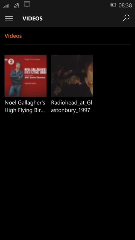
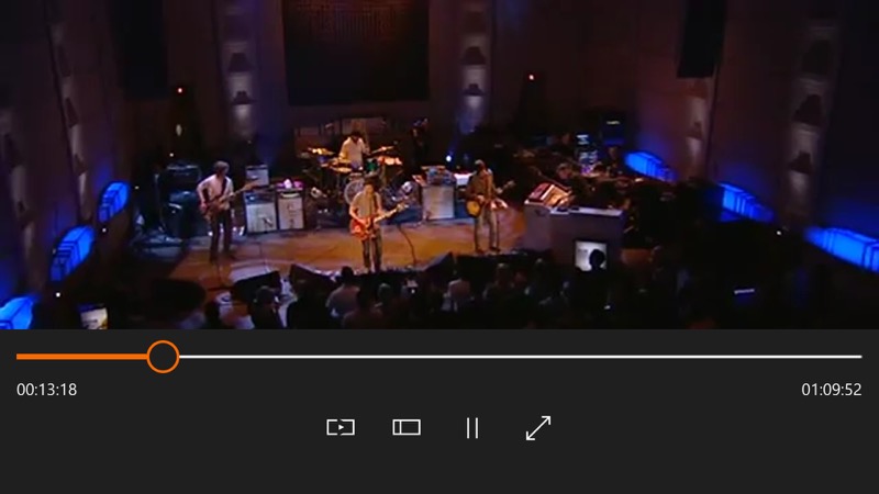
Loading on videos from my Windows PC resulted in a slightly obtuse set of internal folders within the 'Film & TV' application, under 'Videos' on the hamburger menu, but 720p and 1080p videos did play (on my 930) so the codecs are all up and working at least.
Xbox gaming
When launched, this proclaims itself to be just a 'sneak peek' and it's clear that this is still quite early on - certainly there's no UI polish. Diving into the Store section actually links to the main Store application's 'Games' section, of course.
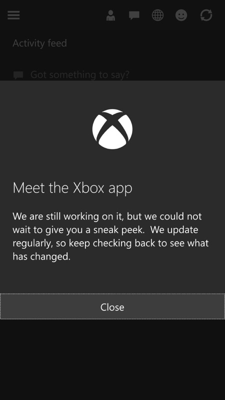
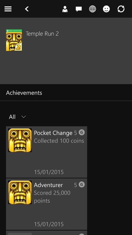
Bare bones content in Xbox at the moment - it'll come....
Reachability
This was a new feature for this build and slides the screen content down on large device - on my test Lumia 930, 1020 and 630 it did nothing, but reports are that it does work on the Lumia 1520, where it will do more good. Of course, the upcoming (rumoured) Lumia 940 XL will be the main beneficiary, later this summer. Maybe. Plus the existing 640 XL, of course.
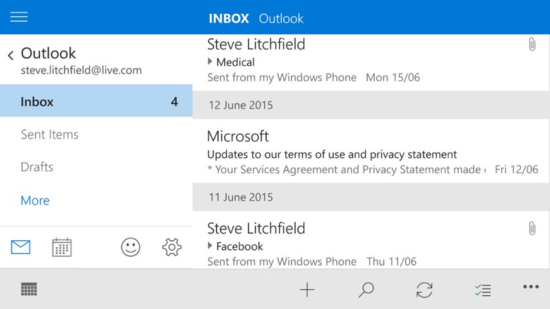
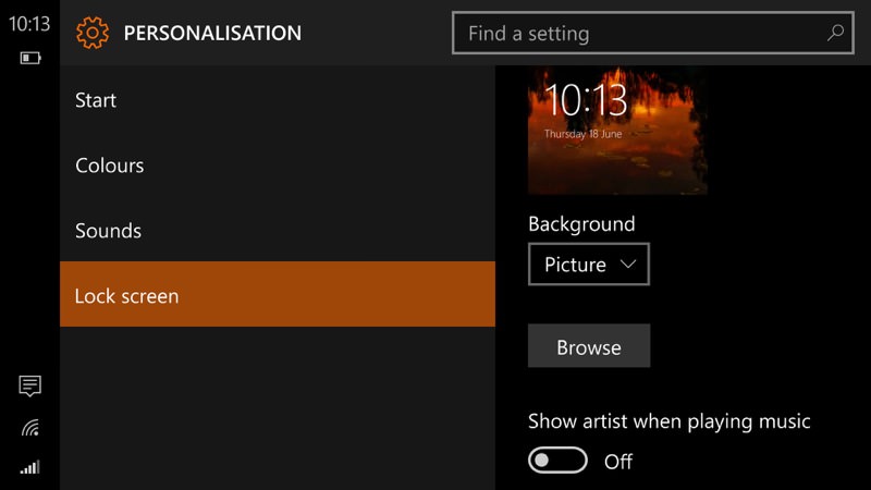
Landscape, two pane layouts
As Windows 10 Mobile is an intimate member of a wider family that includes tablets and PCs, it's not surprising that some of the landscape layouts have made their way onto the phone. So far only a handful of applications use two pane, 'split screen' layouts, but the potential is there for more, especially on large screen devices (again, think 640 XL and a future 940 XL). Here are a couple of examples, from Outlook Mail and Settings:
Start screen and personalisation
Microsoft has done a great job here, keeping all schools of thought happy. There's the choice between 'full screen pictures' (below left) and 'tile pictures' (below right) - take your pick. All other live tile benefits are as they were in previous Windows Phone versions.
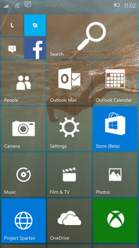
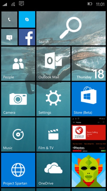
One thing we haven't seen yet is a wider variety of live tile sizes, I suspect these will creep in for future builds, once more applications have been provisioned...
Input
Two input aids stand out, not new for this build (10136) but proving useful for perhaps the first time. The 'ThinkPad' style emulation of a 'pointing stick' (yes, that's what it's really called on a ThinkPad), nestling near the bottom left of the on-screen keyboard, provides nudge control over the cursor in any direction - and works really, really well. I want this on every other mobile OS, please...
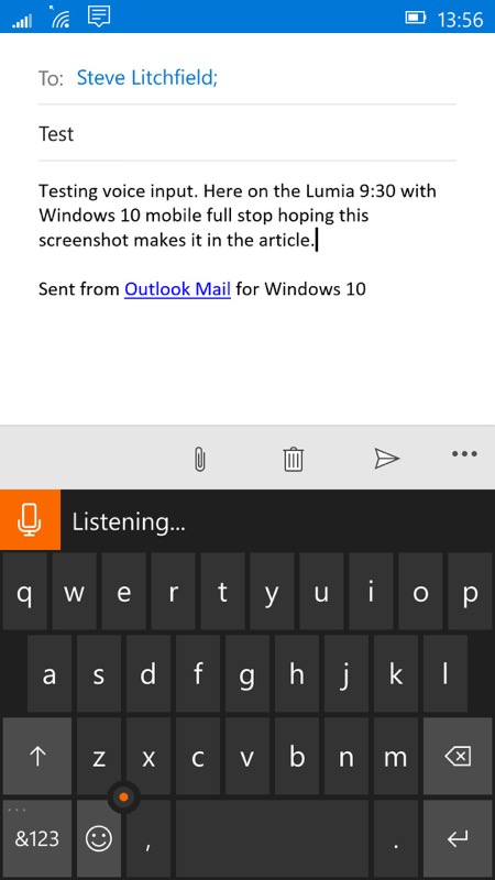
Also useful is the (cloud-powered) voice transcription, enabled by the microphone control just above the keyboard, on the left. As you can see, it's not perfect and some trial and error is needed in order to get it to handle punctuation, but it's as good as you currently get on Android and iOS in the smartphone world. And can only get better.
Desktop connectivity
Worth noting is that Windows 10 Mobile isn't yet compatible with the Mac 'Windows Phone client', but then I'll admit this is perhaps an edge case. Windows 10 Mobile seems perfectly happy talking to Windows 7 and 10 on the desktop, appearing as just another MTP drive in Explorer, etc.
Summary
There's an obvious sense of a work in progress in all this, but it's also worth emphasising that most of it does already work. Now, you could argue that Windows Phone 8.1 'already works', so why re-invent the wheel? Windows 10 Mobile is, of course, part of Microsoft's grand vision for one platform that spans all form factors - and, aside from the fragility of early previews here, there's actually little to lose in aiming for the stars here, since existing Windows Phone 8.1 apps will carry on working, on the whole. With app experiences and purchases common between phone, tablet and laptop, why not indeed embrace Windows 10 Mobile?
[As for AAWP, we're errr... changing the acronym slightly to mean "All About Windows for Phones". Heck, you know where to find us!]
