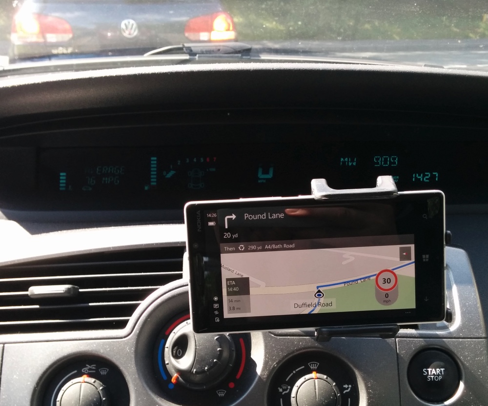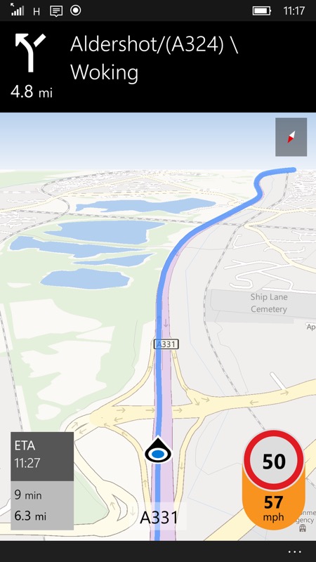
When it works, Windows 10 Maps (on Mobile) does a pretty good job. The interface is clear, though the font used for the journey stats, bottom left, definitely needs bumping up another point size, at least for my eyes on a 5" screen, with the phone in a dash holder. Though not shown here, there's automatic switch to night time colours when needed, on-screen directions are very clear, etc.
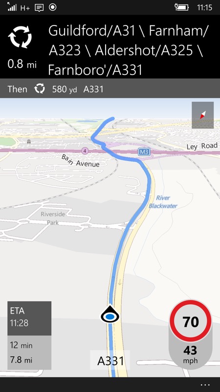
One of my favourite features of Nokia Maps is retained here, the immediate detection of when you're exceeding a speed limit, with an audio and visual warning - see the orange 'actual speed' colouration below.

You can set the exact speed that the warnings kick in, with two settings, one for under 50mph, i.e. suburban roads, and one for over, i.e. motorways and fast dual carriageways. I have the former set to 3mph over (sorry, everything's imperial here in the UK, but you can change it in Settings to all-metric, of course) and the latter to 5mph over, which works for me.
The maps data comes from HERE still, at least in the UK, though it's not 100% accurate, the road in the example below was actually a '50', with permanent signs that had been up for at least a couple of years. Not '70', which it was (presumably) back in 2009 or whenever the road was last surveyed by Nokia/HERE.

This remains, of course, one of the weaknesses of computerised solutions/sat-navs - they're only ever as good as the data available. And I found several small errors in just one day of driving. So I can't emphasise enough how important it is to keep your eyes on the road and its signage and not trust absolutely in the speed limits and other characteristics shown on your phone - stay safe!
There's more than a few 'small errors' in the application itself still though. Pinch to zoom is still hopelessly broken, it plain doesn't work and any finger gestures are complete pot luck. Microsoft knows about this, of course, and I'm sure it'll get addressed before Windows 10 Mobile hits for real.
Even worse, during my travels through the day, Windows 10 Maps crashed on me three times, unceremoniously dumping me out back at the Start screen and I had to manually go back in and choose my previous search and then step through to navigation.
Speaking of which... having located something in the Maps search - which is excellent in terms of places and points of interest - in order to get going you have to tap on 'Directions' and then on 'Go'. Why can't 'Go' be one of the options immediately available after picking somewhere to go? I appreciate that some people may want a list of instructions, but this is always available from the menu and surely 99% of the time users will want to just get going, especially if they're already driving and want to spend as little time as possible interacting with a phone screen? The Directions screen does also offer the choice of changing the mode of travel (i.e. walking or public transport), but I do wonder whether some UI streamlining might help the majority here, with everything else available from the menu or similar?
This thought especially applies when using Cortana to 'Navigate' somewhere. I should be able to say "Navigate Home" and off I go - as happens on Android and Google Maps/Navigation. In fact, I could test this 'one step' approach if the link between Cortana and Maps worked at all. At the moment (on Insiders Preview build 10512), Cortana recognises the command, tries to launch Maps and then the whole thing crashes again.
The (live) traffic routing is fine as far as it goes, but it's based solely on known issues - for example, major roadworks, major reported accidents, and so on. In other words, information from official channels and several times on my journey I found myself held up by local snarl-ups and minor roadworks that were clearly not represented anywhere in Windows 10 Maps.
"But how could these be included?" I hear you say. Yet Google Maps manages to know all about every road in real time thanks to millions of drivers using Android handsets, many of which have location turned on for one reason or another. It's not a perfect system, but it does give Google data on how fast cars are actually moving on a particular stretch of road or at a specific junction. Data which isn't available to other ecosystems. I doubt there's any way for Microsoft to leverage this or attract enough market share to crowd source speed data in the same way in the short term and this will remain a major real time navigation limitation.
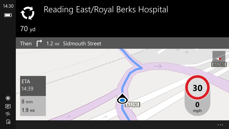
Finally, the interface is very portrait-centric. It's a whole different ball game in landscape:

Given that some people prefer to use phones in this aspect ratio when navigating, a little more optimisation for landscape would be appreciated, Microsoft. Although the information presented is very similar, the 'next instruction' bar needs rethinking for landscape, as it occupies far too much of the screen. Maybe keep the little graphic but shrink the text content to just one row of characters with black background? And the bottom menu bar for '...' could probably be shrunk to a single icon or section.
As it is, it's hard to see much of 'what's coming up' in landscape mode and I wouldn't recommend it right now.
Apologies if all this sound like one big moan, I don't mean to be too negative, all of this is constructive criticism and yes, I've already passed on most of this via Windows Feedback. With the exception of the live traffic reach issue, there's no reason why Windows 10 Mobile Maps can't still be really, really good, if it's given just a little more attention.
