[A (lengthy) article series to read in conjunction with this piece might be Jason Ward's writings here over on Windows Central, where he tackles similar themes from a stats-based angle. Summary: people don't install or use that many apps and most of the common bases are covered anyway.]
The purist in me says that an application should be natively coded and fully tied in with the platform it's running on - such a creation normally ends up smoother and slicker, after all. But I do recognise that for the organisation creating the application for (in this case, the third mobile platform by popularity) Windows 10 Mobile, if there's already a fully working, fully secure, fully tested mobile-friendly web site then why go to the huge expense of commissioning, testing and supporting a native application? After all, on the desktop/laptop, most people access most services via the web anyway, and so Windows 10 and the Edge browser should be a natural 'fit', even here on the smaller screen?
Long time readers may remember (the now very old) 'There's a bookmark for that!', with me pastiching Apple's famous catchphrase in highlighting some of the great sites and services available to anyone with a web browser on their phone. Device speeds and browser capabilities have improved a lot in recent years, meaning that mobile-friendly web sites (often the one served up by default when the server detects that you're on a smartphone) can be almost as pleasant and functional as the full desktop-aimed versions. In many cases it's the exact same site code, but 'responsive' in that it adapts to screen size automatically.
And, with Microsoft Edge on Windows 10 (Mobile) calling a bookmark a 'Favourite', it seems that a slightly renamed update of the original feature/concept was in order. The selection of examples below is more to get you thinking - it's not even remotely definitive. But it does show what can be done through the browser on the platform these days, especially when a native application isn't available, for whatever reason.
Before diving in, I should point out some of the failures of the concept. Snapchat is one of the most popular social communications services in the world and you can't use it via the web at all, and there's no sign of a Windows 10 client. For many over 20 years old, this is probably irrelevant, but it's a showstopper for the typical iPhone-owning teenager (I know, I have one!)
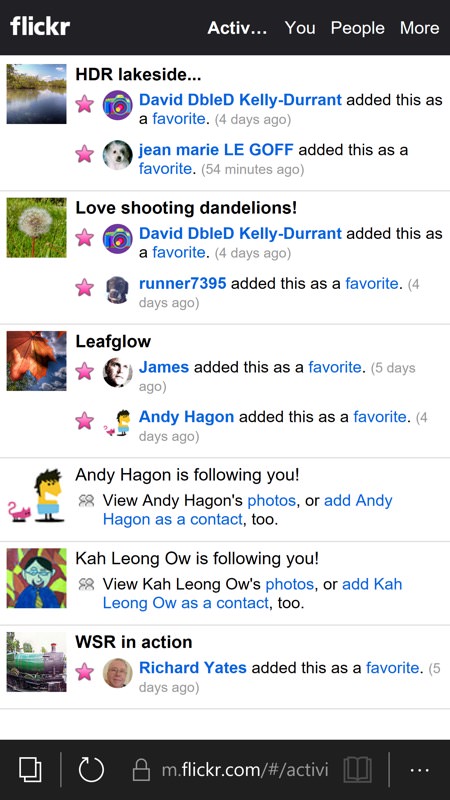
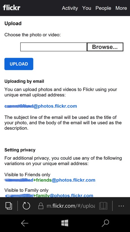
Flickr is the most popular (serious) photo sharing/archiving site in the world, yet one by one the clients have been dropping away, starting with the (old) official one and ending with recent security changes at Flickr's end stopping new users from logging in with the likes of Flickr Central. There's a mobile-optimised web site, but I use the word 'optimised' with prejudice, it's clearly 'mobile' as in '2008' mobile!!
Plus there are many boutique shop and travel aids which are only available on Android and iOS, utilities to help you spend money and help you through the public transit maze.
Then there's the thorny arena of mobile payment, i.e. using your phone to buy something with a real world terminal. This seems years away on Windows 10 (Mobile), but despite all you've read in the press about Apple Pay etc., using your phone or watch to pay for things doesn't seem to have taken off in the mass market (where all bank cards already have contactless capability) and the jury's out on whether paying by touching a terminal with a phone will be a 'thing' long term.
And I'm sure there are some banks out there with terrible mobile web experiences and no applications for Windows 10, though my own in the UK all seem to be fine. Your suggestions welcome in the comments below as to banks and services (etc.) which are left unserved by both web and an 'app'.
The examples here are from my own smartphone use, but (again) maybe they'll get your imagination fired up and you'll discover a great mobile Edge experience for a service/shop/bank that you'll want to mention below?
Amazon (Shopping)
Amazon recently withdrew its shopping application from Store search results, probably because there's a new UWP version coming, but it doesn't matter in a sense because the application was always just a web wrapper and the experience in Microsoft Edge on the phone is superb. A perfect example of how to do a responsive Web shopping system:
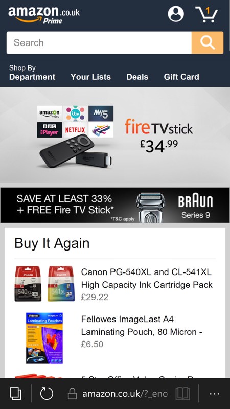
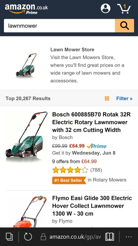
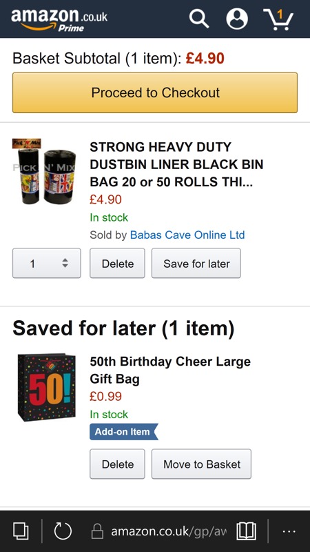
amazon.co.uk
Google+
Well, it almost all works. I say this because although you can keep up with your Google+ contacts and posts, can upload new posts of your own, comment as much as you like, etc. there are parts of the experience that are broken in Edge. For example, you can't '+1' individual replies to posts and, more importantly, you can't tap through to read the substance of notifications (usually posts in which you're mentioned or where someone's replied to you). And, this being Google, there's zero chance that they'll take notice and fix the javascript to work with Edge, so we're probably stuck with the current experience. Still, a lot better than nothing and pretty fast.

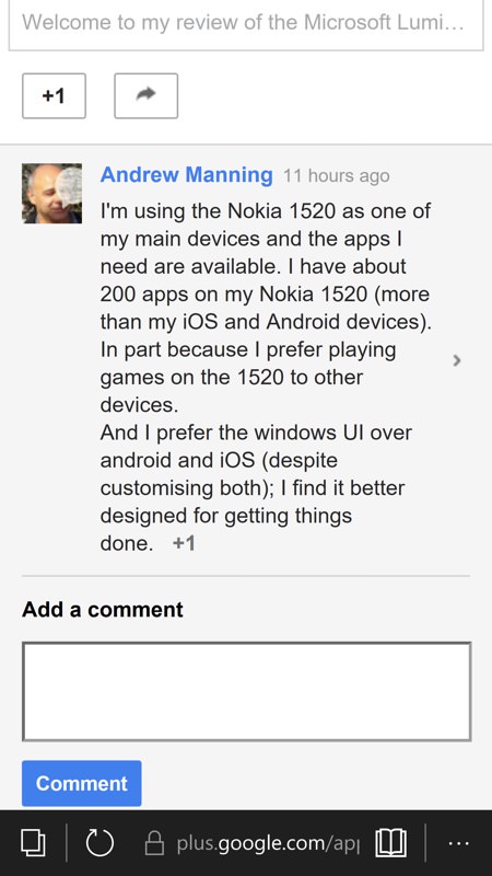
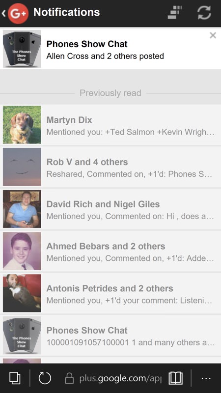
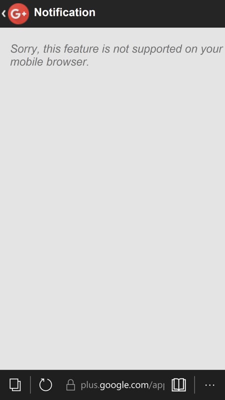
plus.google.com
Google Docs/Drive
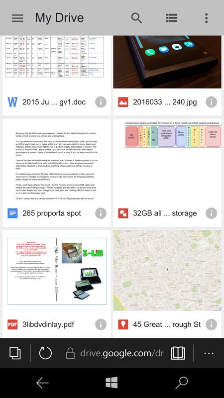
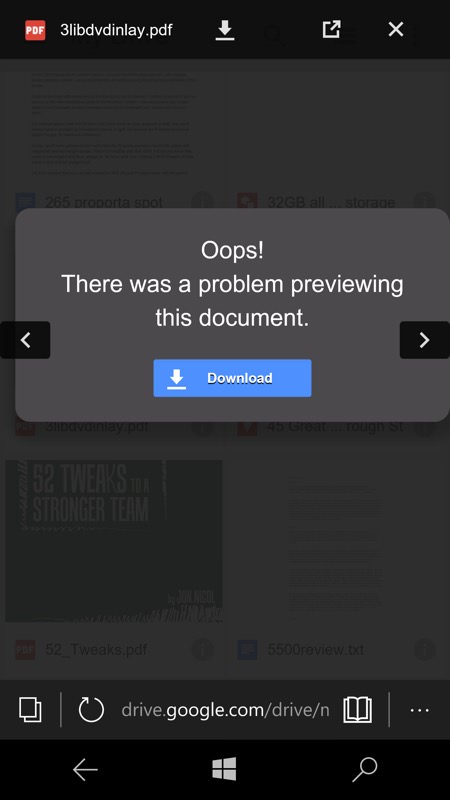
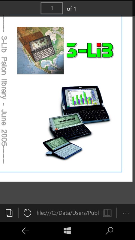
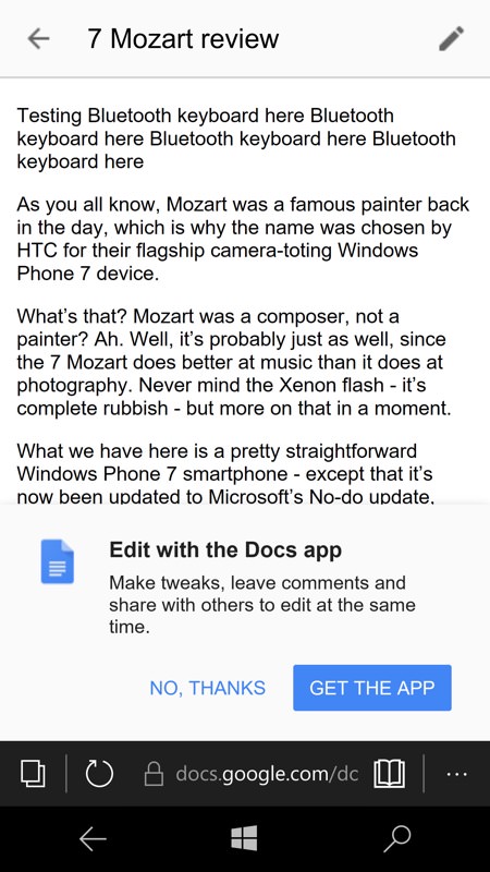
Along similar lines, though updated recently by Google to good effect, the Google Drive web interface now works a lot better on Microsoft Edge and other phone browsers. True, you can't edit documents in the Cloud (you get prompted to download the Android app!) or even upload new ones (no control for this at all!), but you can search for things, preview anything, download it to local storage for editing there, and so on. Well worth noting, at the very least:
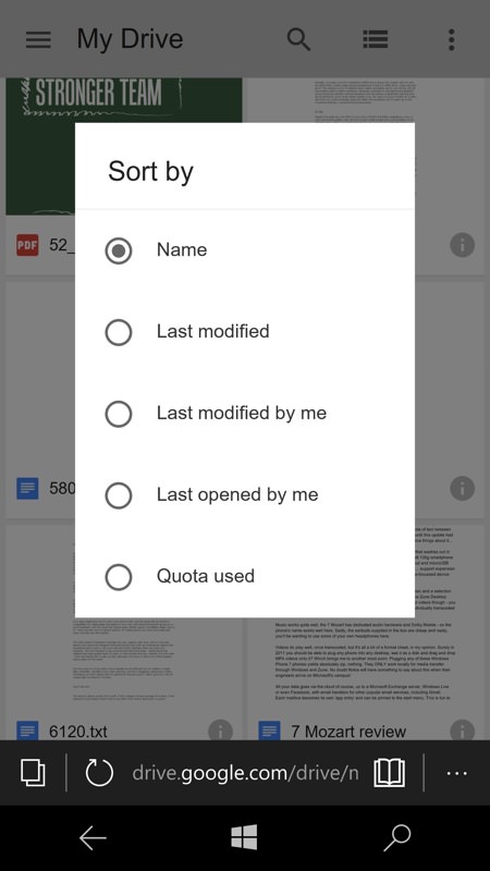
drive.google.com
A slick experience in the Edge browser, spoilt only by persistent banners and the occasional prompt to install the Pinterest Android application! That aside, with slightly less screen real estate, it's similar to being in a dedicated application:
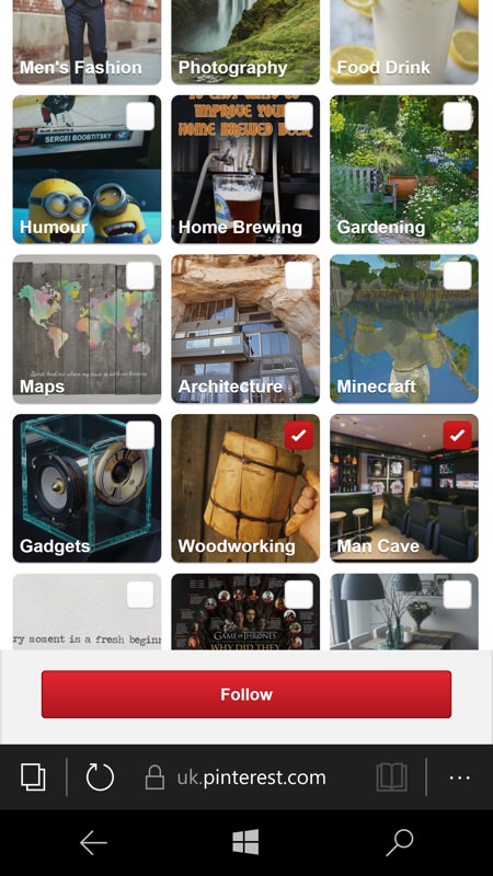
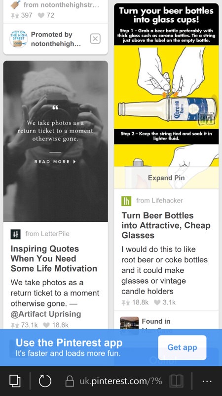
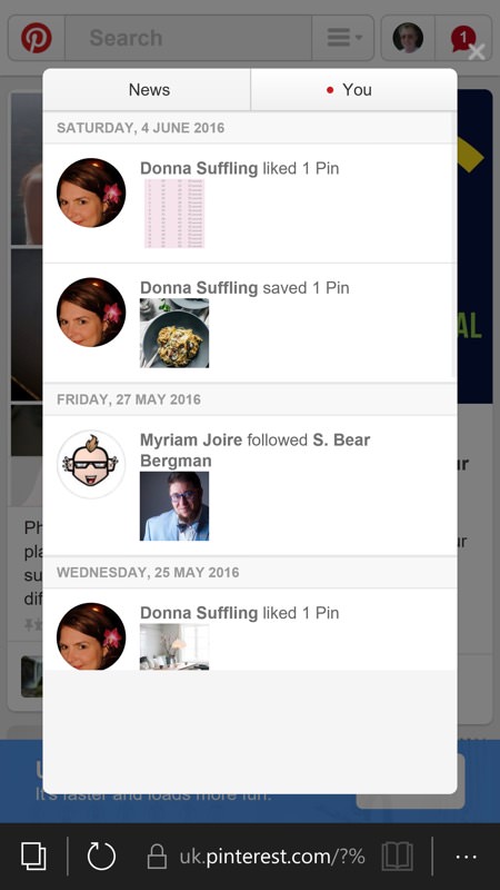
pinterest.com
Lloyds Bank
Very slick from Lloyds, almost indistinguishable from a dedicated application - just the odd menu here and there doesn't quite render correctly. I've had no problems managing my banking using this interface. And it got even better quite recently, as introduced by the promo screens when you log in under Edge, below:
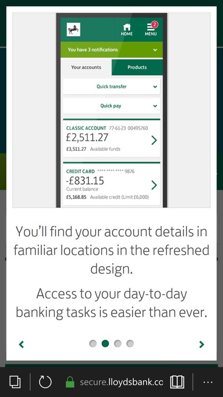
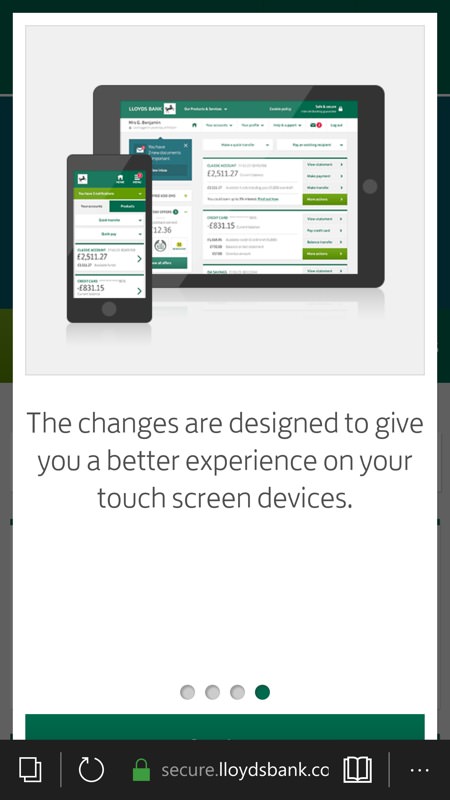
lloydsbank.com
BBC Weather
I've tried all the weather applications for Windows 10 and none beats the quality and accuracy of that from the good ol' Beeb. There's not a dedicated BBC Weather application for Windows 10, but that's because it really isn't needed - the web experience in Edge is identical to that in the application for other platforms. Swipeable panels, pick lists, the lot:
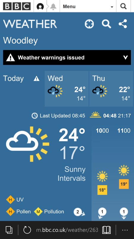
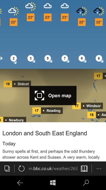
m.bbc.co.uk/weather
____________
Thoughout all of the examples above you have the Edge URL bar, of course, which does take up a few tens of pixels of screen real estate. Plus the virtual controls on many devices, though they're trivial to swipe away, as I've done in many cases above.
Over to you, then. More examples of Edge successes and failures then, please! How much do you need 'apps' and what glaring holes and showstoppers are currently staring you down?
