All three options are completely free, of course, but the latter does have a 'donate' option, should you want to support development.
The options then:
- wikipedia.org in the Edge browser on Windows 10 Mobile
- Wikipedia (by Rudy Huyn (last featured here on AAWP a couple of years ago)
- Wikipedia UWP (by Kavimukil)
I'll look at the interfaces, how content is formatted and then any special features. Let's start with the initial views:
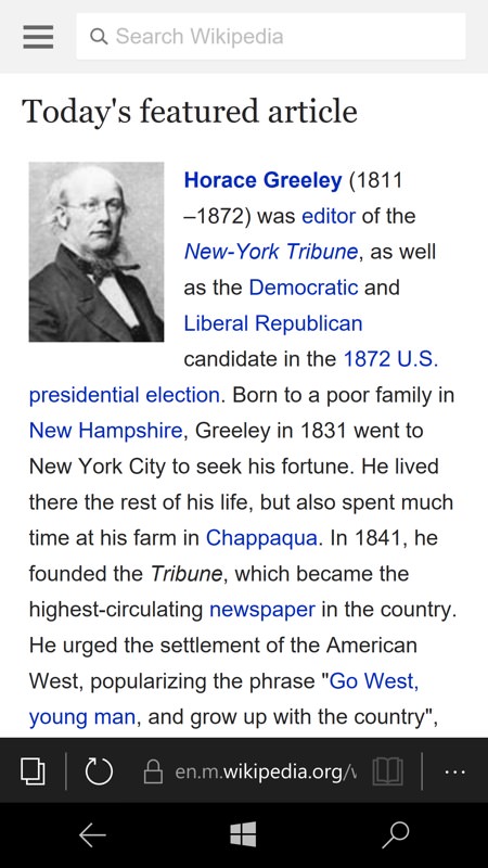
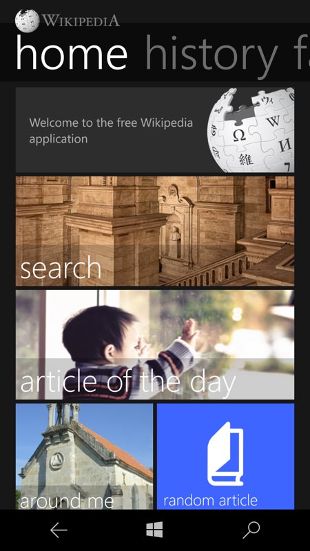
Wikipedia.org (left) has an extract from the featured article of the day, followed by news mentions of content items. There's the usual Edge URL bar at the bottom, of course, this is a web page, after all; (right) Rudy's Wikipedia app kicks off with a very WP 8.1-ish 'Metro' tile-heavy panorama, but including a link to the featured article as well.
Immediately, Rudy's old 8.1 app highlights the chance to switch themes, an immediate benefit for AMOLED-screened phones in terms of saving power. Here's the white theme, which is the default...
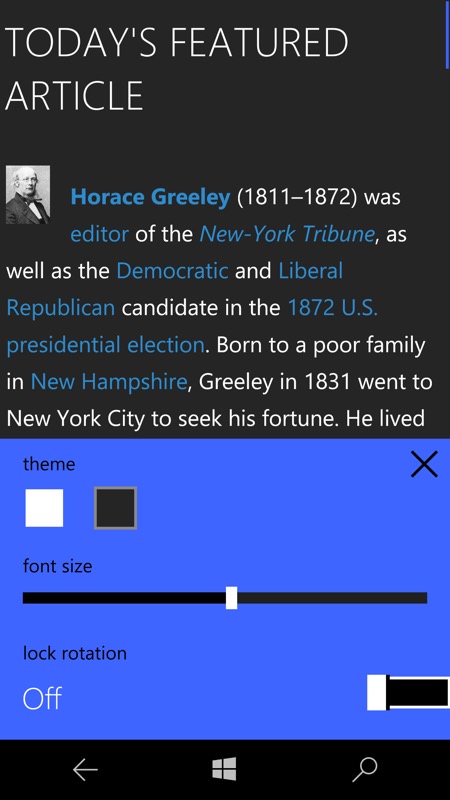
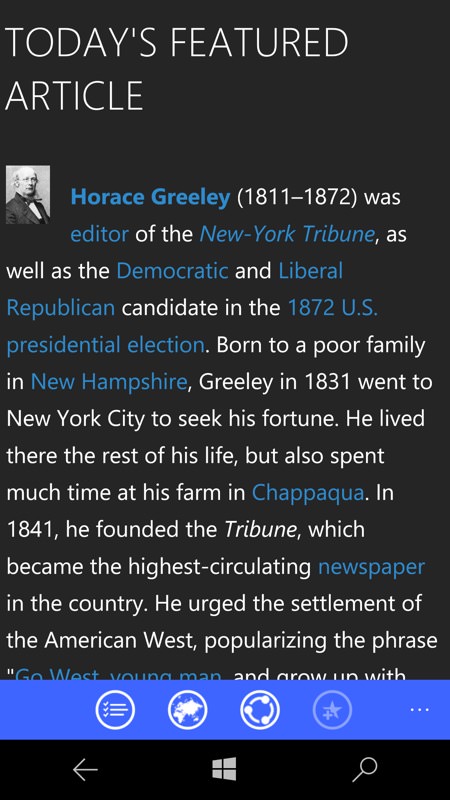
...and then you change the visualisation options to switch to the dark theme, which also helps when reading at night, of course.
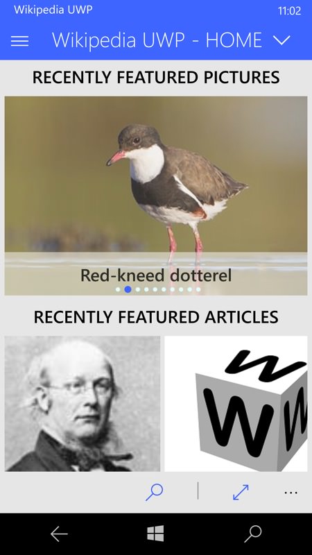
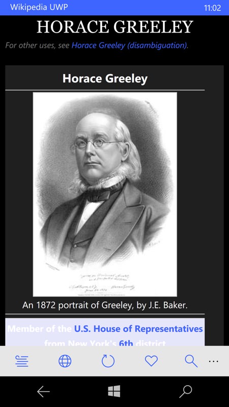
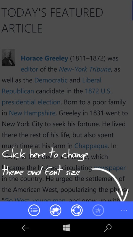
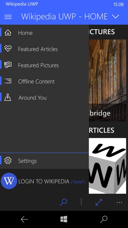
The new Wikipedia UWP has the usual Windows 10 design language - hamburger navigation menu, wireframe controls in the bottom bar, and so on. Again, there's a link to the featured article, though tapping through starts this off with a nice large image rather than a tiny thumbnail, which is a nice touch.
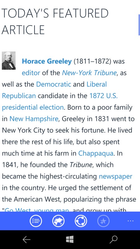
Wikipedia UWP uses the concept of switching backgrounds for content, either for power saving or for clarity of content. Plus the framing and interface is also available in dark and white themes, with the latter being the default.
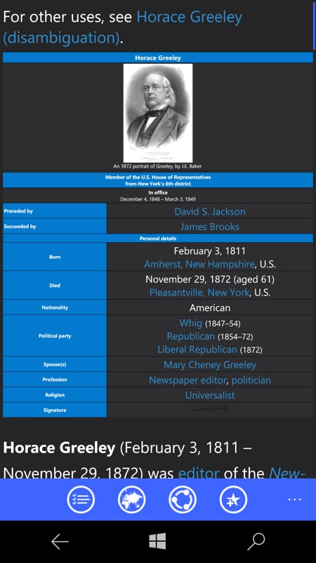
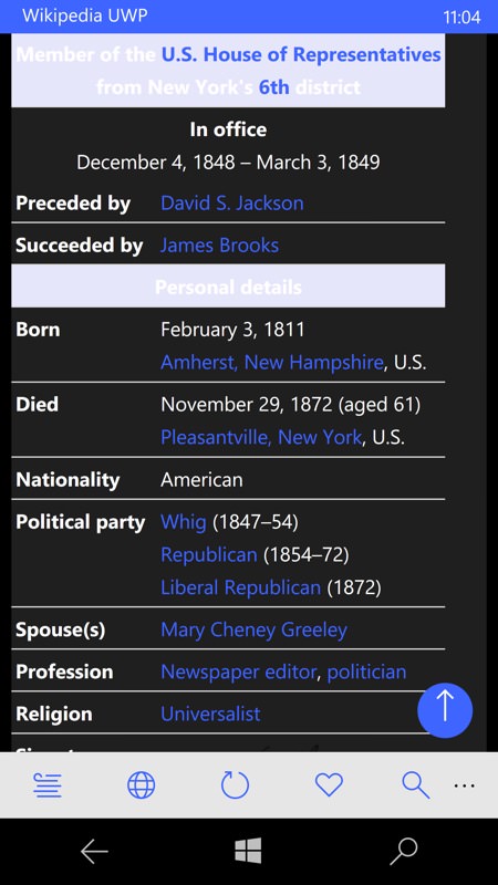
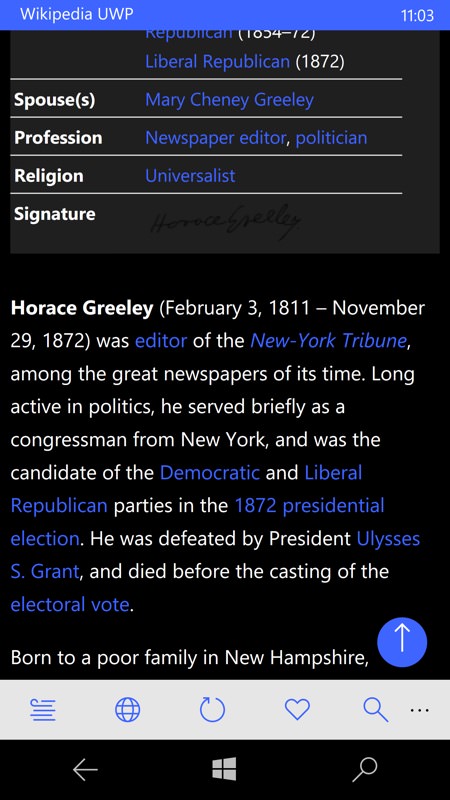
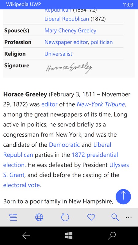
The tabular 'facts' section of each Wikipedia article, as seen in the old 8.1 application (left) and the new Wikipedia UWP (right). The odd light banners, by the way, are because I 'switched background', as mentioned above - you may find that you need to revert this according to content if the occasional white-on-grey headline isn't legible!
Searching for things
I then turned to specific queries and the presentation of the matches. Staying topical, I looked for "AMOLED", i.e. the screen technology:
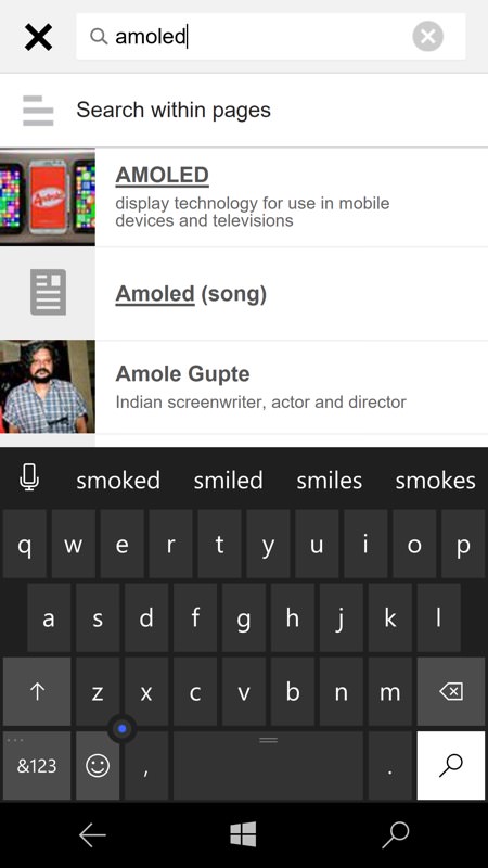
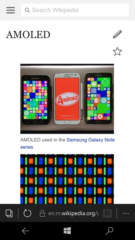
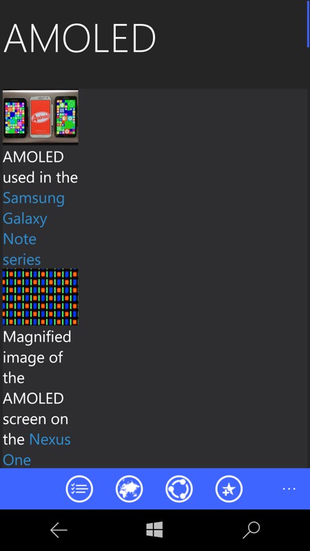
Firstly on wikipedia.org in Edge, it's all white, as already mentioned, but very low bandwith and very functional. Searches are quick matched, relevant images are presented first....
...with the main content formatted perfectly for the phone screen. Article sections are presented initially as headlines with a 'v' or '^' icon to control whether they're expanded, as here (right).
Back in Rudy's 8.1 Wikipedia application, there's also quick matching, though the initial view of an article is a bit screwed up in terms of margins. Hey, it's an oldish app and I'm sure Wikipedia are always tweaking things on their servers....
Once into the main article text though, it's presented pretty well, with the toolbar 'Sections' control popping up a handy navigation pick list (right).
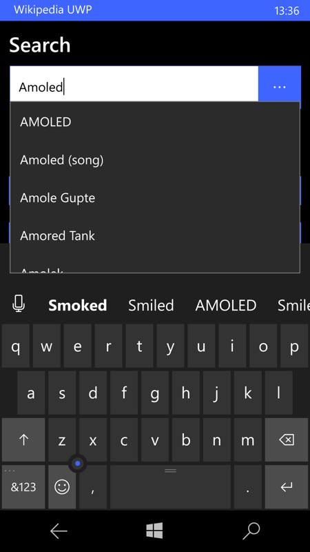
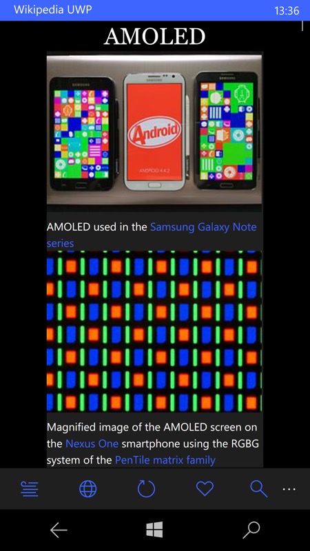
Over in the new Wikipedia UWP, there's also quick matching as I type, plus the initial images in the matched article are more sensibly sized and laid out.
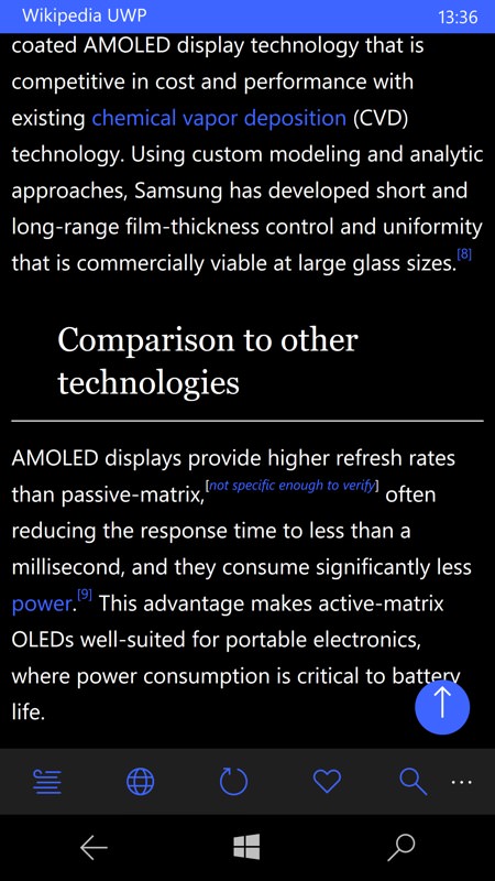
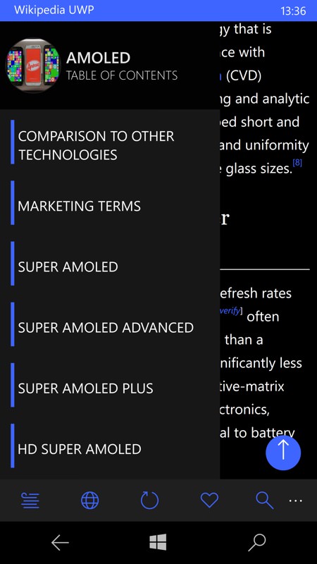
No problems with the article text here, running in dark theme with dark background - it all looks rather magnificent on the AMOLED-screened Lumia 950 and 950 XL. The blue arrow control takes you up to the top of the current article, of course. (right) As with the 8.1 app, there's a control to pop up a hyperlinked table of contents that can be swiped and actionned.
Logging in and marking
What about logging in to Wikipedia and keeing track of the things associated with your account? In fact, there seems only to be the 'Watchlist' at Wikipedia's end. Let's see what happens on mobile:
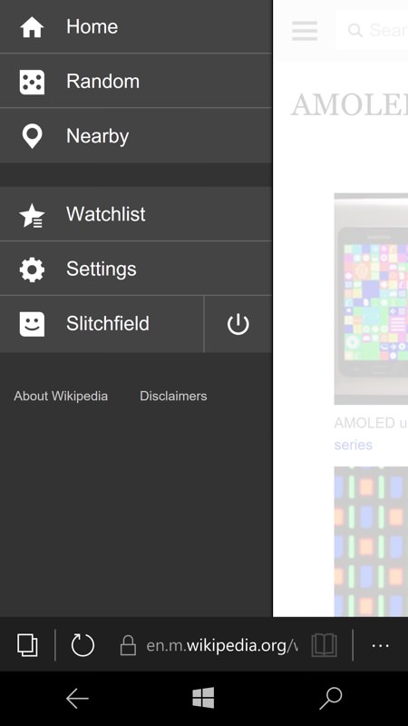
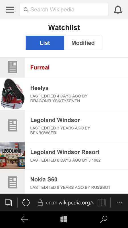
In Edge on the Wikipedia site, of course, it's no problem to log in to your account and see your current Watchlist.
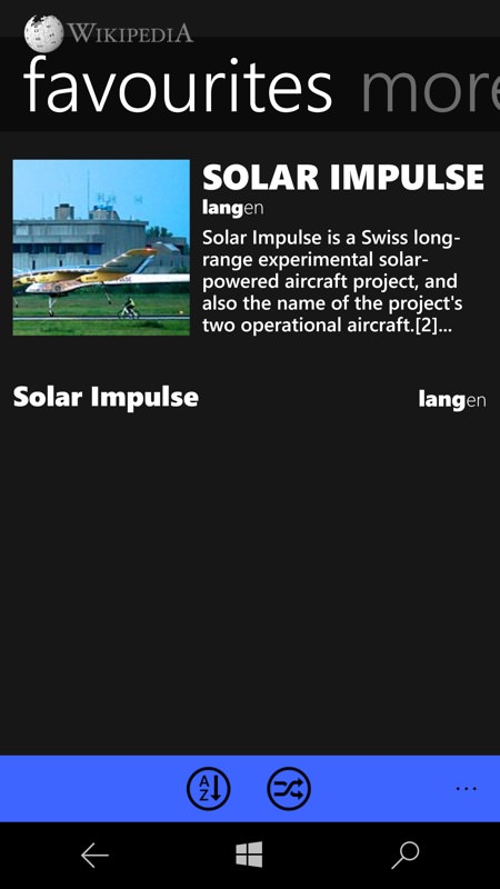
Watch list items are shown with a 'star' (and you add items this way too), so it's clearly analagous to 'favourites'; (right) in Rudy's 8.1 Wikipedia app there's no way (unless I'm missing something) to log into Wikipedia, but you can set articles as 'favourites' locally, i.e. on this particular phone/instance. Better than nothing, I guess.
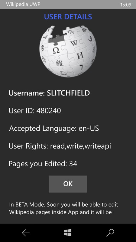
Wikipedia UWP has a fledgling 'login' function, though very restricted currently and labelled firly as 'beta'. There's the promise of being able to edit pages in the app, which is very exciting indeed - plus I'm guessing that the Watchlist will also be either supported or synced with the current (also local) Favourites system.
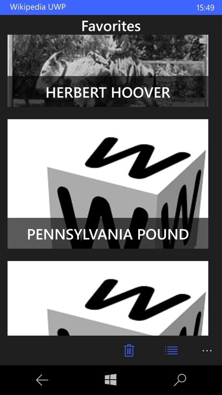
Local favourites are kept, again, but most of the thumbnails are a bit broken at the moment. Early days then for this third party Wikipedia UWP app, but it's looking promising. And remember that as a UWP it works fully on the tablet and laptop too.
Extras
What about extra functions and features in the new Wikipedia UWP?
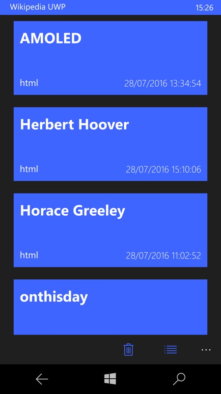
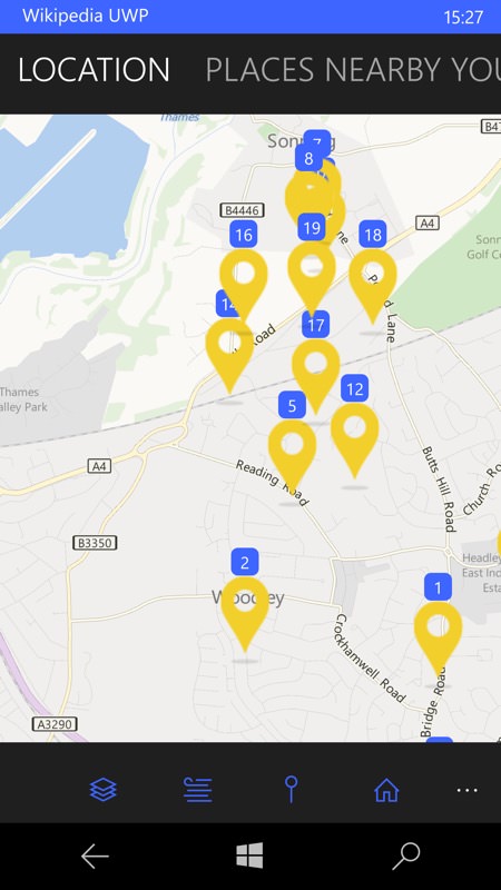
A list of cached ('offline') content is kept, for easy reference later on - it's not clear yet how large this might get - I'd hope for a setting to control it other than just clearing everything; (right) there's a useful 'nearby' list of items from Wikipedia, overlaid on Windows 10 Maps data, though the amount you can zoom out to include more items is very limited currently. Tap on any item to find out more!
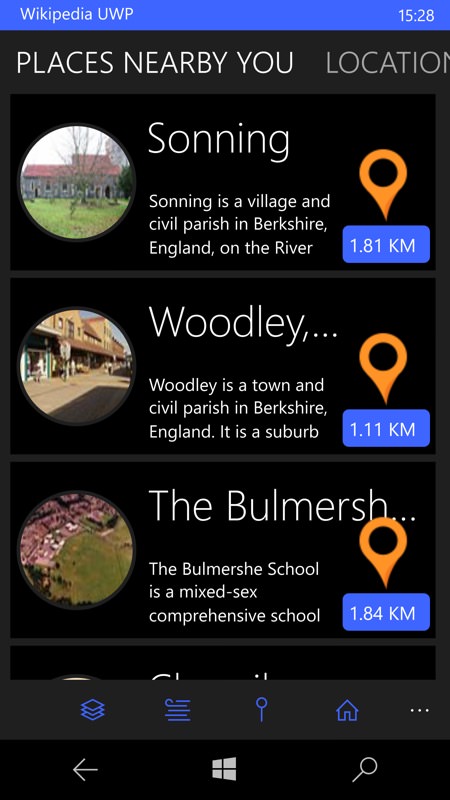
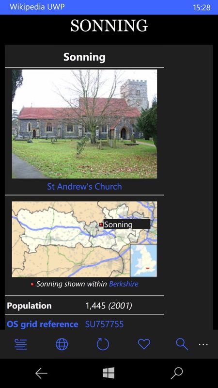
In terms of places, there's also a location-sorted list, with a little more information - tapping through takes you to the full Wikipedia article, as you'd expect.
UWP settings - lots of settings(!)
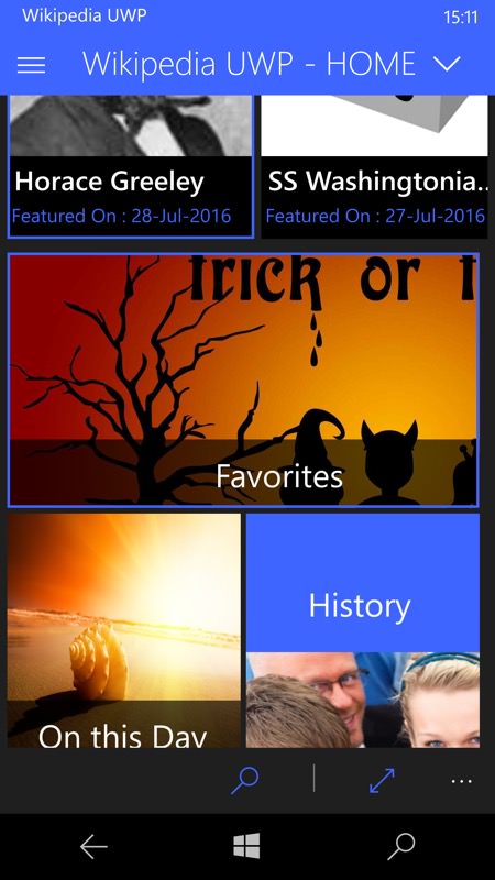
Pick a winner? Well, when it's fully developed, the new UWP app of course - but I do encourage you to give the developer some feedback and even beer donations. There's a lot of potential depth to this new application, as you can see from these final screens:
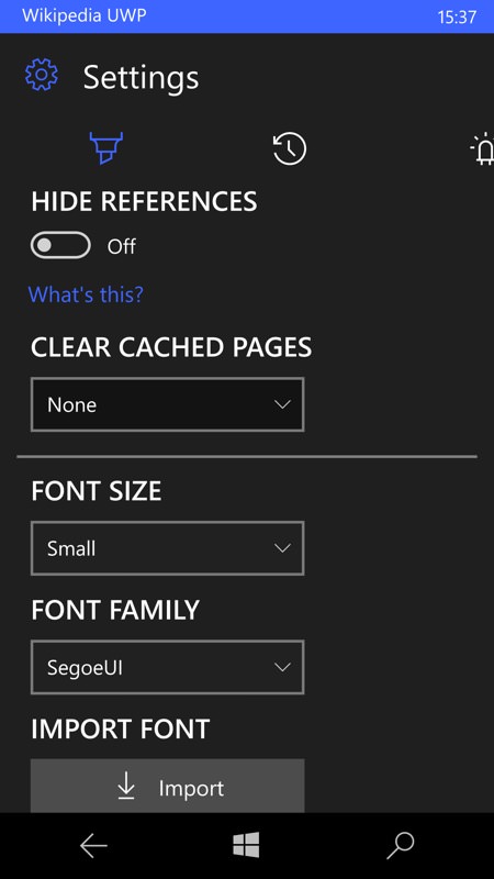
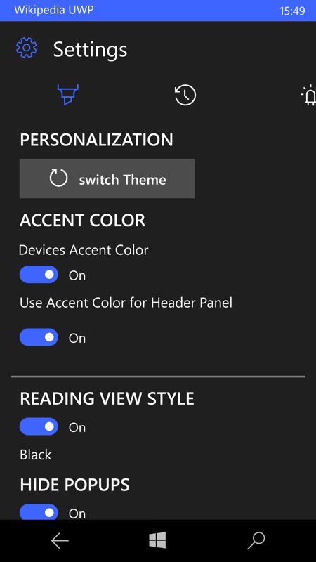
Plenty of tidy up functions (not all shown here) plus the ability to pick a font size and even font family for article display - impressive control and using the full range of fonts built into Windows 10; (right) plenty to play with in terms of colours and styles, worth me playing with, in conjunction with the background and overall themes, I think?
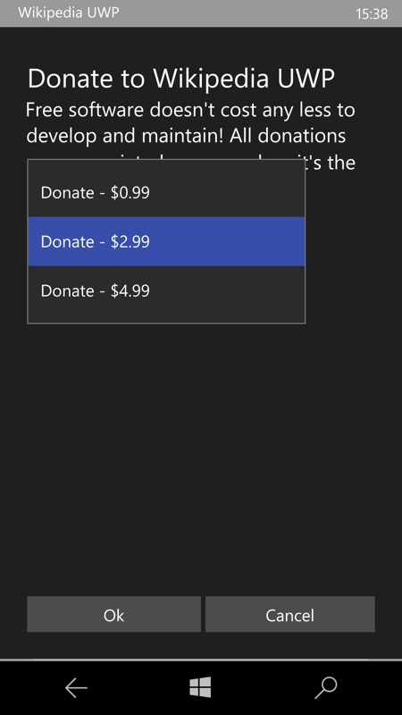
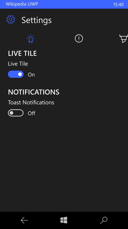
There's a live tile, plus push notifications (it's not clear for what, yet!) - and the suggestion that helping fund Wikipedia UWP will also help pay for the necessary push tokens via Microsoft's servers. Either way, send the guy a virtual beer if you will?
I'll certainly keep Wikipedia UWP installed and monitor it as it develops - do please comment if you've tried it too.
Of course, the Wikipedia application featured here is by a third party and there's no reason why Wikipedia couldn't do its own first party version. But I contend that there's really no need - the existing options, as demonstrated above, work perfectly well and one of the solutions will already meet anybody's needs.