Yes, it's that time of the year. Testing is done, drivers all settled, TV licensing arrangements finalised (sigh, only 10 races on free-to-view, at least here in the UK). But what's available on Windows 10 Mobile to enhance your F1 experience?
In truth, this is a time of flux for the official F1 juggernaut, a 'F1 TV' stream has been formally announced and should come on stream mid season, while the official F1 UWP application (reviewed here last year) has been removed from the Store and (probably) won't work, even if you're still a paid-up F1 Access member. So in part 2 of this feature, I'll revisit this feature in terms of access to F1 TV and more.
In the meantime, there's the official F1 web site, which is mobile-friendly thanks to all its data sections being tables/lists. And its data will be official and up to the second (at least, if you pay), while the timings presented by the two third party offerings here are slightly delayed and from 'unofficial' sources (for which - probably - read official sources, but not so current that the FIA would complain).
Here's how the three current options compare, then:
| PitlaneOne UWP | Racing One UWP | F1.com (in Edge) |
|
| Cost | Free | Free to try IAP removes ads, adds timing panes |
Everything 'live' is behind a monthly paywall (£2.30 a month, or £20 a year) |
| Features |
|
|
And for free:
|
I did some testing during practice for the Australian Grand Prix and I'll definitely have to revisit this (in part 2) once F1 TV is live, in terms of watching video feeds in the Edge browser, and also in terms of testing everything more thoroughly when it's not the middle of the flipping night in the UK!
In the meantime, PitlaneOne impressed me yet again by the attention to detail, while Racing One impressed more visually but whose timings were further delayed and its news stories incomplete.
Here's a visual comparison of the three options:
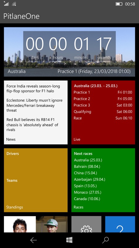
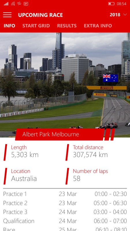
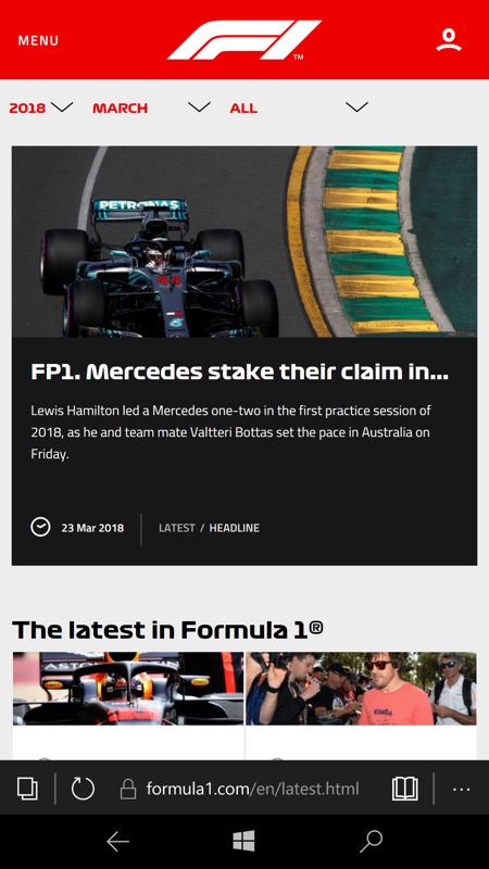
PitlaneOne opens with its visual menu, including the current race, schedule and news, while Racing One opens with the current race and anything else is on its hamburger menu; meanwhile the F1 site takes a story/blog-based approach, with navigation via the text MENU control, top left.
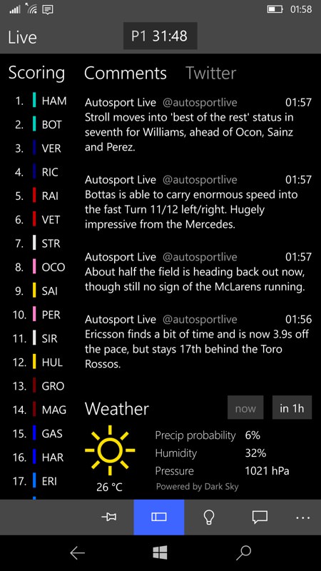
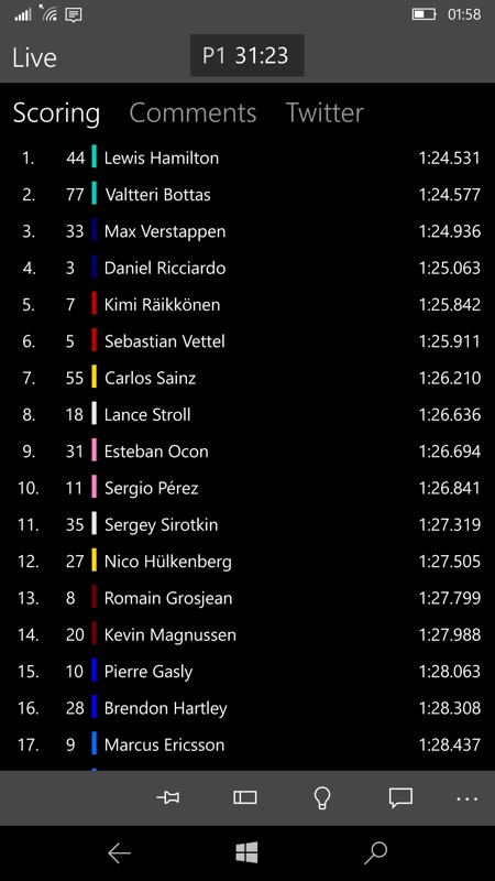
During a session/race, PitlaneOne does a great job of multiplexing positions with Twitter-sourced semi-official commentary and weather, as shown above, left. Or you can view each pane individually as shown above, right.
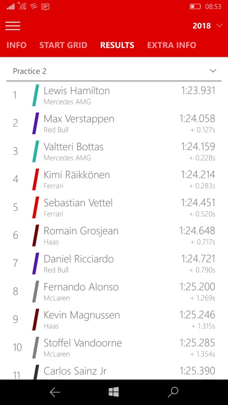
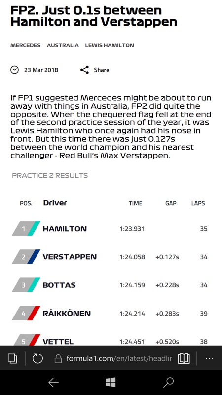
Meanwhile Racing One sticks to just the timings and - at least for the session tested - quite a bit delayed from the pseudo-real-time operation of PitlaneOne; while the F1 site, understandably - for free, sticks to an after-session blog-style report.
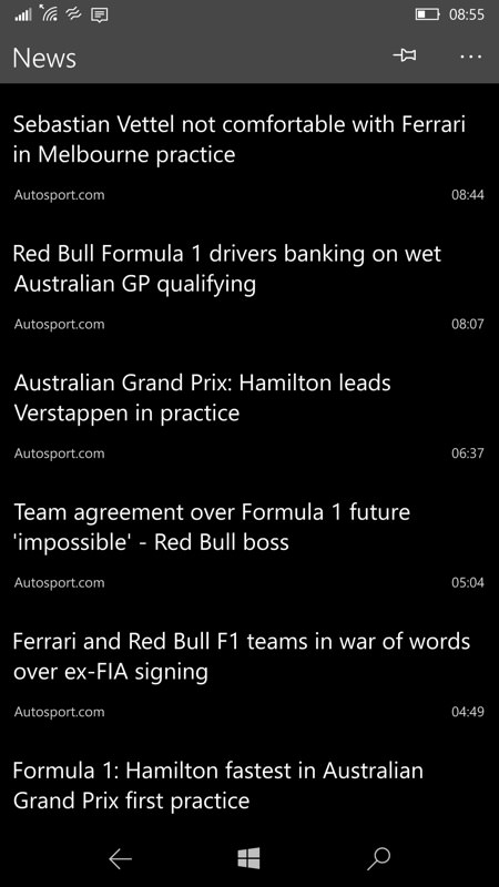
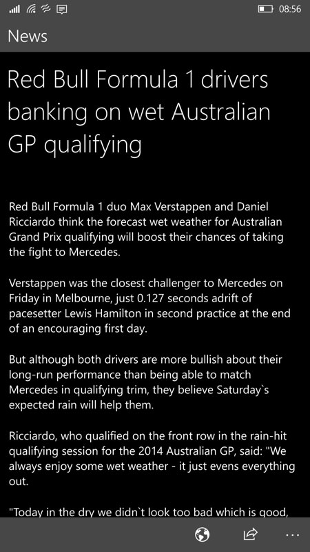
PitlaneOne lets you choose your news sources in some detail, presenting them in plain but efficient form - handily, with a dark background, very power efficient - though even I wished for a little eye candy here and there - as it is, you have to click through to the original story source for photos.
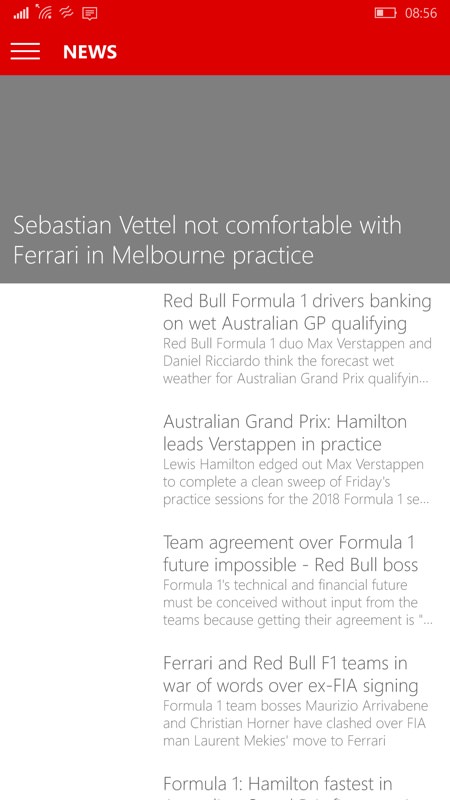
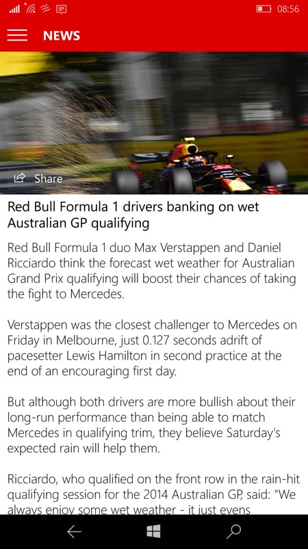
Racing One tries for more visual finesse, but photos seem to be broken at the moment on the headlines page - tapping through reveals more content, though not all stories were complete. Again, I'm going to come back to all these apps and features later in the season.

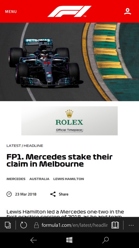
F1's web site does a good magazine-style news section, with photos and thumbnails and with fully fleshed out mini-stories to tap through to.
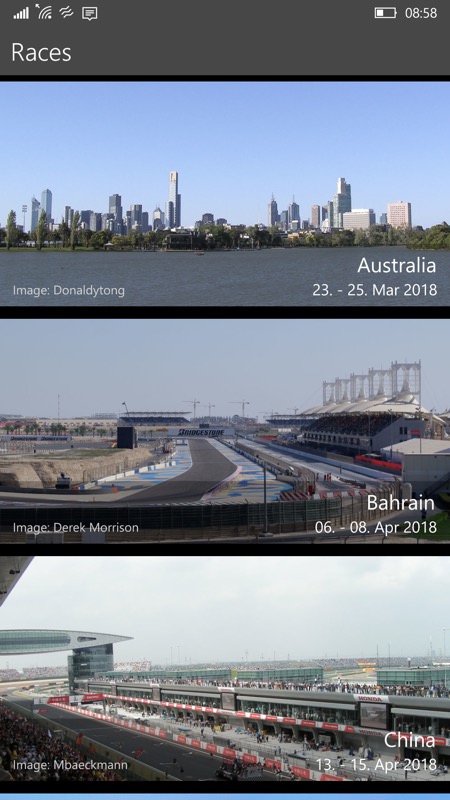
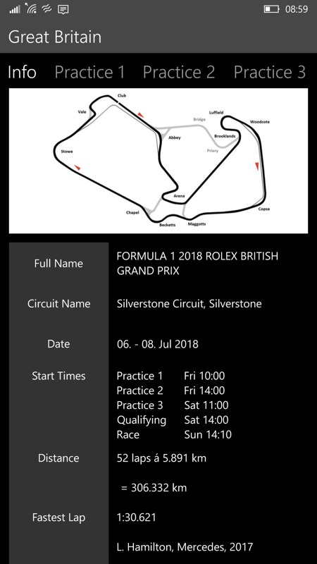
In terms of looking ahead, PitlaneOne has a nice graphical calendar view, and tapping through gives circuit details and you might expect.
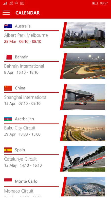
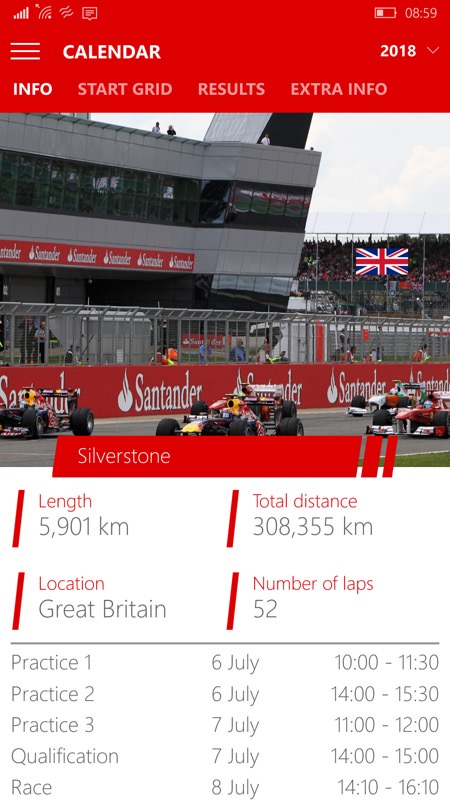
Racing One's F1 calendar pane and, right, tapped though to a tabbed information page.
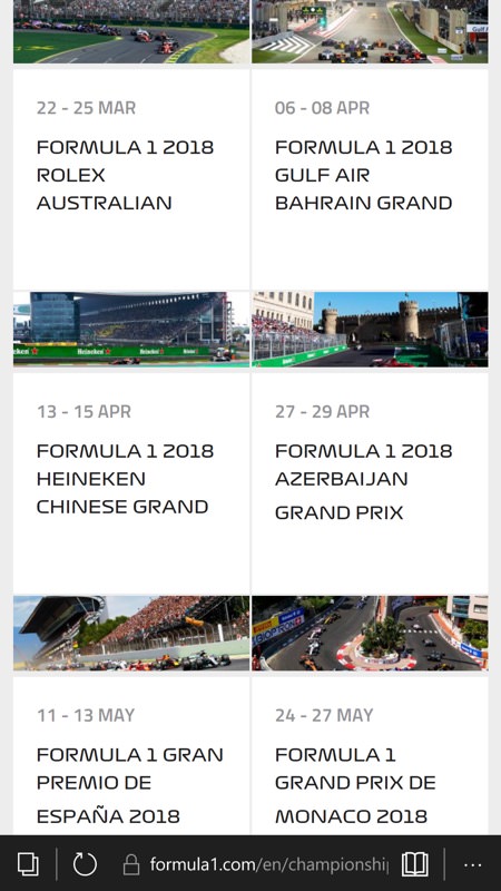
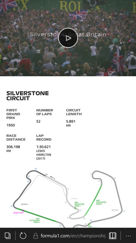
...While the F1 site is similarly informative, but also adds short promotional videos giving a flavour of the country and circuit. A nice touch.
But it's the live aspects, those which aid you while 'consuming' a race, that I'm perhaps most interested in. And which is why I'm going to come back to all this in a 'part 2' later in 2018. By then we'll have F1 TV showing video streams that you don't normally get to see on normal TV, hopefully watchable under Windows 10 Mobile, and I'll also go premium for a while (again) to see how the F1 site stacks up on mobile when using it in parallel with traditional TV coverage. I'll then compare how 'live' everything is compared to the data in the third party apps.
So watch this space - I know F1 is a popular sport among tech fans. And with PitlaneOne being free to use, with Racing One being free to download, and with the F1.com site being free to access (with the caveats above), there's no reason to dip into your wallet too far. Yet. We'll have to see how 2018 pans out...
Comments welcome!
