Review: Formula 1 UWP
Score:
75%
Launched in 2016, this will be the first full season of Formula 1 with the official Windows 10 UWP companion application, with most of its functionality behind a subscription 'pay wall' - but don't get put off by this, we're not talking Sky TV megabucks, this only works out at about £2 a month. Having said that, what exactly do you get for your money? More than you might think, but this is still not everything you might need.
Buy Link | Download / Information Link
If you're reading this review then the chances are that you've at least a passing interest in motor racing, with F1 arguably being its peak. In the UK, only half the races are televised on 'free to air' TV, with the other half exclusive to Sky - the arrangement may be different where you are in the world. The upshot is, usually, that you won't be able to watch all F1 races live, having to rely on radio commentary for updates.
So there's listening to F1 on the radio, there's watching F1 on TV (somehow), and now there's an application which breaks out all the information the radio and TV commentators have access to, on your smartphone, in real time. So, for example, you can see when a driver knocks out a 'purple sector', you can see who's on which tyre, even which gears each car is in and what speed they're currently logged at, all in real time.
I reckon that's easily worth the aforementioned £2 a month - for the dedicated F1 fan. Casual followers of the sport simply won't need or appreciate any of the extra data that the Formula 1 application provides here. At least in its current incarnation, as you'll see - what's it's missing is the option of a thumbnail-sized live video feed, but more on that later in this review.
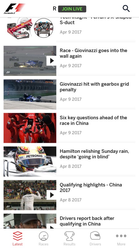
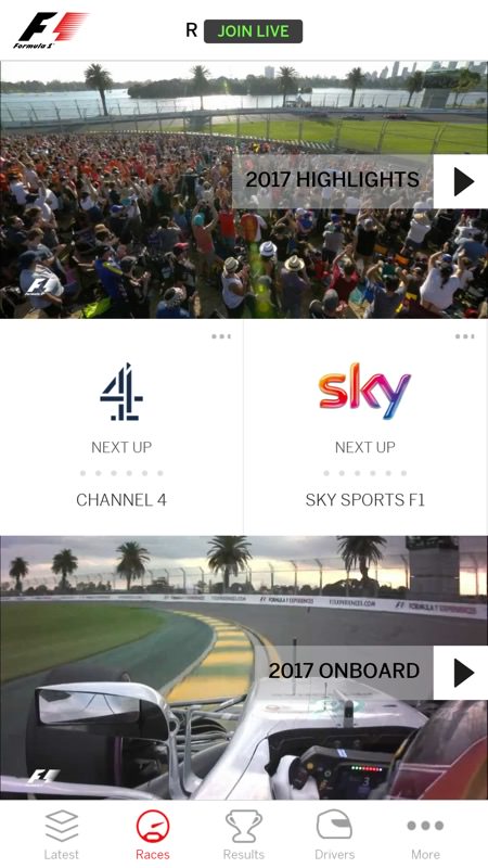
Some of the generic stories and pre-recorded videos. Glossy, but unremarkable so far... Note the 'Join live' banner at the top.
This UWP application does work for free, in a sense - you get official FIA new stories and some short video features, along with basic lap timings during events, but there's nothing here that you couldn't get from other, similar, free applications and sources.
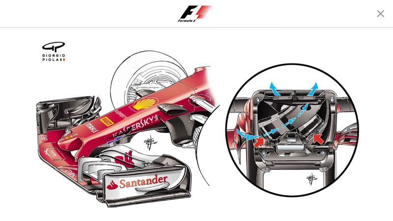
The quality of the illustrations and information is very high, as shown here, you can tell that this is official FIA 'fare' at every turn...
It's signing up to the F1 Access plan (which is cross platform, so once you have a username and password you can use the service on any other device as well, etc.) that takes this application into genuinely interesting territory.
Although a UWP application for all Windows 10 devices (and this aspect is nailed, it works well on all W10 form factors), the interface is more than slightly idiosyncratic. Within the core 'live' sessions (practices, qualifying, race), you're essentially toggling between two main views: a 3D modelled track and information boards. The toggling is done by tapping the 'live' status bar - easy enough when you get the hang of it, but overwhelming at first. Then, within each view, the navigation and interaction isn't trivial.
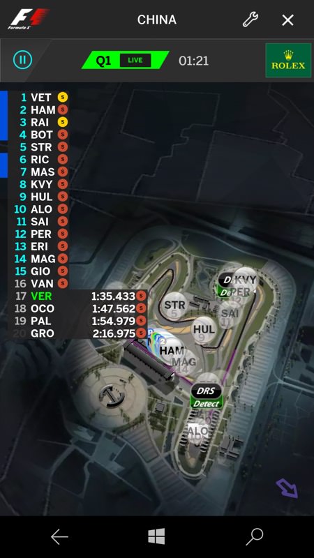
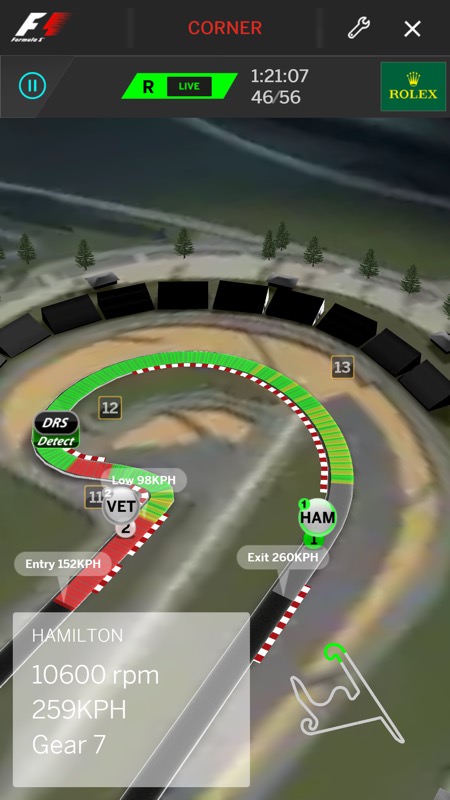
The track overview (here in Qualifying), this starts zoomed out and you can then use touch to zoom in and move around - obviously each dot/blob is one driver; (right) several corners on each track are marked with a video camera icon. Tapping on this brings in a preset, zoomed view of that corner, showing the cars currently going round it, along with entry and exit speeds.
For example, within the main 3D modelled view, simply swiping left and right doesn't pan your viewpoint, it rotates the track instead - it turns out that you have use two fingers to swipe left and right to pan! Pinching and splaying to zoom out and in again work as expected, but even after several days of use I was still getting caught out by the panning/rotating confusion!
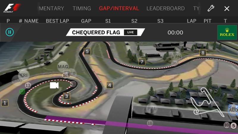
This being a UWP application, of course you can run the whole thing in landscape mode (or indeed on a Continuum display), here showing off the very well done 3D visuals...
Things are slightly smoother when in the leaderboards, with left and right moving between boards, though even then you have to remember what's off to each side, since there's no 'Metro'-like hint in terms of graphics or text. And then the final informational pane, combining a number of feeds, has a UI all to itself.
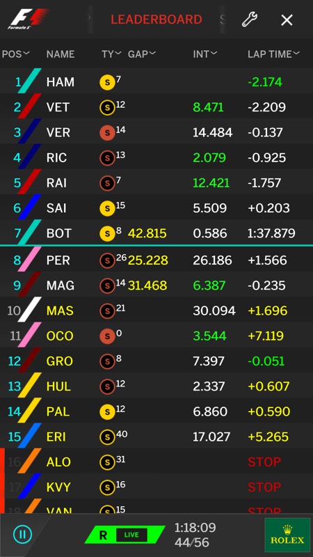
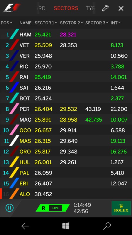
But I'm protesting too much, after a few swipes and half a race(!) you'll be whizzing around quickly, picking out dropping lap times and best sectors with the pros. And, as you can see from the wealth of screenshots here, there really is a mountain of live data on offer, in theory letting you apply your own analysis to what's happening in the race, e.g. Hulkenberg is catching Verstappen quickly because he's on newer tyres, that sort of thing.
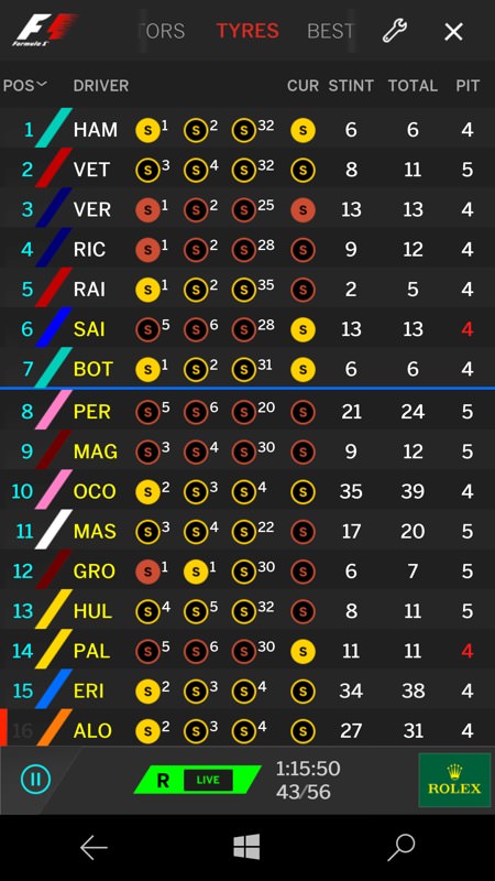
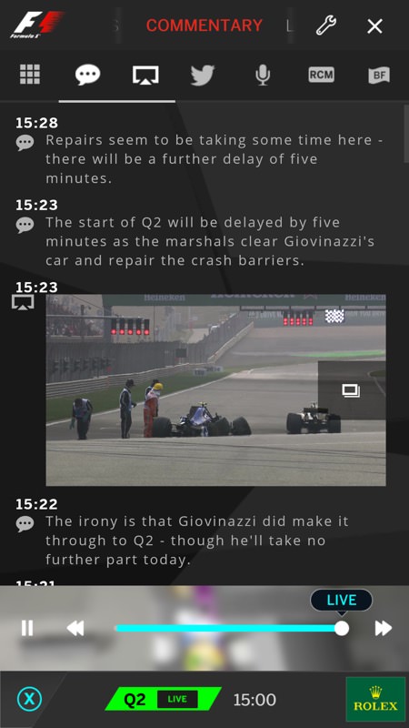
In addition to the feed customisation, above right, there's a wealth of stuff you can change around and turn on or off in the interface, not least on the audio side of things. By default, when in a 'live' session, there's the official FIA radio commentary streamed in, adding atmosphere and insight - there's an (English) international stream and then another in the local language of whichever country is hosting the Grand Prix.
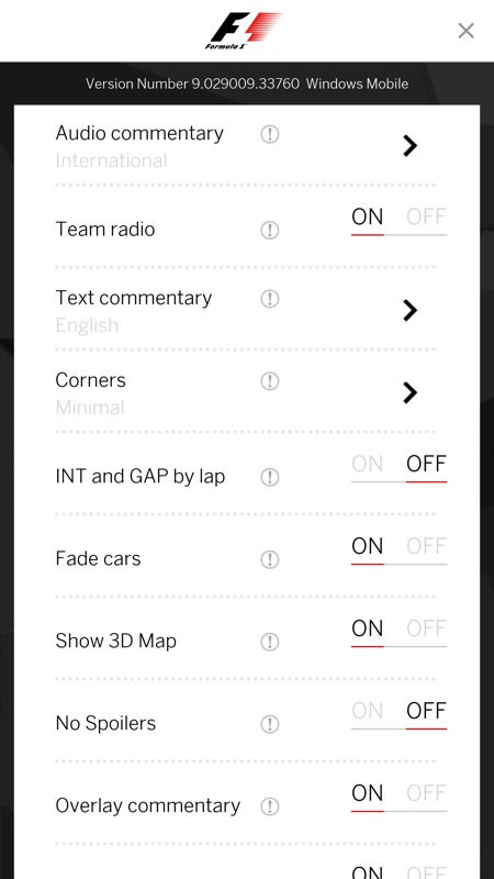
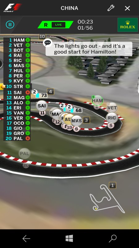
Whether you spend race time watching the animated dots fly around the 3D circuit model or swiping between leaderboard panes is up to you - I suspect you'll mix and match and the race audio continues regardless, if you have this turned on. There's about a 10 second delay between real time data on screen and the audio, but this is acceptable and due to the various encoding, streaming and decoding stages, no doubt.
The 3D graphics are certainly very pretty and you can tap on any driver acronym to 'track' him around the circuit, watching him overtake (or get overtaken by) other 'dots'. You do get fantastic detail even here, with your chosen driver's speed, current gear and so on.
So far so good then, and great value for that £2 a month through this 'F1 Access' and UWP application. However, there are some caveats, and they're whoppers. For starters, 'Formula 1' UWP doesn't override the automatic lockscreen activation on Windows 10 (Mobile), meaning that you leave the display on, sit back listening and watching and then bang, the lockscreen's on and you need to reach down, press the power button and swipe up in order to carry on viewing. Given that games can easily override the lockscreen, I don't see why this application can't do the same.
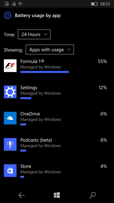
Secondly, as you'll see above right, Formula 1 UWP is a big battery drainer! Now, this is understandable, since it's active all the time, streaming data from the F1 servers, processing the data and animating displays on your phone screen - I'm not complaining about the power drain, but I do have to put in the caveat that a Formula 1 race is up to two hours long and so you'll want to start with a more or less fully charged battery. Or perhaps just dip into this UWP app at exciting times of the race?
Now - with regards that 'exciting' adjective... F1 can get exciting, with crashes and safety cars and (hopefully) wheel to wheel racing. Yet inside this application you only ever hear the commentary, see the dots and occasional team radio audio or transcriptions, as pop-ups. Think of 'Formula 1 UWP' as much closer to that initial radio experience then the TV one. Which is odd, since the FIA has complete control of the TV feeds - it's how the organisation mainly makes its money, selling its video content to TV stations around the world, etc.
So why on earth isn't there a live video feed available as one of the views or as a thumbnail-sized overlay? It wouldn't have to be HD or competing with traditional TV coverage, I'd have thought a simple, optional, low tech 360p stream would have done nicely. So, if you didn't have access to live TV for that race, you'd switch on the official video option and would at least get a sense of the action as it was happening (or, again, 10 seconds after!)
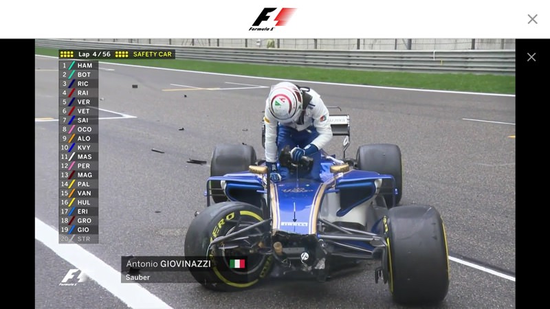
Video highlights of each session/race are available after the fact, with a frame grab here - just nothing in real time. Presumably Sky's rights to the worldwide TV feeds precluded any whippersnapper mobile users having ways to not pay Rupert Murdoch the necessary megabucks per month? Sigh....
So, for example, you get the commentary saying how Hamilton and Vettel are wheel to wheel, you see the animated dots almost upon each other on the 3D display, you see the 'gap' between them down to a fraction of a second and yet... you can't actually see anything. Given the official nature of this application, I really would have expected some kind of licensed live video for my money. Even at low res.
As it is, any self respecting F1 fan will be making sure that they have TV access, even if paying a cable company for the privilege, in which case the Formula 1 UWP app is an excellent companion to what's happening on screen - but it's no more than that and a lot of your attention will still be on the TV. But given the effort given here to the animated visuals and the streaming audio, why on earth hasn't the FIA gone the whole hog, and provided a thumbnail-sized TV stream that really would make your smartphone a way of following the race when completely mobile, no TV strictly needed? Yes, there would be a bit of extra bandwidth, but this app is already sucking quite a bit, I doubt you'd notice the difference.
One particularly nice touch is that the whole 'live' experience can be paused. Or even rewound, or re-lived, thanks to pause/play controls in the interface. Given the real time nature of the sport, it's not entirely clear why you'd want much of this, but at least answering the phone or door or attending to a child (etc.) shouldn't cause you to miss anything vital in terms of the visuals and audio. It's a useful facility to have on board here.
The transformation from free application to the full F1 Access experience can, in theory, be handled on the phone, but I found it much easier to create my F1 Access account on a Windows laptop, with the larger screen and keyboard, and then simply log in (once only) on the phone. I also noted that the login process wouldn't work on a Redstone 2 (Creators Update) device and did contact the developers, but they weren't interested so maybe this was a glitch on that particular phone. It all worked smoothly on my Anniversary Update devices, with screens shown here.
In short then, this is a (quite) well done UWP application that offers F1 fans more live data than they could ever want - just make sure you have some access to the live TV too... even if it's standing outside a TV shop window with the app on your phone in your hand!!
Reviewed by Steve Litchfield at
