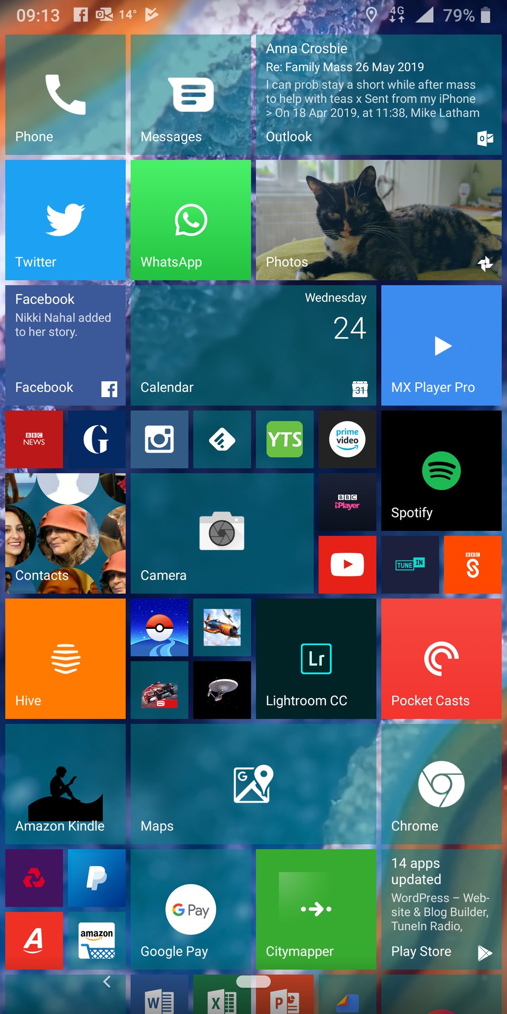
Here's the tweet that started me thinking. And Mike has - obviously - put a lot of effort into customising his Launcher10 install
@stevelitchfield hi there. For those windowsphone addictss amongst us who can't bear any circular icon cobblers, I can't more heartily recommend Launcher10 on android. The live tiles actually work and the customisability/functionality is better than my 950xl ever was.
— Mike Latham (@mikey_wireyface) April 24, 2019

Very nice Mike. Apologies for taking up a lot of vertical space in this feature with his example, but in this case a picture may well be worth a thousand words.
You'll note that, even more so than under Windows 10 Mobile, many tiles don't shown information of any kind. It all depends on the application and how it's been implemented.
- Twitter is a disappointment - seeing latest tweets scrolling through used to be a highlight of my Windows experience. Ditto Pocket Casts, which should show a currently playing (or a new) podcast through its artwork.
- But there are good examples of Launcher10 tiles which do show information and even animate. Outlook, Facebook, Photos (of course), Contacts, and the Play Store. Plus, with some creative tile resizing, you may not even notice that many of the familiar icons are static.
- It's slightly unreal to see titles like Lightroom and Google Pay within a 'Windows' Start screen, but that's the promise of Launcher10...
Still there's enough here for me to try Launcher10 for myself. It's installed in the usual way through the Play Store and then - in my case - can be made the phone's default launcher (when you use the home button or gesture) in Settings/Apps:
![]()
![]()
My layout is above, left. Not as sophisticated as Mike's layout, but I'm just trying the system on a test phone here, so I haven't got anywhere near as many applications installed. I was disappointed again by how few tiles had animation or information - note that Email here is different from Mike's Outlook, with the latter supporting proper live tile function. Photos is the clear highlight here, and note that you can make tiles as large or as small as you like (by tapping and holding to get the options, just as on Windows Phone, though in this case there are sliders to adjust height and width).
Rather touchingly, the 'All Apps' list from Windows phones is mimicked, above right, so picking an application that's not on the Start screen is also easy - you can even tap on a letter to get an alphabetic grid, to jump to a particular (other) letter. And long pressing on an application name gives the familar 'Pin to Start'!
![]()
![]()
Launcher10 has its own Preferences, shown here - with more options than on the original Windows phones, interestingly. Note that the live tiles (i.e. animations and information display) are a premium feature - though with a 14 day trial that I took advantage of in order to try the system out, here.
My takeaways then, after (admittedly only) a day with Launcher10:
- For anyone who's addicted to the Windows Phone/Windows 10 Mobile Start screen, then this utility provides a good, though not perfect, way to get the same home UI on Android. But at least you can get the phone interface more familiar than when thrust straight into Android's homescreen layouts.
- If you do go down this route then factor in the £5 purchase, as you will need the premium 'live tiles', even though many applications don't support this functionality - it's worth it for the apps that do.
- After having used both Windows phones and Android phones extensively over the last decade, I wouldn't recommend Launcher10 necessarily. In fact, I wouldn't recommend any Android replacement launcher. I usually suggest that users at least try to work with the launcher provided by the manufacturer, since these are rarely egregious, can easily be tamed in terms of widgets and icons, and the OS will be optimised for that launcher. So, on a Samsung phone, for example, I use Samsung's launcher, on a LG phone I use LG's, and so on. Whichever way you go, you're going to need to spend an hour fiddling around getting everything the way you like it, so why not go for the defaults, which should consume the least resources?
There's also the Microsoft Launcher for Android, which I reviewed here. It surfaces many Microsoft apps and services more easily, though in an Android-ish way. Well worth a look, though like Launcher10 here, it's more of an 'add-on' and thus you can never rely on its resource usage on the phone.
Comments welcome - have you used Launcher10?
