1. Respond, damn you
One of the core tenets behind the 'ground up' coding of Windows Phone's interface was that it should be responsive. Back in the mid 2000s, phone processors were slow and actions were driven by the user pressing buttons. So you'd press a button and wait for the thing you wanted done to happen. So if it took a second or so for the phone to do something then that was part of 'normality'. It's like pressing the standby button on a TV remote and waiting a couple of seconds for the set to come on. Or pressing the power button on a kettle and waiting a few seconds for any noise of heating action. Button interfaces are by their very nature not tied to expecting an immediate response.
The Apple iPhone, in 2007, for all its other limitations of the time, enabled capacitive touch on a smartphone, and with it the expectation that the UI should follow whatever your finger dictated, in as close to real time as possible. And Apple put in a far faster processor than was in its competitors devices, with absolute emphasis on response time, i.e. never leave the user waiting. They even put up bogus interim screenshots of an application that was being launched, to try to cover up the second or so's genuine loading time.
Windows Phone, four years later did a number of things right (hence this article), one of which was to also prioritise interaction with the user. So 'metro' panoramas could be dragged backwards and forwards, lists could be swiped through (etc) with instant response from the UI, whatever the processor was trying to do behind the scenes.
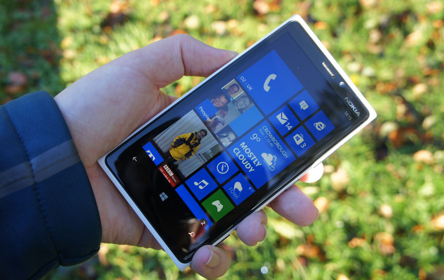
To its credit, Apple kept on doing the same, with modern iPhones still giving the impression of the UI being buttery smooth, but Windows Phone deserves credit for doing the same, even in a world of 2010 and beyond where Android phones of varying speeds and responsiveness came and went.
2. Hello darkness my old friend
So... it's early 2020 and the phone world is (rightly) turning dark, from Whatsapp to OneNote to the Google Play Store and Gmail (the list goes on), so that AMOLED screens can drain less power and so that human eyes don't get blasted with white in the middle of the night. Plus 'dark' is 'cool' now, apparently.
All of which we were saying a decade ago though, in my case with the early AMOLED screens under Symbian and then with Windows Phone in general. From the beginning, Windows Phone had a system wide light/dark theme selection and almost every application adhered to this.
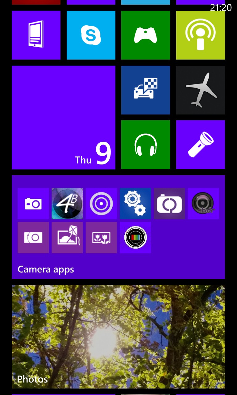
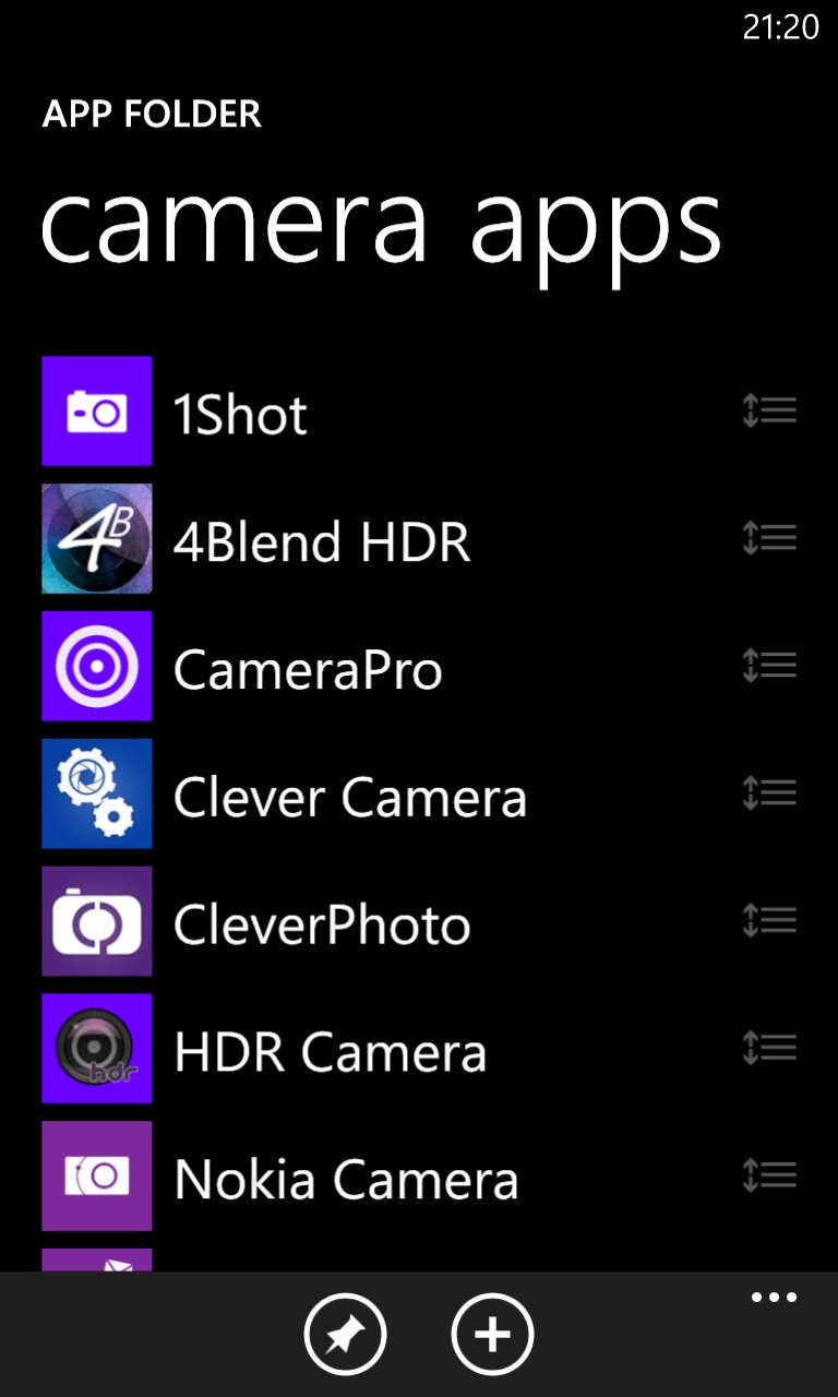
Yet it's taken nine years or so for the rest of the industry to catch up, I'd argue. Some Android manufacturers were 'theming' their phones from about 2016, but Google - and now Apple, with iOS, are finally officially 'dark'-enabled in their very latest OS versions.
3. Offline maps
The idea for having maps 'offline' and thus not needing to be grabbed piecemeal over potentially unreliable bandwidth isn't new, of course, but back when Symbian was fading (under Nokia) and Windows Phone was the new kid on the block, Nokia Maps/Drive and then (renamed to) HERE Maps/Drive was the only free mainstream navigation system in phones to offer offline maps of any country, any region. Google Maps of the time was strictly 'online' and you had to stay connected to see roads and certainly to calculate routes (the latter is still true, by the way, in 2020).
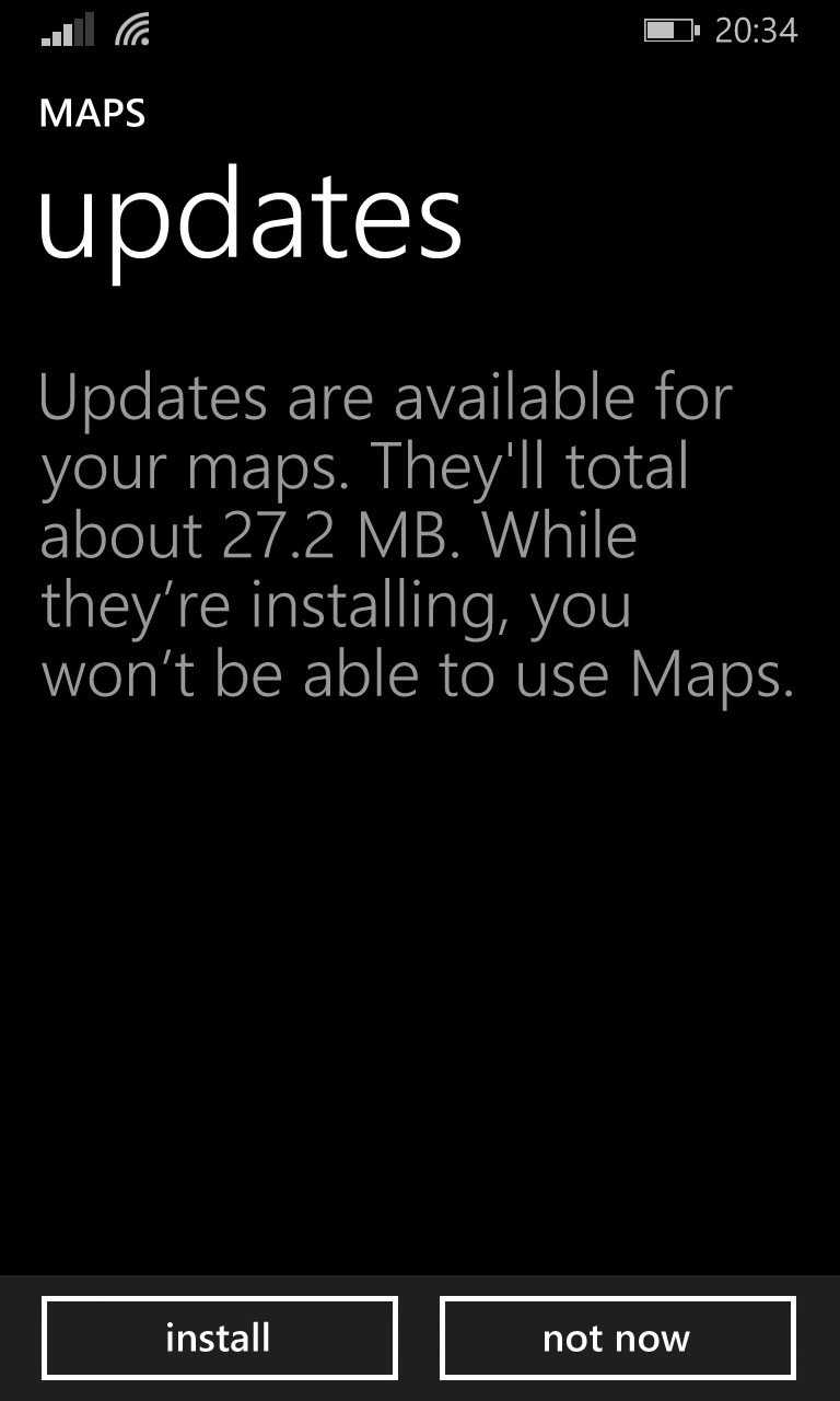

A further rename came, effectively, with Windows 10 Maps, heavily based on the HERE Maps code and using the same data, and with 'offline maps' now so tightly integrated into Windows 10 Mobile that the options to add maps and auto-update them is in the OS's Settings hierarchy.
With full navigation anywhere in the world without needing a connection (other than for live traffic), Nokia/HERE/Windows Maps is still something of a star on the platform, I reckon.
4. Where now?
I had to chuckle seeing people lauding Google's apparently imminent introduction of Augmented Reality into Google Maps, the idea being that when in a city, you can raise the phone so that the camera shows a 'live' view and then the software overlays landmarks and even navigational instructions on top of what the camera 'sees'.
Which all sounds great, except that I reported right here on the LiveSight integration into HERE Maps in 2013, i.e. six years ago, with a very similar idea and implementation on Windows Phone.
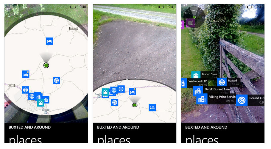
True, the Windows version only handled points of interest and not real time navigation, but do remember that this was 2013 and the rest of the world has, in theory, had six years and vastly more computing resources in order to catch up.
5. People Hub
Possibly the biggest stroke of genius in Windows Phone's history, this integrated Facebook, Twitter, Foursquare, LinkedIn, and Skype, into the People (contacts) application/hub. The idea was that, once connected (signed in), you can see and interact with updates from all your contacts, all in one stream, in one app. Here's a video from back in the day (2012) which gives an excellent demonstration of how it looked and worked:
The huge drawback with this approach is obvious though - the relevant services, eager to please Microsoft in the first place, then started to object to the independence from their official applications - with their info inside the People Hub, there's no reason for people to go elsewhere and therefore no way to generate income from advertising to them. One by one, applications and services got updated and People Hub integration withdrawn, until only Skype was left (because Microsoft bought the company!)
So hugely innovative but also perhaps flawed in terms of commercial realism in modern age - everything has to generate money, it can't just be 'good'. Sadly.
______
So, five ways in which Windows Phone was impressing and leading the way all those years ago.
I'd also point to the Start screen and live tiles (below), plus Cortana (further below) as a super digital assistant that outgunned Siri and (then) Google Now at the time, but these fell into disuse and the competition arguably overtook Windows here, in time:
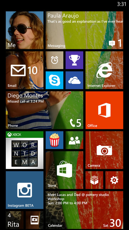
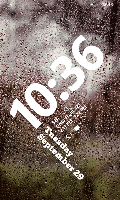
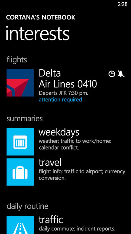
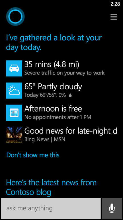
But raise a glass for Windows Phone, which in a surprising number of ways really did represent the future, all the way back in 2012 and 2013. Even if its market share and tech world acceptance never really reached the same heights as its competitors, who had a head start on the world stage and were far better resourced, so the eventual result was understandable.
PS. Some bonus retro links on the hardware front, articles from the AAWP back catalogue that you may have missed... The 10 worst Windows phones of all time - what were they thinking? and The Top 5 Windows phones... ever!
